11 Pricing Page Examples of Productized Services to Copy

“All roads lead to Rome.”
Have you heard that ancient saying?
It refers to Rome being the point of convergence of all the main roads of the Roman Empire.
And in digital marketing, it means the exact same thing.
Rome is your pricing page.
And your landing pages (and all of their elements—CTA buttons, copy, design, etc.) are the spokes to the hub that drive traffic to your pricing page.
Because once customers are sold on the value of your products or service, their next step is to visit your pricing page.
But if your pricing page doesn’t follow certain principles, then you may lose the lead f.o.r.e.v.e.r.
In today’s article, I’ll show you:
- 11 pricing page examples of productized services.
- Which best practices help boost conversions on your pricing pages and which ones certainly don’t.
- And how to identify (and fix) zero multipliers that are killing your conversions on your pricing page.
If you make your prospects’ journey through your site as smooth as possible, then you’ll ultimately convert them into buyers.
Because in the long run, all roads (and leads) lead to your pricing page. Let me ask you this question first...
What Makes a Pricing Page Actually Convert?
You’d be surprised to know how a tiny, simple tweak to your pricing page can actually give you a flood of leads coming into your pipeline.
CTA buttons’ shapes, colors, copy, headlines, price anchoring, optimization, typos, images, design, font size (almost got out of breath here)—all these elements and more come into play when you’re looking to convert prospects.
Especially on your pricing page!
You see, pricing pages are a particularly important part of your sales funnel.
Because your prospects’ journey through your site isn’t complete without visiting your pricing page and clicking on the magic “Buy Now” button.
So on your pricing page, you have an important chance to persuade your site’s visitor to buy whatever it is you’re selling.
And if you can nail the copy, design, and all the high-converting elements of a landing page, then you can boost your conversion rates and make more money with, you guessed: your pricing page!
For example, in this case study, after redesigning their pricing page making CTAs bolder, brighter, clearer pricing, nicer design, testimonial, more obvious currency selection—conversion increased by 25%.
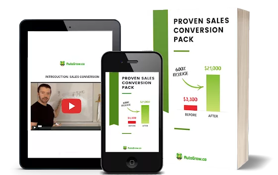
I’ve seen proven patterns (and bottlenecks) towards converting more sales, leads, and email subscribers in the 313 case studies I analyzed in my Proven Sales Conversion Pack.
Now, I’ve shown you in the past the best landing page examples of billion-dollar businesses.
But right now, I’ll show you how some productized businesses have structured their pricing pages to achieve high conversions.
#1 PRODUCTIZED SERVICE PRICING PAGE EXAMPLE: SPEEDKILLS
![]()
What is it?
SpeedKills is a productized business that provides WordPress hosting services.

SpeedKills solve a huge problem.
A website’s Google ranking (traffic) and its sales (conversion rate) are directly tied to how fast a website loads.
So they specialize in solving this problem by upgrading a website’s speed, increasing security, and saving their clients the time of doing these optimizations themselves.
It’s a fully done-for-you managed service with a unique pricing of $97.
What This Pricing Page Example Does Right

- They have one unique pricing plan with price anchoring. And the Law of Friction, one of the Laws of Sales Funnel Physics says that the easier you can make the experience for an interested buyer, the more likely he/she will buy! So having one unique pricing plan helps do just that.
- There’s a FAQ section to clarify any questions prospects may have before checkout.
- Despite not having a live chat, there’s a “contact us” form for prospects who have more questions.
- There’s a clear list of features the package has.
Where This Pricing Page Example Could Improve
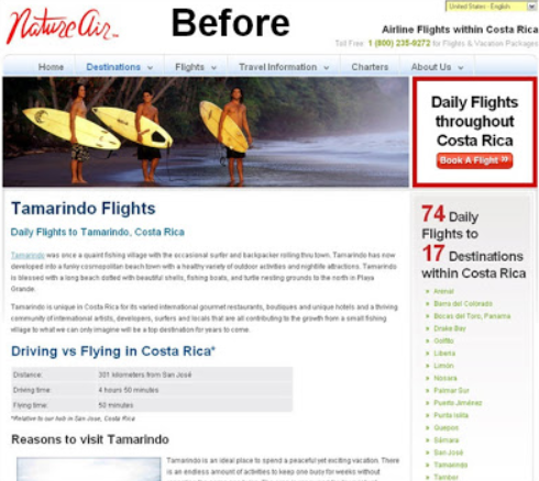
- This pricing page could benefit from having a brighter CTA button (the brown is too passive). Highlighting your key CTA links with color or by turning them into buttons, is always a safe bet to get more people to a key landing page. What's just as worthwhile is to challenge your assumptions of WHEN someone would be prepared to buy, or make a donation, in the case of the example below which spiked conversion by 190%.
Before...

After...

- CTA button shape would stand out more if it was round.
- They could have repeated the pricing and/or the CTA button. The Law of Repetition says that the frequency of exposure to your offer has a direct impact on conversion rates. More exposure to the offer causes more conversion, though ROI diminishes after a point because people get annoyed.
- The Law of Confidence also says that people care a lot about whether or not your product actually does what it claims. People are risk-averse, so they desire proof in order to minimize perceived risk before buying. It can be in the form of testimonials, case studies, etc. And this pricing page example could have benefited from having some social proof.
- There’s no risk reversal.
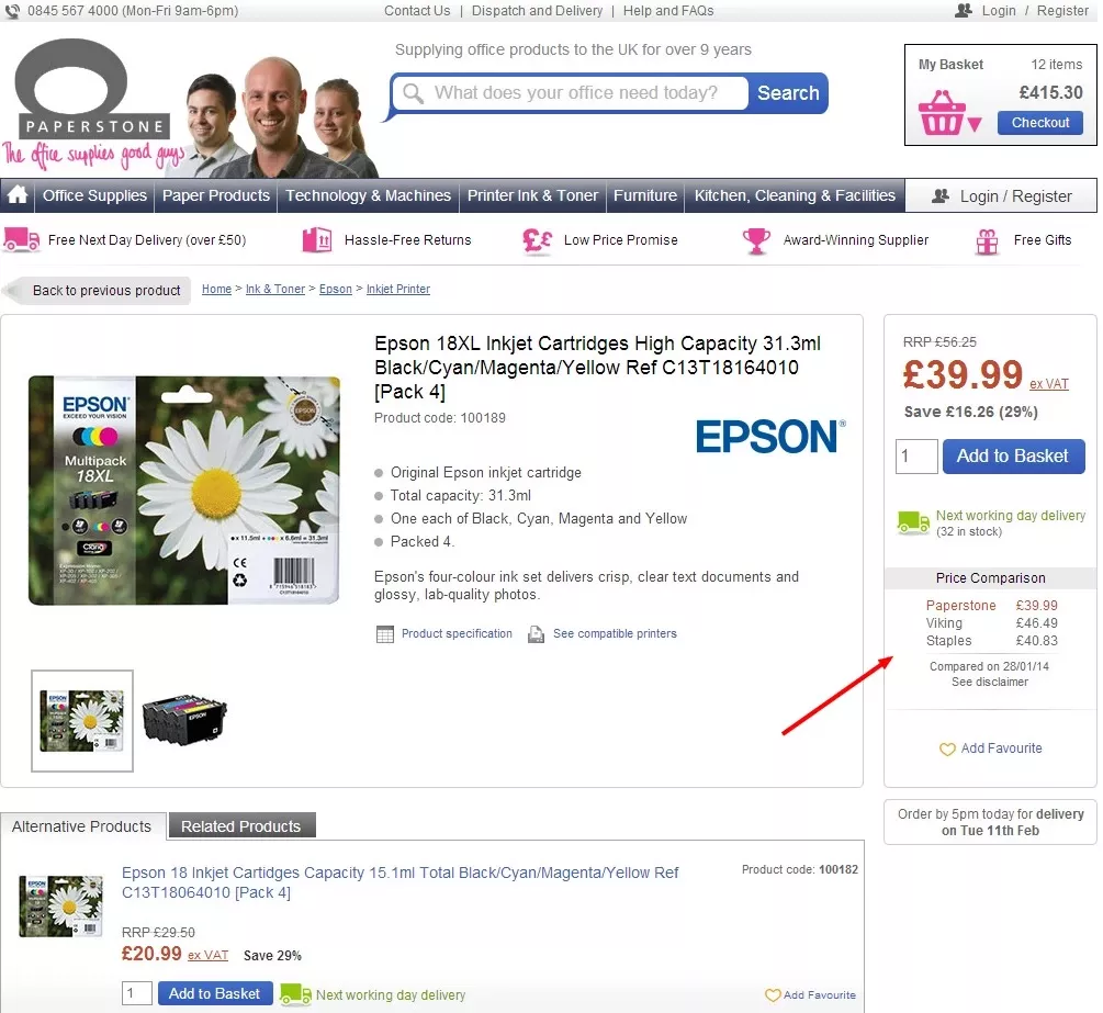
- It’s better to do price anchoring instead of showing just one pricing option. This works because not only do customers converT more on lower priced products, but because of the principle of *Reciprocity*. In fact, providing price comparison increases conversion rate by 10%.
Before...
After...
- Having the CTA above the fold would increase visibility. And the Law of Visibility can boost conversations and sales by 30% and sign-ups by 27.3%. It happened in the case study below.

#2 PRODUCTIZED SERVICE PRICING PAGE EXAMPLE:

What is it?
Leadpages is a landing page builder.
We use it to create and optimize all of our landing pages and those of our clients’.
We’ve been their customer for 3 years already.
And it’s the best tool we’ve used so far for building landing pages.
It’s a good plugin to add to the foundation of your site because you’re capitalizing on opportunities to capture new leads who might be stopping by to check out your content or service offerings.
When it comes to Leadpages’ brand effect on the way your products are sold, Leadpages is the best option.
What This Pricing Page Example Does Right
![]()

- They highlight a recommended plan and offer reassurance by showing which is the most popular plan.
- The mention of the free trial mention mitigates the fear of losing money
- Nice breakdown of the features included in each plan although they limit their features on purpose by an order of magnitude.
- They include social proof in the form of testimonials and added what other people are saying about their business which calms customers’ fears.
- Each plan clearly speaks to every audience (Advanced, Pro, Standard).
- Monthly and annual pricing are included.
- Although they don’t get to chat with someone from Leadpages’ support in real time and open a ticket request for assistance, there’s an FAQ section included.
- Great use of the price anchoring. Because adding the most expensive package to the left makes the other packages look “cheap”.
- CTA buttons are above the fold. And in fact, a simple call to action button placed above the fold can increase conversion rates by 31.12% as it happened in the case study below.
Before...

After...

Where This Pricing Page Example Could Improve
- Brighter CTA buttons would stand out more.
- Having a live chat widget could potentially calm prospects’ fear of buying or answer any additional questions they may have.
#3 PRODUCTIZED SERVICE PRICING PAGE EXAMPLE: ACTIVECAMPAIGN

What is it?
ActiveCampaign is a cloud software platform that offers software for customer experience automation which combines email marketing, marketing automation, sales automation, and CRM features.
We use ActiveCampaign to send our newsletters and email campaigns.
For a limited time, they’re offering CRM with Sales Automation for 3 of their packages for free.
And they’ve got tons of features and their prices are pretty low compared to other options.
ActiveCampaign’s customer support isn’t that great to be honest.
And the tool’s a bit buggy but your emails do get sent.
You can use ActiveCampaign in your sales funnel to create sales rapport building with prospects.
This requires less thought from the prospect, and they’ll generally be more willing to do it, especially if they get a free resource (such as a lead magnet).
What This Pricing Page Example Does Right
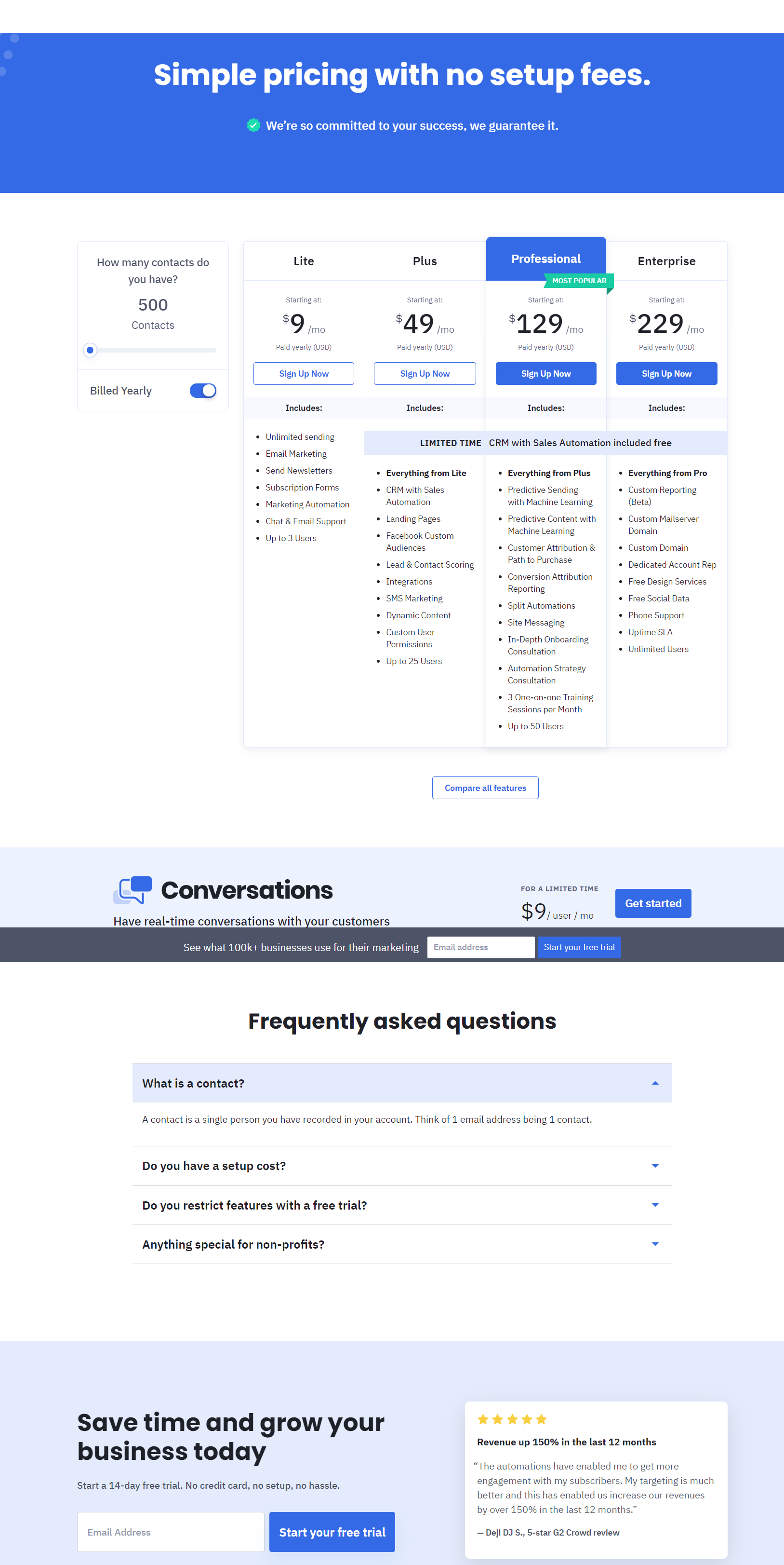
- The Law of Clarity works great here because the headline states that there are no setup fees.
- CTAs are above the fold so that’s awesome!
- They highlight a recommended plan for prospects to find their ideal plan faster.
- By answering the “How many contacts do you have?” question, all pricing plans adapt to the number of contacts you have (pricing varies based on the number of contacts you have).
- They add scarcity with the text “limited time”. The Law of Loss says that people are loss-averse and will do everything they can to avoid missing out on value or a deal. So this text appeals exactly to that fear of missing out.
- They include a FAQ section with the most common questions potential buyers ask.
- Seeing what other customers have achieved after purchasing the product or service helps prospects make a faster buying decision. And ActiveCampaign includes social proof in the form of testimonials.
Where This Pricing Page Example Could Improve
- Adding color to all CTA buttons to make them stand out.
- Improve the layout of the features section in all plans.
- A live chat widget for buyers to get questions answered in a personalized way.
- They could rearrange their pricing from most expensive to least expensive because people read from left to right. But in fact, 81% of SaaS companies organize prices low to high according to Process Street.
#4 PRODUCTIZED SERVICE PRICING PAGE EXAMPLE: ETHERCYCLE
![]()
What is it?
Ethercycle is a productized eCommerce consultancy.
They specialize in designing and optimizing Shopify stores.

What This Pricing Page Example Does Right

- The Law of Range says that audiences respond to having the freedom to choose a variety of products and services. So it’s great seeing so many different pricing options.
- Separating the pricing packages into different categories can make prospects skim through the packages faster.
- There’s clarity on the copy. It states that all packages are based on fixed prices and not on hourly rates.
Where This Pricing Page Example Could Improve
- Adding color to the CTA buttons would actually make them stand out more and would make the design look a bit more alive.
- The shape of the CTA buttons could be round so they’d look more clickable.
- The text on the CTA buttons should be more aligned with what they want prospects to do. Inviting them to learn more can cause some friction because people may just want to sign up for one of the packages.
- Keeping the same order of the prices (most expensive to the left and then most affordable to the right) would be a bit less distracting.
- Adding each pricing package into a box would make the user experience more friendly in terms of skimming through the pricing page.
- It could have benefited from adding some social proof for more credibility.
- There’s no risk reversal information for buyers’ peace of mind.
- They don’t present buyers with an option to speak with a sales rep.
- This pricing page could benefit from making the prices stand out more. In fact, increasing the font size of pricing results in 36.54% more clicks on "Add to Cart" buttons and in a 10% increase in revenue as it happened to this case study from our Proven Sales Conversion Pack.
Before...

After...

- So, having too many pricing options has its downside too. In this case study you can see how when Groove simplified their pricing options, conversions boosted from 1.17% to 350%.
Before...

After…

#5 PRODUCTIZED SERVICE PRICING PAGE EXAMPLE: SCREENCAST-O-MATIC
![]()
What is it?
This is a screencasting and video editing freemium software tool.
Screencast-O-Matic lets you record your screen, edit your video, and share it as a file or link.
And it’s perfect for practically anyone with any goal—work, educational, or personal.
Although it limits you to record 15-minutes videos per upload for free.
If you want to record more than 15 minutes, then you need to upgrade to any of their paid packages.
This tool is very friendly and super easy to use.
Plus their customer support is phenomenal.
What This Pricing Page Example Does Right

- CTA buttons are placed above the fold so people don’t have to scroll down to click on them. Great use of the Law of Visibility here!
- Nice use of contrasting colors.
- Clear chart comparing both pricing plans.
- Trust badges are included so customers feel like they can rely on the business at the time of purchase.
- FAQ section with several questions to help overcome buyer objections.
- They highlight the plan that has new features so prospective customers are enticed to check them out.
Where This Pricing Page Example Could Improve
- Some social proof could potentially calm customers’ sales objections. The Law of Confidence says that people care a lot about whether or not your product actually does what it claims. People are risk-averse, so they desire proof in order to minimize perceived risk before buying—in the form of testimonials, case studies, etc.
- They could rearrange their pricing from most expensive to least expensive because people read from left to right.
- Using $1.65 is not a persuasive price to display. The number that actually improves conversions is 9 according to Gumroad.

#6 PRODUCTIZED SERVICE PRICING PAGE EXAMPLE: AUTOGROW.CO
![]()
What is it?
AutoGrow is like project management software but with proven pros already inside, ready to work on any digital marketing task you delegate to us.
You can submit unlimited requests for emails, landing pages, funnels, graphics, ads—anything.
Then, our team of experts start working on your projects while you just check on the progress of the work through our web app.
You can monitor the work from your laptop or from your phone.

With each package you can get unlimited tasks completed by us per month.
PLUS, for your peace of mind, you’re backed by our 30-day 100% satisfaction guarantee.
And we also have AutoGrow’s Marketplace where you can get just one task done without subscribing to any of the packages.
What This Pricing Page Example Does Right

- 4 pricing packages to give prospects more options to choose from and clear CTA buttons that invite prospects to start the $7 for 7-day trial.

- The pricing packages are highlighted as the most popular and the one that adds the most value.

- Each package doesn’t only show the pricing but the money buyers would save if they’d buy monthly, quarterly, or annually.

- To reduce friction, we have a second CTA button in case prospects aren’t ready to buy yet and need to watch the demo video first.

- The Law of Emotion says that people respond to emotion. And in fact, as much as 95% of customer purchases are driven by that. And in AutoGrow’s pricing page we have different icons representing the name of each package so prospects can easily relate to them.

- We have tons of social proof and a powerful risk reversal for customers’ peace of mind.

- We have live chat support via Tawk.to, one of our favorite free digital marketing tools that helps us handle all the communication with our site’s visitors 24/7.
Where This Pricing Page Example Could Improve
- The FAQ could collapse so it looks less text-heavy.
- Updating our testimonials so that they are more aligned with our value proposition—which is getting creative digital marketing work done instead of guaranteeing X results for our clients and that they’d get rich in X time.
- A/B testing a pop-up inviting people to watch our demo video.
- Removing navigation and footer links.
#7 PRODUCTIZED SERVICE PRICING PAGE EXAMPLE: DESIGN PICKLE

What is it?
Design Pickle has ranked on the Inc. 5000 list in 2019.
This productized service provides unlimited graphic designs to businesses by pairing clients with a professional graphic designer.

Their service addresses the need to hire a graphic designer to create various icons, images, banner ads, etc. for your business.
What This Pricing Page Example Does Right

- They clearly state the features each pricing package has so the alignment of the copy is great.
- Nice design that catches the human eye.
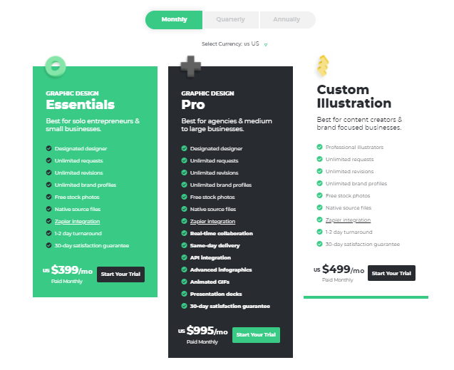
- Clear CTA buttons that contrast and stand out.
- They’ve got options for monthly, quarterly, and annual plans.
- They show their pricing in both American and Australian dollars.
- They have a clear breakdown of what’s included in each plan.
- An FAQ to answer prospects’ questions.
- They have live chat available for anyone visiting their pricing page.
Where This Pricing Page Example Could Improve
- They could rearrange their pricing from most expensive to least expensive because people read from left to right.
#8 PRODUCTIZED SERVICE PRICING PAGE EXAMPLE: SCRIBE

What is it?
Scribe is a productized service that offers unique programs designed to help people write, publish, edit, ghostwrite, and market their books.

Their mission is to help everyone write a book.
Because writing a book takes time to outline, draft, rewrite, re-read, edit—and that’s just for creating it.
But this service is specifically useful for entrepreneurs and authors who want to write a book but don’t have the time to do so.

What This Pricing Page Example Does Right

- They have an FAQ at the bottom of the page.
- They have a label with their most popular plan.
- The Law of Repetition was used properly here since they have their pricing plan stated twice. So people who are at the top of the page can see it as well as the people who scrolled down too.
- Clear breakdown of what each plan includes.
- Clear distinction between all plans and who they are for.
- I think it’s good that they have an option to schedule a consultation because this could potentially help nurture the relationship with clients. And also answer questions that weren’t included in the FAQ.
Where This Pricing Page Example Could Improve
- The Law of Visibility could have played an important role on this productized service pricing page. By having colored and contrasting CTA buttons, they would stand out more. Therefore, more people would click on them.
- Probably a CTA redirecting to the checkout page would add less friction to the users. Because if a prospective customer is looking to buy, then the checkout option isn’t right there and they have to try to find it.
- I think it’s great that the breakdown of each plan is very detailed. But at the same time, it makes the pricing chart look too long and prospects may not scroll down to read the whole thing.
- Including a live chat widget could help increase conversions. Because chatbots may overthrow email as the king of digital marketing.
- CTA buttons with colors.
#9 PRODUCTIZED SERVICE PRICING PAGE EXAMPLE: BIGTINCAN

What is it?
Bigtincan is an AI-powered sales enablement automation platform that helps sales and service teams learn faster, sell better, and be more productive.
They provide effective ways for teams to perform at higher levels. It also helps to deliver better business results by creating pleasant buying experiences.
What This Pricing Page Example Does Right

- They keep their language simple and straightforward.
- Clear CTA buttons in terms of copy and design.
- They limit their pricing plans to a few options (good use of the Law of Range here).
- Good visibility of their CTA buttons.
- They have live chat support.
Where This Pricing Page Example Could Improve
- They could rearrange their pricing from most expensive to least expensive because people read from left to right.
- Features of each pricing plan would be easier to read if they were left aligned.
#10 PRODUCTIZED SERVICE PRICING PAGE EXAMPLE: SUMO

What is it?
Sumo is a suite of tools for automated site growth.
The 4 tools they offer are:
- The Smart Bar for email collection that can be used as a CTA or placed at the bottom or top of the page window.
- Share Buttons for social sharing.
- Welcome Mat for email collection that can be added as a video, CTA, embedded on an article, or on a landing page.
- List Builder for email collection that can be added as a click trigger or a pop-up.
What This Pricing Page Example Does Right

- They use social proof in the form of testimonials so potential buyers see how satisfied past customers have been.
- Great visibility of their money-back guarantee. People don’t have to scroll down to see it.
- CTA button is above the fold so prospects don’t have to scroll down.
- They feature their monthly and yearly options along with the money prospective customers would save with each payment option.
Where This Pricing Page Example Could Improve
- Not using the Law of Range here and only offering prospects one pricing option could scare them away. Because people like having options to choose from and not feel like they’re stuck with only one.
- This pricing page could use some design optimization to make it visually more attractive. In fact, pricing page optimization can cause 76% more visits to a free trial page.
Before...

After...

#11 PRODUCTIZED SERVICE PRICING PAGE EXAMPLE: SAMCART

What is it?
SamCart is a digital marketing tool that allows you to create simple checkout pages for your business.
They also have a ton of templates to choose from so you can A/B test your checkout page copy.
They’re great for upselling too.
You can create upsells and downsells that are dynamic based on how your customers respond and whether they take an offer or not.
When we started using this tool 2 years ago, we thought it was kind of clunky because there’s limited ability to kind of put things where we want them to go.
But after getting the hang of things, now we use it for all of our info products checkout pages.
What This Pricing Page Example Does Right

- They have pricing options for billing monthly and annually.
- CTA buttons are above the fold.
- They show the savings from the annual pricing.
- They include an FAQ section. And FAQs help grow sales.
- They have a live chat option plus their contact information for prospects to email them.
- The name of their packages are easy to understand and speak to their audience. For example, someone who wants to “launch”, “grow” or “scale”.
- They use price anchoring to make expensive plans look cheap.
- The powerful word “free” is included.
Where This Pricing Page Example Could Improve
- Add color to their CTA buttons to make them stand out more.
- Although it’s good to have benefits and features clearly stated, having so many bulleted items makes the pricing plans look too long and prospects may not scroll down.
Conclusion
See how you can easily start seeing leads and customers coming in to your checkout page by tweaking your pricing page?
The important thing is you know which of the best practices outlined in this article will work best for you.
To review, some of the best practices that successful productized services follow on their pricing pages are:
- Making CTA buttons visible and clickable (preferably above the fold).
- Using price anchoring to make some options look more affordable.
- Adding live chat support to attend any inquiry or question prospects may have.
- Showing the money people would save if they’d buy any of your pricing plans.
- Including social proof in the form of testimonials, vanity stats, or trust badges.
- Having an FAQ section to answer any questions potential customers may have.
- Removing navigation and/or footer links that could be distracting.
- Showing pricing tailored to annual and quarterly plans.
Those tweaks can take minutes to implement them, and when done right, you’ll see massive conversions!
Because your prospects’ journey through your site would be completed right after they hit that “Buy Now” button.
Now, quick question: does your pricing page follow any of those best practices? Or to the contrary, does it lack those? Have you tried A/B testing to optimize your copy and design and see what your audience is really looking for?
Let me know in the comments below.
Keep AutoGrowin’, stay focused.