
12 Conversion Techniques Of a (Just Launched) Successful Landing Page

I’m Alex, AutoGrow’s copywriter, and I wanted to ask you a question…
Remember playing with Legos when you were a kid?
You’d bring home that box full of pieces banging against each other, pour it all out onto the floor, and step back and think…
How the heck is this going to turn into a spaceship?
But then you’d get to work—separating the similar shapes into their own little piles, stumbling across that really weird piece that you thought had no place in a spaceship.
Then step by step, you’d begin putting all those strange little pieces together. And little by little, they’d start to form shapes and structures you actually recognized—the rocket boosters, the cockpit, the main hull with that awesome little claw built in that you could move around and grab stuff with.
And then you’d take in the full glory of your creation, the thing that you built all by yourself.
Nothing and no one told you how to play and have fun with your creation—to use it for its true purpose.
Now, playing with Legos and creating landing pages may not have much in common to the naked eye, but...
There are plenty of resources out there that tell you exactly which pieces you need and where they need to go—the essentials. But just because you have all those pieces put together, it doesn’t mean your landing page is going to get the conversions you’re after—its true purpose.
That’s why today I’m showing you how to give your landing page a conversion boost.
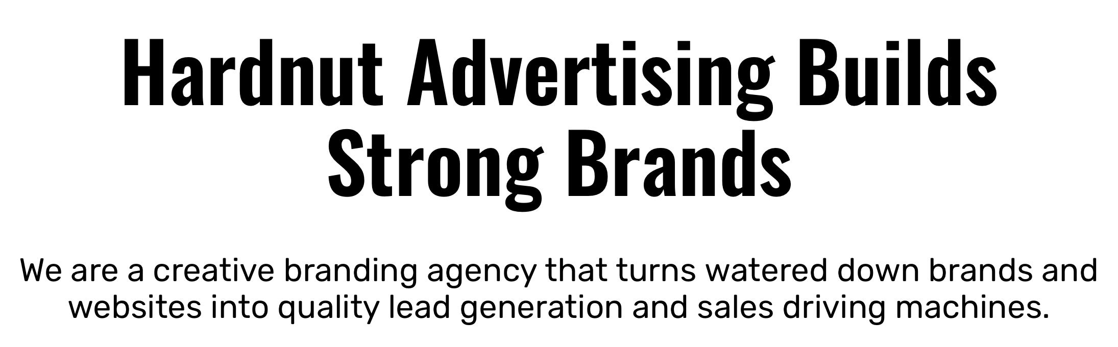
I’ll be sharing with you 12 highly-effective design and copywriting techniques with real examples of a landing page we created for one of our Done-For-You service’s clients, Hardnut Advertising.
But before getting into the nitty-gritty of it all, let’s cover the obvious points first.
Receive a copy of this article to read later
The Basics: Downright Necessities For Landing Page Design & Copywriting
If you want to create a landing page that converts, it should have essential elements for the copy and design. They’re the bottom tier, the foundation, the basics.
But surprisingly, we see a lot of landing pages out there that (somehow) still miss those basic elements.
So just to be sure, all of our bases are covered, below are the basic elements that should be included in every landing page you create.
Design
- Margin consistency throughout
- Font color doesn’t lead to copy blending into background
- Font size and type consistent throughout (i.e., headers match headers, body copy matches body copy, etc.)
- CTA buttons are the same color, size, and shape
- All links and opt-in forms actually WORK
Copy
- Zero grammatical errors
- Style is consistent throughout (i.e., Oxford Comma, when to write numbers out or not, publication title styles, etc.)
- Language makes sense (i.e., no mixed metaphors, no bungled sayings, no misused words, etc.)
- No offensive language (...to a reasonable degree)
Alright, now that we’ve got the basics out of the way, let’s jump into the subtleties of creating delightful design and killer copy for high-converting landing pages.
Design
Eye-catching and user-friendly design is critical for any high-converting landing page. It’s the very first thing that your visitors notice.
And if you don’t spend the extra effort making your page’s design pop and work well, that can lead to your prospects going in the wrong direction.
The team and I actually spend a lot of extra time getting all clients of our Done-For-You service design just right. But now I’ll share with you some of the highly-effective design techniques we used to boost Hardnut Advertising conversion.
And here’s how we did it.
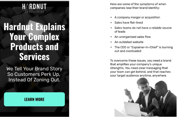
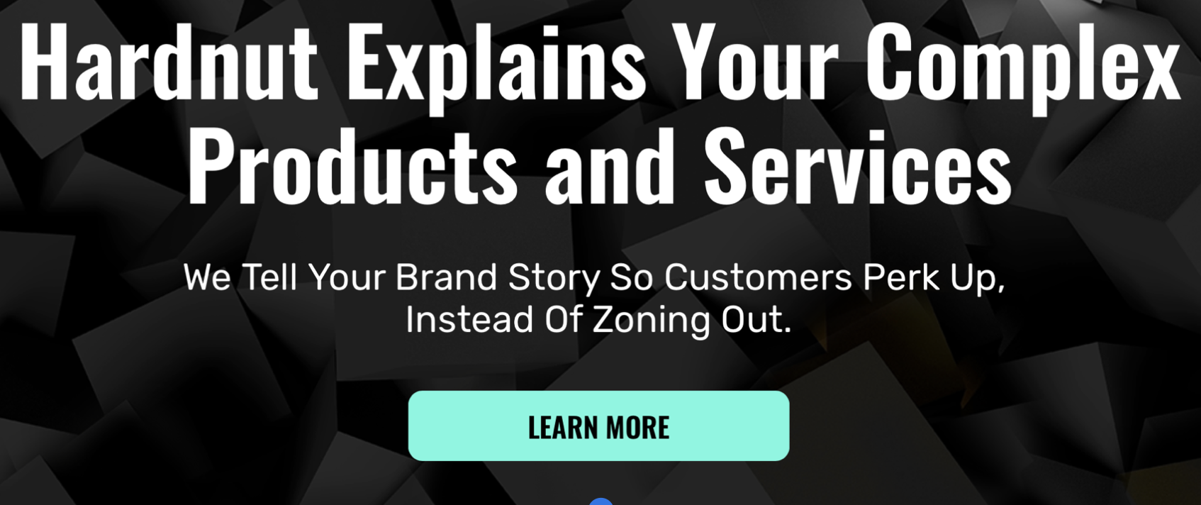
Design Point 1: Make CTA Buttons Big, Bold, & Above The Fold
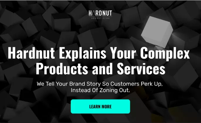
We’ve talked quite a bit about all the different elements that go into making an irresistible CTA that captures leads. And on this client’s landing page, we used those same tactics to create highly clickable CTA buttons that actually turned prospects into leads.
First and foremost, there’s the color.
The light turquoise of the CTA buttons throughout the page pops every time you see them. There’s no other section where this same color is used, making it stand out all the more.
Then there’s the placement.
The very first CTA is placed above the fold–no scrolling down needed. This makes users be immediately enticed to interact with the content.
This CTA button in particular just brings users down the page so they can learn more about Hardnut’s services. But even still, it draws the eye and is a powerful way to keep visitors moving through the content.
Show Me The Proof
CTA button placement, shape, and visibility all come into play with conversion rates.
Here are some interesting stats to keep in mind when designing your CTA buttons.
- Making CTAs look like buttons created a 45% boost in clicks for CreateDebate according toCopyblogger.
- Reducing clutter around Open Mile's CTA button increased their conversion rate by 232% according to VWO.
- Placing multiple CTA buttons within a page rather than just one boosted Fulcrum Gallery’s conversion by 20% according to Invesp.
Design Point 2: Use Clear Fonts & Colors
When it comes to font type, size, and color, the first goal is always clarity.
There’s room for personality, sure. But if your audience can’t make out a word, even for a split second, it could end up driving them off your page for good.
That’s why our designer chose a crisp and clear font that’s accentuated by high-contrast colors.
See how the white really stands out against the black background in the screenshots above? That makes it much easier for visitors to take in the meaning of the copy quickly and effortlessly.
Plus, it gives Hardnut Advertising a sense of boldness that works well in the marketing industry.
Show Me The Proof
Font legibility is highly important when it comes to conversions. One case study from ClickLaboratory showed that a simple switch from 10pt font to 13pt font led to the following dramatic changes for Numara Software:
- A 10% decrease in bounce rates
- A 19% decrease in site exit rates
- A 24% increase in pages viewed per visit
- A 133% increase in form conversion rate
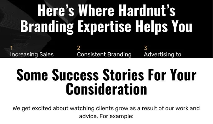
Design Point 3: Keep Design Elements Consistent

Keep your design elements consistent.
CTA buttons, headline and body fonts, colors and themes–all should maintain their own individual styles throughout the landing page.
In this example, CTA buttons remain blue to the end of the page and have the same call-to-action text on each (except for the secondary CTAs like “Learn More”).
Fonts only jump from black or white depending on the background. And besides the testimonials, they never change styles.
On top of that, brands should have consistent styles and themes across platforms as well. Emails, landing pages, lead magnets–all should use the same branding colors and themes. Doing so helps reduce confusion and build stronger brand recognition.
Show Me The Proof
Design element consistency across your landing page helps build a stronger brand. According to Lucipress:
- Brands that are consistently presented are 3 to 4 times more likely to experience brand visibility.
- The average revenue increase attributed to always presenting the brand consistently is 23%.
Design Point 4: Incorporate Design Elements Smoothly
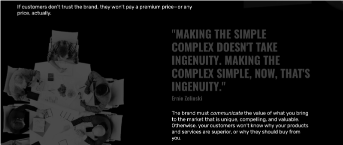
A well-designed landing page isn’t just a bundle of design elements thrown together haphazardly. Why? Because that doesn’t sell your product.
It’d be like turning over a box of loose Legos and expecting them all to click into place as a pirate ship or a police station or the millennium falcon. It just doesn’t work like that.
Instead, each element has its own place that’s in-line with the other elements around it.
Images are evenly spaced to give the copy enough room to breathe. Chunks of copy and corresponding images are sectioned off from other blocks of content.
And quotes (like the one pictured above) blend with the background enough to not take away from the copy but stand out enough to make an impact.
Show Me The Proof
Attractiveness is key for creating a well-designed landing page. And the more smoothly you incorporate design elements like quotes, pictures, and logos, the more attractive it will be.
Design layout matters. And here are some stats that prove it.
- If the content on a website is unattractive in its layout or imagery, 38% of users stop engaging completely. (Adobe)
- Customers who have an unpleasant experience on your website are 88% less likely to return. (Gomez)
- 48% of people cited that a website’s design is the No. 1 factor in determining the credibility of a business. (Blue Corona)
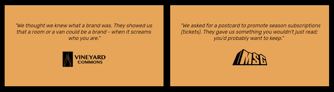
Design Point 5: Use Badges & Brand Logos
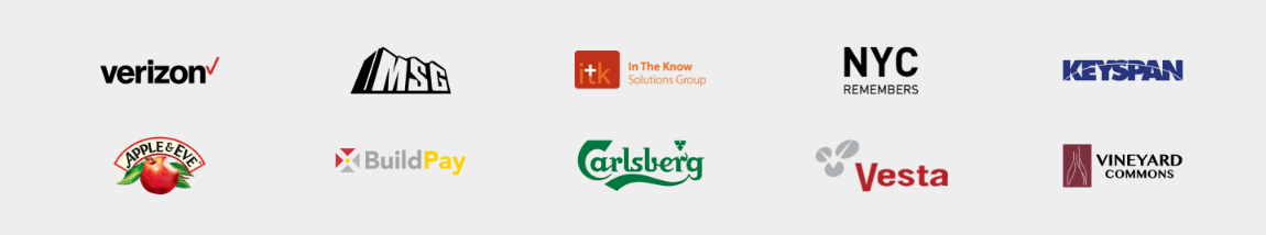
There are few elements of a landing page that convert prospects as well as social proof. Testimonials, user reviews, star ratings–they’re all great ways to add credibility to your business and get your leads clicking that sweet, sweet CTA button.
And when you’ve worked with big companies like Hardnut Advertising has, one of the quickest and most space-efficient ways of communicating that credibility is by including a strip of recognizable brand logos of past clients.
There are plenty of written testimonials peppered throughout the copy too. But popping in a strip of brand logos of former customers is a great way to catch the eye of visitors.
Show Me The Proof
Trust badges and big-name company logos are quick ways to establish strong social proof. They’re basically saying “These popular brands trusted us, so can you.”
Placing the logos of business customers on a website can create massive conversion boosts–up to 400% according to Conversion Rate Experts.
Taking advantage of trust badges (especially ones that involve transactions) can be also huge.
And as a matter of fact, Blue Fountain Media saw a 42% increase in sales after adding a VeriSign Trusted badge to their quote page.
Design Point 6: Optimize for Mobile
There’s nothing more frustrating than seeing a good, solid company completely ruin their online experience by neglecting mobile optimization.
Without a mobile-optimized page, words would be running into images, images would be running off the screen, and visitors would be running to the competition in no time flat.
But now, look how clean it comes through on a smartphone (see images above)!
One more thing: be sure to optimize across phones, tablets AND laptops too.
Show Me The Proof
More and more, mobile is becoming the preferred way to view websites. Here are some stats from Invesp that show just how important mobile optimization really is.
- Mobile commerce now accounts for 23% of all online sales.
- 55% of purchase-related conversions occur within 1 hour of initial mobile search.
- 43% of consumers are unlikely to return to a slow-loading mobile site.
- 40% of consumers will turn to a competitor’s site after a bad mobile experience.
Copywriting
If design is the face of your business, then copy is its voice. A smooth and eye-catching design can certainly keep visitors from hopping off the page due to discomfort alone. But copy is where you actually sell your service or product.
Here’s how we made our Hardnut Advertising copy convert rather than fall flat.
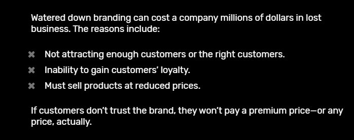
Copy Point 1: Write w/ Crystal Clear Language

Like design, the first rule of writing effective copy is clarity.
And in fact, it’s a problem that we struggled with when we started writing the copy for this page.
Our first published version wasn’t getting close to the conversion rate we were hoping for. And after taking a closer look, we determined that the copy was the problem–it just wasn’t clear enough.
Part of the issue was the way we were trying to present Hardnut Advertising in the first place–as a more upscale, boutique creative branding agency. And that led to us trying to be more subtle with the wording as you can see by the first screenshot above.
But with our re-write, we took a much clearer approach to what Hardnut Advertising does. They help clarify your brand messaging so you can improve your lead generation and attract the right customers. Simple. And that’s what we put in the headline.
Lessons learned:
- Language should be straightforward.
- Sentences should be short and sweet without a whole lot of confusing punctuation.
- Paragraphs should be capped at 3 sentences max for easy skimming.
A great way to check your copy readability is by using the Hemingway App. This page came in at a 7th grade reading level. And in general, you want to aim for below 9th grade for maximum conversions.
Show Me The Proof
This one is backed up by copywriting clout more than numbers. Often dubbed the king of modern advertising, David Ogilvy once sent out a memo to his staff titled simply, “How To Write.”
And in it, he outlines 10 tips for effective writing. These are some of the tips that apply here.
- Write the way you talk. Naturally.
- Use short words, short sentences and short paragraphs
Never use jargon words like reconceptualize, demassification, attitudinally, judgmentally. They are hallmarks of a pretentious ass.
The takeaway? Keep your copy clear.
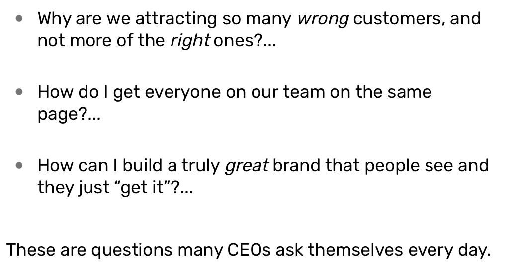
Copy Point 2: Organize w/ Design In Mind
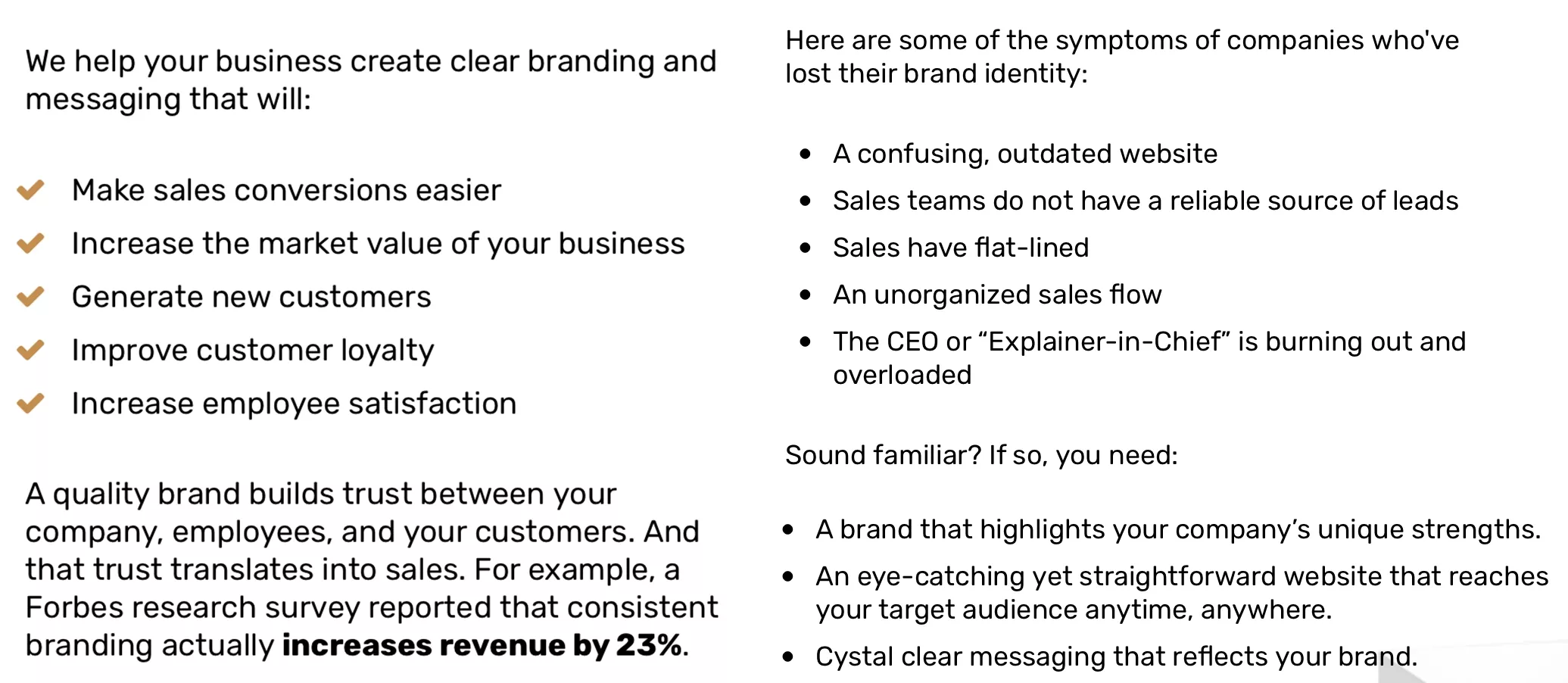
Another way to improve the readability of your landing page is by writing your copy with design in mind.
Be conscious of white space and try to unpack bulky blocks of text. Use bullet points frequently to help draw the eye like in the screenshot above. And organize your landing page into copy sections using headers and subheaders.
It’ll not only make your designer’s job a lot easier to organize the copy. But it’ll also help make it easier for your readers to get the gist of what you’re selling more quickly too.
Show Me The Proof
According to the user experience researchers Nielson Norman Group, most people will only read about 20% of a full web page.
Skimming is inevitable. And making the decision to write with eye-catching design elements in mind can help your readers absorb the important points quickly and effortlessly.
Copy Point 3: Use Visual Language


Injecting visual language into your copy is a great way to keep your audience reading on.
But even more than that, visual language also evokes mental imagery in the minds of your prospects. When your audience can actually visualize what you’re talking about, they get drawn into the copy. They lose themselves in your words.
And that can make convincing them to buy all the easier.
See how the words “perk up,” “watered down,” and “flat-lined” all call to mind very real visualizations when you read them?
The energetic jolt of “perking up.” The unsatisfying murkiness of “watered down.” The devastation and disappointment of “flat-lined.”
These phrases were all conscious decisions on the part of me, the copywriter because of the feelings they evoke.
Show Me The Proof
The power of visual language comes from how the mind encodes experiences.
In an interview with Dave McRaney, Professor Melanie C. Green talks about the power of stories to change people’s minds.
It’s why so many copywriters use storytelling to increase audience engagement in the first place.
One element that makes stories so effective, Green points out, involves the perception of realism. When a story is written with visual language, it produces more vivid imagery in the mind of the reader.
They can practically see the events that are being described in their minds. And that helps the brain encode the experience, make it more real, and ultimately have a greater impact on the reader.
Copy Point 4: Boost Your Credibility w/ Social Proof
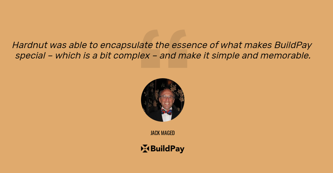
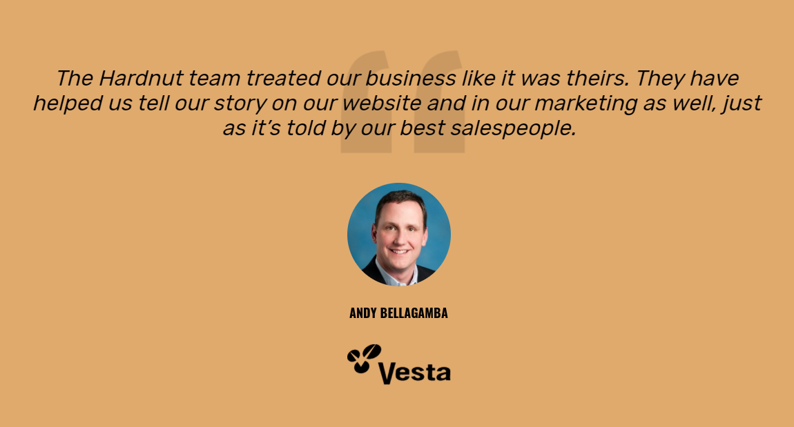
We’ve said it before, we’ll say it again: social proof is huge for selling, especially on landing pages.
Testimonials, customer reviews, case studies, and brand logos as mentioned above–these can go a long way towards making your business look more credible and will help you boost your conversion.
But there are right ways to use social proof and wrong (or at least less effective) ways of using it.
One right way was the one we used for creating Hardnut Advertising’s landing page. We used social proof by including pictures of their clients. This helps readers trust the testimonial more because it’s coming from a real-life person. And look! There he is!
It’s a simple change but it can have dramatic results.
Show Me the Proof
Properly using social proof is a game-changer. Just have a look at these statistics from Hubspot and Boast on how the right endorsements can affect your selling power.
- 88% of consumers trust user reviews as much as personal recommendations.
- 57% of consumers will only buy or use a business service if it has at least a 4-star rating.
- For 50% of all consumers, their very next step after reading a positive review about a company is to visit their website.
- Customer testimonials and case studies are considered the most effective content marketing tactics identified by 89% and 88%, respectively, of B2B marketers.
- 90% of respondents who recalled reading online reviews claimed that positive online reviews influenced buying decisions.
Copy Point 5: Use Reader-Focused Language


Along with being a power word (more on that in a sec), reader-focused language like “you” and “your” makes the landing page more active in the mind of the reader.
It’s YOUR business, YOUR story. And since it’s YOURS, then this solution is for YOU.
It’s calling out the reader to engage with the content rather than passively skim it over.
And on the landing page we created for Hardnut Advertising, we employed this type of reader-focused language a lot. Like “60 times on a 1400 word landing page” a lot.
And that helped create an engaging, high-converting page that holds the attention of leads all the way through.
Show Me The Proof
Reader-focused words like “you” and “your” are great for driving conversions.
In fact, they’re referred to in the industry as power words. And they’re used to trigger quick and powerful psychological or emotional responses to copy.
Some other power words include imagine, because, actually, introducing, guarantee, and free.
Renowned digital marketer Neil Patel even calls these power words “hypnotic” in their persuasiveness.
“You would never suspect these hypnotic words of holding any power. They are simple, and innocuous. But when you use them consciously and correctly, they can dramatically improve your persuasive power.”
The takeaway here is that power words work. And they’re perfect for landing pages.
Copy Point 6: Follow Proper Pacing Procedure
One of the most effective copywriting techniques out there is the PAS formula: Problem – Agitate – Solution.
- Identify the problem your audience is suffering from and the pain points it’s causing.
- Agitate those pain points. Make the reader understand why they hurt and what’s going to happen if they don’t solve the problem.
- Tadaa! Present the perfect solution to their problem (i.e., your product or service).
It works. It’s why professional copywriters have been using this same formula for ages. And it’s why we used it in the Hardnut Advertising landing page too.
- P) Not bringing in the right customers and got a weak brand?
- A) It’s making it hard for you to build loyalty and keep up with costs.
- S) Hardnut Advertising can fix that for you.
Simple. Effective. Reliable.
Show Me The Proof
Dan Kennedy has gone down in history as one of the highest paid copywriters of all time.
His sales letters, scripts, and DVDs reached more than 500,000 viewers in 2015 alone and generated more than $100 million in sales. And at least 100,000 pieces of his direct-mail works travel the country every month.
He’s also authored 24 published books on the art of copywriting.
The point? Dan Kennedy knows how to write persuasive copy.
And in his book, The Ultimate Sales Letter, Kennedy lavishes praise on the PAS formula. He says:
“When you understand that people are more likely to act to avoid pain than to get gain, you’ll understand how powerful this first formula is. (…) It may be the most reliable sales formula ever invented.”
Conclusion
The Hardnut Advertising landing page turned out as beautiful as it was high converting. And it’s due in part to the 12 landing page tweaks I showed you in this guide:
- Make CTAs Big, Bold, & Above the Fold
- Use Clear Fonts & Colors
- Keep Design Elements Consistent
- Incorporate Design Elements Smoothly
- Use Badges & Brand Logos
- Optimize for Mobile
- Write w/ Crystal Clear Language
- Organize w/ Design in Mind
- Use Visual Language
- Boost Credibility w/ Social Proof
- Use Reader-Focused Language
- Follow Proper Pacing Procedure
Of course, there are plenty of other strategies you can use to boost your landing page conversions.
But thanks to the actual results we have already seen from the Hardnut Advertising landing page we created, these 12 techniques are without a doubt some of the most powerful. And they’re bound to serve you well too!
What other landing page conversion techniques have you used on your pages?
Which of the ones we shared today were the most helpful?
Let us know in a comment below!
And don’t forget to share on Facebook, LinkedIn, or Pinterest to help spread the word to other marketers and entrepreneurs.
Alex


