Top 15 Logo Redesigns from Top Companies
One of the most common things your business is known for is its logo.
And everywhere your brand goes, the logo follows it.
Logos play a pivotal role in how consumers identify with a brand.
But sometimes logos need to be redesigned due to how outdated they become.
Or just the fact that the previous logo no longer represents what the company is all about.
Logo redesigns can come in many different shapes and sizes depending on the company.
They range from completely new logos to a simple adjustment that had a big impact on consumer perception.
For this list, we’ll take a look at 15 examples of the best logo redesigns from some of the top companies.
A logo redesign can:
- Keep your brand modern
- Allow your brand to align with company values, objectives, and vision more closely
- Make your brand become more recognizable and recalled more easily among consumers.
With that in mind, let’s dive right into the first example.
#1 Examples of the Best Logo Redesigns: Uber
The ride-sharing service company is one of the most well-known companies in the world.
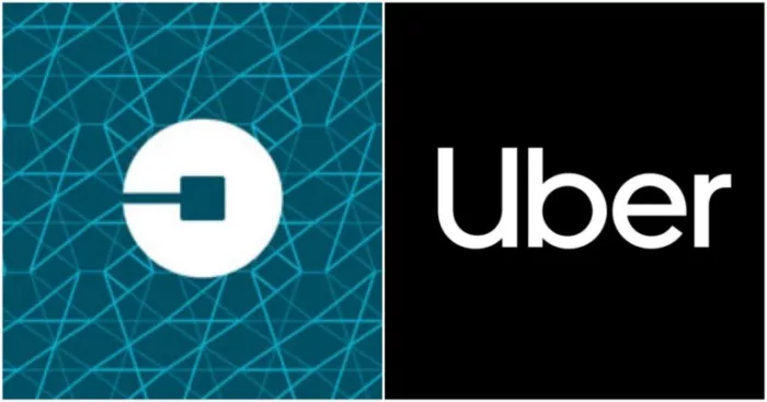
They changed their logo back in 2018.
And the change was radical.
Beforehand, the logo was colorful and wordless.
But with the new one, the company name is spelled out in white lettering, with “U” being capitalized to symbolize putting you, the customer, first.
Uber aimed to go for a simplistic design—a logo that represents humility.
Why?
Because Uber wanted to break free from its past with former CEO Travis Kalinick—and the toxic culture that he was known to instill.
In essence, this was a PR move.
This is one of the best logo redesigns because it tells a story of moving forward.
It’s an example of a company trying to start fresh.
#2 Examples of the Best Logo Redesigns: FedEx
Originally named Federal Express, the shipping giant underwent an identity crisis in the early 1990s.
And in 1994, its leaders committed to the new name, FedEx, and a logo refresh.
What we got is a much more impactful logo design.
Not only did designer Lindon Leader make the purple and orange more prominent, he also added the hidden arrow icon between the “E” and the “X.”
This arrow represents speed and efficiency.
And the nice use of whitespace allows you to absorb the brand more smoothly.
#3 Examples of the Best Logo Redesigns: Pepsi
Pepsi’s logo redesign in 1991 was a big change.
Whereas the previous logo brought the globe front and center, the new one reduced its prominence.
With the italicized design, Pepsi wanted to be known as forward-thinking. Like it’s the future.
But keeping the globe was a smart choice.
Not only does it allow consumers to easily recognize the brand, it still shows emerging markets that Pepsi is a global brand for everyone.
As you may already know, the Pepsi logo has changed a bit since then too to keep it modernized. But for the time, it was a huge change that reshaped the brand. identity .
Ok let’s move on to the next example of one of the best logo redesigns from a top company.
#4 Examples of the Best Logo Redesigns: Adobe
The Adobe logo has been around since 1982.
And it has gone through quite a few changes. In fact, it was originally blue. Then black.
Finally Adobe settled with a red and black color scheme between 1993 and 2020.
But in 2020, Adobe went for an all-red look.
In a blog post, the company said they wanted to focus more on the color red to represent its users.
You see, the color red is associated with creativity—which is what Adobe's platform is all about.
And you might notice the red palette is a little warmer than before, making it more inviting.
According to a University of Winnipeg study, 62-90% of consumer assessments are based on color alone.
So this new Adobe logo design ensures that everyone from designers to sales managers perceive the brand as creative—and being innovative.
#5 Examples of the Best Logo Redesigns: PayPal
The next best logo redesign I want to discuss is PayPal.
For years, PayPal was used mostly on desktop.
But by 2014, PayPal wanted to prepare for a more mobile world.
In 2012, there were just over 1 billion smartphone users worldwide, according to CBS.
And just 4 years later, that number has nearly quadrupled, according to Statista.
The problem is, the previous PayPal logo was not mobile friendly.
So PayPal went with a new design that makes the app icon easy to detect on a smartphone.
The double P sticks out. And the use of more dynamic font colors makes the logo much more prominent than before.
#6 Examples of the Best Logo Redesigns: Facebook
Facebook owns dozens of companies.
And many of them include other apps such as Instagram, WhatsApp, Oculus VR, and more.
So as a way to distinguish the parent company from the apps, Facebook went with a logo redesign in 2019.
But it’s unique in that the color depends on the app you use—in order to strike contrast between the app brand and the Facebook parent brand.
As an example, if you’re using the Instagram app, you’ll see the parent company logo in an orange hue.
A Pew Research survey in 2019 found that just 29% of Americans knew Facebook owned Instagram and WhatsApp.
What Facebook has done is demonstrate transparency—which is why it makes the list for best logo redesigns.
Facebook wants its users to be able to distinguish between its apps and the corporate team.
According to Sprout Social, 73% of consumers are willing to pay more for products that show total transparency.
Although these apps are free for non-business users, it still shows how important it is to be forthcoming with your customers.
#7 Examples of the Best Logo Redesigns: Twitter
In 2010, Twitter changed their logo from what they previously used since 2006.
And the best part of the logo redesign is that it streamlined their previous logo by using a more iconic—and making one of their best overall design elements, Larry the bird, as an icon for its mobile app.
Twitter included a nod to its history with elements from their old logo and combined them into a completely new design.
With the new mascot, Twitter’s logo captures the busy nature of the social media platform and attracts new users.
Twitter has since outgrown the need to spell out its name.
So we are now used to the logo version with just Larry, albeit a little modified.
By removing the wording, Twitter allows users to focus solely on imagery.
As 3M says, our brains process images 60,000x faster than words, it makes it more likely that consumers will recall the Twitter brand more easily.
#8 Examples of the Best Logo Redesigns: Dunkin
In 2018, Dunkin’ Donuts changed its name to simply Dunkin’.
And this had obvious consequences for its logo.
In a world where consumers can go to competitors such as Krispy Kreme, Honey Dew, McDonald’s, and more, Dunkin’ had to adapt.
By removing donuts from the logo, the brand is less focused on selling donuts and more on breakfast in general.
That way, Dunkin’ has broader appeal.
And it can eat more of that $36 billion in the coffee shop and cafe industry in the United States alone, as reported by Statista.
#9 Examples of the Best Logo Redesigns: Calvin Klein
In 2017, Calvin Klein’s creative director, Raf Simons, and graphic designer, Peter Saville, teamed up to change the brand’s logo.
But it was very subtle. Yet effective.
As you can see, the only obvious change is the use of uppercase letters for the new logo design.
With the use of all caps, Calvin Klein retains its iconic style while positioning itself as more authoritative.
“I changed the original Calvin Klein lettering from upper and lower case to upper case—it became capitals. It’s evolved from the subjective to the objective, but it still looks like Calvin Klein.”
— Peter Saville in an Oi Pollio interview
#10 Examples of the Best Logo Redesigns: GoDaddy
The web-hosting service, GoDaddy, has always been a little bit of an eccentric brand.
Its logo had always evoked a sense of quirkiness.
But with the logo redesign, GoDaddy goes for a more serious tone.
The logo wants to emphasize the “Go” in GoDaddy.
And as its Twitter account stated, it’s all about empowering its millions of users—and it embodies the go-getter spirit.
GoDaddy’s chief branding officer, Cameron Scott, says that the company wants to show entrepreneurs that GoDdady is with them at every step of the journey.
And that GoDaddy always has their back.
You see, consumers gather a lot from your brand just by the logo design.
According to the marketing specialists at Promotique, 42% of consumers think a logo shows your company’s personality.
Just like GoDaddy, the next best logo redesign is also a night and day difference.
#11 Examples of the Best Logo Redesigns: National Instruments
National Instruments provides automation and testing tools for engineers to make more informed, environmentally-conscious decisions.
Its original logo wasn’t cutting it.
To put it simply, it just wasn’t very inspiring.
It was too generic.
And it was also just not great to look at.
As reported by Promotique, 60% of consumers admit they avoid brands with unattractive logos.
So to remedy this issue, National Instruments did a redesign that uses the power of simplicity.
With the minimalist approach, the logo is a lot more aesthetically pleasing.
And you have to appreciate the use of the color green in the logo redesign.
See, National Instruments are big advocates in making the world more environmentally-friendly.
By making green the only color, the company’s goals and the logo are better aligned—and it allows for consumers to draw a more accurate connection.
#12 Examples of the Best Logo Redesigns: Verizon
Verizon changed its logo in 2015 to go along with its “renewed purpose.”
According to Verizon, the company was looking to evolve with its customers.
And it wanted an identity that expressed the beginning of a new chapter. (Keep in mind that this change was shortly after Verizon’s $4.4 billion acquisition of AOL.)
With the logo redesign, the Verizon check mark is less emphasized.
Moreover, the gradient effect is removed as well as the italicized font.
Below, you can compare the original with the one introduced in 2015.
Verizon’s new logo pays tribute to its history while displaying its identity that represents simplicity and honesty - two things that its middle class customers can relate to.
#13 Examples of the Best Logo Redesigns: Rolling Stone
Rolling Stone magazine had been rocking a very outdated logo for quite some time.
But its new one in 2019 was a major upgrade.
As seen above, the new logo design is much more modern while maintaining that classical touch.
The new look is clean.
It’s easier on the eyes.
And the reason why it’s one of the best logo redesigns is because it reduces the number of colors being used.
As reported by Marketo, 95% of the top 100 brands use just one or two colors.
I can’t help but think Rolling Stone drew inspiration from one of those brands, Coca-Cola.
#14 Examples of the Best Logo Redesigns:Travel Channel
On October 1, 2018, Travel Channel updated its logo design as it began to focus on the paranormal, unsolved mysteries, and other creepy genres.
And this was obviously just in time for Halloween too.
Whereas the older logo was predominantly blue and associated with the Earth, the new design is a very different direction.
In color psychology, yellow means excitement.
Meanwhile, purple is associated with spirituality and the unnatural.
Now, that's the perfect combination for a network rebranding for paranormal entertainment.
And something to note is how the color yellow is easier to recall.
According to Website Planet, there’s been a study that’s shown how people recall images with the color yellow 33% more effectively than other colors.
With a big rebranding mission, Travel Channel puts itself in a better position to stick out among consumers that come across its logo on the internet, in TV ads, and anywhere else marketing communications are made.
For the next best logo redesign example, we’ll look at another major TV network.
#15 Examples of the Best Logo Redesigns: Animal Planet
New York-based design consultant Chermayeff & Geismar & Haviv was tasked with Animal Planet’s logo change—which was introduced in October of 2018, much like the Travel Channel’s rebranding.
For the updated logo, Animal Planet went with a more sleek look than in the past.
And adds a blue elephant icon to pay homage to its original logo.
Animal Planet’s previous logo was just too noisy.
And a little hard to even read.
But the new and improved look is crisp.
And although green may have been a better choice, blue still corresponds well with the programming content.
By the way, the (re)addition of the elephant evokes a sense of nostalgia for consumers.
This will hook in older TV viewers.
According to FONA International, 71% of consumers enjoy things that remind them of their childhood.
Conclusion
It’s been said that a company's logo is its most important marketing tool.
That being the case, it should come as no surprise that some of the best logos in recent history have been rebranded with new design styles and colors.
In this resource, I showcased 15 examples of the best logo redesigns from some of the top companies.
These redesigns show that creativity can be used in any industry and with varying approaches from simple typography changes to full-blown restructuring of the company identity.
And the work ranges from minimalistic and modern designs to more detailed pieces using mesmerizing colors, textures, patterns and shapes.
There’s something in here for everyone.
If you're looking for a way to refresh your brand or want help making sure yours stands out among all others, get in touch with us at AutoGrow today.
We’ll make sure your new logo captures your company’s mission, vision, and values—so your customers can better connect with you.
So tell me...
Which logo redesigns stood out to you the most?
Let me know in the comments below.
Keep AutoGrowin’, stay focused.


