
5 Surprising Ways White Space Adds Power to Your Web Pages Design

Want to improve your landing page design to boost your conversion rate sky-high?
Great, you came to the right place and I have a question for you…
Have you ever heard of “Horror Vacui”?
This is a popular expression used in design and art to define the tendency of filling up all the empty space. It means “fear of emptiness” in Latin.
But it’s a mistaken mindset when it comes to web design.
Some marketers nowadays think that they need to fill up any page with text and images to reduce the white space. But as Ludwig Mies van der Rohe said once, “less is more.”
This means that less decoration and the right use of elements in your landing page—including white space—has more impact on your audience than a lot.
In today’s article, I’ll show you…
- How to craft the perfect balance between all elements in your landing page
- Why white space is not wasted space but an active element that boosts conversions
- And the 5 simple ways white space adds power to your web pages design
In a nutshell, this is how the proper use of white space can maximize your conversions...
What Does “White Space” in a Landing Page Mean?
White space, also called negative space, is the space between elements in a composition. It’s the blank space used strategically on any landing page to make certain areas or elements—headline, body text, images, paragraphs, CTA buttons, columns, testimonials, trust seals, video, margins, etc.—stand out.
White space in any web page design is any portion of a page that’s left unmarked. In other words, the empty space on a page.
Each element in your page plays a critical role when it comes to converting visitors. This is why all elements deserve a noticeable place on your page. And it’s the balance between those elements that helps persuade your site’s visitors to convert into a lead/customer.
But white space doesn’t refer exclusively to “white” backgrounds. It refers to any space of any color.
Let’s take Apple’s homepage as an example.
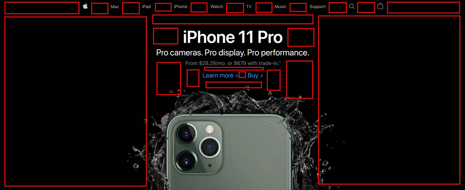
Despite its background being black, it’s still called white space. So, it’s literally every space between absolutely all elements on your page.
Now, designers have an important responsibility when it comes to creating a page guaranteed to convert.
Achieving a balance between simplicity and design that looks incomplete is a task that takes time, effort, practice, and skill. The result needs to be impeccable, consistent, and pleasing to the human eye. Otherwise, prospects looking at your web page design will simply leave.
In fact, according to Adobe, 38% of people will stop engaging with a website if the content or layout are unattractive.
Too many elements randomly placed can be distracting and overwhelming.
Simply put: when you go shopping (the old fashioned way) in-person, and stare at the shop window, the more mannequins with clothes there are, the more overwhelming it is for you to perceive what’s in front of you.
As a matter of fact, research by SUNY Polytechnic Institute shows that the more cluttered a shop window is, the more the perceived value decreases. For instance, while some clothing stores would fill their shop windows as much as possible, high-end boutiques often display just one mannequin—sometimes even without even a price tag.
The same thing happens with web pages. The more elements randomly put in, the more distracting it’ll be. And this results in the prospect leaving.
So if you want to boost your conversion rates, you need to properly give your pages a quality assurance evaluation to make sure all elements on it are harmonious and balanced.
Let’s take a look at the example below.

Are elements and white space balanced? Is there a sense of harmony when you first glance at those screenshots?
What if we rearrange all the elements and present them like this?...

Much better, right?
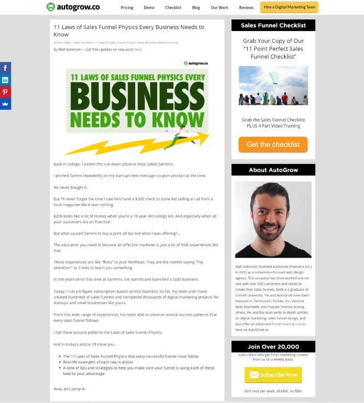
The first example above was a landing page design that a former designer of AutoGrow submitted.
It doesn’t take any expertise to judge those designs and label them as poor.
After going through our QA process, those designs absolutely improved. And although those weren’t the end result, quality assurance helped the pages to look better.
When it comes to strategically using white space in your landing pages design, it doesn’t require expert professional input. It requires common sense.
Wrong Myth: “White Space Is Anything But Wasted Space”
Jan Tschichold, a calligrapher, typographer and book designer, said in the early 1990’s: “white space is to be regarded as an active element, not a passive background.”
And yet, there’s a misconception about white space being wasted space.
White space is necessary for all web pages design. It plays a fundamental role because it leads the viewer around your page.
White space is essential for providing spatial relationships between visual elements. It guides viewers’ eyes from one point to another.
Many people still think of white space as wasted space. They think it should be used to present more information about their products or services.
But the truth is, white space provides breathing room, it promotes wayfinding, it attracts the eye, and it adds elegance and sophistication to your page.
When you create a lead magnet landing page with Leadpages, you shouldn’t try to fill up the page with text and images to reduce the white space. You should be sure the elements that pop are the ones that matter the most.
In fact, a study by NCBI shows that human beings have a natural tendency to follow the gaze of others. We’re programmed to follow arrows directing us to where we should be looking or going.
So when it comes to your web page’s design elements, distribute them in a harmonious way. Otherwise, it can be hard for the viewer to navigate because there are so many elements competing for their attention.
If you want to boost conversions with a high-converting landing page, these are the fundamental principles you must follow to achieve the perfect balance of your white space.
1. Don't Let Text Get Lost
Text on your landing pages is what will educate people about your products or services. Whatever is written is what’s going to help you sell.
According to Wichita State University, white space around text and titles increases user attention by 20%. This means that your goal should be to make prospects’ eyes read the content of your page to eventually get them to buy. Because what’s the point of having text that won’t be read?
You need to ensure your text doesn't get lost in your landing pages. Your prospects shouldn’t work to scroll down to find the information they’re looking for.
Not only is white space responsible for readability and content prioritization, it also plays a crucial role in the visual layout and brand positioning. So don’t bury the text in your landing pages. Make the user experience as friendly as possible by distributing the content properly with white space.
For instance, a cluttered landing page is unattractive. It doesn’t incentivize users to read the content, especially when there’s no visual hierarchy within the text.
Let’s take a look at an example of a landing page where the text is lost.
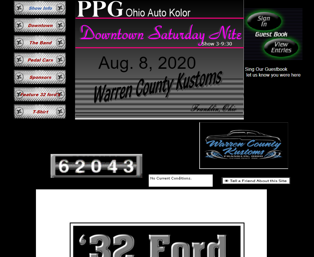
The page shown above suffers from “page clutter.” This is when you put so much information and so many elements on one page that the user has no idea what to look for or where to scroll.
The page is simply overwhelming.
2. Ensure Good Color Contrast
Color contrast is key. Without it, your message and background blend together.
An attempted highlight text can fail when not enough tone difference is present between the background or surrounding text.
Let’s take a look at this example.
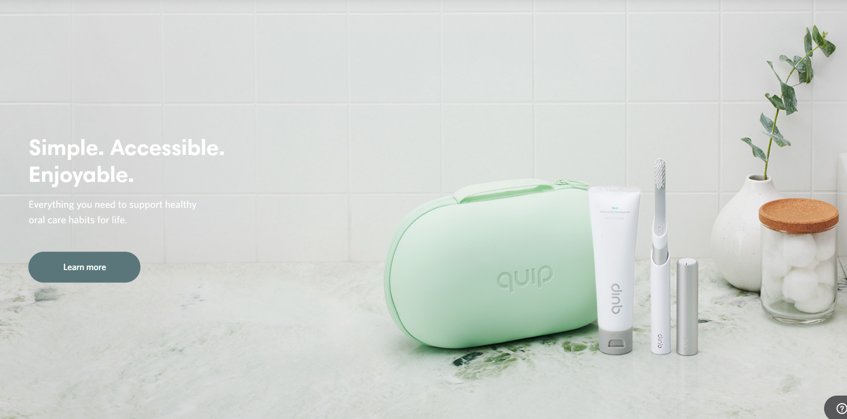
This landing page has a really nice aesthetic. Elements are in balance with the white space and the page follows a white & mint color palette.
However, white space doesn’t work if the colors don’t contrast.
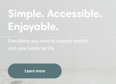
White text on a light grey background doesn’t make the text stand out.
And the same thing happens in this other example.
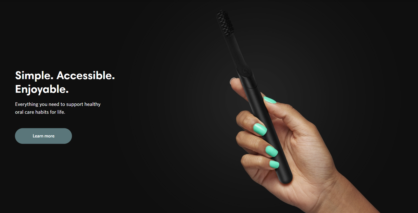
There’s a nice balance between the white space and elements in the page and even a sense of sophistication, but the colors simply don’t contrast.
Adding a black image on a black background makes it hard to understand what they’re trying to advertise.
So in these cases, white space wasn’t used properly. It would have worked better if for the first example the text would’ve had a darker font, and if the black background from the example above would’ve been light.
Colors can do more than highlight and contrast. Color communicates feelings and emotions.
For example, colors like blues and greens give a passive feel, while reds and oranges communicate activity. Target shoppers on a budget with navy blue, attract women for clothing brands with soft colors like pink and light blue, use green to help users relax, and use black for luxury product websites.
Robert Plutchik’s “wheel of emotions” shows some of the most popular emotional layers…
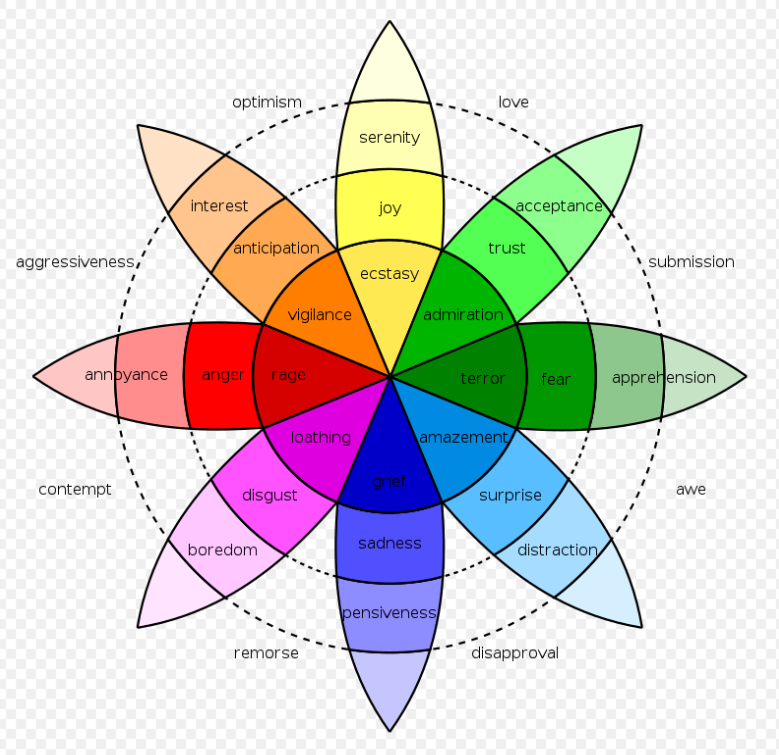
Choose colors that contrast and stand out but also colors that match the message you want to communicate on your landing page. Text that doesn’t contrast with the background doesn’t get read, therefore, it doesn’t convert.
If your prospects have to work and make an extra effort just to read whatever is displayed on your landing page, they’ll leave.
3. Enhance Readability
Research by Wichita State University shows that white space actually improves reading comprehension. This means that if you don’t have effective use of white space, your prospects may not even notice your content.
The best example of this principle is an article.
What’s the point of having a content writer write an article backed up with research and data, polished with great images, and signed by a well-known author if the content doesn’t get read?
None.
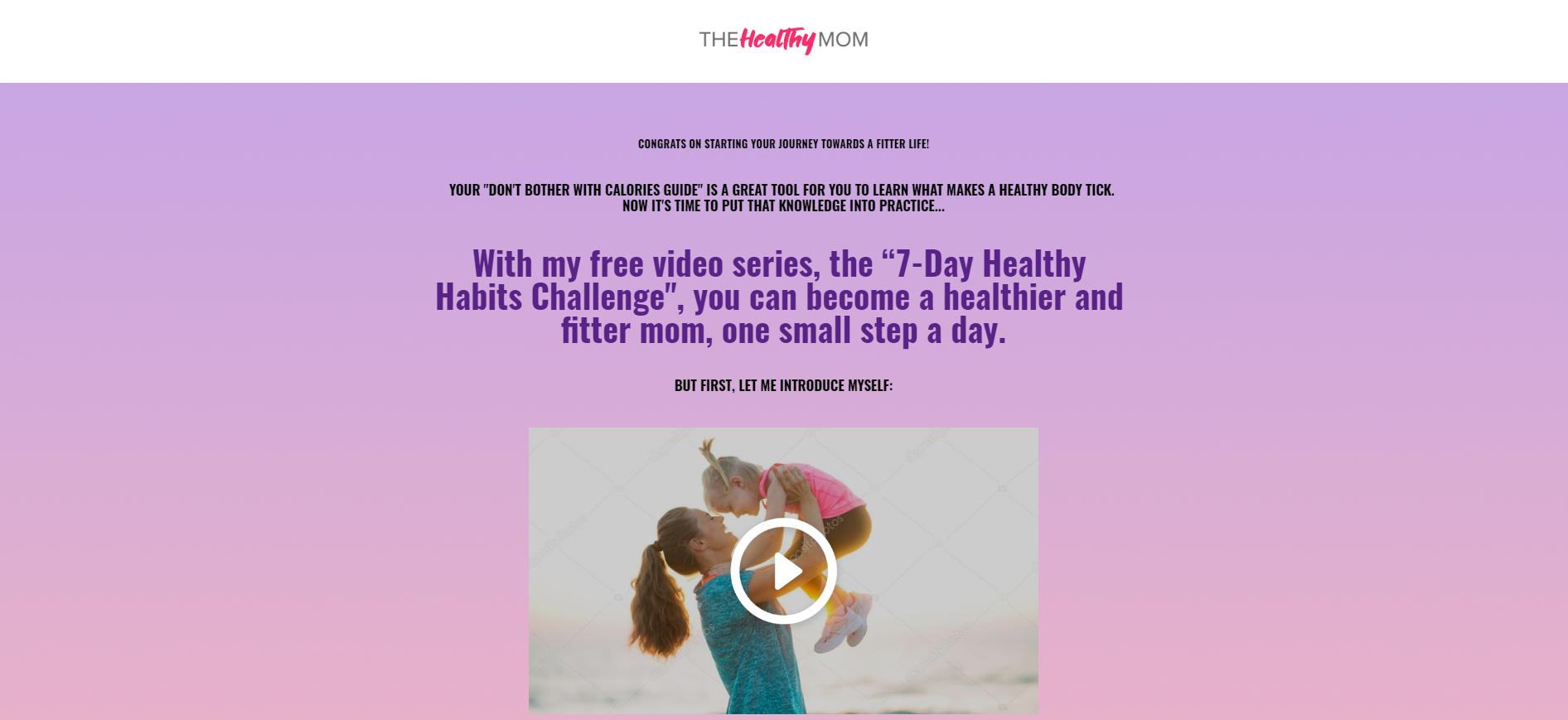
Let’s take a look at this landing page briefly…
Do you feel like reading it?
And what about this one?
The reading experience is nicer with this one, isn’t it?
Comfortable font style, nice text size, good contrasting colors, and GREAT use of space.
The crisp sentences surrounded by the white space makes the content easy to digest. The reader doesn’t have to struggle to go through this article. The text is properly distributed on the page.
As a matter of fact, research by Nielsen Norman Group shows that people scan web pages and phone screens in various patterns, one of them is the shape of the letter F.
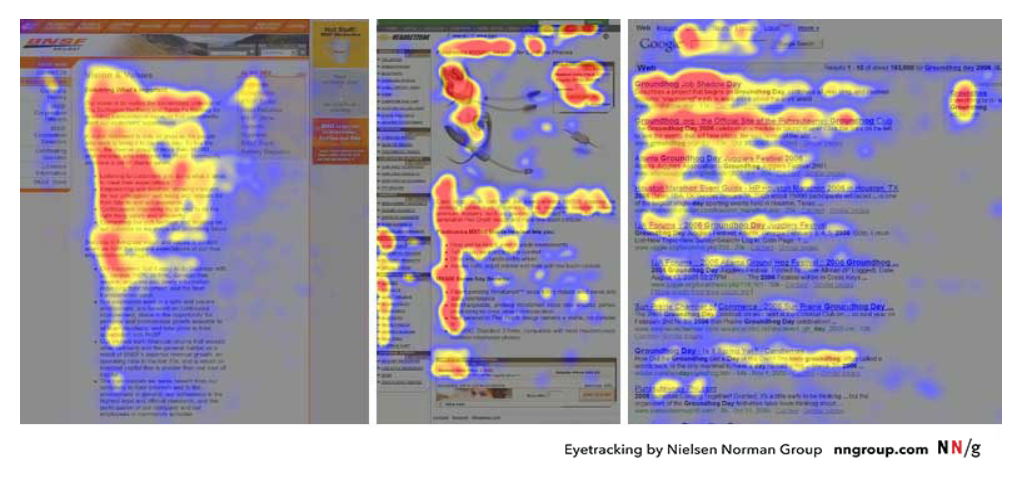
Source: Nielsen Norman Group
Another study by Nielsen Norman Group says that on web pages, people spend more time viewing on the left half of the page versus on the right half. 80% of the fixations fall on the left half of the screen, and 20% of fixations on the right half of the screen.
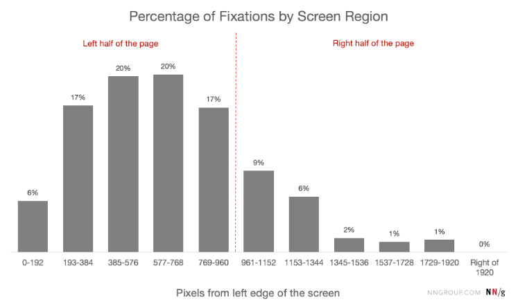
Source: Nielsen Norman Group
In a nutshell, white space distributes elements to be recognized and easily read and interacted with. And by following this principle, you’ll nail the perfect balance between your lines of copy and improve legibility and comprehension.
4. Add Prominence
The proper use of white space on your page adds prominence to the elements that matter the most.
And this is exactly what white space does to your elements: it enhances them. So if you want an element in your page to stand out, just add white space around it. As simple as that.
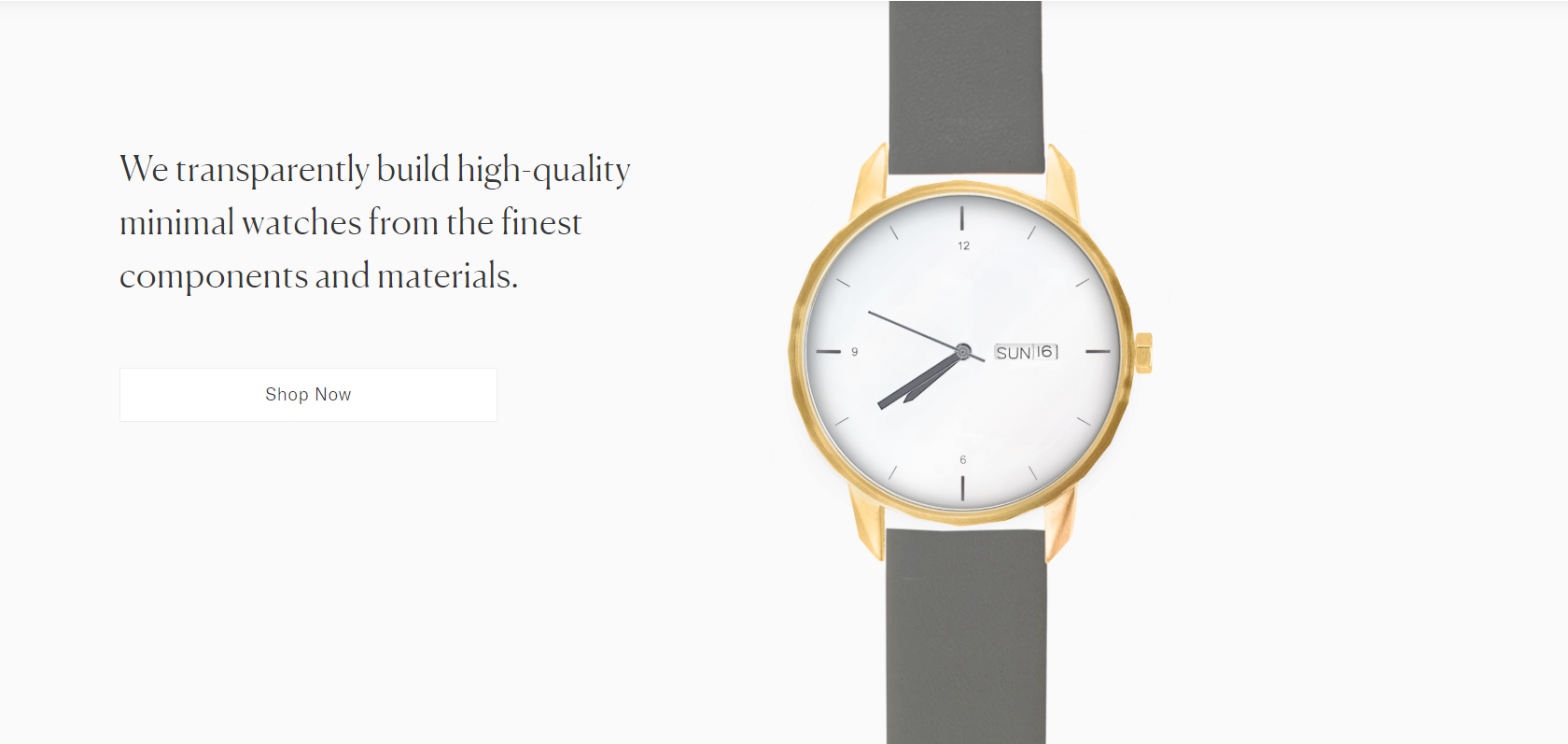
In the example below, see how even the CTA button to buy the watch doesn’t have prominence. Only the watch stands out from the rest of the elements.
And adding prominence in your landing pages works great when you sell products or services.
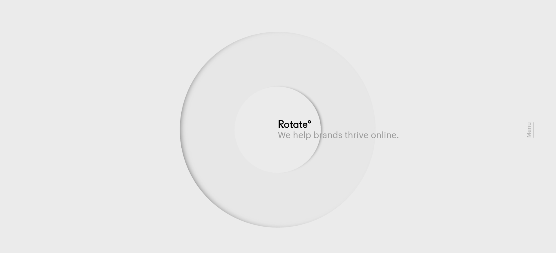
Take a look at AutoGrow’s new homepage.
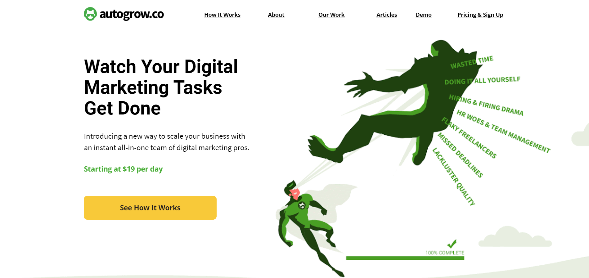
The clear, contrasting CTA button has prominence and is balanced with the white space on the page. So whether it’s a 2-step opt-in, hyperlink, image, buttons, or text, you can add prominence to any of the elements on your landing page.
5. Make Your Page Look Sophisticated
Less is more.
Adding many elements on your landing page doesn’t necessarily mean it’ll convert better.
It’s a good idea to keep your landing page layout clean and minimalistic so that people don’t get distracted by too many visual elements.
Many marketers nowadays think that they need to include a lot of elements on a page in order to make them look sophisticated. But in fact, luxury brands use a lot of white space to create a neat and simple design.
We tend to associate heavy white space in pages’ design with luxury and premium brands. And on the other hand, little white space not used properly conveys cheapness.
Take a look at the following examples…

High-quality brands don’t use overwhelming graphic design.
In the examples above, a fair amount of white space makes the products displayed have a clear focus on their design and premium quality.
And of course, Google, as you can see, is a big advocate of white space in their designs. They have a very clean design without distracting elements.
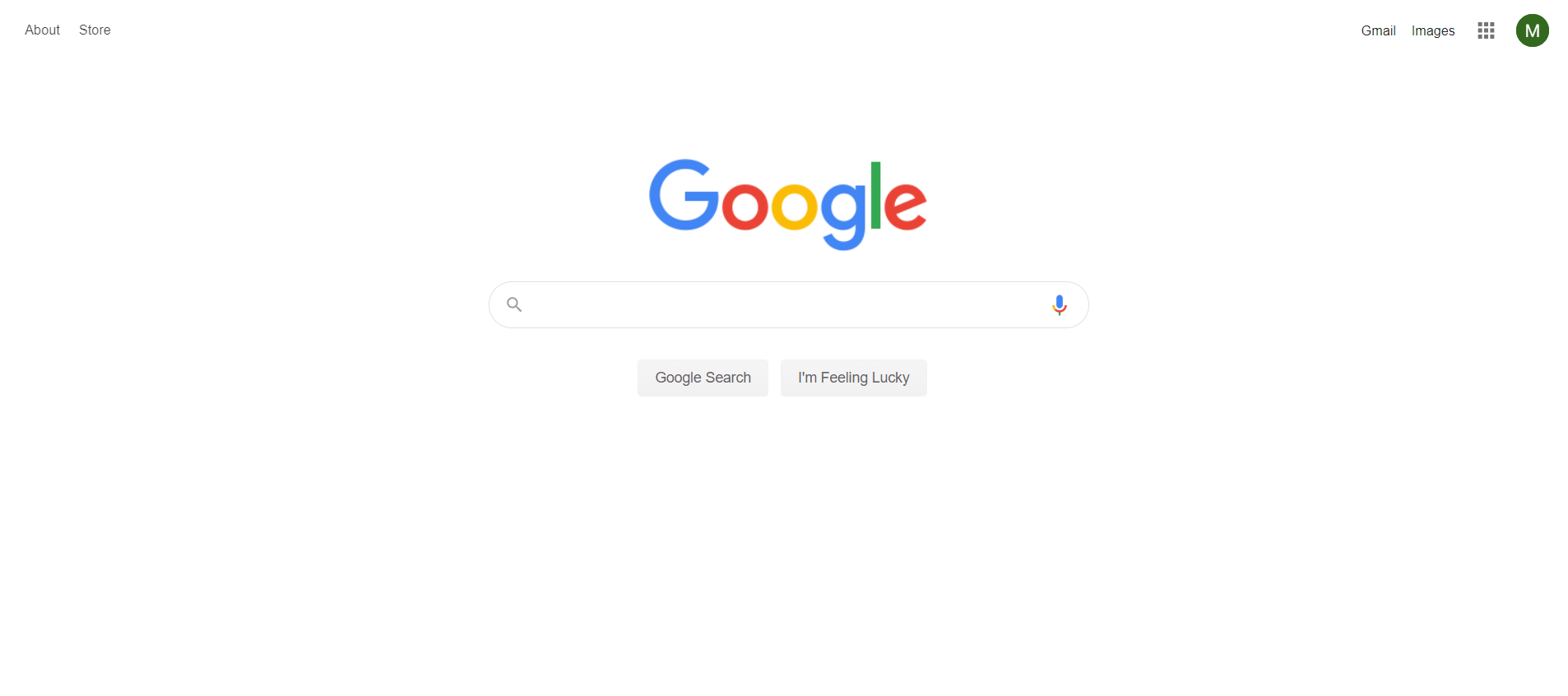
So without a doubt,web design can look luxurious just by using the "less is more" principle.
Conclusion
White space is the empty space between paragraphs, texts, images, buttons, icons, headlines and any other element on your web page. It’s one of the many areas that can affect customer perception and their subsequent experience on your website.
How you distribute white space in your landing pages can have a dramatic impact on your users’ experience and in their buying decisions.
And you don’t even have to be an expert designer to craft the right balance between white space and other elements in your pages.
You just need to leverage the space by using high-contrasting colors, enhance content readability, add prominence to the elements that matter the most, don’t let text get lost, and add sophistication to the page.
For instance, avoid using busy layout or page clutter, difficult to read the text, and poor alignment and margins.
Finding the right balance of your white space is key to converting site visitors into paying customers. Because if they don’t like what they see, they’ll leave.
Now tell me something, have you ever considered white space as an active element in your web design? Or did you think of it as a wasted space instead?
Let me know in the comments below.
Keep funnelin’, stay focused,
Mariana Lessmann


