Agencies: Boost Sales by 21% w/ These 7 Visual Persuasion Examples

It’s no secret that simple visuals like ❤️ c.o.n.v.e.r.t..
Because, when was the last time you were persuaded to buy by a boring, plain block of black and white text?
Serious question .
You see, high conversion rates are the holy grail for digital marketing agencies like yours.
Because traffic means nothing if your agency’s conversion rates are low.
And many agency owners think that increasing conversions refers to only getting more clicks and more impressions.
But increasing conversions must be all about driving more sales.
That’s why I’m here to help you with a little something called visual persuasion.
In this article, you’ll learn:
- What visual persuasion strategy is and why it’s important for your agency’s sales conversions.
- 7 great visual persuasion examples—why they work and how you can copy them in your own funnel (and your clients’ funnels too).
- And I’ll give you 3 easy tips for improving your own visual persuasion strategy.
Some of this sales funnel conversion topic I cover in our Sales Funnel Blueprint in case you want to go through this step-by-step, easy-to-follow guide to create your own agency sales funnel.
Now, are you ready to know…
What Is Visual Persuasion Strategy?
To put it simply, visual persuasion strategy refers to the use of visual elements in marketing materials, such as websites, emails, and advertisements, to persuade potential customers to act.
This can be done through visual cues like color, images, text, photos, and animations that evoke certain emotions or associations in the viewer.
So what separates visual persuasion from normal design?
It’s kind of like “all squares are rectangles, but not all rectangles are squares.”
Visual persuasion is an aspect of design. So while design might be concerned with a variety of things, such as aesthetics, brand identity, cohesion, and persuasion, visual persuasion is focused solely on using visual elements to encourage a certain action or behavior in the user.
Normally, this action involves trying to persuade users to sign up, buy, or otherwise convert.
Visual persuasion might involve things like:
- Adding a picture of someone smiling to create associations between your product and happiness or excitement.
- Using a graph or chart to visualize statistics that make your business seem favorable compared to competitors.
- Using color, shapes, and other visual elements to draw attention to an important component, such as a call-to-action button or information on your latest product.
Makes sense?
Why Is Visual Persuasion Important for Marketing?
Obviously, visual persuasion is important for marketing because it’s a way to convince people to buy your product or service.
But the way visual persuasion accomplishes this includes a few unique elements you may not immediately realize.
Other reasons visual persuasion is important include:
- People are wired to process things visually. Did you know that the human brain processes visuals 60,000 times faster than text? How about that people can identify images in as little as 13 milliseconds? When you present things visually, you’re using a method that’s naturally more engaging and easy to absorb than text.
- Visuals communicate complex data clearly. Because human beings are naturally visual creatures, we respond a lot more positively to infographics or charts than we do to raw data. When you use visuals, you can compress complex concepts into a format that’s much easier and quicker to understand.
- Visuals utilize the subconscious. What’s more convincing — a photo of someone smiling while using a product or a piece of text that reads, “This product will make you happy”? Unless you’re a robot, the answer’s probably the photo — even though you may not realize the message is the same. When information is communicated visually, it bypasses our logical brain and gets delivered directly to our subconscious — which means there’s less resistance.
7 Visual Persuasion Examples in Action
Now that you know why visual persuasion strategy is important, let’s get into some concrete examples of how it works in action and how you can use it.
Here are 7 different visual persuasion examples that prove how effective visuals can be in influencing human behavior.
1. Make Your Numbers Clear With a Visual
It’s great to have numbers comparing your business or products’ effectiveness compared to your competitors, but sometimes, numbers alone aren’t enough.
When you’re working with numbers, especially large differences in numbers, it’s easy to lose perspective.
For example, even though everyone logically understands a billion is much higher than a million, most people don’t really get just how much bigger a billion is — they just think of both as “a lot.”
But when you put it into visual form, the difference really hits home.

The same principle applies to your comparisons to your competitors.
When we tell you that our services cost 1/10th of the price of our competitors, you might think, “Sounds cool, but what does that mean?”
But, when we put it in a visual that utilizes:
- Precise numbers
- A visual comparison
…The difference in price really hits home.

2. Use Real People To Make It Personal
Although it may sound silly, something as simple as adding a real person to your funnel can make your conversions skyrocket.
Don’t believe me?
Check out this case study from Signal v. Noise.

After redoing a landing page to include a photo of a human as a primary design element, they saw a 102.5% jump in sign-ups.
Why?
Because people like seeing other people. When they see an actual person associated with an offer or company, it automatically humanizes the offer and makes it seem more approachable.
This is especially true when the human is conveying a happy emotion or is doing something we wish we could be doing.
We’re also hard-wired to recognize human faces — it’s a brain feature called pareidolia, and it’s so effective, it even causes us to see faces in places they don’t exist.
So, even when there’s no logical reason, we’re automatically drawn to human faces and will pay more attention to them than other types of stimuli.
To learn more about why faces are effective and how you can use them, check out our article on using faces to boost conversions.
3. Simplify Information With Infographics
We’ve already explained why visuals can help with simplifying complex information — so how do you put that in action?
One of the most effective ways to convey data and information in a way that’s easy to digest and engaging is by using infographics.
Although many infographics are massive and include dozens of data points, it doesn’t have to be complicated. Check out the likes and engagement to this LinkedIn post that organized a few pretty simple lines of content into an effective and intuitive infographic.


4. Make the Buyer Journey Transparent by Adding Steps
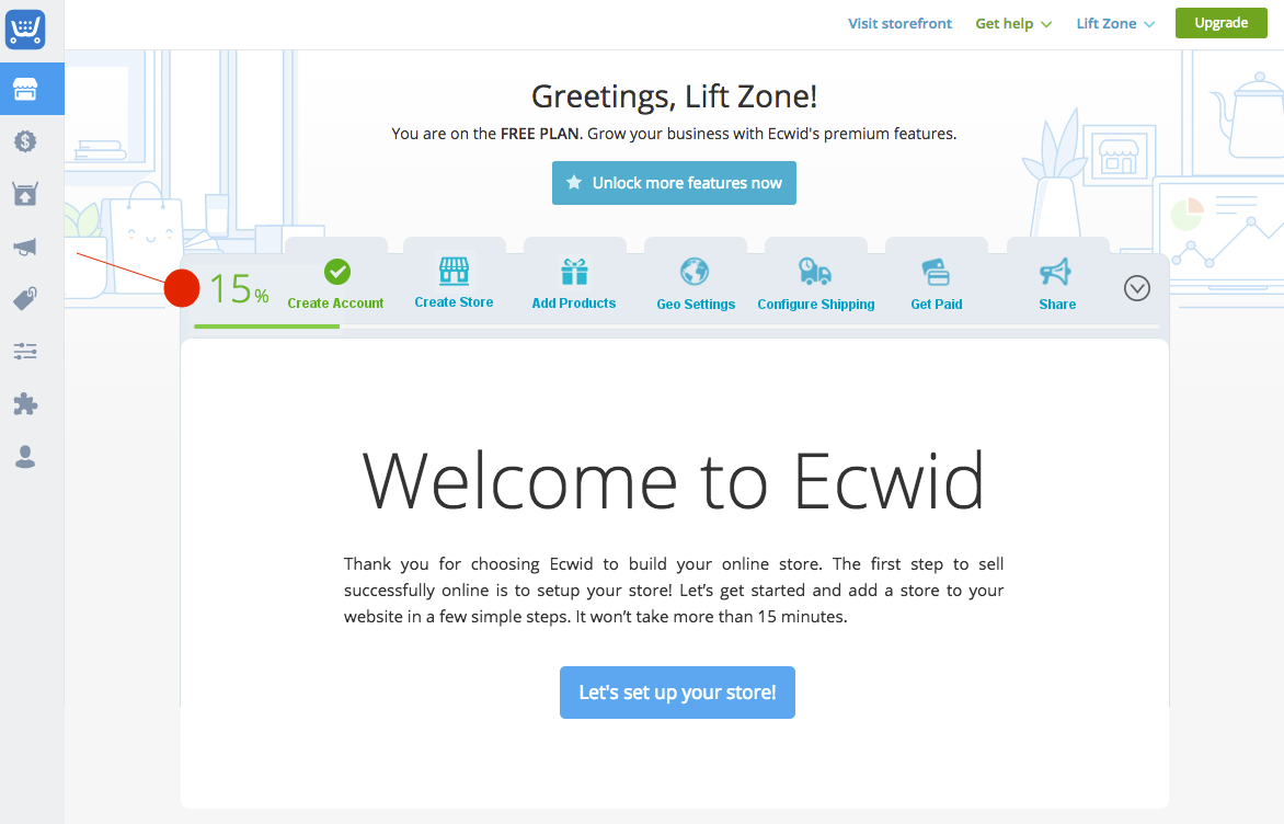
Have you ever hesitated to sign up for a software or service because you feared it would take 30 minutes of filling out forms?
No one wants to waste their time. And in a world where lack of information during a sign-up process often means there’s a hidden catch (think about all the times a “free” service ended up asking for your credit card information), a little transparency can go a long way.
For example, just by adding some labels that showed how much progress a buyer has made in the sign-up process and how many steps they have left, ecommerce platform Ecwid saw sign-ups jump by 15%.
Before:

After:
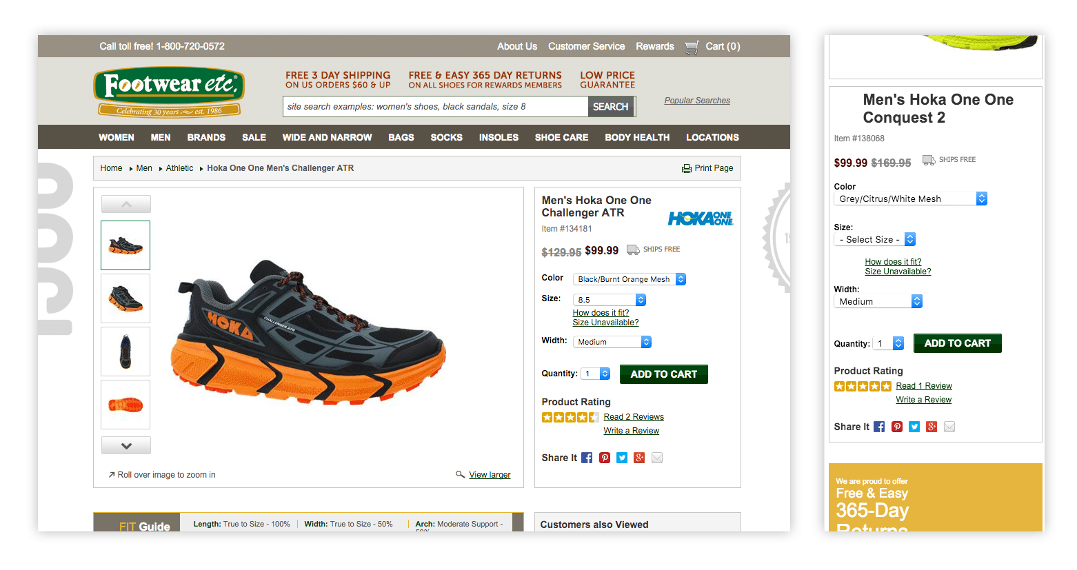
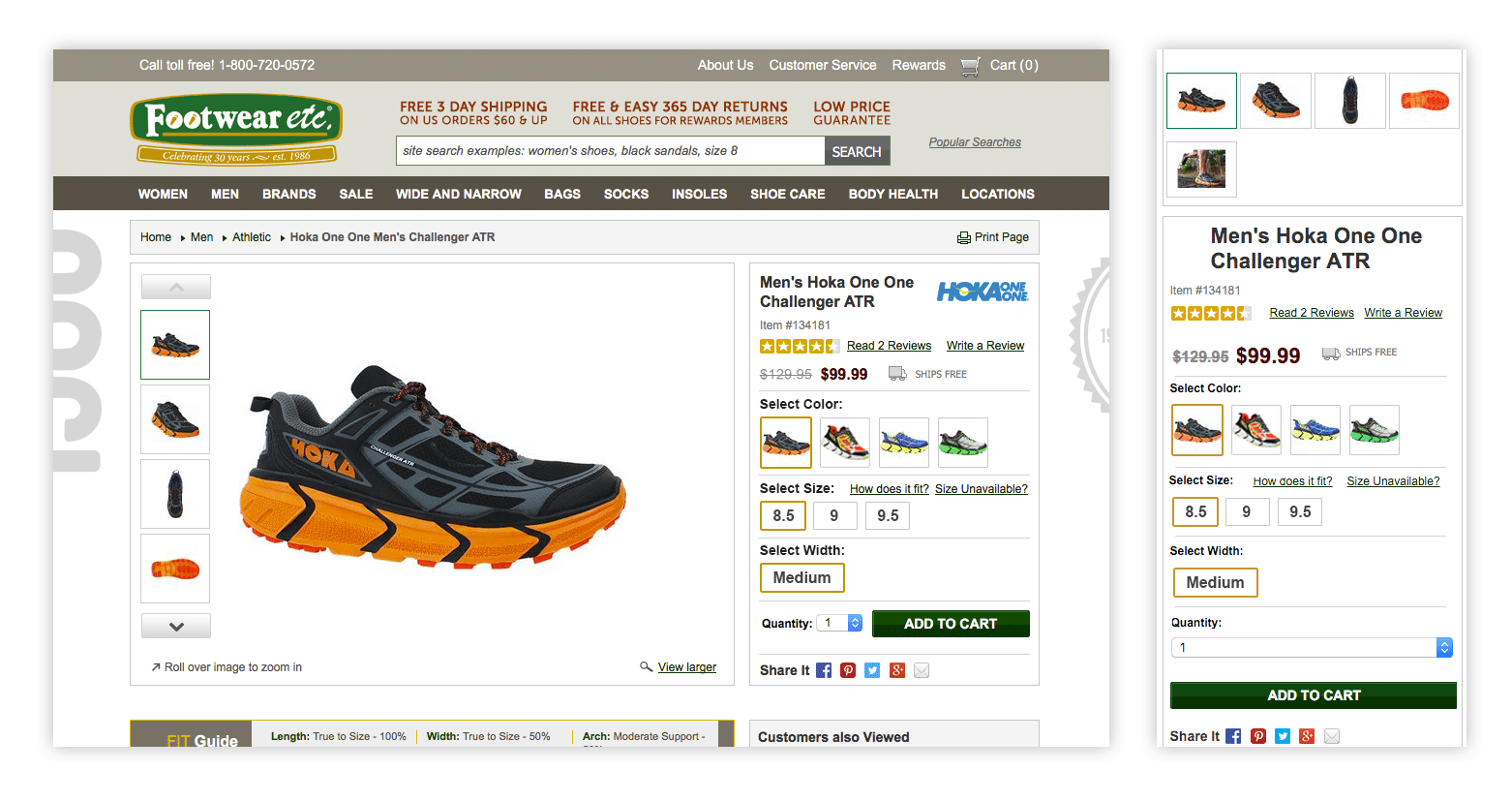
5. Letting People Shop With Their Eyes Can Boost Sales by 14%
If you’re selling a product with lots of different options (like different colors, sizes, or formats), it may be tempting to just show one version of the product and trust that the customer can visualize the rest.
However, although avoiding extra photo shoots is less effort for now, it can cost you big in the long run.
When people can’t physically touch a product, such as when they’re shopping online, they need extra reassurance that it will look and feel how they expect it to. They want to have as many resources as possible to visualize it — sizing charts, pictures, diagrams, videos — heck, ideally, they’d want you to teleport it into their home.
Since we’re not in the Star Wars universe quite yet, the best thing you can do to satisfy this need is to provide highly visible pictures that showcase what each version of your product looks like.
When Footwear etc. did exactly this and swapped a text-based drop-down menu for thumbnails, they saw their Add to Cart click rates shoot up by 14%.
Before:
After:
6. Improve Focus by Cleaning Up Distractions
When you’re creating visuals like charts and graphics, it can be easy to overdo it.
You might lose yourself in scraping the data and want to point out several different aspects at once — after all, the more that’s communicated in one chart, the better, right?
Well, yes and no.
While it’s great to save space by having a chart or graphic communicate several things at once, it’s important to make sure the focus is still on one primary takeaway.
When you’re creating visualizations, ensure your colors, text, shapes, and other elements are all pointing to one conclusion so that your viewer doesn’t get distracted and confused.
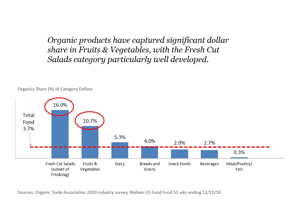
For example, consider this chart about the percentage of each food category that’s produced organically.

What do you think the key takeaway here is? After a while, you might come to the conclusion that fruit and vegetables dominate the organic industry. But that’s only after you finish contemplating:
- What color you’re supposed to be focusing on. (Is it green for good? Or red for bad?)
- Why organic fruits and vegetables are mentioned as the leader even though the chart says fresh cut salads is the leader.
- Why fruit and vegetables are separated from fresh cut salads. (What kind of categories are these? Shouldn’t it be meat, diary, and vegetables? Where do they draw the line between a salad and vegetables?)
- Why baby food is mentioned when it’s not even on the chart.
But, when you compare it to this revised chart, the takeaway becomes much clearer.
7. Less Is More — Take Out Some Urgency and Improve Conversions by 9.3%
When you’re trying to close a sale, it can be tempting to layer on every sales and marketing tactic you know — things like:
- Adding urgency with exclamation marks, timers, or capital letters.
- Putting a CTA front and center.
- Emphasizing discounts or benefits a customer can get out of taking a desired action.
- Using loud colors and visuals to focus attention on the offer.
- Sending emails, notifications, or pop-ups to create repetition and make your offer memorable.
However, sometimes, you can do too much of a good thing. Depending on the context of your offer and the audience you’re working with, too many marketing tactics can scare people offer rather than urge them to buy.
Consider this example of a page urging people to donate to a good cause — to keep running a site that helps sick children and families.

Even though the CTA wants people to donate to a good cause, the format of the widget makes it look like an ad. It has:
- Capital letters, normally used to grab attention and denote urgency.
- A logo, which makes it feel corporate and impersonal.
- A centered alignment, a subtle design trick that is commonly used to grab attention.
- A brightly colored orange border, which makes the widget seem loud and intrusive.
The result?
The widget seems like an annoying ad and caused people to skim past it without even reading what it said.
But, after CaringBridge changed the widget to be more relaxed, personal, and subtle, they saw donations rise by 9.3%.

Why did this work?
Because the personal, subtle nature of the new widget made it feel more human. Not only did this encourage people to pay attention to it in general, it also aligned with the tone of the offer and website itself.
How You Can Use These Visual Persuasion Examples To Boost Your Conversions
Each of these examples covers a different type of visual persuasion strategy, so you may be wondering how you can use this in your own funnel.
So to boil it down, here are three takeaway tips from these examples.
1. Visualize Your Numbers and Data Clearly
If you’re using numbers and data, visualizing them in a chart, infographic, or other type of graphic is a great way to make the data easy to understand and digest.
But it’s important to remember the law of clarity.
Make sure each of your visualizations is pointing to 1 key point and not trying to communicate 10 different things at once.
Get rid of distractions like extra text, unnecessary data, and bold colors for unimportant points and try to condense your graph to only show the absolute most important information.
2. Make It Personal
Adding a human touch can go a long way in building a connection with your audience.
Incorporating things like human faces or personal, casual language and design elements (as opposed to overly formal or salesy elements) can help create an emotional connection with your audience.
Not only will this make your brand more memorable, it will also help your audience associate your brand with authenticity — a trait that’s usually viewed positively.
3. Design With Transparency in Mind
Whether you’re working with a sign-up process or an eCommerce store, it pays to show people what they’re going to get when they do business with you.
If there’s an opportunity to showcase what the next steps of a process are going to be, or what your product actually looks like, take it. Being mysterious is overrated — people are much more likely to buy from a brand that is transparent about their product and offering.
Conclusion
Improve Your Visual Persuasion With AutoGrow
So there you have it: 7 times where visuals made all the difference in influencing behaviors and emotions and 3 ways you can implement similar strategies to improve your own visual persuasion.
And if you don’t have time to improve your visual persuasion because your plate is already filled to the max, don’t worry, we’ve got you covered.
With a full team of designers, strategists, developers, and everything in between, AutoGrow can help you ideate and execute effective marketing deliverables all across your sales funnel so you can boost your clients’ conversions, sales, and revenue.
Simply sign up to get started or watch our demo to learn more about how our platform works.
What visual persuasion strategies have you used that had a big impact on your conversions?
Let me know in the comments below.
Keep AutoGrowin’, stay focused.