
How To Boost Mobile Conversion Rate With Mobile Optimization

Quick: When was the last time you checked your phone?
For most people, the answer is probably anywhere from 2 hours ago to 2 seconds ago.
According to data from Zippia, the average American checks their phone 96 times and spends an average of 5 hours and 24 minutes on their mobile device—per day.
This means that if you’re not worried about how you and your clients’ website looks on a mobile device, you’re missing out on a huge chance to capture more traffic, leads, and conversions.
Fortunately, boosting mobile conversion rates doesn’t mean you have to reinvent the wheel. In fact, it often comes down to doing a few basic mobile optimization tweaks. Keep reading this beginner’s guide to learn:
- What mobile optimization is and why it’s important.
- What separates mobile and desktop traffic in terms of user behavior.
- 7 tips for optimizing your website’s mobile experience so you can drive higher mobile conversion rates.
Let’s dive in.

What Is Mobile Optimization and Why Is It Important?
In short, mobile optimization is the process of ensuring that a website or app is well designed and structured for mobile use. It is generally focused on making sure a website fills a mobile screen properly and offers a good user experience that takes into consideration what a user wants to get out of a mobile browsing session.
Think about it like this.
You know how apps like Amazon or Youtube look completely different on your phone than your computer, even down to the navigation flows and buttons they offer?


Youtube’s desktop vs. mobile interface. See the difference?
By contrast, you know how those old-school HTML websites from 2005 completely glitch out or end up zoomed into five words you can’t zoom out of whenever you try to visit them on your phone?

An old-school website that wouldn’t last 10 seconds on a modern smartphone.
That’s mobile optimization at work. If you don’t pay attention to it, you risk having your or your clients’ professional, modern website looking like a rookie Angelfire page from 20 years ago.
Mobile optimization is especially important because more and more people are using mobile devices to browse the internet. In 2020, mobile devices drove 61% of U.S website visits, compared to 35.7% visits driven by desktops and 3.3% from tablets.
So, unless you’re catering to an incredibly niche audience that only uses desktop, for most businesses, if you want to reach and engage with your target audience, it’s crucial to have a mobile-optimized website.
Benefits of Mobile Optimization
By providing an enhanced user experience that caters to the mobile experience, you can contribute to creating a more positive lasting impression about your brand as a whole.
In the modern day, customers expect to have a seamless experience across all devices that takes into account how their needs vary across devices.
This includes expectations for:
- A website that can adjust to various screen sizes.
- An overall digital experience that provides the same basic information and services across all touchpoints — including your flagship website, satellite sites, apps, and even your social media pages.
- Customized pages and interfaces that depend on how user actions differ across devices. For example, if your app is primarily used to check on the progress of tasks, users want to have that function front and center, even if it’s not front and center on your main site.
When all of these things are done right, you provide a better user experience that allows for a higher mobile conversion rate and more satisfied customers.
Oh, and one more thing — mobile optimization can also improve your search engine rankings, as Google and other search engines favor mobile-optimized websites in their search results.
So even if you don’t have a need to attract mobile traffic, the simple act of having a mobile-optimized website automatically boosts your visibility and rankings, which can drive more traffic to your site, including the desktop version.
Mobile vs. Desktop — What’s the Difference in User Behavior?
So how exactly do you define and design a mobile site that caters to the unique needs of your mobile users?
It all starts with understanding how user behavior differs across mobile and desktop. Here are some key differences.

Statistical behavior between mobile and desktop users. In general, mobile users are less attentive and serious about their web browsing.
Mobile Users
Although more traffic comes from mobile users, they tend to have shorter attention spans compared to desktop users, spending an average of 158.21 seconds per session as opposed to desktop users, who spend 323.47 seconds per session. They also have higher bounce rates.
Mobile users tend to use their devices for more preliminary research, such as browsing products or services, checking prices, and reading reviews. They might not be ready to make a purchase yet, but they are still engaging with your business.
However, they also tend to want to complete short and easy tasks quickly, making them more likely to buy a product or service on the spot. Many impulse purchases for small-ticket B2C items take place over mobile.
In short, mobile users are basically like squirrels or toddlers — they lose interest easily and bounce from task to task quickly without spending a lot of energy on any one task or website.
This means that businesses need to make sure that their mobile website or app is designed to capture the user’s attention quickly and efficiently. You need to know why your users are visiting your site and supply that information in a quick, easily accessed manner.
Focus on providing useful and engaging content to mobile users, such as product information, customer reviews, and educational content, to keep them engaged and increase the chances of converting them into customers. This content should be quick and easy to digest.
Creating seamless and easy-to-use user flows and mobile purchasing experiences can also greatly increase lead generation and mobile conversion rates.
Desktop Users
In many ways, desktop users are the direct opposite of mobile users.
Desktop sessions are longer, which means users are more likely to take their time to research, compare, and make a decision. Desktop users might be doing more in-depth research and want to do longer, more involved tasks. They also tend to partake in longer purchase timelines for bigger, more serious purchases.
This makes desktop the ideal interface for B2B businesses, especially when it is time to close the sale. To optimize for desktop users, businesses should focus on providing detailed information and resources to help desktop users make informed purchasing decisions.
Desktop may include more complex navigation menus, longer landing pages or product information summaries, and instructions to complete multi-step, complex tasks that involve more work than just filling in text and clicking buttons.
6 Tips for Increasing Mobile Conversion Rates With Mobile Optimization
#1. Shorter = Better
To cater to mobile users’ low attention spans, decide which information really needs to be presented upfront. By eliminating unnecessary elements and keeping the most important information easily accessible, businesses can make it easy for mobile users to find what they are looking for and be more likely to convert.
This can be achieved by having a clean and simple layout, using clear and concise language, and featuring a clear call to action. Take a look at your clients’ current website and decide where any fat should be trimmed.
Are there 3 promotions before your homepage displays a functional CTA? Is there a huge hero image that takes up a whole screen before the user can scroll beyond it? These are all things that need to be eliminated or condensed in a mobile format.
One way to ensure that the most important information is presented upfront is to conduct user testing. This can help you understand how users interact with your clients’ website on mobile devices and identify any pain points or areas for improvement.
By understanding how users interact with their website, businesses can make changes to improve the user experience and increase conversions.
#2. Think of Your Site Like a Powerpoint
One technique I’ve used with great success for both AutoGrow’s mobile app and the websites of my clients is to think of a mobile website like a Powerpoint. Instead of displaying everything you offer at once, share bite-sized pieces of information that are easy for users to digest.
This means breaking up content into shorter paragraphs, using images and videos to supplement the text, and making sure that the most important information is presented in the most concise, visible way possible.
You should also consider the use of white space, typography, and other design elements to make your website more visually appealing and easy to read on a mobile device. By doing this, you can capture mobile users’ attention before they get distracted and ensure their user experience is pleasant.

See how the second interface treats the website like a short, concise snapshot of information, similar to a PowerPoint?
#3. Ensure Your Website Is Responsive
Responsive web design refers to the ability of your site to automatically adapt to different screen sizes, and it’s one of the most important technical aspects of mobile optimization.
Making a website with responsive design usually involves the expertise of a web designer and a web developer in tweaking various aspects of your site’s code and appearance. Using flexible grid-based layouts, CSS media queries, or a responsive design framework like Boostrap are all methods of accomplishing this.
To test the responsiveness of your website, businesses can use online tools such as BrowserStack or Google’s Mobile-Friendly Test. These tools allow businesses to see how their website looks on different devices and identify any issues that need to be addressed. Additionally, businesses should also test their website on different operating systems and browsers to ensure compatibility.
#4. Adjust Your Navigation
Naturally, no matter what kind of design acrobatics you do, it’s simply not possible to fit everything that’s on a desktop screen onto a mobile screen.
That’s why mobile optimization involves making strategic choices about what information and features should be the most easily accessible and how to create a navigation flow that’s still easy despite involving more steps than a desktop navigation flow.
To improve navigation on mobile, consider transforming your homepage into a minimal icon-based layout rather than an information-based layout, similar to an app. For example, take a look at how Harvard.edu’s mobile interface compares to a non-mobile optimized website, Cruises.co.uk.

You can also consider using a hamburger menu, which collapses the navigation into a button when the screen size is reduced. Another option is sticky navigation, which remains visible when users scroll down the page.
It’s also important to make sure that links and buttons are large enough to be easily tapped on a mobile device.
#5. Consider the Unique Needs of Your Mobile Users
For many businesses, the needs of your users will vary depending on whether they’re accessing you through mobile or desktop. In order to provide the best user experience and increase mobile conversion rates, you need to understand your users’ unique needs on mobile.
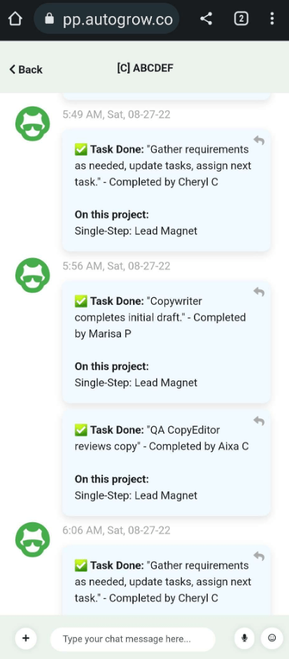
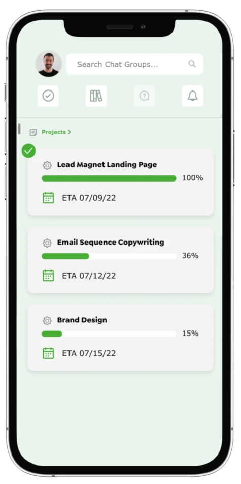
For example, at AutoGrow, we know our users use our mobile app to do brief check-ins. They’re not trying to assign complex tasks, attach files, or have prolonged conversations. Instead, they just want to quickly check on the status of their project or write a quick question in their chat. Because of this, we make status updates and chat messages the first thing you can access on our app.
To make sure the things that are important to your users are easily accessible, you need to understand their unique user flows on mobile. To do that, you need to track their behavior and engage in user testing. This can help you identify any pain points or areas for improvement.
#6. Enhance All Aspects of Your Digital Presence
To truly boost mobile conversion rates across the board, it’s essential to optimize all aspects of your digital presence.
This includes not only your website but also third-party apps, your blog, and other digital assets. By optimizing all of these elements, you can create a seamless experience for mobile users and increase conversions.
For example, businesses can optimize their social media profiles and make sure that they are mobile-friendly. They can also optimize their blog for mobile by using responsive design and ensuring that the content is easily readable on a mobile device.
Additionally, businesses can optimize third-party apps and tools that they use to interact with their customers, such as chatbots, to ensure that they are mobile-friendly.
#7. Have the Right Team
Whether you want to optimize your own website or offer mobile optimization services to your clients, you’ll need a team of designers, writers, and developers to do it properly.
The team should have the necessary skills and experience to design and develop a mobile-friendly website that is easy to navigate and provides a great user experience. They should be familiar with the latest trends and best practices in mobile optimization, UX principles, search algorithms, and all the other basics of web design.
Conclusion
Mobile optimization is essential for any business that wants to improve its mobile conversion rates and reach more customers, and it’s especially important for agencies who wish to help their clients create effective, conversion-optimized websites.
With a website that’s well-designed and easy to use on multiple mobile interfaces, your clients can capture more traffic and get more leads and conversions on the interface that matters most.
By understanding:
- The difference between user behavior on mobile vs. desktop.
- What your or your clients’ users’ unique needs are depending on the interface.
- My 6 tips on how to improve your mobile optimization.
…You can create a great, modern website that can handle any interface.
What’s your experience optimizing websites for mobile? Any tips I missed?
Let me know in the comments below.
Keep AutoGrowin’, stay focused.


