
23 Principles to UP Conversions w/ Landing Page Optimization

High conversion rates are the holy grail for online businesses.
Because traffic means nothing if your conversion rates are low… lower than the limbo bar set by your favorite masochistic co-worker at an office party.
Everyone wants a high conversion rate but most don’t know how to achieve it.
You see, many marketers and business owners think that increasing conversions refers to getting more clicks and more impressions.
And that’s true, right?
Wrong!
Increasing conversions must be all about :::drum roll::: driving more sales.
Because, when prospects visit your site, they engage with your offer on different levels.
They read your copy. They see your web design. And they absorb the value of your offer (and how it is presented… Oh, and they notice EVERY error).
But that’s why the marketing Gods invented the landing page optimization.
This is where you make tiny tweaks or deep structural changes to each of your landing pages.
And as a result, your conversions go UP and you start seeing more people hitting the buy button to checkout or book a call.
In today’s article, I’m showing you…
- Why your landing page optimization is a process you must follow to increase conversions.
- The 23 proven landing pages best practices you can apply immediately to start seeing your conversions rise.
- And why you should focus first on your copywriting tactics, design second, and quality assurance last.
- Plus, a bonus video walk-thru...
Let’s dive into these 23 landing page optimization’s best practices.

What Are the Principles of Landing Page Optimization & Why Do You Need to Follow Them to Boost Conversions?
The principles of landing page optimization are the best practices you *must* follow on each of your landing pages to increase conversions.
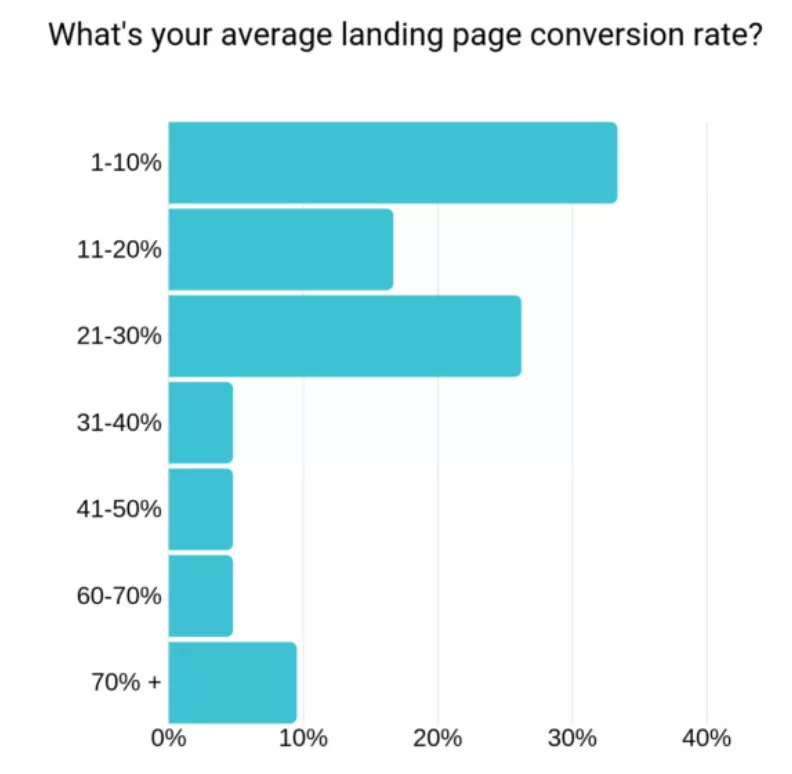
Unfortunately, a survey by Databox shows that the majority of marketers’ landing pages have a conversion rate below 10%.
According to Wordstream, landing page optimization not only boosts conversions, but it also raises the ROI of your PPC marketing campaigns.
Some marketers may consider this process to be a few simple tweaks to be made on your landing pages. Others may consider them deep structural changes of your funnel.
But the truth is, optimization is a process that all your landing pages must go through at some point.
Think of it like this.
Your landing page is like a person.
It needs certain elements to be alive.
For example, a person needs oxygen and blood to live—the same way your landing page needs copy and design to convert.
If any of those vital elements (oxygen, blood, copy, and design) are removed, then there won’t be any pulse.
In the case of your landing page, the pulse is the leads it converts.
If no leads are converting, then your landing page needs serious surgery.
And here’s when the optimization process comes in.
You need to make sure all your landing pages that have no pulse and don’t convert are put under a microscope. Really take the time to analyze what the problem is.
This’ll let you determine where your landing page is leaking leads and money.
Then, and only then when you optimize or fix those bottlenecks or issues, your business will be able to breathe again and see your conversions rise.
Now, it’s time to strengthen the pulse of your landing page. And for that, let’s put your landing page under the microscope.
I organized these landing page optimization principles in 3 categories (copy, design, and quality assurance).
This’ll let you evaluate and determine easier what’s causing the lack of conversions.
Let’s start with copywriting first and here’s why you should start with it.
Landing Page Optimization for Sales-Focused Copy—How to Apply These Principles to Your Copywriting
When optimizing your landing page, your starting point should be your copy because this is what’ll get you the sweet, sweet sale.
And not only that, but you can easily come back to your copy to optimize it without needing a designer to do any tweaks to your landing pages.
You can always log in to your landing page builder (we at AutoGrow use Leadpages to create our landing pages), edit the copy, and make the changes go live.
Without any further ado, let’s review the best practices you need to apply to your landing page copy.
1. Speak With Emotion & Directly to Your Audience… Or Risk Attracting the Wrong Audience
The first thing you need to do is to know and understand your audience.
You can’t write solid copy if you don’t know who you’re writing it for.
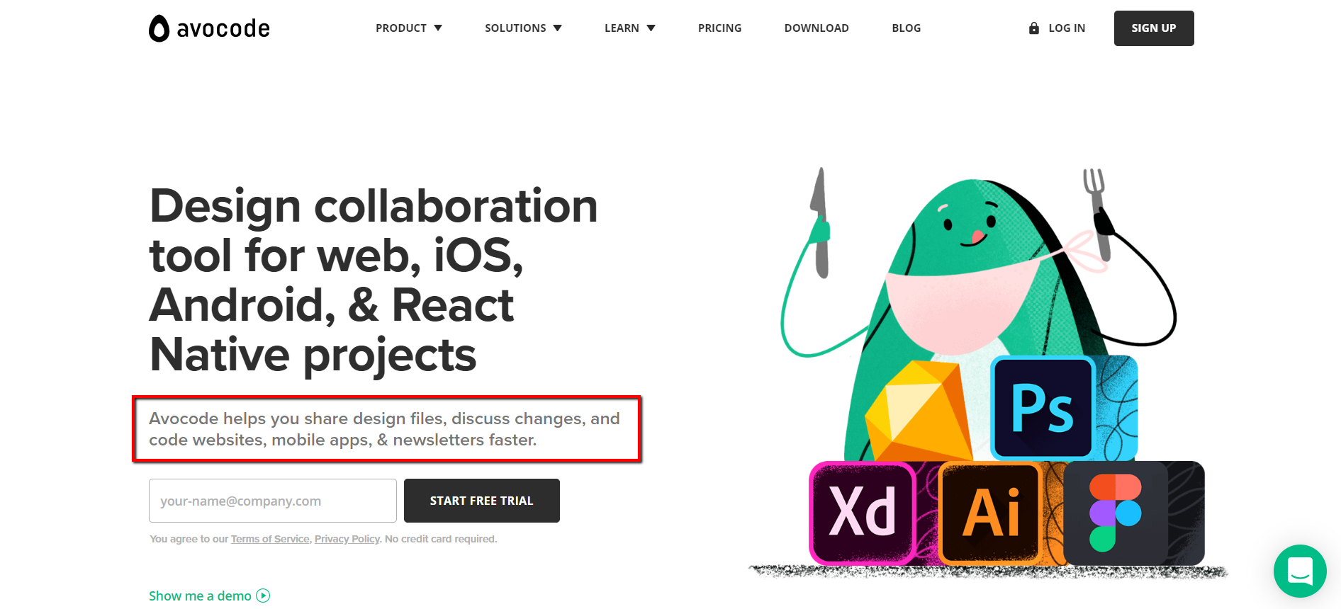
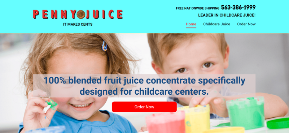
Do you really think that by writing copy directed specifically to high-level executives (like in the example below) you’ll be converting freelancers or startups’ business owners?

The answer is pretty clear.
Heck no.
It’s like writing a letter to someone you don’t even know.
You must understand your prospects’ needs, problems, who they are and what they want.
That’s the only way you’ll know how to nail that perfect copy that’ll satisfy all of their needs and solve all of their problems.
And don’t forget to nail the right tone and language too.
Even if you know who your target audience is, you must talk to them in the way they want you to talk to them.
For instance, keep a conversational tone, avoid using corporate and formal language (we all hate that!), and inject some emotional language into your copy.
Because as neuroscience has proven, people buy on emotion and justify their purchase with logic.
2. Write a Crystal Clear Headline—Are You Being Clear Instead of Clever?
Most marketers fail here.
They think that writing a super clever headline with some overcomplicated quote from a 600 year old philosopher is going to explain their products or service better.
One of the 11 Laws of Sales Funnel Physics—the Law of Clarity—is to be clear, not clever. Don’t use fancy words to try to sound too smart like in the example below.
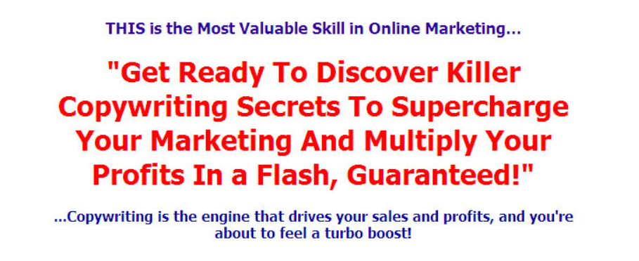
Too many unnecessary adjectives used, don’t you think?
And if you understand something from the example below, please let me know...

Simplicity and clarity are the most important elements when it comes to your headlines.
This text will tell your readers the single most important thing about your product or service.
Your headline should entice visitors to keep reading and it’ll be the first thing that’ll capture your prospects’ attention.
Don’t let your prospects wonder what your headline means.
If you get the headline wrong, prospects will end up leaving your site—no matter how good your offer is.
Here are some examples of clear headlines you can take inspiration from…
After taking a look at those examples, read your own headline and ask yourself if it really is clear enough.
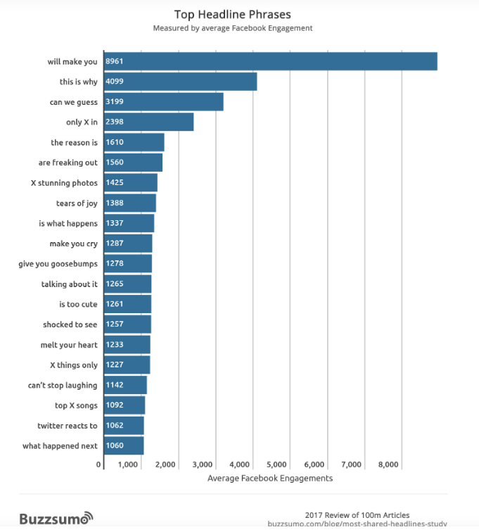
And use Buzzsumo’s suggested most engaging top headlines phrases as inspiration.
3. Headlines Shouldn’t Be Too Long nor Too Short—Find the Right Length
Headlines shouldn’t be a long testament that’ll take your prospects forever to read.
But they shouldn’t be either 3-words long.

Write a clear and compelling headline.
Don’t expect that with a long headline people will understand you better.
Simplicity and clarity are key on your copy. Especially when it comes to your headlines.
So keep your headline short and sweet. They shouldn’t take up more than 3 or 4 lines (maximum) in the design.
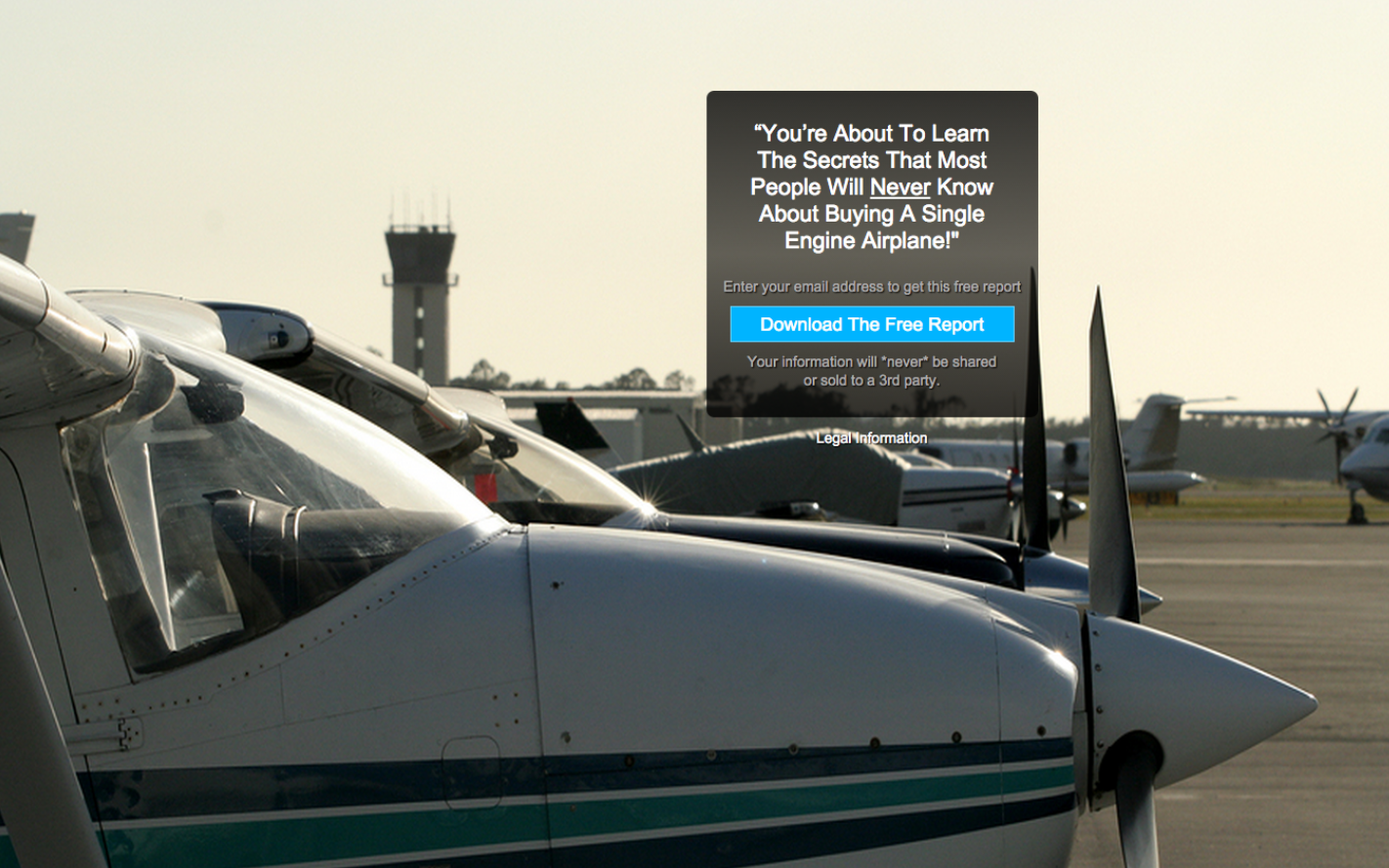
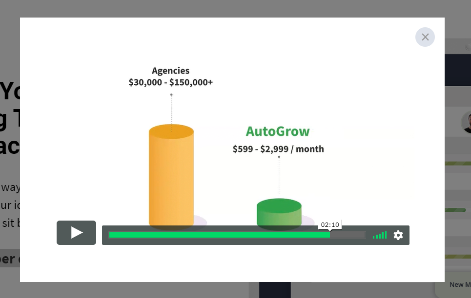
In fact, using a simple, short, and clear headline can equate to 388% more opt-ins to download a lead magnet.
And that’s exactly what happened in one of the 313 case studies analyzed in our Proven Sales Conversion Pack that you can find in our brand new AutoGrow Marketplace.
After reducing their headline (5 lines vs 4 lines) and being more clear, they saw spikes in their opt-ins.
Before…
After...
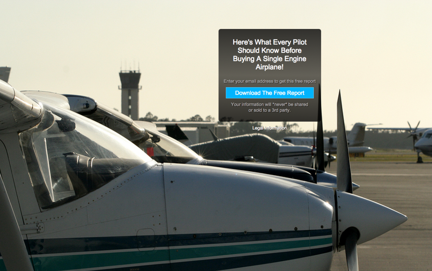
See how “You’re about to learn the secrets that most people will never know about buying a single engine airplane” was way too complicated?
There are always better alternatives to simplify and add more clarity to your copy.
In this website’s case the better alternative was “Here’s what every pilot should know before buying a single airplane.”
4. Write a Sub-headline That Supports Your Headline & Gives Your Readers More Clarity
Adding a subheadline to support your headline is a great way to explain your products or services to your site’s visitors in more detail.
It goes right below your headline.
Take a look at our homepage…
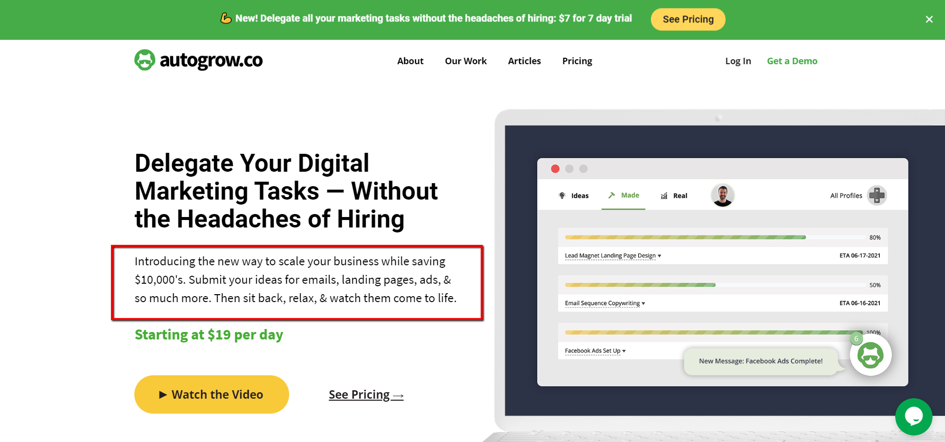
See how the subheadline supports our headline and adds some more information about our offer?
This is your opportunity to expand on what you’re selling, clarify whatever you’re saying in the headline, and hook the reader to keep reading.
What you propose in your sub-headline will be followed by a CTA.
This will be the answer to your sub-headline—what do you want them to do with what they’re reading?
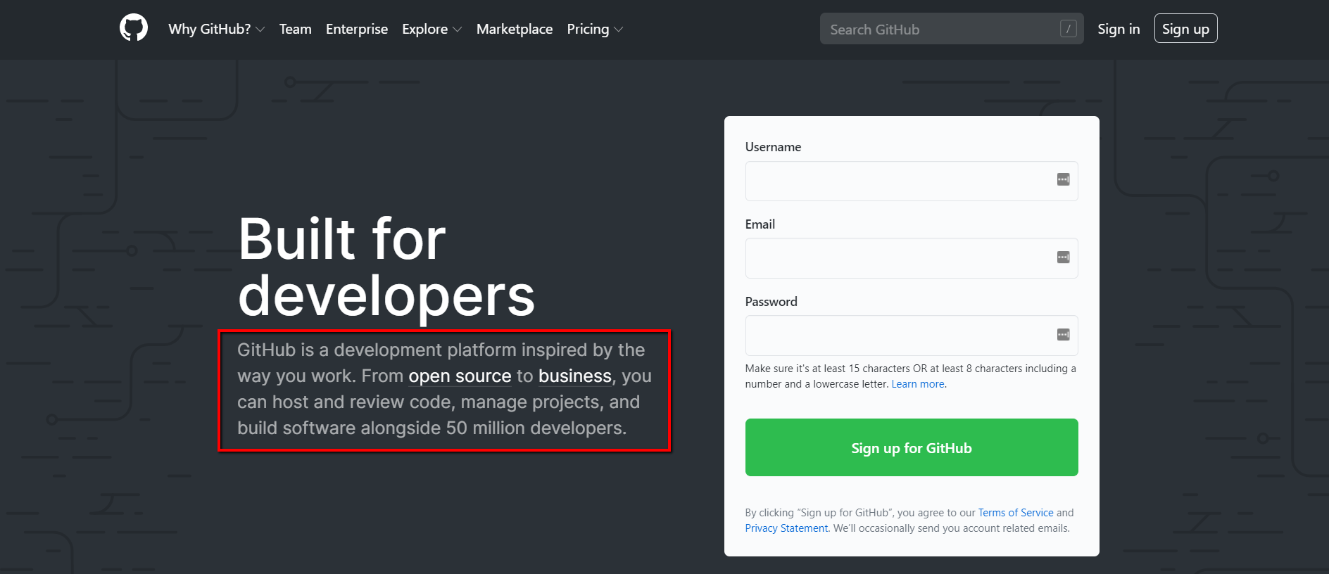
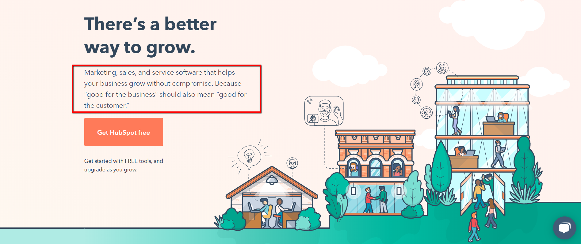
Here are some examples of clear sub-headlines that support the headline’s main idea.
5. Write Clear Text for Your CTA Buttons—Accurately Guide Prospects to the Next Step in Your Funnel (Law of Alignment)
Your CTA buttons’ copy is as important as your sales page copy.
You won’t convert a prospect if your landing page copy is clear and compelling, but then the CTA button copy is not aligned with your offer.
As a matter of fact, research shows that adding a clear call to action to your landing page can cause as much as 250% more visitors to convert.
Your CTA buttons’ text must guide prospects through your funnel.
They are the arrows on the road showing you where to drive your car.
Your CTA buttons’ purpose is to make your site’s visitors do whatever you want them to do.
For instance, if you want them to learn more, add a CTA that says “Learn More.”
If you want your prospects to download your lead magnet, add a CTA that says “Download Your Lead Magnet.”
Don’t expect them to watch a demo video if your CTA button’s text says “book a call.”
Your CTA buttons will boost conversions if they’re aligned with your offer.
Think of the CTA as the answer to your sub-headline.
You’ve proposed something to your audience with your sub-headline. What do you want them to do now?
For our homepage, our CTA buttons are very clear (“Watch the Video” and “See Pricing”).

And after people click on “Watch the Video”, our demo video is displayed so the prospect can watch it…
See the alignment?
The CTA button invites people to watch a video and we show them the video immediately so they can watch it.
It may sound dumb but most marketers actually miss this important point.
6. Put Your Finger on Your Audience’s Problems & Agitate Those Pain Points
Empathize with your readers by mentioning and reminding them of the problems they’re experiencing.
That’s why they’re visiting your website anyway. They’re looking for a solution to their problems.
And you have that solution!
You just need to make your site’s visitors think (and feel), “Hey, that exact same thing has happened to me.”
And you can create this connection with your reader simply by letting them see their problems reflected in your copy and acknowledged by someone else (you).
This’ll make them feel understood and hopeful that someone can help them.
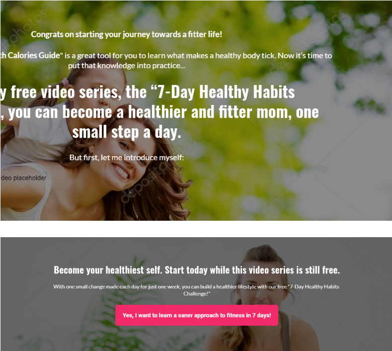
Try starting with a brief story anecdote where you put yourself in your readers’ shoes.
Storytelling can boost conversions and increase your audience’s engagement. We use this technique all the time.
You can even start your landing page optimization process by introducing the problem(s) your readers are struggling with.
See how high-converting websites use this powerful technique?
They all start by twisting the knife a little.
But don’t worry, you’re not being mean here. Your readers will actually thank you for describing their problems as clearly and vividly as possible.
7. Introduce the Solution Your Prospects Need for Solving Their Problems (AKA: Your Product or Service)
It’s time to....:::drum roll:::....introduce your products or service.
Did you introduce your offer to your audience or did you miss this critical step?
At this point, your prospects want to hear what your solution for their problem is.
Here, you’ll go into more detail about what your product is, and what it does.
Clearly state what the solution to their problems is—that thing they’re waiting for to make all their pain points go away.
The more descriptive and unique you can be, the better.
So start by telling people what you want them to do. Use strong verbs and an authoritative voice.
Show them how your product or service will make their lives better.
And if you’re already introducing your products or service in a clear way but still don’t see any conversions. Don’t worry.
Make sure you answer the question “How will this product add value to my readers’ lives”?
Most business owners feel too proud of the product or service they’ve created and see no flaws in it.
And here’s where so many businesses don’t even make a single sale. And even worse, 90% 90% of new startups fail according to Medium.
Because they’re too blind to see that their products or service aren’t really solving a problem for their audience.
For instance, be transparent and don’t try hooking prospects with false promises or with a product that doesn't really add any value to their lives.
8. Explain Your Products or Services’ Irresistible Features & Benefits
People are naturally interested in knowing what benefits they’d get by using your products or services.
So this is a good opportunity for you to list down at least 3 or 5 of the main benefits and features or end results your customer would get by using your product or service.
Some people may just want to cut to the chase on your landing page, skim through it, and only check out your products or service’s benefits and features.
So write for skimmers and use bullet points and numbered lists.
This form of copy will attract attention because structurally and visually they’ll stand out.
Take a look at the examples below…

9. Explain How Your Products or Service Works—Finally Tell the World How in 3 Easy Steps They’ll Use Your Products or Service
Explain to your prospects how easily your product can be used and how simply your service works.
This is your opportunity to clarify those questions to them.
Nail that explanation down in 3 short and easy-to-understand steps.
Don’t write a long sales page on how to use your products or service.
This’ll make your prospects think of it as a complicated product that requires a long instruction book in order to use it.
It’s ok if your products or service requires more steps in their explanation. But in your landing page optimization, make sure you nail the full explanation in 5 steps maximum.
Otherwise your products or service will look too complicated and no one will want to try them.
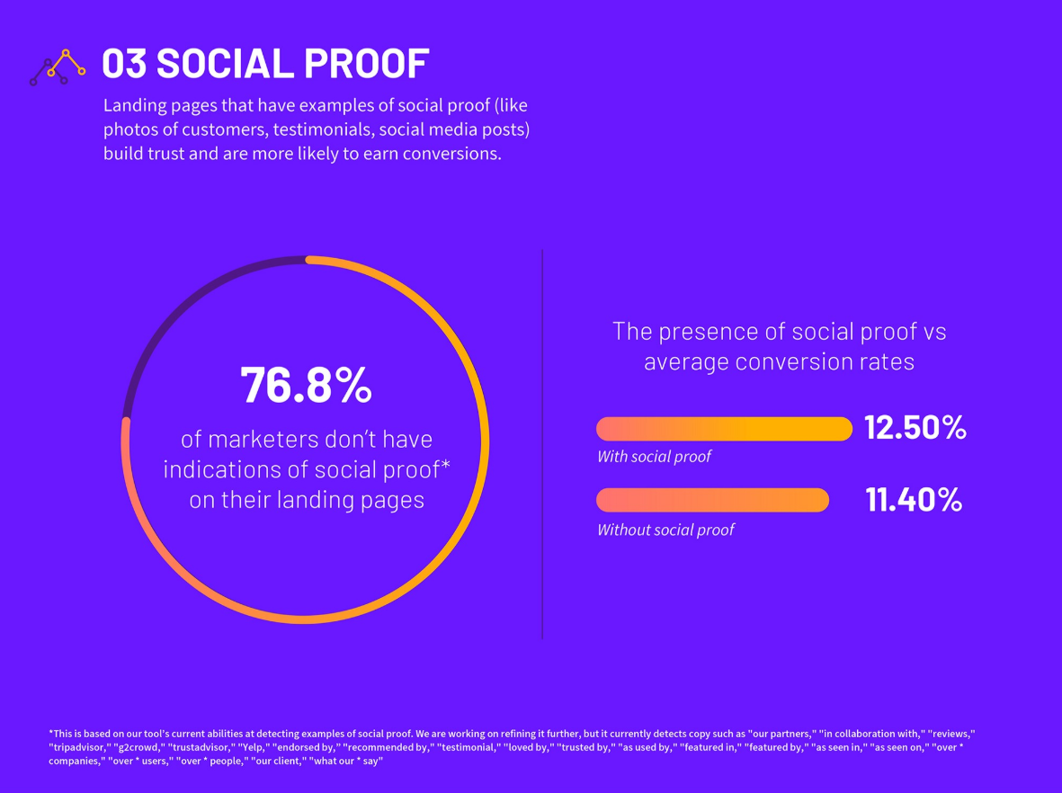
10. Include Social Proof in the Form of Testimonials, Vanity Stats, Reviews, & More to Add Credibility
Adding trust badges to your landing pages can uplift sales conversions by a whopping 32%.
This is because relevant trust badges are an easy way to unlock sales growth.
Adding any form of social proof to your website reassures potential customers and grows sales.
In fact, according to Medium, landing pages that have social proof in the form of copy have an average conversion rate of 12.50%. And landing pages without social proof only convert at 11.40% on average.
A trust badge can be something as simple as a reassuring visual element with some copy like a checkmark + "free shipping".
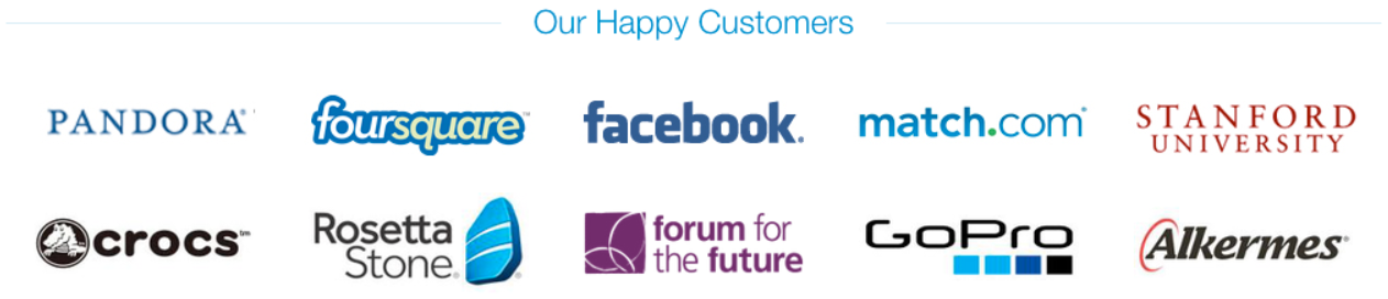
Another example of social proof is logos.

But in some cases, less is more.
And this simple tweak this website made helped them earn a 15.7% conversion rate.
Before…
After…

The reason why less social proof in the example above converted better is that too many customer logos may actually be distracting.
In other words, more logos can actually increase on-page friction.
The additional logos move the page further out of alignment by looking like the site is trying too hard.
So when adding social proof, be sure not to overdo it.
People may perceive it as "trying too hard" or it might just be distracting from the message.
And be sure to increase visibility for testimonials (especially the ones that work to reframe the value and increase urgency) by placing them directly above the CTA too.
Landing Page Optimization for a High-Converting Design—How to Apply It to Your Web Design
After going through your copy and making sure all the landing page optimization principles listed above are followed, it's time to jump into the design phase.
The reason why you should be checking your design second is because design amplifies the copy.
So let’s review which best practices you must follow for your landing page.
11. Make Sure All Design Elements Feel Integrated & Aren’t Randomly Placed
All visual elements on the website must feel integrated.
They shouldn’t be randomly placed.
Graphic/web design amplifies the copy and your whole website.
When the elements from your landing page (text, headlines, logo, images, footer, sub-headlines, etc.) are placed randomly or without care, your website won’t meet its goals (to convert leads into buyers).
The user experience must feel integrated when navigating through your site.
You’ll want to be sure the images aren’t cookie-cutter or seem like they were just “thrown” on the page for instance.
There has to be a connection between your brand, your logo, colors, and the font style and size you choose. Otherwise, your brand ideas won’t be understood.
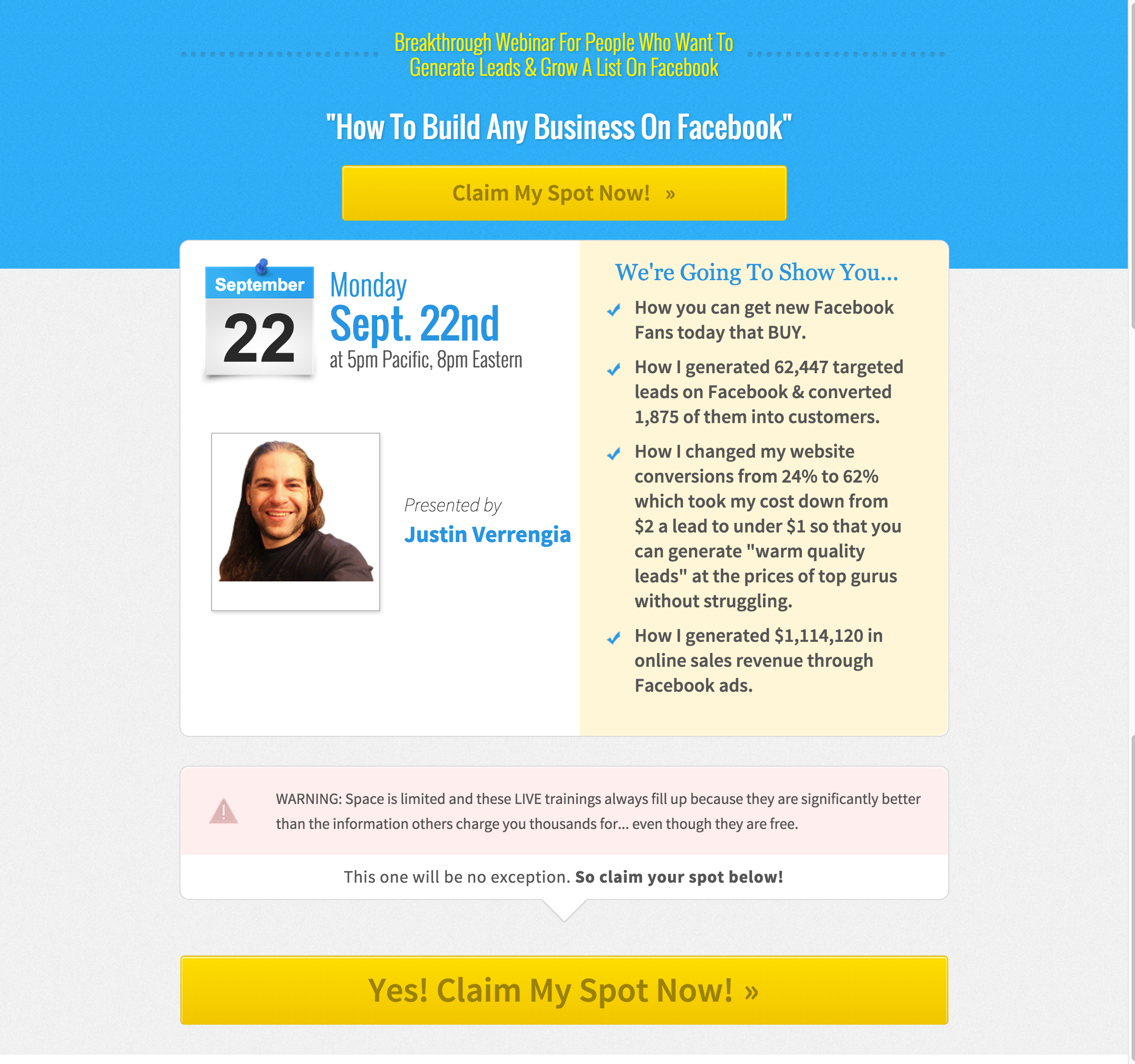
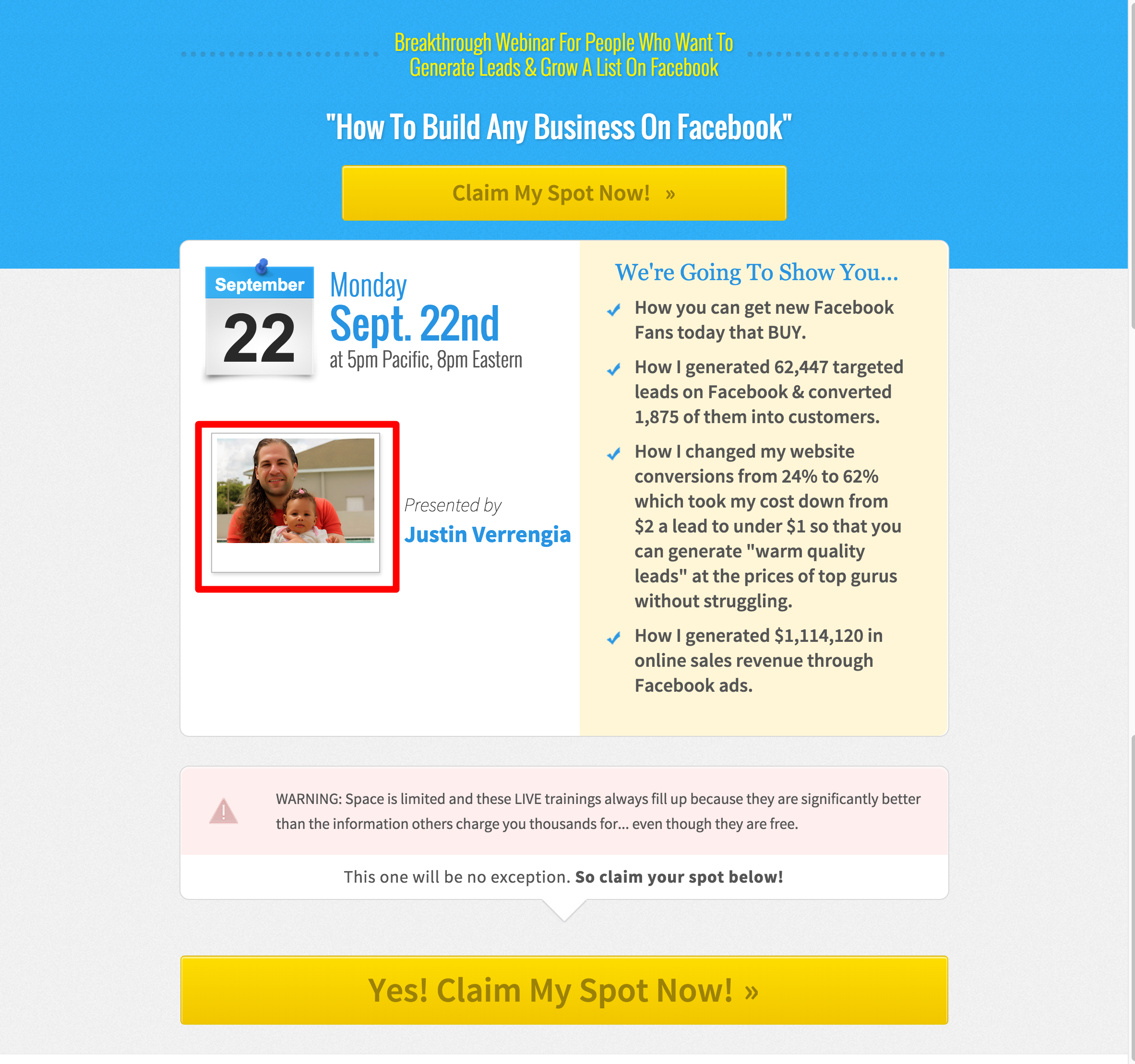
12. Use As Many Real Photos As Possible & Avoid Using Stock Photos
Making sure your brand is perceived as authentic is vital for your conversions.
Even if you do not always have the real photos of the people you feature in your testimonials, or any photo you add in general, you should always try to avoid using stock photos.
People notice it when you add fake pictures where the people look like models.
The idea is to convey as much realness as possible with your site. To make your visitors trust you and to feel empathy for whomever they see in your landing page.
Including human faces into your landing page design is a proven method for upping your conversions.
Take a look at this image, doesn’t it look super fake?

Of course it does look fake because that’s Bradley Cooper, you know, the Hollywood actor.
Your prospects notice that fakeness too.
As a matter of fact, a repeating conversion pattern I’ve found when I created our Proven Sales Conversion Pack was that using an authentic photo instead of a stock photo converted significantly better, to the tune of 20-30%, or more.
Using a more personal photo resulted in an increase in webinar sign-up rates by 66% in the case study below.
Before...
After…
Over time, consumers have become more sophisticated at identifying anything that stands out as an ad or as something fake.
But by adding real images to your landing pages you can gain as much as 34.7% more subscriptions.
13. Keep Your Design Elements Consistent & Symmetric—Watch Out for Unnecessary White Space
There must be consistency and symmetry along with the website. This translates to:
- The font size and font style are consistent. This means all headlines on your landing pages have the same font size and font style, all subheadlines have the same font size and font style, and all body text have the same font size and font style.
- Spacing consistency above and below sections, between text and headlines, between images and text, and between images and sections.
- Consistency with margins along the page.
- Columns are balanced and have the same width and height.
Most designers don’t realize that when they create different landing pages for the same client, they’re still creating pages for the same client.
And that means each page shouldn’t feel completely different from each other. They need to feel integrated.
Keep an eye on your white space too because people tend to not know how to use it correctly.
White space is an element that when used properly, it adds to the quality of your design.
14. Don’t Overlap the Text With People’s Faces on the Images
Your hero section is one of the most important sections of your landing pages because it’s where prospects first land on your page.
It’s the very first impression they get from your website.
A poorly designed hero section can make your prospects leave immediately without even knowing what your core offer is.
To avoid this, the text in your hero section (headline and subheadline) must not overlap people’s faces in the background image like in the example below…
It’s much more enjoyable to look at people’s faces clearly, isn’t it?
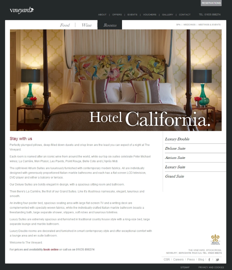
15. Keep Your Primary CTA Button Is Above the Fold
If you bury your CTA on the page, you’re likely to lose sales because you’re making it more difficult for your site’s visitors to buy.
When visitors are either returning to your website or already familiar with your offer, they’re expecting to see the button they need to click right there in front of them.
They’re not expecting to scroll down to find the button.
As a matter of fact, a simple CTA button placed above the fold increased conversion rates by 31.12% to this website.
Before…
After…
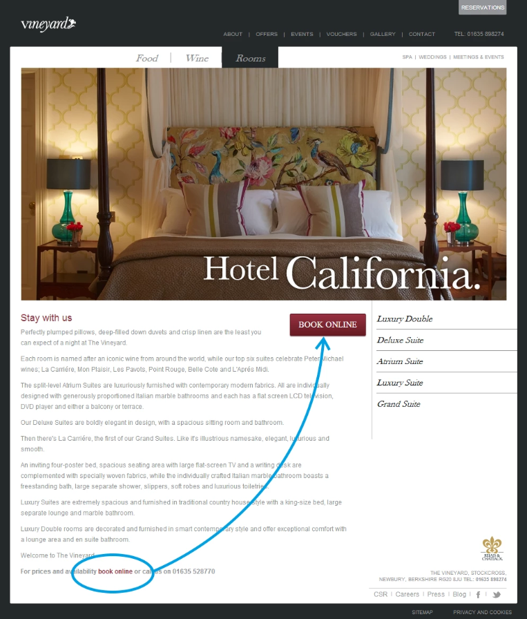
And they not only displayed the button above the fold, but they actually turned the text link that was buried at the bottom of the page into a noticeable button.
Your CTA simply must be visible in the hero section. Prospects shouldn’t scroll down to look for it.
And this validates one of the 11 Laws of Sales Funnel Physics—the Law of Visibility.
This law says that people will convert on offers that are highly visible and noticeable to them. If they don’t see it, they won’t convert.
If people see your CTA button, they’re more likely to click it and buy as well.
So, increase visibility in terms of placement of the CTA button and use a more noticeable color to create irresistible CTAs. This will lead to more clicks to checkout.
16. Make Sure Your Logo Has Good Readability & Contrast
Your logo is the strongest symbol of your brand.
It builds brand recognition and it helps your target market recognize you wherever you are displayed on the web.
In order to give your logo maximum legibility and exposure, you must use a high-contrasting background color to make it stand out.
Add some areas of clearance around the logo to give prominence.
And don’t forget to keep the logo high-res.
Do you notice in the example below how pixelated the logo is?

Not good at all...
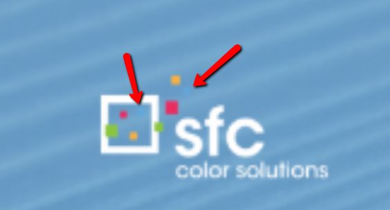
And by the way, did you notice that the logo actually has some small blue squares?
Of course you didn’t notice because it was placed on a blue background.
Those are the exact types of errors you must avoid on your website and make sure you fix in your landing page optimization process to increase conversions.
17. Be Sure Your Text Has Good Readability & Contrast
So, what’s the point of writing awesome copy if when it’s added to the landing page it doesn’t have good readability?
Take the example below.
It’s completely hard to read.
It’s text-heavy, the font size is too small, text color doesn’t contrast, and there isn’t enough spacing between lines and paragraphs.
All headlines, subheadlines, CTA button text, and body text in your landing pages must have good readability.
Letters should have enough space between them and there should be enough space between lines too.
Also, don’t forget to use a background color that contrasts with the text.
Don’t make your prospects work.
Make the reading experience for them as smooth as possible.
And as a matter of fact, contrasting colors in your landing page can make people purchase 57% more, and using high-contrasting color on a landing page can translate to a 10.66% increase in sign-ups.
And that’s what happened to the website below…
This means that the colors you use for text and/or your background can provide an incremental (or better) increase in conversions.
The text has a better contrast against a white background and makes the reading experience easier. More comfort and a better experience mean less friction in deciding to sign up for your trial or not.
18. Use Bright & High-Contrasting CTA Buttons That Stand Out—Avoid Using Passive Colors
Don’t spend countless hours crafting the perfect button color for your CTA buttons. It doesn’t matter too much, it just needs to contrast with the background.
And this is one point where marketers and business owners tend to lose conversions.
Your CTA buttons are meant to be clicked. They’re not decorative elements in your website.
They have a purpose. They’re the elements that will take your prospects to your checkout page.
For instance, don’t make them look just nice.
Make them stand out.
See the difference below?

Which one looks more clickable?
Highlighting your text links with color or by simply turning them into buttons is always a safe bet to get more people to a key landing page.
And it’s a great great landing page optimization best practice (that’s why it’s included in this article =)).
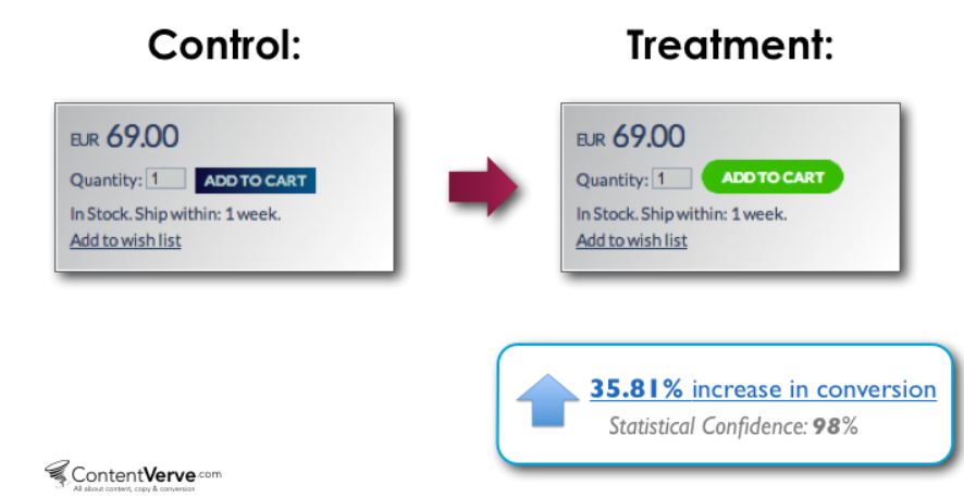
Take this website as an example.
Changing just the color of the CTA button translated to a 35.81% increase sales...
For your CTA buttons, use a noticeable color.
Red, green, orange—these often work well.
But it's not about any single color.
If you have a website with a "green-ish" theme and a green button, green won't work so well because it’ll blend in with the rest of the site.
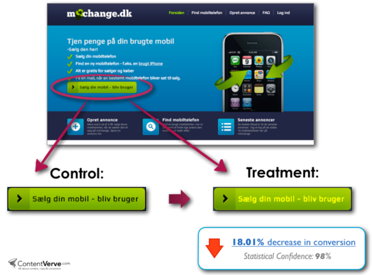
Also, use a contrasting color for the text in the button too.
Because tweaking the font color of the CTA buttons on the example below resulted in an 18.01% decrease in click-through rates.
Landing Page Optimization for Quality Assurance—How to QA Your Website to Avoid Zero Multipliers
Enough with copy and design.
Now it’s time for a critical part of your landing page optimization that most marketers neglect.
Did you know that you can actually boost conversions with quality assurance?
This is an overlooked part of your conversion rates and I’ll show you which are the most important areas to look for.
19. Make Sure All CTA Buttons in Your Landing Page Work
Ensuring all your CTA buttons work is a fundamental step in a well-constructed funnel.
Why?
Because with misdirected CTAs, you are essentially preventing your leads from buying your product or service.
So if you’re seeing lack of sales or zero leads coming into your key pages, test absolutely all your CTA buttons.
For just one missed CTA could really hurt your conversions.
At AutoGrow, we actually triple check all of our clients’ landing pages for errors like this and always make sure their funnels’ stages move prospects along in the right direction.
20. Check That All Opt-in Forms Work & Redirect to the Right Pages
Similar to testing your CTA buttons, test your opt-in forms.
This is a common place where websites leak leads.
People don’t realize that their forms aren’t working because they don’t check.
And who’s really going to take time to email the website and tell them “Hey, your opt-in form doesn’t work.”
Those prospects will more likely simply leave your site.
You’ll also want to make sure your email automation is properly set up and that the prospect filling out the form will be redirected to the next step of your funnel and receive your email follow-up sequence.
21. Ensure All Buttons Redirect to the Right Pages—Does the Funnel Flow Make Sense?
Ok, so you won’t believe how many times I’ve seen websites leaking money in places that are completely preventable.
Last week, a customer bought one of our info products.
She reached out to me with a question.
And when I took a look at her website, I found so many areas that were more likely making her leak money and leads.
She’s selling an info product for $37.
But the landing page was too long and too complex for an info product sales page.
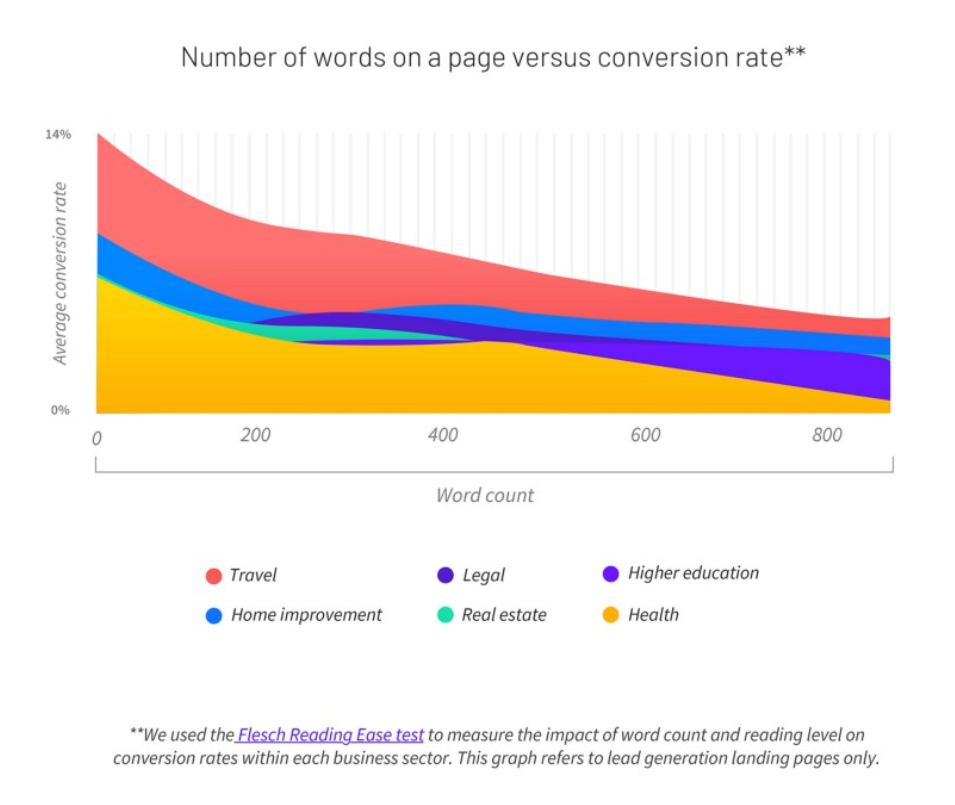
In fact, according to Medium, 29.5% of landing pages have too much copy and an average conversion rate of 11.10%.
And landing pages that are word-count-cautious convert on average at 14.30%.
And not to mention the quality of the graphics was very poor. And a bad use of colors (she’s using red and yellow which are colors that conflict).
And all that, of course, hurts trust because the page being that long makes it look like she’s trying too hard to sell the product.
Plus there was too much friction on the homepage.
It was too complicated to land on her info product sales page.
So anyway, when it comes to your landing page optimization, you must ensure that all CTA buttons redirect to the right pages.
Those pages must follow the flow of your funnel.
If for example you’re selling high-ticket products or services, then your funnel would look like something like this…

So you must ensure that each page redirects your prospects to the right pages so your potential customers’ journey through your site makes sense.
22. Make Sure All Landing Pages Are Mobile Optimized—Most People Check Your Website from Their Phones
Is your website mobile friendly?
This could be a major area where you’re losing potential customers.
In fact, according to Statista, in 2021, 53.9% of all retail e-commerce is expected to be generated via m-commerce.
This means, having your website working perfectly for mobile is mandatory.
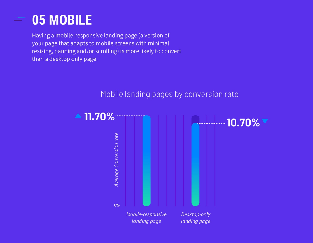
According to Medium, landing pages that have a mobile page have an average conversion rate of 11.70%. And the ones that don’t have a mobile page convert on average at 10.70%.
Always be sure you check from a phone, tablet, and desktop to make sure all elements in your landing pages are displayed correctly.
See how in the example below, that website was not mobile optimized?
This easily makes people leave your site and even worse, makes them not come back ever again.
23. Check That Sections Aren’t Duplicated
Make sure your landing pages’ copy flows and that there aren’t any duplicated sections.
If your prospects visit your site on mobile and come across a section like this, they’ll likely think you’re not a serious or professional business.

I could have listed this point under the design section, but in my experience, most designers are more careless and don’t catch these types of errors.
That’s why we always make sure this point is covered in our thorough quality assurance process.
BONUS 24: Do a User Test—Have Your Family & Friends Test Your Landing Page(s)
So at this point you know all the best practices for increasing conversions on your landing pages.
But my gift to you is this bonus principle.
This is an effective and proven-to-convert best practice that only requires you to ask a favor to a friend or family member.
Ask them to visit your website and navigate through all of your landing pages.
This simple action will give you important feedback on how the user experience is like for someone visiting your website.
Because, no one’s more honest than a family member or friend to give you feedback or constructive criticism, right?
Ask them what navigating through your site is like.
- Is the navigating process complicated?
- Is it easy to understand the end goal of your page?
- Is the copy clear?
- Is your offer valuable?
All this will let you determine areas of improvement and have them fixed so a prospective customer visiting your site will end up hitting the buy button instead of the exit button.
Conclusion
There you go.
These are the 23 overlooked areas you must ensure to optimize to boost conversions…
For copywriting:
1. Speak With Emotion & Directly to Your Audience… Or Risk Attracting the Wrong Audience
2. Write a Crystal Clear Headline—Are You Being Clear Instead of Clever?
3. Headlines Shouldn’t Be Too Long nor Too Short—Find the Right Length
4. Write a Sub-headline That Supports Your Headline & Gives Your Readers More Clarity
5. Write Clear Text for Your CTA Buttons—Accurately Guide Prospects to the Next Step in Your Funnel (Law of Alignment)
6. Put Your Finger on Your Audience’s Problems & Agitate Those Pain Points
7. Introduce the Solution Your Prospects Need for Solving Their Problems (AKA: Your Product or Service)
8. Explain Your Products or Services’ Irresistible Features & Benefits
9. Explain How Your Products or Service Works—Finally Tell the World How in 3 Easy Steps They’ll Use Your Products or Service
10. Include Social Proof in the Form of Testimonials, Vanity Stats, Reviews, & More to Add Credibility
For design:
11. Make Sure All Design Elements Feel Integrated & Aren’t Randomly Placed
12. Use As Many Real Photos As Possible & Avoid Using Stock Photos
13. Keep Your Design Elements Consistent & Symmetric—Watch Out for Unnecessary White Spaces
14. Don’t Overlap the Text With People’s Faces on the Images
15. Primary CTA Button Is Above the Fold
16. Your Logo Has Good Readability & Contrast
17. Text Has Good Readability & Contrast
18. Use Bright & High-Contrasting CTA Buttons That Stand Out—Avoid Using Passive Colors
For quality assurance:
19. Make Sure All CTA Buttons in Your Landing Page Work
20. Check That All Opt-in Forms Work & Redirect to the Right Pages
21.Ensure All Buttons Redirect to the Right Pages—Does the Funnel Flow Make Sense?
22. Make Sure All Landing Pages Are Mobile Optimized—Most People Check Your Website from Their Phones
23. Check That Sections Aren’t Duplicated
BONUS 24: Do a User Test—Have Your Family & Friends Test Your Landing Page(s)
If you’re looking to optimize your copy, all it takes is going to your landing page builder and fixing it directly in there.
If you’re looking to optimize design elements on your landing page, you may or may not need a designer to give you a hand with that.
And if you’re looking to QA your landing page, you can simply do it yourself or ask a friend to do a user test.
But of course, if you don’t want to do anything by yourself, AutoGrow can take care of all of your digital marketing tasks.
We can do all of your landing page optimization process for you from start to end so you can increase conversions while watching us do the hard work.
Now tell me something, have you tried optimizing your landing pages to knock out a high-converting copy?
Have you tried any of the principles listed above in terms of QAing your own website?
Which ones have helped you up your conversions?
Let me know in the comments below.
Keep AutoGrowin’, stay focused,


