
53-Point Free CRO Checklist: Increase Your Conversions Fast
When I started AutoGrow back in 2010, I didn’t know what to expect.
But I knew one thing:
I wanted our service to sell.
Now, in the last 3 months, we’ve grown fast.
And that growth has been possible, in part, to Conversion Rate Optimization (CRO).
You see, CRO is the changes you make to your website or landing page(s) to persuade more people to buy (but in a cool way. Not in a “BUY IT, BUY IT NOW!!” kinda way ).
Sounds like something you want, yes?
Yet, you think about what truly matters:
“Is my business really going to make more money from selling this?”
And if you don’t say that, you just say “Forget it…” and move on to the next priority because your time is too valuable.
That’s why I put together today’s article and checklist. To give you a shortcut to achieving “hockey stick” lead conversion growth jumps.
Here’s what you’ll get in today’s resource:
- A 53-point proven CRO checklist backed from a curated collection of 313 AB tested conversion rate case studies.
- What areas of your website you should prioritize optimizing for faster results.
- My in-depth thoughts on how to apply this checklist for best results when selling services vs. selling products.
- Plus, you get to download our CRO checklist fa’ free.
Trust me, if it has worked for us and our clients, it will work for you too. But first…

First, You Need To Set a Conversion Goal
Your conversion goal will decide what you should focus on. In other words: Your conversion goal is the most important action you want your audience to take.
For instance, you can focus on:
- Getting more people to buy
- Getting more people to click on your checkout page
- Getting more people to fill out your lead generation form
- Increasing the quality of your leads
- Growing your email list
Ideally, you should choose one. You can’t focus on multiple goals at the same time. Otherwise, that is like trying to run in two or more directions at once.

Have you ever tried that? It’s hard, you know… Not that I tried it…
Last Sunday around 3 p.m. …
ANYWAY! I digress!
One thing is for sure:
CRO that grows your revenue doesn’t have to take a lot of time or require you to have millions of visitors (although that certainly doesn’t hurt)…
Here’s How To Do CRO Fast (Even if You’re a Startup Without a Ton of Traffic)
Most CRO companies are paid $10,000+ for their expertise.
That’s because their work is very custom and the results are tied closely to a company’s bottom line. Thus they can command a higher price for such a service.
Thanks to my research on the Sales Conversion Pack, I found something interesting.
All these companies were getting results the same way. I’ll explain…
You see, they were guided to grow conversions based on ideas that didn’t come from them (98% of the time). Instead, the ideas came from people who used their clients’ websites.
This data source is common across hundreds of case studies for all observed changes.
These are easy for you to put in place (and even automate! Just let them run inside your sales funnel/on your site and review them once a month!).
Here’s what they are:
- Email Surveys: Set up a free account on CognitoForms.com. Create a 3 question form to ask people what they think of your content and offers. Ask what problem they want to solve, and what’s holding them back from buying. You might want to consider a survey funnel which can boost sales, engagement, and give you actionable data.

- On-Site Surveys: Use on-site surveys to collect data from non-members of your audience. Discover why they leave without subscribing or buying, and improve their interest retention. RightMessage is a tool we use for this. (By the way, I recently interviewed the founder of Right Message about marketing personalization. Join our email list if you want to hear about it .

- 1-on-1 Video / Phone Interviews: Back in 2016, I consulted a B2C company targeting photographers. I helped increase conversion rates by 600%. My approach: interviewing survey respondents and asking what their connection to photography was. These personal, relatable stories efficiently boosted conversion rates.
- Post-Purchase Follow-Up: Use a simple landing page and/or email follow-up campaign. It should be linked to a variety of conversion-related benefits. Ask how you’re doing and how you can improve. Gather testimonials as proof. Ask what they liked the least or what “tipped” their decision to buy—and what made them almost not buy.
- Layout Your Funnel: Visualizing your funnel helps understand buyers as they become customers. For instance, I used Google Drawings to help me create our product, the Funnel Diagram Pack.

- Discovering Pages with a Bounce Rate: Easily discoverable on your Google Analytics dashboard. A high bounce rate could suggest problems with:
- Copy
- Page Design,
- Or the offer you're presenting.
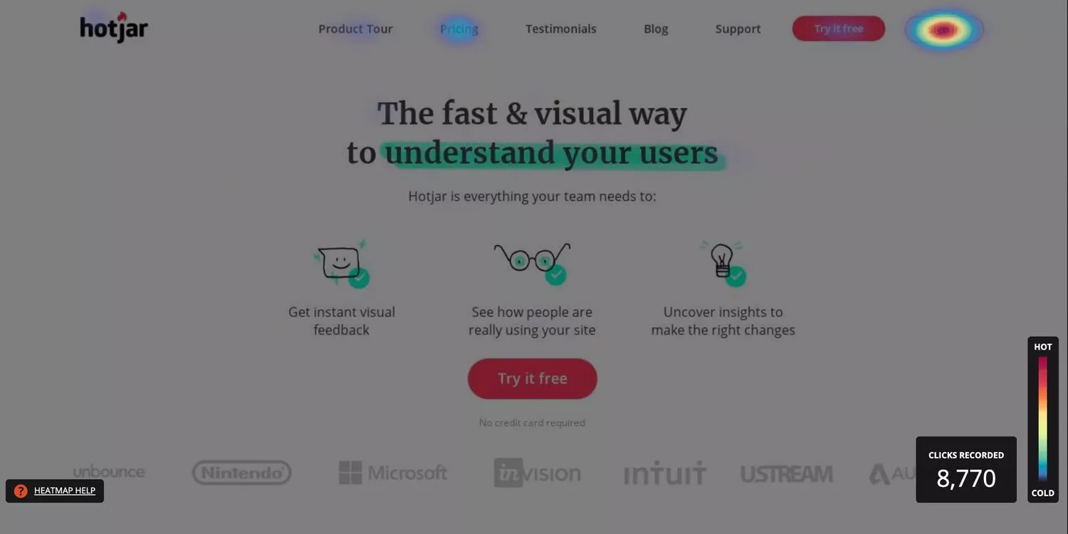
- Heatmap / Scrollmap Tracking: CrazyEgg, Hotjar and Mouseflow offer a solution for tracking user activity. Understanding where people “look” on your web pages and how far down they scroll.
- User Session Recording: Works similarly to observing someone in a live user test. You can watch individual people's interactions on your website through video recordings. Mouseflow provides an excellent tool for this purpose.

- User Testing (Written, Grouped): See what groups of people have to say about your site. Do they trust it? Do they love it? UserInput.io offers a solid solution for doing this.

- User Testing (F&F): User tests live, one-on-one. Rely on friends/family members as they can give you honest (and useful) feedback.
- User Testing (Video): Short videos give you a perspective on how people view what you’re selling. People talking as they walk through your website, for instance. I recommend UserBob.com and UserInput.io for this.

Now we understand some of the data-collecting tools. It's still useful to point out what areas of your site you SHOULD focus on. Of course, based on my 150+ hour study of 313 AB-test conversion case studies.
These will give you your best “biggest bang for your buck” as they say.
If you’ve liked the article so far, you should subscribe to our newsletter!
What Areas of Your Site SHOULD You Focus on Optimizing First?
As I was creating the Proven Sales Conversion Pack, I noticed something. There were several patterns through 300 conversion case studies.
These patterns helped me identify “high points of leverage”. Small, simple things that can dramatically grow your conversion rate.
Modifying these areas can quickly boost your conversions.
(To learn more about insights like these and other conversion patterns, read my article)
Here are the areas of your site to focus on optimizing:
- Image choice
- CTA Buttons
- The text/area immediately above or below your CTA buttons
- Pricing presentation
- Navigation area
- Headlines/value proposition
- Limits on opportunity
- Design layout/arrangement
- Forms/form fields
- Checkout page
- Size of value proposition or benefit elements/text size
- Pop-ups
Now that you know about the basics…
- Why setting a specific conversion goal is key.
- How to quickly gather actionable data.
- And which areas of your site give you the best ROI.
It's time for the checklist.
Remember: this checklist is based on hard data.
I didn’t just “pop” a wet finger into the air to see which way the wind was blowing. (Conversion wind? What… No worries, just go with it!)
No. This comes from my 17+ years of hands-on experience. AND an extensive review of 313 AB-tested, conversion case studies across dozens of markets.
From that, I’m giving you a single checklist to grow your conversions with proven strategies.
We organized this checklist according to the 11 Laws of Sales Funnel Physics. These are the timeliness conversion principles I mentioned earlier.
I’ll be publishing a complete ebook on the topic of “Sales Funnel Physics” soon.
In the meantime, go to Conversion Insight #4 on this article if you need more info on what this is and why it is a “real thing”, not just theory.
Now, let’s increase your conversion rate…
The 53-Point CRO Checklist You Need To Increase Your Sales Funnel’s Conversion Rate
1 – Law of Confidence (People want what they see to be popular or trustworthy)
- Include press logos.
- Add testimonials.

- Add 3rd party accreditations, awards, honors, and memberships to your website. Displaying these will boost credibility.
- Consider using trust badges. These often (but not always) are 3rd party security seals, like McAfee or Norton. It’s also possible to make your own social proof, but that’s an advanced topic for another day.
- Include 3rd party research stats and data to support your stated value proposition.
- Advertise your social media follower count.
- Use other vanity stats.
- Use authentic images of you and your team to avoid a “commercial” vibe and overused stock photos. Here’s how one company grew its lead generation rate by 34%. All by using authentic images of their founder on the homepage. This example is one of the hundreds in my Conversion Pack):

2 – Law of Visibility (If it isn’t seen, it won’t sell)
- Maximize visibility. Make website visitors aware of what you sell via:
- - Navigation links
- - CTA buttons
- - Pop-ups
- - And in-line CTAs or sidebar widgets.
- Pay special attention to your headlines and bullet points. They are read more than other texts on your page.

- Include a big, beautiful CTA button.
- The primary call to action should never be out of sight. The very action you want people to take on a page should always stay within view. It should also “follow” the visitor as they explore the site. It shouldn’t block the reading of key content. Again, the principle here is increasing the visibility of key elements.
3 – Law of Repetition (“Say it again, because I may change my mind.”)
- For email list building, consistently request opt-ins using the same incentive (lead magnet). Vary the wording to make different appeals.
- Use an autoresponder to target people who visit your landing page.
- Use retargeting ads to bring back leads and customers who left before converting.
- Repeat your primary CTA more than once. Here’s a before and after example from my Sales Conversion Pack which grew leads for this company by 80%:

4 – Law of Clarity (Be clear, not clever, to convey understanding through text and design)
- Perform a user test to check if people understand what you’re selling. Don’t guide them. Instead, listen and take notes.
- Keep your words simple so people know what you’re offering.
- Say that it’s free.
- Clearly explain or hint at what you’re giving them in the copy.
- Add a “How It Works” section for additional clarity.
- Visual clarity is as powerful as copy clarity. Use images to clarify how the product or service works. We process images much faster than words. Here’s proof of the power of visual clarity from another Conversion Pack case study. In this case, it grew free trial downloads for the business by 85%:

5 – Law of Maximization (Everyone wants maximum value)
- Use word choices that convey an immediate benefit. Avoid neutral or delayed benefits (e.g. “watch” is better than “request”).
- Talk about benefits. Explain why it’s valuable.
- State your USP.
- Price anchor. Make your product or service seem cheap by comparing it to something more expensive. For example, “You COULD get a tutor for your child to help him or her read better at $50-$100 per session. Or you could spend $99 one time on our 12-week reading software”.
- Offer an incentive to buy now (discount, value add-on, etc.).
- Survey your customers to understand why they made a purchase. Highlight the top benefits prominently in your copy and design. This company from my Conversion Pack boosted sales by 64%, for instance. All by using surveys to shape their redesign.

6 – The Law of Alignment (How well your site aligns with customer preferences)
- Consider the context carefully. Ensure that it's to the point, not only in terms of wording but also where it's featured on your site and its target. Everything should be in sync and aligned.
- Make an explanation video. A significant portion of your audience will prefer video, while others prefer to read.
- Tell a story, either in your video or somewhere in your funnel/landing page. Stories are memorable and relatable. Several case studies show storytelling work to increase conversions.
- Match customer vocabulary. Mimic the language used by your customers. Use it to tackle their problems and why your service is valuable.
- Make headlines match with the ad links or CTA button text. This is an example of “explicit” alignment. You should fulfill the expectations you set. If your CTA button text says “Add to Cart” but then a customer is taken to checkout, it’s an example of misalignment. Fixing it, like the below AB tested case study from my Conversion Pack, can grow your leads by 38% or more:

7 – The Law of Emotion (We buy for reasons unrelated to a value, like a desire for status, kindness, or guilt)
- Use emotions. Test an aspirational approach via word choice in your copy and/or images.

- Start your sales by defining and “agitating” a problem. Your audience should believe you understand their problems. If you do it, they will be more likely to believe you have the best solution to solve them.
To learn more about the Law of Emotion and how to apply it, check out our 11 Laws guide.
8 – The Law of Range (Different prices or offers means more sales)
- More lead magnet offers = more subscribers. Multiple lead magnets make it more likely for visitors to convert.
- Provide 2 to 3 pricing options.
- Frame the value of your product or service in different ways. This will help you target different segments of your audience. For example, this dating website was able to increase its conversion rate by 304%. All it did was reframing its value proposition. for a specific segment of its audience:

9 – The Law of Loss (People act more on potential losses than on potential gains)
- Email List Building—Address people’s underlying fears.
- Email List Building—Add a “100% privacy guaranteed” policy line (but do NOT mention the word “spam”).

- Lower commitment lead magnets often convert better (e.g. ebooks vs. checklists).
- Include an FAQ section. It should have the top 4-8 most common questions customers have. To learn more about how to create an FAQ that increases your sales, read this article.
- Scarcity. Limit the quantity of your product or service available. You want people to buy now, so take initiative and control the supply of your product or service.

- Immediacy. Again, give people a reason to purchase NOW and not later by making a timed offer.
- 30-Day Money-Back Guarantee. This is a standard technique because it works well. You can even sweeten the guarantee to make it 60 days. “And we’ll come to your house and make you some fresh squeezed lemonade if it doesn’t work out.” It can be a little ridiculous and over the top, too, as long as it aligns with your brand’s identity.
- Lead Generation—Add a free trial option to your sales funnel. For example, my company, AutoGrow.co, is a happy customer of SamCart. Initially, for their SaaS product, they offered a 30-day money-back guarantee. I decided not to sign up at that time but they emailed me with an offer for a two-month free trial. Today, we happily pay them about $1200 a year. Free trials work because they widen your funnel and reduce the perception of risk. It allows customers to try before they buy. Consider adding a free trial as a down-sell to whatever it is you’re offering.
10 – The Law of Friction (Difficulties or distractions hold customers back)
- Remove navigation and footer links that take people out of your funnel.
- Have one primary CTA on a key landing page, not three.

- Minimize distracting copy or design elements.
- Limit form fields to as few as possible.
- Use heatmap and video-based user-testing data.
- E-commerce/Digital Products—Buying from you should be done in one simple step. If it is done it multiple steps, break it down into singular step-based decisions. Show customers their progress as they move to complete their orders.
- Delete clutter to limit distractions that hurt conversions. Here is what this might look like in a before and after case study example from our Sales Conversion Pack:

The 11th Law of Sales Funnel Physics is The Law of Scale. To grow traffic and leverage whatever has distribution or traffic.
It’s not applicable to our discussion on how to increase your conversion rate. It deals more with traffic generation, a topic for another day…
Want a treasure chest of AB-tested ideas that will inspire you and make it easy to copy and paste the success of others onto your website?
Then check out my newest product, Proven Sales Conversion Pack.
Quick Thoughts on Converting More Product Sales vs. Services Lead Gen
- For Services—You can control the quality of your leads. This is done via the number and type of questions you require people to answer on your lead generation/contact form.
- As such, more form fields increase friction but might also increase lead quality.
- For Product Sales—I’ve heard of a “conversion best practice” for selling digital products. To ask for more info than necessary, like a mailing address. The theory is that “people trust a checkout page more if it is not only asking for email and credit card number.” In my research, I have not seen any published data to support this idea, nor have my own AB tests confirmed this. It may be market-dependent (i.e. older consumers trust less online stores in general). But it may also be a comfort preference that will go away. AB test it on your site to know for sure.
- For Services—An alternative to increase lead quality/conversions is to add a step to your funnel. It sounds counter-intuitive at first, but it works in some cases. Something like requiring leads to watch a demo video before they are shown the option to jump on a phone.
- For Product Sales—Most buying processes are often done online. Keep this in mind. It will help you better empathize with potential customers and grow your conversions.
Conclusion & the Question: Should You Apply EVERYTHING in the Conversion Checklist?
You know the basics:
- Set a specific conversion goal.
- How to quickly gather actionable data.
- And which areas of your site give you the best ROI.
Now you have a complete conversion rate optimization (CRO) checklist that shows you how to quickly grow your conversion rates.
The idea isn’t for you to necessarily cram EVERYTHING on the checklist into a single landing page.
It has to flow and make sense from the customer’s point of view.
If you can achieve that, then including 53 out of 53 points from the checklist on your website will make sense.
So, which point on the checklist did you find most surprising? Do any “light bulbs” go off as you read it?
Is there anything you can think of to add to the checklist that I may have overlooked?
Let me know in the comments below.
Keep AutoGrowin’, stay focused.

Image Credits:
- https://www.scuba.io/tech-library/what-is-funnel-analysis
- https://rightmessage.com/
- https://www.shopify.com/au/blog/post-sales-emails-turn-buyers-into-fans
- https://www.hotjar.com/


