
How to Optimize Your Contact Page For Better Conversion

Just picture this:
You come to a website. You read their blog, visit their landing page, and even check what they say in "About us" section. Hmm, it's interesting. Why not say hi, get to know them better, or even buy from them?
It's a go!
You click "Contact Us" and...
Hrmph... It's definitely not what you expected.
"They want me to fill in this boring form? Really? To give them my phone number and mailing address? Yeah, dream on! And how the heck do I know who will read my message? Sorry, guys, not today."
Isn’t it the worst nightmare of most marketers?
Spending hours on thinking of strategies that would engage users and convert them into leads, we concentrate on landing pages and super-duper content creation/promotion. A contact page is often an afterthought: just slap a standard form there or, if worst comes to worst, give them a general email address a la support@ or info@ — and you're all set, right?
Wrong.
Conversation is what drives business. In today era of AI and massive automatization, people crave human-to-human contacts more than ever. We want to see real people behind brands, so we pay much attention to how they build communication with potential customers. With that in mind, marketers need to consider contact pages a core component of conversion and sales.
It builds awareness and trust, invites people to join your community and become your friends, demonstrates you are open to conversation and ready to help. A beautiful and engaging contact page gives rise to your long-term relationship with potential customers.
Think of it as of one more landing page at your business website, optimize it accordingly — and it will convert like crazy.
How to do that?
1. Make It Personal
What's the first thought that crosses your mind when you see the contact page with nothing but such a form?
Mine:
"Damn! Don't they have an email? No one cares of contact forms like this one, so it seems I'll never hear back from them. Okay, I've got it: it's a fake! They don't want anyone to find them."
When I come through such pages, I feel sad and somehow untrustworthy. Am I so bad that I don't even deserve a real email address?
I want to do business with people, not websites. I want them to talk to me as I am a real person. And I am sure your potential customers want the same when clicking "Contact Us." So introduce them to your contact page and make them feel invited; humanize your brand and talk to visitors like they are your friends.
For that:
Stand Out
Don't be afraid of getting creative. Most businesses see nothing wrong with slapping standard templates throughout a website, but what's the point if they look like thousands of others online?
Cliche forms and phrases will hardly impress visitors and invite them to contact you. Think of power words, creative hooks, relevant CTA, and appealing design for your contact page to showcase a personality behind your brand, communicate its message, and, at the same time, help people reach you.
As Legwork Studios did:

Set Expectations
Let them know how long it will take to get a reply from you.
Get thousands of emails per day? Not going to write back to certain types of messages? Be honest, and people will understand and trust you.
A palmary example of a creative contact page with clearly set expectations is that from Quick Sprout. Many writers tell about it when crafting content on contact page optimization, because Neil Patel and the team... well, nailed it by all means: infographic-designed, it's eye-catching, informative, and yet personal and inviting to get in touch.
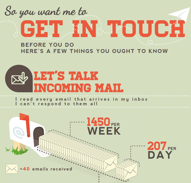
And yet, Neil is also rumored to scare customers away with such a straightforwardness. Looking for "Contact Us" examples to share in this article, I came across several comments from users who called the above page from Quick Sprout unfriendly, discouraging, and time-consuming to read.
Lesson learned?
There is a fine line between arrogance and self-confidence. Try not to cross it when set limits and expectations for users to contact you.
Answer Their Questions
Depending on the nature of your business, a contact page may show appropriate FAQs and support options to guide visitors and help them find the right person to contact or solve their problem right away. But don't turn this page into your Help Center: several direct links answering the most popular questions will be enough.
JetBlue did it right:
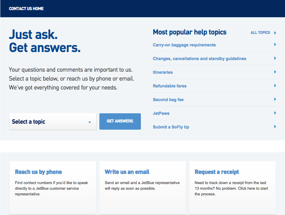
Also, provide people with several contact options: emails, social media accounts, live chats. Think of what information customers expect from you — and give it to them.
Show People Behind Your Brand
According to the research, our brains are tuned to recognize faces. So, add photos of yourself or your team to the page for visitors to see real people behind the brand and understand whom they will talk to — and they will more likely contact you.
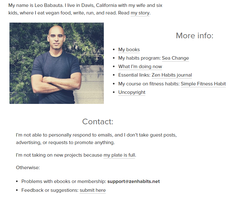
Case in point:
The contact page of Zen Habits is filled with links to introduce the resource to people and help them learn more about the creator, Leo Babauta. And yet, it's pleasing to the eye, with set expectations, calls to action, and Leo's photo that makes the page look human and more personal.
2. Consider UX Design And Writing
To make a contact page convert, remember about human psychology and behavioral patterns when choosing a design for your contact form. First and foremost, you need to understand the reasons why most people don't want to fill in standard templates:
- It might be time-consuming.
- It asks for personal information they don't want to share (a phone number, a home address, a credit card details, etc.)
- It's visually unpleasant.
- It's complicated and therefore confusing: users don't understand what to write or where to click for getting the expected result.
- It doesn't explain what happens next.
- It asks for captcha. (Nobody likes captchas!)
Follow these research-based techniques to prevent the above failures and positively influence your contact page conversion rate:
Make It Single-Column
Studies have it: single-column contact forms convert better. It happens because they allow a person to stay focused when filling in, while several parallel columns distract and interrupt users.
Just place fields one below the other to help visitors concentrate, complete the form, and submit it.
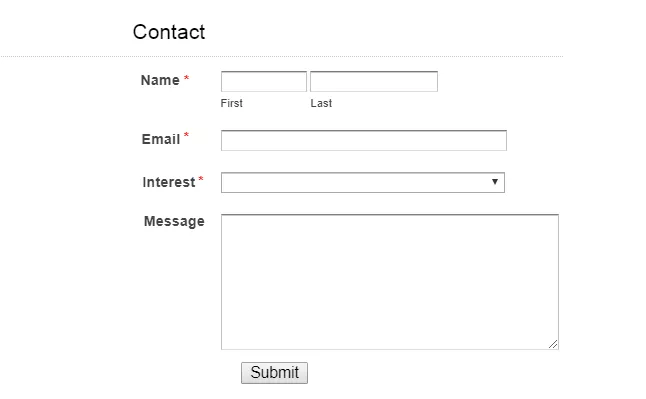
Limit the Fields
Nothing frustrates people more than a call to spend hours (well, figuratively speaking) on your contact form to ask one short question. To make it user-friendly and inviting, do your best to limit the number of fields they need to fill in. Experts recommend to include no more than three, which guarantees a 25% conversion minimum.
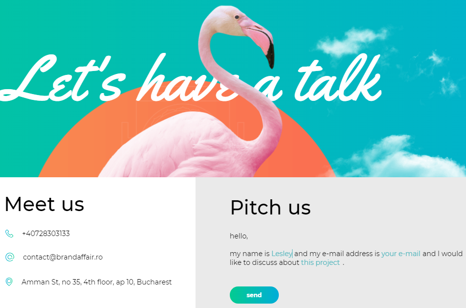
As they say, everything of genius is simple. Brand Affair seems to know that:
Also, consider the field size. Make them match the expected length of answers.
Consider Buttons Design
First things first, your contact page needs buttons as they are direct calls to action for users to submit a message. Make sure they are easy to recognize on the page.
Tips:
- Think of the right color for your CTA button. Obviously, it needs to fit the overall website design but, at the same time, motivate users to click. Case studies say the best performing color is red; orange and green also work well.
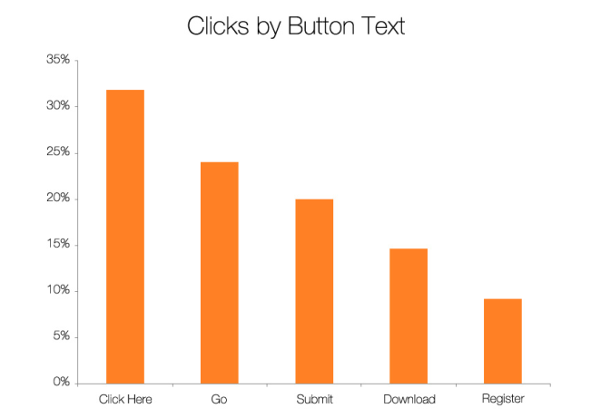
- Words matter here, too. Although "Submit" is the most common variant among marketers, it's not that inviting and descriptive for CTA buttons of your contact page.
According to studies, words like "click here," "send," or "go" may increase a conversion rate by 25-30%.
And one more thing:
Don't make the button active until a visitor completes all fields. It will help him check the information before sending. Also, a smart solution would be to add the autofill feature so users could fill in your contact form faster and prevent spelling errors. Nothing is more frustrating (except captchas, to be sure) than a request to fill a form over and over again.
Long Story Short...
Regardless of your business niche, a contact page at your website needs to be user-friendly, beautifully designed, and inviting to click. So and in no other way, it will turn into one more landing page, building a long-lasting relationship with your visitors, converting them into leads.
This checklist will help to leave no detail to chance:
- Be creative. Say no to faceless contact forms. Reshape your page to highlight the brand identity and make consumers see you care about them.
- Make it easy for visitors to find your contact page, remove all optional fields from it, let it look simple yet eye-catching, informative, and inviting to click.
- Provide several options to contact you: emails, active social media profiles, phones, live chats, short contact forms, etc. Don't hide behind "departments" but show photos of real people behind your brand. Sure enough, you can use an "About Us" page for that.
- Remember the UX design principles when crafting your contact form: reduce the number of fields, consider the autofill feature, tell people what happens when they click your CTA button, make that button bright and engaging itself.
- Explain how you can help visitors, and set expectations. Let people know how long they will need to wait for a reply from you.
Believe it or not, a contact page is among the most visited pages of many websites. Some are so beautifully and creatively designed that they engage a user in exploring the rest of website pages, subscribe to it, and therefore begin a conversation with a brand. For many brands, a contact page is the beginning of a rapport with potential customers.
So why miss its marketing power and underestimate the role it plays for business growth?
About the author: Lesley Vos is a web writer for Bid4Papers.com and publications on digital marketing, content creation, and self-growth. You might see her works at Moz, Crazy Egg, HuffPost, and more.


