
Want to Instantly Convert More in Your Sales Funnel? Steal My “Salty Foot” Formula

A few months ago, I got out of a serious relationship.
Although it’s winter here in New York, and fresh snow is on the ground, I’ve taken up long distance running as a form of therapy.
Unfortunately, running long distance can cut your feet up pretty bad. It can also lead to the occasional minor toe infection.
When I went to the foot doctor, he did a quick procedure. Now, I’m all good to run. But it didn’t happen until I took care of my foot first.
“Soak it two to three times a day in Epsom salt,” the doctor told me.
Got it, doc.
I didn’t do it for weeks, though. I’m terrible at these things.
Once I noticed my foot wasn’t healing as fast it could, I decided I needed to start soaking in Epsom salt more often.
But how? I simply kept forgetting.
So I tried something different to “convert” myself into taking the desired action.
I placed the green salt carton on my kitchen counter. This way, I’d always see it whenever I walked by. It was smack-dab in the middle of a “high traffic area,” so this increased its visibility. It worked to remind me to do this.
And I did. With my foot healed I’m ready to run a marathon (almost).
What I realized is that the same conversion principle can work to grow conversions in your sales funnel.
Whether you want to increase email opt-ins, generate more leads or sell more of your flagship product, you can by using my “Salty Foot” Formula.
What Is the “Salty Foot” Formula?
To understand the “Salty Foot” Formula, I should tell you a story first.
About three weeks ago, we started making the shift toward selling our course, the Sales Funnel Blueprint.
I wanted to prove that there was still a need in our audience for this, without over-investing or wasting time.
To make sure the message was still aligned with our audience, we made the homepage the course sales page. We already had the landing page set up when we had previously launched the course. It was still live, but it wasn’t in a very visible location.
Before, people would have to dig to find it. We did have it linked in a footer link, but it still wasn’t easy to find.
So by making that page the homepage, it became one of the highest-traffic pages on our site.
Almost instantly, we made our first sale.
I thought, “awesome.” I decided to add a link to the course in our blog newsletter. As a result, sales went from zero to about $450 in 36 hours.
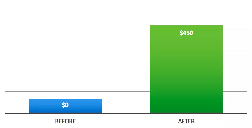
We had four sales right away.
Ok, so back to the “Salty Foot” Formula. What does it mean?
If you want to get more conversions (opt-ins, sales, etc.), put your offer somewhere where it will be seen. It should stand out like one of the few convenience stores next to a busy, high-traffic highway. Not one that’s in the middle of nowhere on a dusty dirt road.
The formula is traffic + greater visibility for your offer = more conversions.
Examples of the “Salty Foot” Formula in Action
Now that you understand my “Salty Foot” Formula, here are some examples of companies with highly visible product sales pages.
Double Your Freelancing
These examples are like how I treated my foot: by putting the green salt carton in a more visible place.
Similar to that, my friend Brennan Dunn at Double Your Freelancing uses an exit pop-up. This illustrates the same principle, since it appears to each visitor who is about to leave the site.
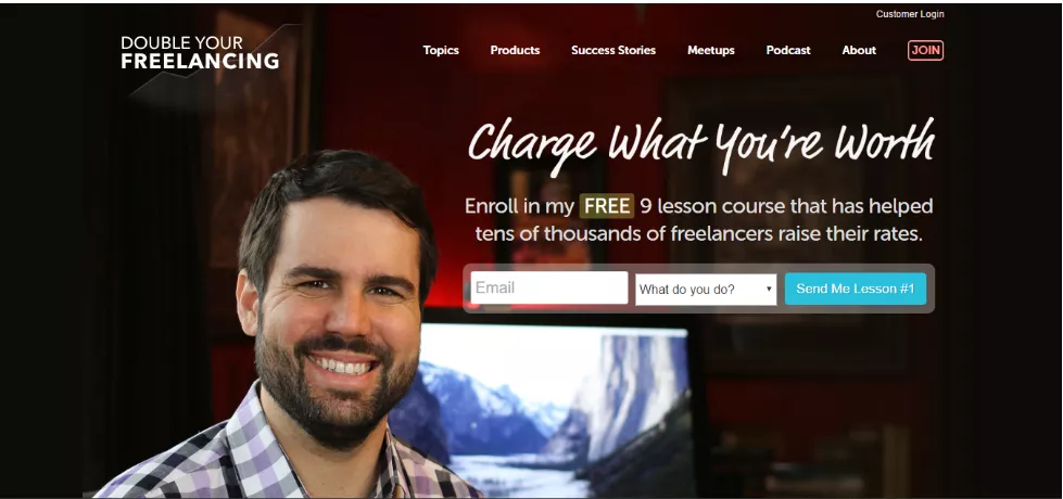
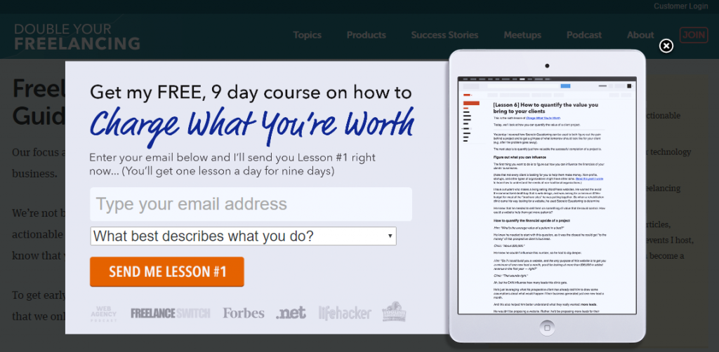
This is why pop-ups work. They are placed in the direct line of site for everyone trafficking the site, in this case, for a free nine-day course.
Unbounce
Unbounce, a SaaS landing page builder for marketers, follows the same principle. They put their CTA button in the top right corner of their site. It's very visible and very clear, which encourages visitors to sign up.
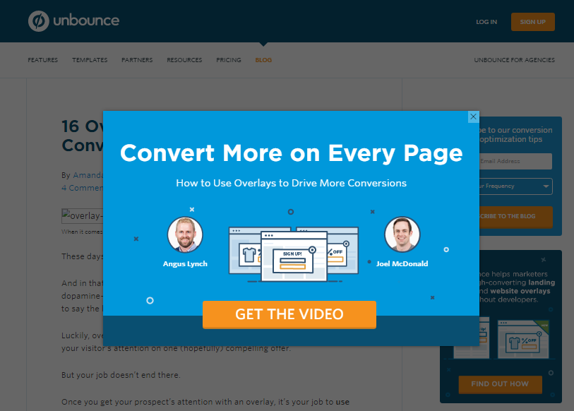
Unbounce also makes great use of pop-ups.
ConversionXL
Conversion optimization agency ConversionXL is also a good example of my Salty Foot Formula in action. Their hello bar at the top of their blog post pages let you know about their upcoming event.
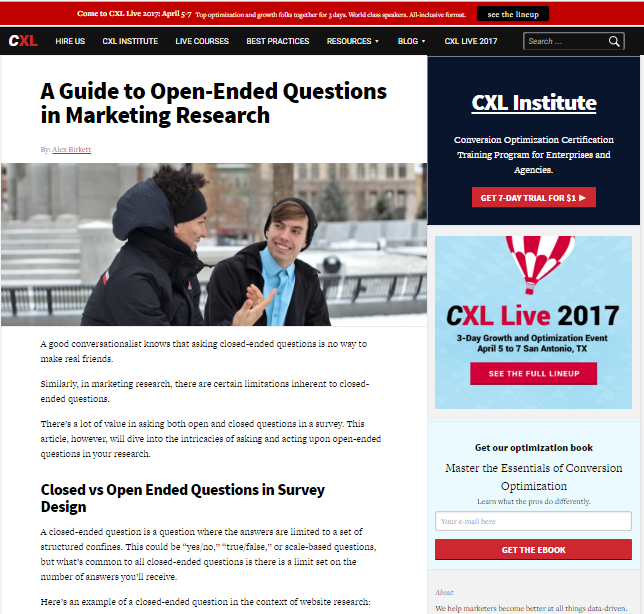
This bar is highly visible since it's right at the top of the page. It even follows you down the as you scroll.
ConversionXL also strives to get more email conversions, so their email newsletter opt-in form follows you down the page as well.
Lastly, the following A/B tests and case studies support the “Salty Foot” Formula’s marketing principle:
More visibility for a key offer or CTA drives more conversions and sales.
WiderFunnel Increases Lead Generation by 32.5%
WiderFunnel noticed its software trial landing page was performing poorly. Worse than that, this was negatively affecting the company’s target lead-generation rate.
WiderFunnel turned to SAP Crystal Reports to change this. SAP A/B tested different landing pages to see if they changed the download conversion rates. Here are the two pages.
Variation A:

This page has a clearer CTA off to the right. It’s a big orange button, or BOB. The rest of the page outlines the product itself, its benefits and even some reviews.
Variation B:
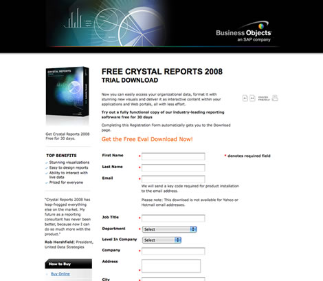
The second version of the page doesn’t have the big orange CTA button. Instead, there’s a line of bold, red text and an opt-in form. The product, benefits and reviews are presented differently so users would focus more on opting in.
So which page performed better? There were 32.5% more conversions for Variation A and only 17% more conversions for Variation B.
Swedish Financial Services Company Uses A/B Testing, Gets 7% More Conversions
Financial services company Northmill is huge in Sweden. It has 120,000 customers and counting. However, they wanted even more customers, so they decided to run some A/B tests to see which version of their CTA would appeal to the most people.
They moved their CTA button to the upper right corner of the site. They made the button green for better visibility. The CTA button would take the user to the application form where they could sign up for Northmill’s services.
The company reported a 7% jump in conversions over five months.
How Can You Apply It?
My “Salty Foot” Formula applies not only to sales, but all kinds of products. You can also use it to generate more leads and email opt-ins.
Here’s how to steal my formula and make it work for you.
1. Decide which landing page is most valuable and should become the homepage. If not the homepage, you can add this to your navigation. This is still highly visible. People will click over from whatever page they’re on to the navigation link you’ve given them.
Let’s say increasing your email list via email subscribers is your main revenue source. In this case, you can apply the “Salty Foot” Formula by linking to your landing page in your navigation similar to how Unbounce did it in the example above.
2. Make sure the CTA buttons are highly visible and very clear. Use best practices like making sure these actually look like buttons. Use the BABBS Formula, aka “Big Ass Bold Buttons”. The buttons should have rounded corners. Colors like yellow, red and orange consistently convert and have a higher click rate than other colors. Amazon is constantly A/B testing this but hasn’t had a button that converts better than the orange / yellow version it currently uses.
3. Consider having your phone number in the top-right corner if you’re a service business. Similarly you might want try placing your contact form in a more visible place as well, like directly on key landing pages of your site to increase visibility.
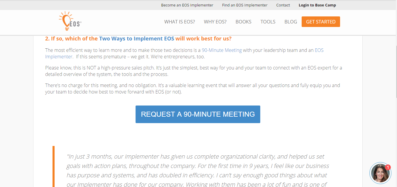
For example, one thing EOS Worldwide does is work hard to drive you to a specific page via their site-wide “Get Started” CTA button. From there you can schedule a 90-minute meeting or request a demo right on the page.
Conclusion
My “Salty Foot” Formula is all about putting your most important offers right in front of your audience (your homepage, CTA, opt-in form) so they are more likely to do it (buy, sign up, learn more).
Besides being good for your health, this formula is also good for sales and conversions.
To review:
- Place your most important offer in the direct line of sight of website visitors. This drives more conversions.
- Experiment with your design. Run A/B tests to see which gets more conversions.
- Make sure your buttons are noticeable. Follow BABBS.
- Visibility is about more than just your homepage. Consider making your navigation menu more visible too. Pop-ups, like in the case of Brennan’s site above present a similar opportunity.
What do you think of my “Salty Foot” Formula? Do you plan on changing your homepage after reading this? Tell me all about it in the comments below.
Keep Hustlin’, Stay Focused,
—Matt


