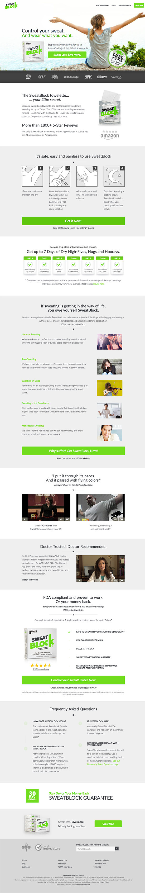
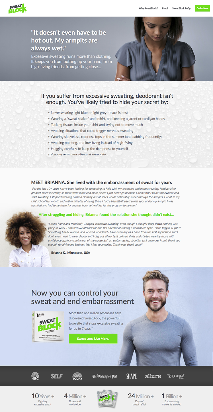
21 Conversion Rate Case Studies for Your eCommerce Business

Some people say that conversion rate case studies are BS.
But you might be wondering: “The case studies I read show me fancy bar charts and numbers so they gotta be reliable.”
And that’s a good point. Why would people say they aren’t reliable?
The answer is because the confidence levels are either not high enough to bet on or are simply not reported at all.
Put plainly, those conversion rate changes worked in one situation, but probably won’t in others.
That’s why today, I’m doing something special for your eCommerce business.
I’ve put together a list of the most reliable (that’s the key word here) conversion rate case studies for eCommerce stores from our Proven Sales Conversion Pack.
In this article, I’m going to show you:
- 21 conversion rate case studies from eCommerce stores that you can copy in a snap and see conversions rise.
- Each case study is packed full of stats, insights, and screenshots so you can see the winning and losing variations (and how you can A/B test the same elements too).
- And how by implementing any of the lessons learned in these case studies, you can see conversions boost by 1,892%.
Aren’t you curious to see what the heck did these eCommerce stores do to achieve a 1,892% conversion increase?
Let’s dig in the first case study...
Conversion Rate Case Study #1 for eCommerce Stores: Writing Action-Oriented Copy Makes 93% More People to Click
Before…
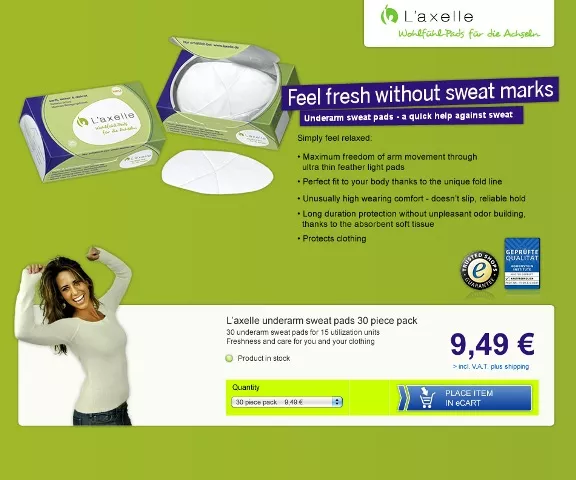
After…
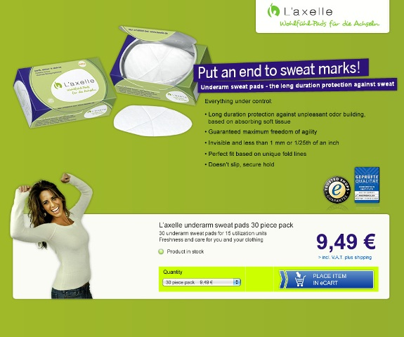
Bottom Line
Action and solution-oriented copy simply converts.
And it’s actually one of the proven copywriting formulas that convert.
Don’t assume that "comfort" or emotional "feeling-based" copy will convert. Especially if your target market is women.
Consumers want fast solutions, especially to problems they’re experiencing.
The Law of Clarity from the 11 Laws of Sales Funnel Physics plays an important role here.
Why Does It Work?
The headline (which is the most visible section of any landing page) is more action-oriented after the tweak.
It is more focused on positioning the product as a practical, immediate solution to the problem women were experiencing.
So it’s less focused on feelings or how the product will make the customer feel.
See how even the word “feel” was used in the first variation?
How Do I Execute to Get Results?
Rewrite your headlines to be direct, practical, clear, and solution-focused.
Is your headline really solving a problem for your audience?
If it’s not offering a solution, then prospects won’t consider your eCommerce product a solution to their problems.
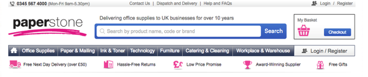
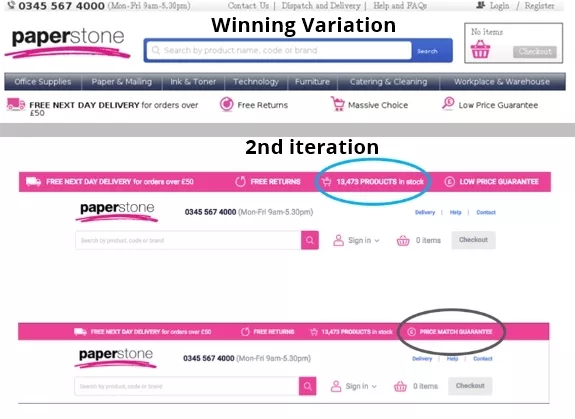
Conversion Rate Case Study #2 for eCommerce Stores: Adding Free Shipping Increases Orders by 90% & AOV by 7%
Before…
After…
Bottom Line
There are a lot of common reasons why people don't buy.
And for eCommerce stores like yours, one of the most common reasons is not offering free shipping for the product you’re selling.
Extra fees create more buyer resistance which leads to abandoned orders.
Because no one wants to pay extra money, right? Especially when you’re already investing a good chunk of money into a new product.
So what did this eCommerce store do?
Simple.
They included free shipping.
Why Does It Work?
Adding an incentive for people to buy works because people like to save money. They don’t like having to pay for shipping, taxes, or any other extra unexpected fees that can significantly vary from the amount the buyer thought they were spending.
The Law of Visibility here is critical because the free shipping text was prominently added to the landing page.
And you know that what gets seen converts.
And adding the free shipping incentive also serves as a reason for people to add more products to their order prior to buying.
How Do I Execute to Get Results?
To get the results this eCommerce store had, give people on your site an upfront reason to buy.
For example, If you sell physical products that require shipping, offer free shipping with a similar condition that will not eat into your profit margins. And of course, advertise it prominently on your landing page(s).
And if you sell a digital product, consider adding a "bonus" or free add-on benefit or feature or extra "capacity" (in the case of SaaS) for people who invest in your higher packages.
Conversion Rate Case Study #3 for eCommerce Stores: Stating the Problem in Your Copy Increases Sales by 50%
Before...
After…
Bottom Line
As I mentioned in the first case study, including the solution your products solve for your audience converts.
But it also converts stating the problem your audience is experiencing.
It’s actually one of the copywriting techniques to capture leads we follow.
Why?
Because by calling out your audience’s pain points, you’re utilizing both fear (fear that they’ll keep feeling that pain) and empathy because you understand what they’re going through.
So start with the problem and then agitate it in your landing page's copy.
Why Does It Work?
This eCommerce store follows the PAS framework (problem, agitate pain points, and solution).
This copywriting formula works because it is based on a proven persuasion strategy called "pacing and leading".
Pacing and leading means that if you pace your prospects by showing you understand them and you empathize with their problem, then they are more likely to buy your solution (product).
Being understood is a fundamental human need and this is why it worked for this eCommerce store.
How Do I Execute to Get Results?
As this conversion rate case study for eCommerce stores did, state the problem your audience is experiencing in your copy (headline, subheadlines, body text).
Then, go into vivid and visual detail (but don't overdo it) on those problems.
It’s what we commonly refer to as twisting the knife.
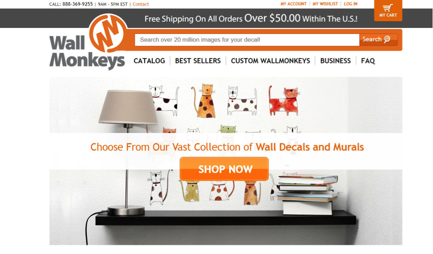
Conversion Rate Case Study #4 for eCommerce Stores: Making the Search Bar the Focus on Your Landing Page Generates 550% Increase in Revenue
Before...
After…
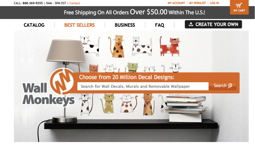
Bottom Line
Make your search bar more visible to drive customers towards a purchase.
Why Does It Work?
This change works because prospects interacted with the search bar more frequently than anything else on the page.
And also, the specificity of the copy (clarity, i.e. "20 million" vs "vast collection") was improved which also conveyed more value (maximization).
How Do I Execute to Get Results?
Sign up for a heatmap and click-tracking tool like CrazyEgg or Mouseflow.
See what key design elements customers are interacting with the most to get where they want to go.
Also, increase the focus on and visibility in the design on such elements.
Conversion Rate Case Study #5 for eCommerce Stores: Header Change Drives a 28% Revenue Increase
Before...
After...
Bottom Line
Addressing your prospects’ key points of anxiety and resistance in highly visible places like the header of your landing pages is likely to lift revenue per visit.
And it actually grew revenue by 28% for this eCommerce store.
Why Does It Work?
Removing any distractions from your landing pages naturally makes visitors more likely to complete a purchase.
Addressing your buyers’ anxiety alleviates resistance to buying.
For this conversion rate case study for an eCommerce store, revenue increased by 14%.
Then, in the follow-up test, by amplifying the message in a slightly tweaked format, sales increased again by 16%.
Finally, another key reason this worked was because the test was done on the landing page’s header—a key element seen by almost all visitors of the site.
How Do I Execute to Get Results?
You can use a heatmap tool like CrazyEgg to detect points of distraction on your website.
You can also survey customers and prospects on why they bought or what held them back.
Eliminate any distractions in your site's navigation.
And finally, try addressing buyer anxiety (about pricing or shipping costs) in the header.
Conversion Rate Case Study #6 for eCommerce Stores: Removing Distractions on Checkout Page Results in 14.3% Increase in Revenue Per Visitor
Before…
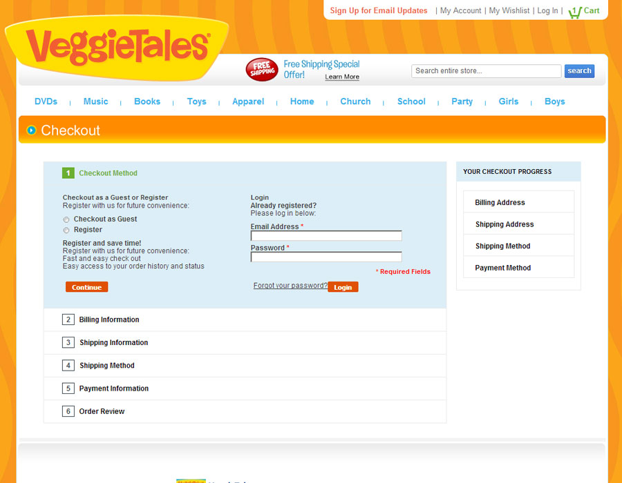
After…
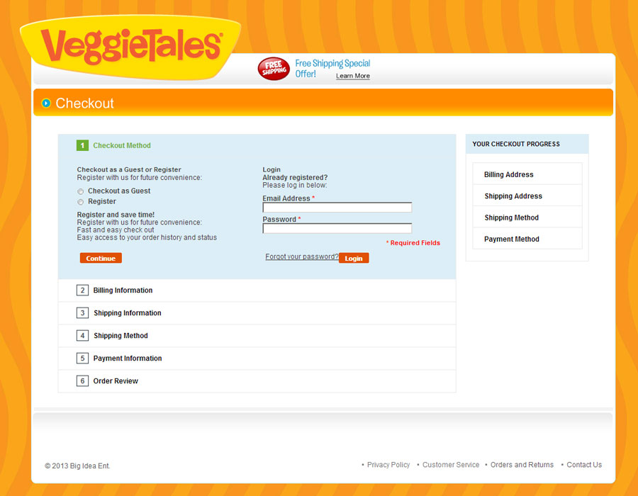
Bottom Line
Hiding one distracting element from this eCommerce store’s checkout page resulted in over 14% increase in revenue per visitor.
Focusing customers’ attention on a desired action and perhaps a related benefit by hiding or deleting any distracting element from header, footer, or nav links, can boost your conversions too.
Why Does It Work?
A prospect who visits your checkout page is significantly more likely to buy compared to a visitor who just visits your landing page or product page.
By eliminating the header options and navigation links (which are more like "trap doors" for potential customers to get distracted by and fall through, thus not buying), customers were more focused on completing the transaction.
Also, the simpler design allowed for more emphasis on the free shipping benefit.
How Do I Execute to Get Results?
Remove or hide any navigation, header, or footer links on your checkout pages.
This will absolutely keep the focus of your prospects on what matters the most: getting them to buy.
Case Study #7 Conversion Rate for eCommerce: Removing Drop-Down Menu From Landing Page Increases Revenue by 56%
Before…
After...
Bottom Line
Full-screen dropdowns in your navigation like the one featured above may be killing your conversions because they trap users.
Why Does It Work?
The drop-down menu clearly didn't work here—especially where the products are more unique and niche.
Further, it should be noted that this drop-down menu from the nav bar took too much of the screen.
This may have created a usability issue because it's difficult for a user to "get out" of that view (i.e. Amazon uses a couple of dropdowns, but they DO NOT take up the entire screen).
The other reason this eCommerce store grew revenue is that the new "flow" allowed potential customers to view the list of products before clicking to learn more.
How Do I Execute to Get Results?
Ask your friends or family to navigate through your site to make a purchase.
If they report getting stuck on your nav, you should revise your landing page layout.
If using drop-down menus is important, model how Amazon does it. Not how this site did it which was full-width.
Conversion Rate Case Study #8 for eCommerce Stores: 360 Image Gains Additional 39% Revenue Per Visitor
Before…
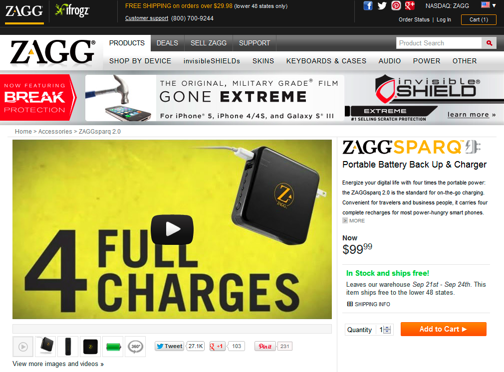
After...
Bottom Line
Interactive or video elements added to your landing pages can grab potential customers’ attention, engage them, and better clarify the value of your eCommerce product.
Why Does It Work?
The 360 degree slider allowed customers to better understand how the product looked and functioned.
This tweak also works because it captures more attention from the site’s visitors. It's more unique, unlike product pages with static images.
How Do I Execute to Get Results?
Add video or an interactive slider to your products page. To save time, you can repurpose existing content.
Conversion Rate Case Study #9 for eCommerce Stores: Crisp Headline Translates into 89.97% Jump in Sales
Before…
After…
Bottom Line
Clarity sells—even if you think it makes your product or service sound "boring".
Why Does It Work?
If people don’t understand what you are selling, they are much less likely to buy.
Even if it says it "further down" on your landing page, potential customers will be needing this vital information.
In this conversion rate case study for eCommerce stores, the addition of the single word "supplement" worked to almost double sales because before, the benefit was clear. But not in what form or way that benefit was delivered.
So with the word "supplement" added to the copy, customers understood it was probably a tablet they would take on a regular basis.
How Do I Execute to Get Results?
First, consider rewriting your landing pages’ headlines and subheadlines.
Then, ask friends or family to explain to you what it is you’re selling based on your copy.
The feedback you receive from family and friends is incredibly valuable when it comes to finding out what the user experience is like.
Because if they don’t understand what it is you’re selling, then your audience probably won’t understand it either.
Conversion Rate Case Study #10 for eCommerce Stores: Including Price Comparison to Your Landing Pages Increases Conversion Rate by 10%
Before…
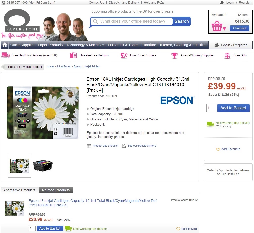
After…
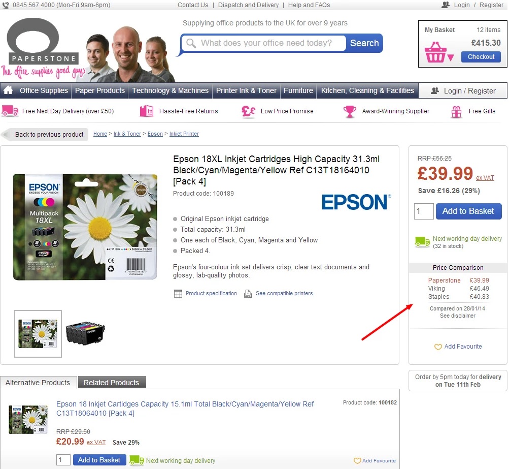
Bottom Line
Customers appreciate transparency, and especially, knowing they are saving money without having to check out competitor sites.
Why Does It Work?
The second variation for this conversion rate case study for eCommerce stores won because they added price comparison to the landing page.
How Do I Execute to Get Results?
For your eCommerce sales funnel, you'll need to make this change in this case study programmatically.
For instance, you can create a chart that allows you to compare your offering with what competitors offer (and not just in the pricing dimension).
Conversion Rate Case Study #11 for eCommerce Stores: Clearer Messaging Results in 72% Increase in Free Trial Opt-ins
Before…
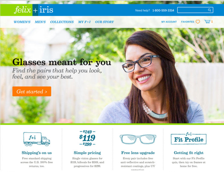
After…
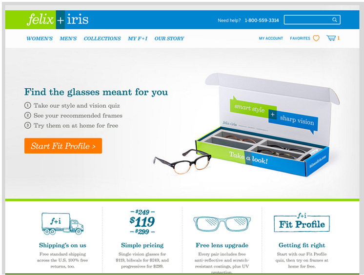
Bottom Line
Both your copy and images must clarify, support, and amplify your USP (unique selling proposition).
This is why this change actually converted for this eCommerce store.
Why Does It Work?
The eyeglasses company here provided customers with a unique, no-risk experience for shopping eyewear online.
The updated background image of a box with glasses in it clarified this unique aspect, as did the 3 steps copy and CTA in the subheadline.
How Do I Execute to Get Results?
When it comes to creating a landing page that practically prints you money, there are several aspects you need to take into consideration.
One of them is your imagery.
To execute what this eCommerce store did, evaluate the images you're using throughout your website on key landing pages.
Ask yourself which ones are generic?
Test replacing them with images that clarify and support your USP.
Are there special steps or a process your prospects must follow to get value from your service or products online?
The more unique your product, the better it will convert.
Conversion Rate Case Study #12 for eCommerce Stores: Adding Social Media Badge Increases Visits to Shop & Checkout on Affiliate Partner Sites by 72%
Before...
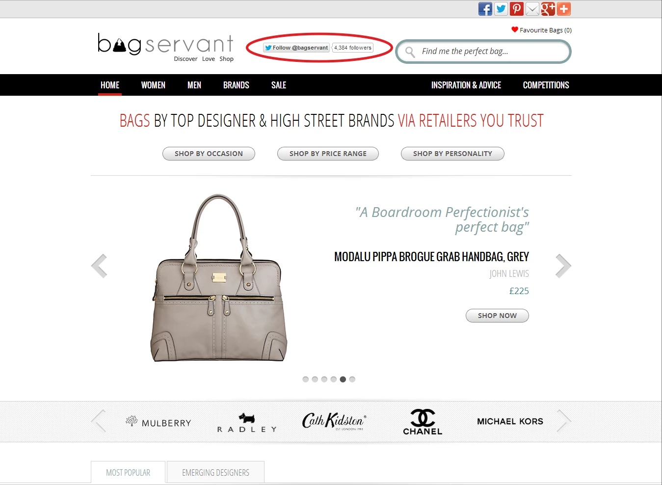
After...
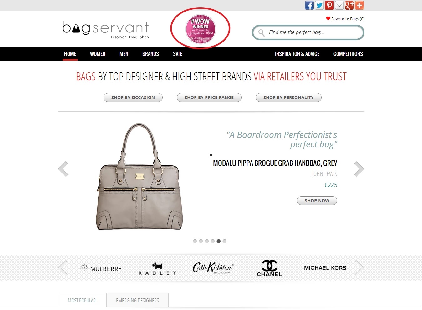
Bottom Line
You can do wonders with your conversions by adding social proof to your landing pages.
And adding trust badges in the right place on your landing pages is certainly one of the easiest ways to instantly grow your conversion rates.
Why Does It Work?
Visitors want to know that your website or brand is legit. Especially when they’re on the fence.
Many prospects will visit the same websites over and over again just because it feels safe and they know what sort of experience they will get if they end up buying from you.
For new site visitors, showing signs of credibility will usually work in your favor as it did in this case study.
First, with the Twitter followers vanity metric, and then even better, with the display of the badge which had been given as an award.
How Do I Execute to Get Results?
Brainstorm what trust badges (or widgets, e.g. Facebook followers, which also worked for this business, but not as well as the trust badge) you are able to add to your website.
And don't forget accreditations, networking groups, certifications, honors, and awards.
And finally, when you have them, add them to your navigation or somewhere where it’s prominent.
Once again, remember: what gets seen converts.
Conversion Rate Case Study #13: Adding a Pop-up Skyrockets Catalog Requests By 775% & Email Opt-ins By 124% Despite More Form Fields
Before...
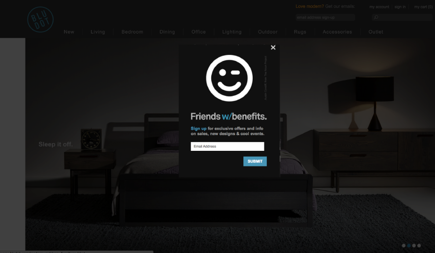
After...
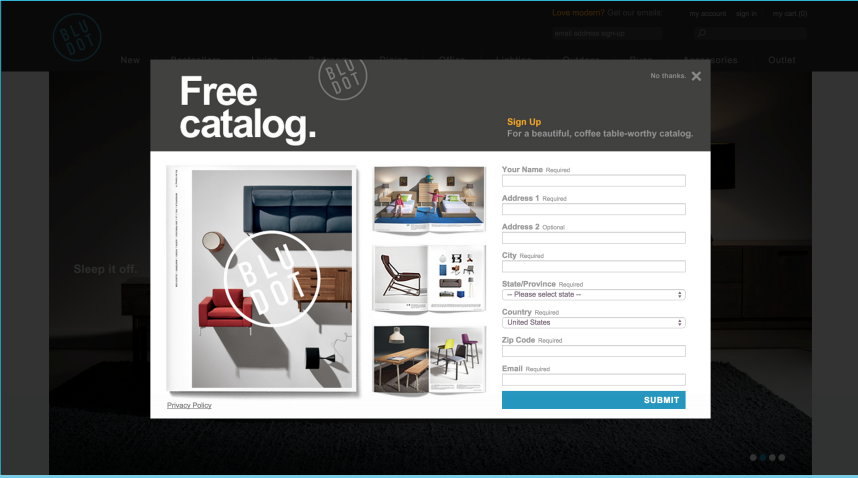
Bottom Line
Ultimately, if you're offering value that people want, it doesn't matter if you have 1 form field or 8.
Why Does It Work?
Although there's more friction (perceived effort) with filling out the longer form, the desire for a physical catalog of nice furniture advertised as something that "looks good on your coffee table" outweighs that friction (maximization).
In other words, the value of a free physical book for people who want nice furniture is what beats a newsletter pop-up offer.
The other reason the new pop-up for the catalog won is because the original pop-up's headline is completely irrelevant.
And once again, clarity beats cleverness here.
How Do I Execute to Get Results?
Think about how to optimize your copy for clarity as well as how to offer a lead magnet that is perceived as higher value.
Conversion Rate Case Study #14 for eCommerce Stores: Adding Incentives at Checkout Spike Conversions by 18%
Before...
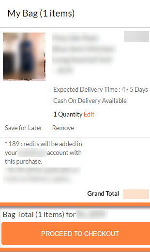
After...
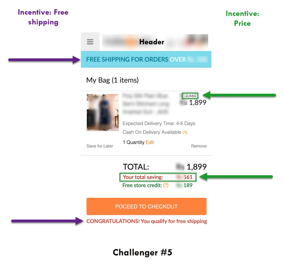
Bottom Line
Emphasize any incentives for customers to buy.
Remember, prospects are interested to know what they will gain if they buy your products.
And that’s exactly what happened in this case study.
By showing prospects the money they would be saving by buying their products, conversions simply rose.
Why Does It Work?
This tweak works better because it reminds potential customers of the incentives (savings or free shipping) to buying.
How Do I Execute to Get Results?
Right before prospects will buy from you (at checkout!), remind them of your incentives.
Remind them how much they’re saving or if they qualify for free shipping or something else.
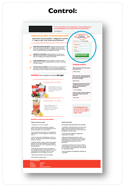
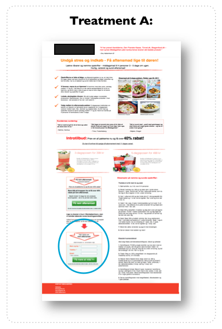
Conversion Rate Case Study #15 for eCommerce Stores: Compelling Call to Action Improves Click-Thru Rates By 620.9%
Before...
After...
Bottom Line
Better aligning your design with your prospects’ behavior and what they want and need actually captures more clicks.
Why Does It Work?
The winning variation converted better here because we read from left to right so the CTA button that’s more to the left was easier to digest.
Also, prospects visiting the landing page wanted a pricing guide, so the CTA text was more relevant (“Price Guide” vs. “Download”).
And here, the Law of Alignment with the CTA buttons was critical in showing what the prospects’ interest really was.
If they were looking to find out what the price of the guide was, then a CTA button with “Price Guide” is what definitely makes more sense.
How Do I Execute to Get Results?
Consider revising your CTAs to be more specific. And make sure your CTAs’ copy are aligned with the next step your prospects should take on your sales funnel.
Conversion Rate Case Study #16 for eCommerce Stores: Adding a Guarantee & Urgency Generates 41% More Turnover From Visitors
Before...

After…

Bottom Line
Customers need to trust you to buy—and badges or guarantees can grow sales significantly.
Remember, adding social proof to your landing pages is vital for building trust and loyalty with prospects, and nurturing the relationship with them.
Why Does It Work?
Guarantees, security seals, and trust badges work to reassure customers.
They help calm your potential buyers’ fears of purchasing.
So if you offer them an amazing product or service, but they don't trust you or feel anxiety around buying something that you don't address, you’ll lose those customers.
Why?
Because they fear losing their money and/or time more than they want what you’re selling.
How Do I Execute to Get Results?
Add any form of social proof to your landing pages.
A trust badge doesn't have to be some third party "certified" seal.
It can be a simple stock icon or custom design of your own or a statement that reassures or shows credibility (like the 2-year guarantee in this case study).
So to copy the success of this case study, brainstorm possible trust seals related to buying.
It can be how long you've been in business, it can showcase your customer satisfaction rate, or you can make one that showcases your guarantee.
You can also implement a banner of 3-4 of these trust badges on your product or service landing page towards the bottom.
Conversion Rate Case Study #17 for eCommerce Stores: CTA Button & Opt-In Form Added Below the Fold Results in 304% More Sign-Ups
Before…
After...
Bottom Line
Adding a CTA button at the bottom of your landing pages makes sense if people see your offer as something more "complex" that they need to read more about on the page in order to understand.
Why Does It Work?
For this case study, other elements helped convert like better images to clarify the offer, better placement of testimonials, easier to read layout, and a 2-step form.
But changing the placement of the CTA button further down the landing page helped simplify the presentation of the offer.
How Do I Execute to Get Results?
Move your opt-in form down and to the left of your landing page (and use a 2-step opt-in instead of an on-page form).
Conversion Rate Case Study #18 for eCommerce Stores: Scarcity Effect Translates to 24.5% Revenue Uplift
Before...
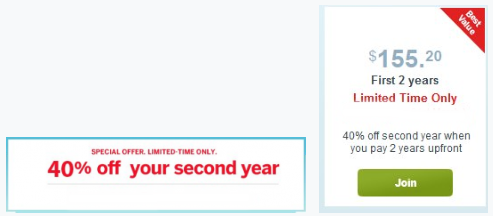
After...
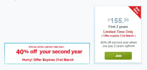
Bottom Line
Adding FOMO (Fear of Missing Out) via an expiration date or a limited-time offer has been repeatedly proven to drive buying decisions.
Why Does It Work?
Introducing scarcity makes prospects pay more attention while evaluating an offer, especially the closer to the expiration date they are.
And this is also why you see sales spike in the days immediately prior to the offer expiring.
Because people naturally have a fear of missing out (FOMO).
How Do I Execute to Get Results?
Add an expiration date to any of your discount offers (or even your lead magnet offers) and watch as conversions spike, especially as the deadline nears.
I recommend testing a countdown timer as well since the animation with that can be more noticeable, driving more attention.
Conversion Rate Case Study #19 for eCommerce Stores: Repeating Your Free Shipping & Return Policy Across Your Landing Pages Actually Increases Orders by 19%
Before...
After...
Bottom Line
Repeating incentives (like free shipping) in a well-thought-out place on your landing pages can have a big impact on sales.
Why Does It Work?
Banners used to work extremely well, but less so now. Over time, consumers have adapted to them and recognize them as having commercial intent, so they often go ignored for this reason.
By repeating your incentive on your landing pages, the visibility of the incentive increases because what gets repeated gets remembered (Law of Repetition).
So in this conversion rate case study for eCommerce stores, reminding people of the incentive yielded incremental benefit.
The free shipping incentive was well placed and well-aligned with any prospects who were on the fence or considering clicking "add to cart."
It simply gave them one more reason to do so.
How Do I Execute to Get Results?
A/B test adding a relevant incentive like free shipping or free returns just below your CTA buttons.
Conversion Rate Case Study #20 for eCommerce Stores: Re-designing a Landing Page Results in 1,892% Increase in Sales
Before...
After...
Bottom Line
Your prospects must understand what you’re offering and how your eCommerce products work. Otherwise, they will not buy.
And clarity doesn’t only translate into copywriting. It also translates into your design.
See how in the screenshots above, the clearer design makes the offer actually be more clear too?
Why Does It Work?
There are a few reasons this redesign worked so well.
The most important reason is clarity.
By redesigning and rewriting the copy, it was easy to understand what problem the service solves and how it solves it for their audience.
And this was not conveyed clearly before.
Also, the social proof (testimonials) were more believable, and the design overall is more professional and trustworthy. This, in turn, increased confidence.
How Do I Execute to Get Results?
Understand if lack of clarity is a major bottleneck on your website.
Have a few trusted friends or family members (or order a user test) and have them read your landing page.
Without guiding them, are they able to tell you what you're actually selling and what problem you're solving?
If not, you need more clarity in your copy.
Also, revise your copy to clearly (and visually, like was done here with the 3 steps) convey what it is you're offering and the problem it solves for people.
Finally, use real and believable headshot photos for your testimonials.
Conversion Rate Case Study #21 for eCommerce Stores: Radical Redesign Results Improves Sale By 68.6%
Before...
After…
Bottom Line
Combining tactics that address multiple points of conversion gain and/or loss creates a win. But unfortunately, doing it as a radical redesign, you can't be 100% which adds the most, or if any actually subtract for unforeseen reasons.
Why Does It Work?
Their longer form copy allowed for increased clarity of value, benefits, and more opportunity to educate and address key fears and concerns of customers (fear of loss).
The proof of scientific results to support claims of the product work to increase buyer confidence, as do trust seals.
Also, instead of 3 choices on the landing page there was just one: "view pricing and purchase".
How Do I Execute to Get Results?
Gather data from visitors who don't convert, as well as customers soon after buying before guessing about making a radical redesign like this.
Also consider user testing via trusting friends or family.
Conclusion
Every business is different and serves different audiences.
But if you’re an eCommerce store, then these case studies show you the succes patterns that you can copy in a snap.
These conversion rate optimization case studies for eCommerce stores like yours provide a ton of useful ways to start testing different elements on your sites and landing pages.
Not only that, but now that you know what data to look for in a conversion optimization case study, you’ll also know what to look for when validating the next one.
To review:
- A/B testing is always the safest bet to know what your audience prefers.
- Know your audience. While a video could convert well for some businesses, an image could work for yours.
- Always use clear, targeted CTAs and copy over generic text. What’s clear for your audience will be more likely to be bought.
- Adding social proof is always the best way to build trust and nurture the relationship with prospects.
And if you simply don’t want to spend time optimizing your sales funnel for conversions, AutoGrow is ready to do the hard work for you.
You can delegate any digital marketing task to us and we can optimize your sales funnel so you don’t have to.
Now tell me something, which of these case studies resonated with your eCommerce store the most?
Which changes do you plan to make to your own landing page after reading this article?
Let me know in the comments below.
Keep AutoGrowin’, stay focused.