
13 Data-Packed Conversion Design Tactics for Landing Pages

Ever looked at your landing pages with frustration?
Ever wished your landing pages could be actually converting?
Have you wanted to yell at your laptop because the darn landing pages you’ve sunk thousands of hours (and dollars) to publish aren't working?
Sound familiar?
Back in 2015 when we launched a much more basic version of AutoGrow’s service, people started signing up.
But the problem was, the leads we got weren’t qualified. The volume of sign-ups was really low. And people weren’t trusting what we were offering.
Fast forward to today, AutoGrow has more demand than we can even fulfill.
And that’s what people call “a good problem to have in business.”
But today, I want to talk to you about what we learned to get from A to B.
And a big part of it was because of our design.
That’s why in this article, I’m going to reveal the secrets behind converting with your landing pages’ design. Also...
- How you could have the best copy in the world, but if it’s visually not compelling, it won’t convert (and how to fix that).
- The 13 DIY data-backed tactics you can implement without an expert designer’s help.
- And how all of these conversion design tactics will help you convert passive prospects into active buyers.
Let’s rock it into this awesome pot of conversion design tactics. And the first one says...

#1 Conversion Design Tactic: Create High-Contrasting CTA Buttons That Get NOTICED (Use Our BABB Formula)
What gets seen, c.o.n.v.e.r.t.s.
This means that what is visible on your landing pages will get noticed.
You see, in order for your website to convert visitors into buyers, you need to clearly show the path to prospects through your sales funnel.
And this includes, of course, showing your CTA buttons.
Your call to actions are one of the most important elements on your landing pages. Because these will command people to take action.
Whatever you want prospects to do on your landing pages, you gotta tell them what it is.
- Sign up for free trial
- Download lead magnet
- Learn more about a product or service
- Buy
- Subscribe to email list
Any action you want prospects to take in order to convert them into buyers must be clearly stated on your CTA buttons.+
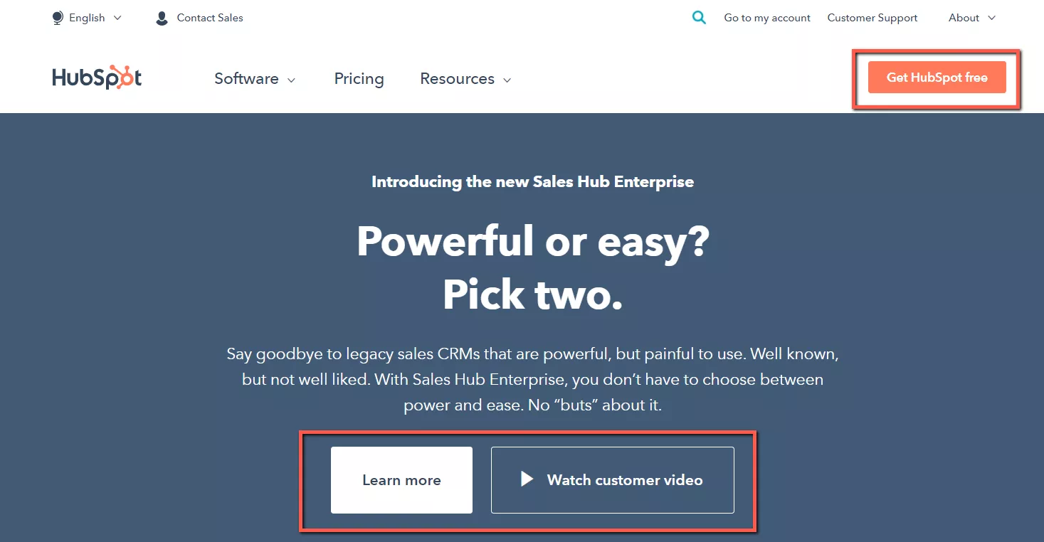
As a matter of fact, research shows that adding a clear call to action to your landing page can cause as much as 250% more visitors to convert.
It’s why we follow our BABB formula:
Big-Ass (big on-page) + Bold (strong color contrast) + Buttons (easily recognized as a clickable button, with rounded corners).
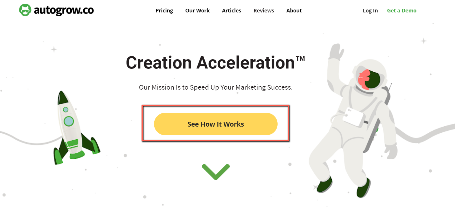
This is the best way to make sure your prospects don’t miss any steps in the path they need to take down your funnel.
And yes, the color and size are equally important.
Because the size and color of any element in your landing page affects its visibility.
Remember the Law of Visibility from the 11 Laws of Sales Funnel Physics?
This law says that what is more visible gets more attention.
So by simply changing the color of your CTA button, you can see a 35.81% increase in sales
And by, for example, making an “Add to Cart” button more prominent, removing distracting content areas like sidebars, and by adding more spacing around the button, revenue can increase by 13.9% per visitor.
And that’s what happened in these case studies from our Proven Sales Conversion Pack.
Case study #1:

Case study #2:
Before....
After...

Making your CTAs prominent is a basic conversion design tactic.
And if you’re a do-it-yourselfer, it will literally take you seconds to implement it.
Remember, CTAs are high points of leverage for conversion optimization because visitors are constantly interacting with them immediately prior to actually buying from you.
So here are some call-to action buttons examples that will give your conversions a boost.


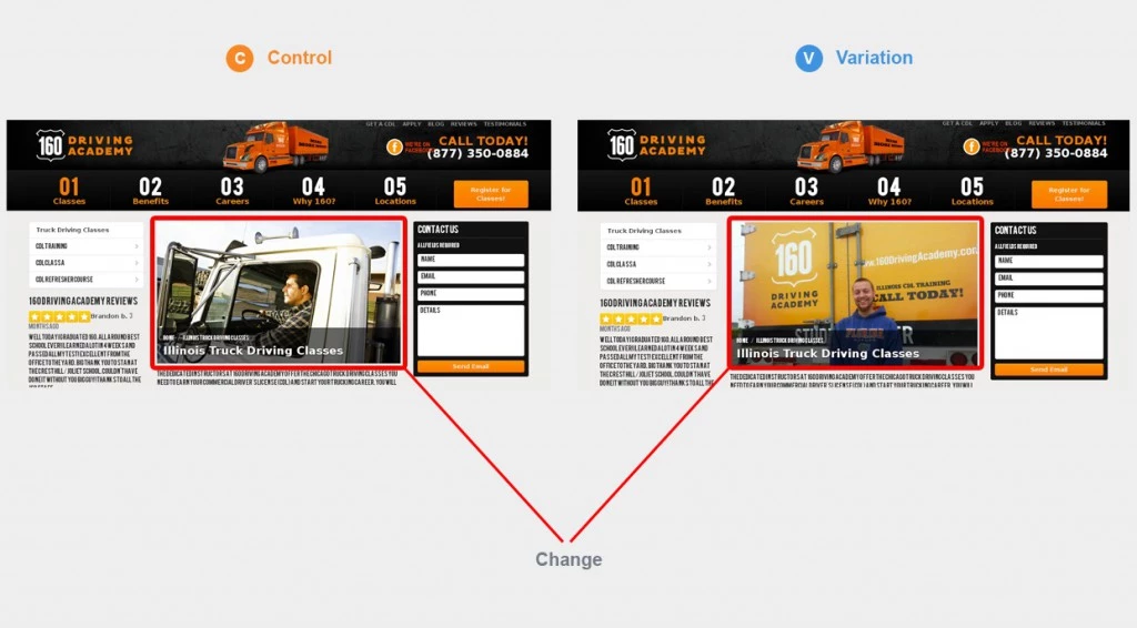
#2 Conversion Design Tactic: Use Real Images, No Stock Photos
This is an important conversion design tactic often missed.
When you create a landing page that’s guaranteed to convert, you must make sure your brand is perceived as authentic. This is critical for your conversions.
You see, sometimes designers use stock photos instead of asking the business owner or staff to provide them with real photos of themselves.
The result of that is this:

You can obviously tell the person in the photo is just a model. It looks fake.
No one holds cash in reality like that.
So even if you don’t have the real photos of your staff, or the people you feature in your testimonials, always try to avoid using stock photos.
Instead, convey as much realness as possible with your images to make your visitors trust you.
Look at the photos of AutoGrow’s team members on our About page…

In fact, including human faces into your landing page design is a proven tactic for growing your conversions.
And a repeating pattern I’ve found in our 313 conversion rate optimization case studies I analyzed is that using an authentic photo instead of a stock photo converts significantly better.
For example, showing real images can improve sign-up rates by 45.45%. And it can also boost form submission by 161%.
And that’s exactly what happened in the case studies below…
Case study #1:

Case study #2:
Remember, consumers and site visitors are able to identify anything that stands out as something fake.
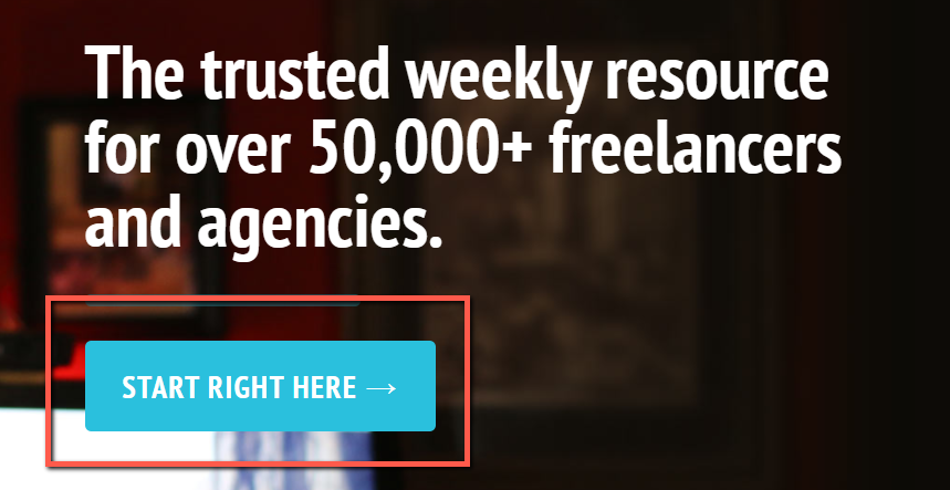
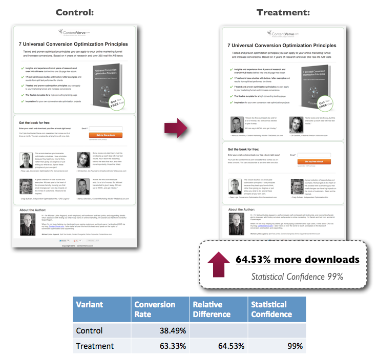
#3 Conversion Design Tactic: Add Social Proof to Prove Prospects You’re the Best Option & That Customers (& Clients) Love You
I’ve told you in the past how in order to close more sales you must build rapport with prospects and position yourself as an authority.
And to do that, you must show your site visitors why they should choose you and not the competitors.
But how?
Simple. Through social proof.
According to Medium, landing pages that have social proof in the form of copy have an average conversion rate of 12.50%.
And landing pages without social proof only convert at 11.40% on average.

Adding any form of social proof (trust badges, security seals, testimonials, reviews, etc.) to your website simply reassures potential customers and calms their buying fear.
And you’ll see conversions spike.
For example, if you add trust badges to your landing pages, you can uplift sales conversions by a whopping 32%.
Or adding a social proof widget in the form of customer reviews can increase sales by 58.29%.
And if you add testimonials with real images and increase their visibility, you can get 64.53% more downloads.
See it yourself in the case studies below…
Case study #1:
Before…
After...

Case study #2:
#4 Conversion Design Tactic: Readable Font Style & Size (Don’t Make It Hard for Prospects to Read Your Content)
So, in order to communicate your value proposition, benefits of your products or service, how it works, its features, etc., you must use a readable font style and size.
You see, the point of having well-written and high-converting copy is to actually make it get read.
It’s simple: if prospects don’t read it, they won’t convert on your offer.
So, for this, ensure that the font size is big enough for anyone in your audience to read it.
And make sure that the font style is also easy to read.
Take the case study below as an example.
By simply increasing the font size of the price on the landing page, there were 36.54% more clicks on the "add to cart", and a 10% increase in revenue.
Before…

After...
So don’t add text-heavy paragraphs or use a tiny font size.
Make the text color contrast and add spacing between lines and paragraphs for easier readability.
And if for example you’re targeting C-Suite executives of 50+ years in your business, don’t use a tiny 10-point font size.
#5 Conversion Design Tactic: Keep Your Landing Pages’ Design Optimized for All Mobile Devices
According to Medium, landing pages that have a mobile page have an average conversion rate of 11.70%. And the ones that don’t have a mobile page convert on average at 10.70%.

Optimizing your landing pages’ design for mobile is as important as optimizing your landing pages’ design for desktop.
You see, in the second quarter of 2020, mobile devices (excluding tablets) generated 51.53% of global website traffic according to Statista.

And according to CNBC, by 2025, almost 72.6% of internet users will access the web via their phones.
That represents nearly 3.7 billion people worldwide.
Oh my!
This means that the majority of people are navigating through your website on their mobile devices.
So your landing page design must be optimized for mobile. It has to be user friendly for mobile viewers.
This is one of the zero multipliers that kill conversions that you want to avoid at all cost.
For instance, take a look at how this map marker (which looked completely normal on desktop) turned out looking on mobile.

Would you want to buy from a company that made this kind of mistake?
I didn’t think so.
So follow this conversion design tactic in order to convert more leads into customers via mobile devices.
#6 Conversion Design Tactic: Create Compelling Design That Feels Integrated
All visual elements on each of your landing pages must feel integrated.
They shouldn’t be randomly placed.
Graphic/web design amplifies the copy and your whole landing page.
And when the elements from your landing page (text, headlines, logo, images, footer, sub-headlines, etc.) are placed randomly or without care, your website won’t meet its goals (to convert leads into buyers).
So the user experience must feel integrated when navigating through each of your landing pages.
You’ll want to be sure the images aren’t cookie-cutter or seem like they were just “thrown” on the page for instance.
There has to be a connection between your brand, your logo, colors, and the font style and size you choose. Otherwise, your brand ideas won’t be understood.
#7 Conversion Design Tactic: Add Big Bold Headlines to Hook Your Readers
The same way that your blog post titles are your audience’s first impression of your business, your landing pages’ headlines have the same effect.

If you’re more of a do-it-yourself type of person and don’t want to spend money on designers, don’t worry.
You can implement this conversion design tactic by yourself in a matter of seconds.
All you have to do is turn your headlines into concise, big bold text.
In fact, using a simple, short, and clear headline can equate to 388% more opt-ins to download a lead magnet.
So make your headlines stand out and catch your prospects’ attention.
Once your headlines get noticeable, the rest will be easier for them to read.
#8 Conversion Design Tactic: Add Animations & Videos to Make It More Interactive
If you’re looking to convert prospects into customers, one important conversion design tactic you must follow is adding videos or animations to your landing pages.
This makes users’ journey through your site more pleasant.
And, of course, it’s not like you’re going to add a video on each landing page. Nope.
Use them strategically.
Whether it’s a demo for your lead magnet or a demo for your products or service like we have on our website…

...You’ll be providing your site’s visitors a different way of consuming your content.
In fact, using videos on landing pages can increase conversions by 80% according to Unbounce.
And according to UXPlanet, 70% of consumers liked a product more after seeing a video animation.
#9 Conversion Design Tactic: Crisp Sentences & No Text-Heavy Copy
I already mentioned briefly in the conversion design tactic #4 that all text must have good readability.
But this tactic talks more about how your copy should not be text heavy.
To the contrary, it should have crisp sentences (1-3 per paragraph).
Just as we always do in our articles.
Because no one will want to read large blocks of text.
And most site visitors will just skim quickly through your site.
And this includes headlines, subheadlines, CTA button text, and body text in your landing pages.
Don’t write very long text on your CTA button—keep it up to several words.
Don’t write 6-line long headlines—keep them to 3 or 4 lines maximum.
Instead, to keep prospects from leaving your page, add short paragraphs and avoid at all cost long, boring chunks of text.
#10 Conversion Design Tactic: Target Your Audience With the Right Images
When you’re looking to convert leads into prospects, you’re looking to convert people from your unique audience.
Sounds obvious, I know.
But sometimes marketers forget that their businesses must speak directly to the right audience. Not to everyone.
In a few words, the more niched the better.
You see, as much effort, time, and knowledge you put into trying to convert pretty much everyone who visits your site, you won’t be able to do so.
Why?
Because all your site’s visitors aren’t necessarily qualified leads interested in your products or service.
They may have landed on your site by accident.
So instead of trying to convert everyone, niche down and target your right audience.
When creating your landing page design, include images of your right target audience.
And I say “right” because I’ve come across landing pages that are selling mental and wellness therapies, but they added images of women working out at the gym.
And those images were misleading the audience.
Because someone who’s looking to actually invest in mental and wellness therapies won’t be interested in investing on a product that helps women lose weight.
So speak to the right audience (the one who is actually interested in whatever it is you’re selling) with images that connect directly with that niche.
#11 Conversion Design Tactic: Use High-Contrasting Colors (Don’t Make It Hard for Prospects to Navigate Through Your Site)
Colors help your prospects digest the content on your landing pages.
And all design elements on your site will convey more value to the user if they actually contrast.
In fact, using contrasting colors on your landing page can make people purchase 57% more and can increase sign-ups by 10.66%.
Just how it happened to the landing page below…

See how the text has a better contrast against a white background and makes the reading experience easier?
The text has a better contrast against a white background and makes the reading experience easier. More comfort and a better experience mean less friction in deciding to sign up for your trial or not.
This means that your color choice for your text and/or your background can provide an incremental (or better) increase in conversions.
#12 Conversion Design Tactic: Use Your White Space Wisely
Have you ever heard of “Horror Vacui”?
This is a popular expression used in design and art to define the tendency of filling up all the empty space.
It means “fear of emptiness” in Latin.
But it’s a mistaken mindset when it comes to web design.
Some marketers nowadays think that they need to fill up any page with text and images to reduce the white space.
But as Ludwig Mies van der Rohe said once, “less is more.”
This means that less decoration and the right use of elements in your landing page—including white space—has more impact on your audience than a lot.
Now, designers have an important responsibility when it comes to creating a sales page guaranteed to convert.
Achieving a balance between simplicity and design that looks incomplete is a task that takes time, effort, practice, and skill.
The result needs to be impeccable, consistent, and pleasing to the human eye. Otherwise, prospects looking at your web page design will simply leave.
In fact, according to Adobe, 38% of people will stop engaging with a website if the content or layout are unattractive.
So use your white space strategically in your landing pages design.
#13 Conversion Design Tactic: Keep the Design Simple—Less Is More
The more design elements you throw into your landing pages, the more work you’ll give to your prospects.
Don’t trust me?
Take this homepage design as an example…
Is it easy to navigate through it?
That’s what I thought...
The more you add to your pages, the more elements your prospects will have to digest.
That’s why we always follow a minimalist approach when it comes to designing our own website and our clients’ landing pages.
Here’s a sneak peak of how we follow this important design tactic to get customers to click “Buy”.

See how our designers stay away from adding too many unnecessary elements on the landing pages that can end up being distracting?
And see how the design actually looks cleaner and more pleasing to the eye by keeping the design simple?
This is just a best practice that you must follow to skyrocket your conversions.
In fact, this website saw a spike in conversions after changing their homepage design to a simpler version.
Take a look at how their homepage design used to look…
And how they made it a lot simpler...
Obviously, the simpler design increased conversions from their homepage to the sign-up landing page by 35%. And the total increase in subsequent sign-ups was 31%.
Conclusion
If your landing pages aren’t converting, then you need to do something with your design.
And if you’re a do-it-yourself type of marketer, these conversion design tactics won’t take you too much time to implement.
Here are the key takeaways for your review:
- Your copy must amplify your landing pages’ design. Even if you have the highest-converting copy written on your sales page, it won’t sell if the design isn’t compelling.
- Less is more—each of your landing pages’ design will convert better if they follow a minimalist approach.
- Your CTA buttons must STAND OUT.
- Your font size and style must have good readability and contrasting colors that make the user experience through your landing pages pleasant.
- Prove to your prospects why you’re the best option and why former customers and clients have chosen you through social proof.
- Target the right audience with images that appeal to them.
- Forget about using stock photos—your audience knows when you’re being fake.
- Prioritize mobile optimization because the audience that navigates through mobile is larger than through desktop.
Now tell me something, which conversion design tactics have grown your conversions?
Are you going to try all of the ones outlined in this article?
Let me know in the comments below.
Keep AutoGrowin’, stay focused.


