
Ultimate Guide to Boosting Conversions With Your CTA Buttons & the Law of Visibility

As human beings, we naturally want a silver bullet solution to our problems. We want to just flip a switch and see results instantly.
And if you’re a startup or busy business owner looking to keep scaling your business, fortunately, there is a way out of the growth plateau.
And all it takes is making your offers more visible.
Something as simple as misplaced call-to-action buttons could be causing you to leak money. Wait, what? How’s that even possible?
You see, it all has to do with The Laws of Sales Funnel Physics—success patterns that every high-converting sales funnel follows.
In physics, for example, if you’re throwing a ball up in the air and you know the wind speed, the weight of the ball, and the force behind it, you can predict exactly where the ball is going to land.
Why? Because the physics of our reality are governed by laws that, for the most part, we understand.
The Laws of Sales Funnel Physics are like that. The better you understand them, the more you’ll be able to make your sales funnel a success. The difference is, they apply to digital marketing and sales funnels.
And one of those Laws of Sales Funnel Physics is the Law of Visibility.
This principle says that people will convert on offers that are highly visible. If for instance, prospects don’t actually see your CTA buttons on your landing pages, they simply won’t convert.
In this article, I’ll show you…
- How you can drive sales in a predictable way (like in physics) with small—yet significant—structural changes to your CTA buttons.
- How, following the principle of the Law of Visibility, you can bring in massive results with tiny tweaks you can do without the help of an expert designer.
- And you’ll learn from real case studies how to get people to click on your call-to-action buttons and buy what it is you’re offering.
I guarantee that if you take advantage of these proven conversion tactics, you’ll accelerate sales in a snap.
Without any further ado, let’s dive in!
What Gets Seen, Converts
You’d be surprised to know how tiny—yet powerful changes—can be done to every single element in your landing page to accelerate conversions. And the best thing is, you can do them without much help from an expert designer.
One mistake most marketers and entrepreneurs like you make, though, is underestimating the power of these small changes that you can do in a snap.
People often think that in order to bring in big results, you must make a big change. But that doesn’t necessarily apply to marketing.
When it comes to your funnel’s conversion, tweaking something as simple as a word, color or button can actually bring in massive results.
Matt, AutoGrow’s CEO, hosted a webinar and wrote an article not so long ago about Sales Funnel Physics.
One of the Laws of Sales Funnel Physics is the Law of Visibility. This principle says that people will convert on offers that are highly visible. But, if prospects don’t see the offers, they won’t convert.
And ultimately, your end goal is to take people to your key landing pages.
Sometimes a simple element on your landing page like your CTA buttons could be the cause of you leaking money.
And it all comes down to your buttons not being visible.
Let’s see how, following the principles of the Law of Visibility, you can bring in huge results with tiny tweaks you can do in a matter of minutes.
Start by discovering what customers need and then emphasizing it with visibility following these best practices...
1. Make the CTA Buttons Prominent in Your Landing Pages
The size of any element in your landing page affects its visibility. Because what is more visible gets more attention. And by simply making your CTA buttons prominent on your landing pages, you can increase sales by 30% and sign-ups by 27.3%.
And that’s what happened in this case study.

People won't land on key pages of your website unless you direct them via a link, right? You have to clearly show them the path.
This means they’ll be less likely to get there if they don't see that link anywhere around your landing pages.
You must have clear and prominent CTA buttons so prospects can easily click on them. And that’s what happened in the example above.
At first, the button was not visible. People just weren’t seeing it. So they placed another CTA button within the content area, and that simple tweaked brought a 30% increase in sales.
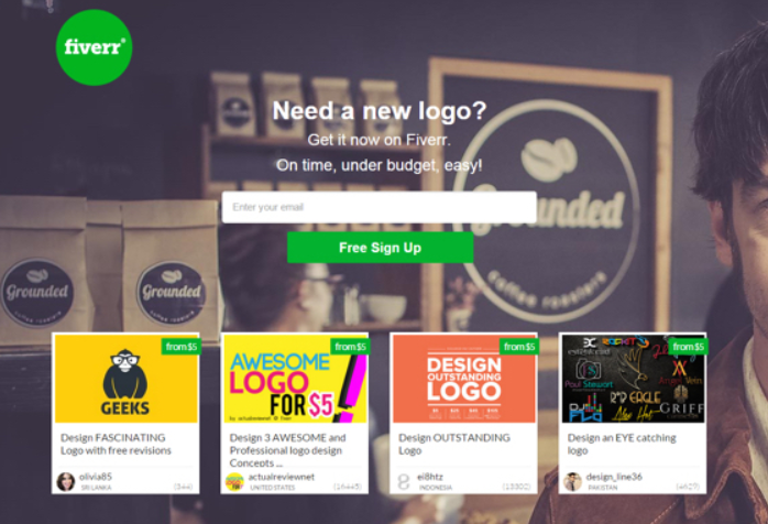
And the same thing happened to Fiverr.
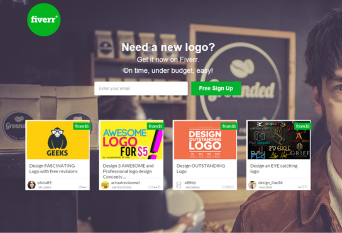
By simply adding prominence to the CTA button (it was placed below the field and widened), it increased sign-ups by almost 30%.
This small tweak decreased friction because people were looking at the image example rather than focusing on the sign-up area, and by increasing the size of the button and giving it a dedicated line, it emphasized the visibility of the desired action which was to sign up.
See how easy it is to apply a small tweak and see a spike in conversion?
Another example worth mentioning is the following.
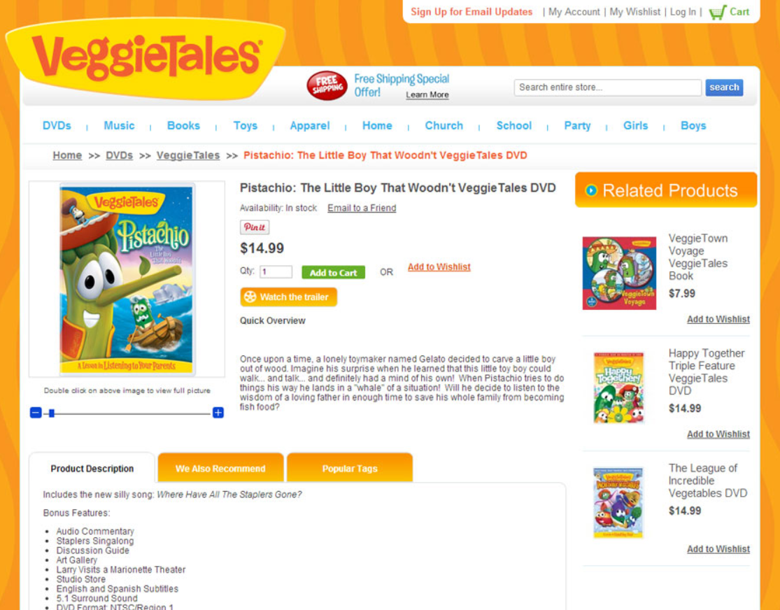
By making the green “Add to Cart” button more prominent, by reducing friction removing distracting content areas like the sidebar, the orange tabs, and by adding more spacing around the button, revenue increased by 13.9% per visitor.

Takeaway: Making your CTAs prominent is a basic step in the optimization process. CTAs are high points of leverage for conversion optimization because visitors are constantly interacting with them immediately prior to actually buying from you. Give the CTAs on your forms their own dedicated line if possible, increase the width of the button, and add spacing below the CTA if there's additional content that may be distracting.
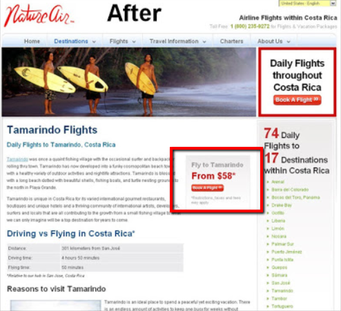
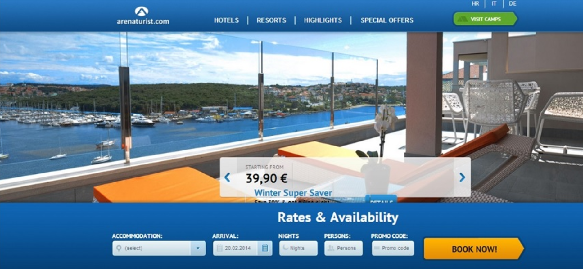
2. Place Your Primary CTA Button Above the Fold
Your primary CTA button should be visible and above the fold.
If you bury your CTA to learn more, book a call, sign up, or whatever you want your prospects to do, you’ll likely lose them because they won’t see your offer.
So don’t make it difficult for people to find your CTA buttons. Add one in your hero section and above the fold so prospects don’t have to scroll down.
For this website, for example, by simply placing the CTA button above the fold, the conversion rate increased by 31.12%.
Before…

After…

See the difference?
Can you imagine wanting to book a room on that website and struggling to do something that simple?
That’s not how any booking experience should be. Always place a CTA button above the fold.
By following this best practice, the website below saw a 27.39% revenue raise by moving the CTA button above the fold.
Before...

After…

Sounds simple and it is.
Some factors like adding a more noticeable color to the button and adding social proof below it helped increase revenue. But the biggest factor was placing the button above the fold.
In this other case study that we analyzed in our Proven Sales Conversion Pack, moving the primary CTA drove phone orders up by 19%.
Before...

After...

And what was the big change the website above did? Simple. They moved the CTA button above the fold. They made it more visible and removed distracting elements around the button.
Those minor design tweaks drove significant results for two reasons: 1) moving the button up, above the grey dropdown increased its visibility on the page, and 2) the "all costs at a glance" dropdown (“Alle kosten op een rijtje”) was likely a source of friction, people were distracted by it, and by seeing the cost breakdown, they may have gotten scared off and worried about if they'd be able to afford it.
Put everything that is essential above the fold on your landing pages. Limit the content to headline, subheadline, and the primary CTA. If you follow these best practices, your CTA buttons won’t get ignored.
Takeaway: If you run an ecommerce store, the placement and design of your CTA button is a key point of conversion leverage. Consider moving it up, above the fold on your page, and use a powerful color. Also, add a testimonial as a "pattern interrupt" on your products’ page because social proof is persuasive and that’ll help you convert better.
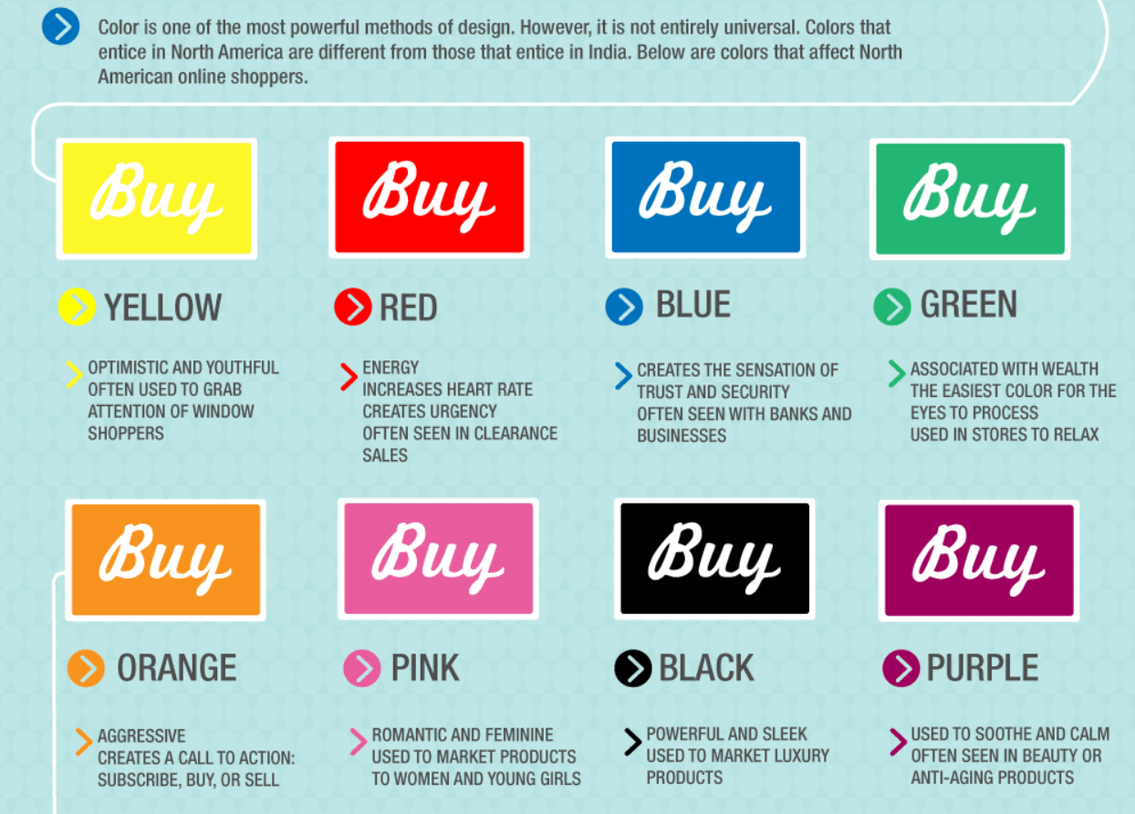
3. Use Powerful Colors That Stand Out
When tweaking your CTA buttons, follow this tried-and-true button format that we, at AutoGrow, love...
BABBs—Big-Ass (big on-page) + Bold (strong color contrast) + Buttons (easily recognized as a clickable button, with rounded corners).
That’s the best way to make your prospects not ignore the path they need to take down your funnel.
Your buttons need to pop. And the best way to do that is by adding powerful colors that catch prospects’ attention.
Colors are tied to emotion, and emotions have a direct correlation with purchasing decisions. This means each color has their psychology behind them.
Research by Midas Media shows that the best colors to use for CTA buttons are orange and blue. In fact, one case study analyzed in our Proven Sales Conversion Pack shows that a big orange button boosted lead conversion rate by 32.5%.
But ultimately, your color choice will depend on your website design.

Source: Midas Media
There are plenty of choices for your CTA buttons like the ones shown below. However, A/B testing is always a secure way to make sure your elements in your landing pages are converting or not.
Source: Neil Patel
In the example below, a simple change in a call-to-action button color raised free trial sign-ups by 12%.

They simply added a green call-to-action button in the bottom navigation bar that stood out more than the blue one. Also, they changed the text for a more appealing one (Join Live Demo vs. Free Trial).

This simple CTA color change had a high impact on sign-ups because it was shown on all pages of the website in the bottom navigation bar. This small tweak converted better because it brought the CTA into alignment with all the other pages that used green as the CTA standard.
Consistency in design is a form of explicit alignment and it converts.
In the example below, by making the navy button green, the website saw a 35.81% increase in sales.

It's pretty amazing to see how a simple change in the color and design of the “Add to cart” button on a landing page increased sales—not clicks, but sales—by more than 35%.
And here's the reason why. First and foremost, the visibility of the button was increased so that it stood out on the page and was clearly recognized as a button (note the rounded corners). Also, note that the size of the button was increased.
Takeaway: Ensure that all your critical CTA buttons use a consistent color that stands out. Red, green, orange—these colors often work well, but it's not about any single color. Because if you have a website with a red-ish theme and a red button, then orange won't work so well because it will blend in with the rest of the site. Use a color that won’t be ignored.
4. Use Colors that Contrast the Background & Text
Tell me something, is it worth it so far using powerful colors for your CTA buttons? Of course, it is. But that’s not the only thing that matters when tweaking your buttons to boost conversions.
The color of the text and the background of the page are actually just as important as the color of the button itself.
The text on your button must be readable. It needs to contrast with your button color because it can provide an increase in conversions.
For instance, research by Midas Media shows that the best color to use for the text in CTA buttons is white.

Source: Midas Media
Since most buttons have a colored background like orange, blue, or green, white text happens to be the easiest color to read on those backgrounds.
Don’t make your prospects struggle to read anything on your landing pages. The reading experience should be comfortable, simple, and effortless. Otherwise, guess what’s going to happen? Your prospects will exit your page in the blink of an eye.
As a matter of fact, contrasting colors make people purchase 57% more often. Don’t believe me? Here’s a case study that proves it.

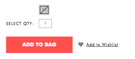
The reddish-pink button converted better because it stands out more than the black one. It's a powerful color that contrasts with the white background. Black and white obviously contrast, but in this case, the lower example is actually better because the text on the page is already black and gray.
The reddish-pink is a more unique color, and there's something emotional about it. Red connotes energy, vitality. And since the text on the page is black and gray, this contrasted more for that same reason. So be wise when choosing your font color.
In the example below, tweaking the font color on the button resulted in 18.01% decrease in click-through rates. And that sucks. Why would they change the black text to yellow anyway?

Takeaway: sometimes obvious choices are the wrong solution. For example, black and white contrast for sure, but when your website design is already dark, adding a black button with white text won’t stand out. Always choose a color that pops out at first glance.
5. Make Your CTA Buttons Look like BUTTONS
What do you think will happen if your call-to-action buttons don’t look like buttons?
Prospects won’t click on something that doesn’t look clickable. Even using hyperlinks can be not noticeable. So you better make sure your buttons’ shapes are easily recognized as a button.
It’s your call if you want to leave them with square edges or with rounded corners. But ultimately, you’ll have to A/B test shapes and see what converts better on your website.
At AutoGrow, we actually use buttons that are rounded because we consider them easier to be recognized. So when redesigning your buttons, make sure they are not just a random box on your page and that they have clear borders and white space surrounding them.
In Dallas Theological Seminary’s website, highlighting the text in the top navigation yielded 190% increase in conversion.
Before...
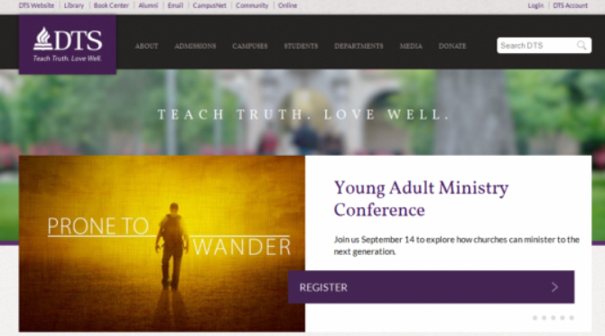
After…

Highlighting your key CTA links with color or turning them into buttons is always a safe bet to get more people to a key landing page.
This small tweak worked because it makes a critical action more visible. And that which is more visible gets more attention and more clicks.
Takeaway: People don’t click on something that doesn’t look like a button. Define their shape no matter if they’re squared or rounded. And make them pop out.
6. Place Your CTA Buttons in Visible Places
Define the action you want people to take in your funnel. Ask yourself, “where is a big bottleneck in my sales funnel right now?” And then, decide where you can place the CTA buttons on that bottlenecking step so more people can flow to the next step in the funnel.
Navigation and sidebars are often good places to add your buttons. But don't feel limited to those options. Consider putting them directly into the content of your page.
You already know that your CTAs should be above the fold near the top of the page so visitors don't have to scroll down to see it. So don’t be shy when trying to show them.
Research by Nielsen Norman Group shows that people scan web pages and phone screens in various patterns, one of them is the shape of the letter “F.”

Source: Nielsen Norman Group
Another study by Nielsen Norman Group says that on web pages, people spend more time viewing on the left half of the page versus on the right half. 80% of the fixations fall on the left half of the screen, and 20% of fixations on the right half of the screen.

Source: Nielsen Norman Group
Position your CTA button where they’ll influence the decision-making process of your prospects.
In fact, using vertical layouts can draw 52% more bookings. And that’s what happened in the example below.
Before...
After…

This tweak worked because the new placement of the CTA button gives greater visibility (moved higher on the page) to the most important CTA section of the page: the booking form. It’s also directly in the user's line of site, overlapping the hero image.
This other study demonstrates that single line search can generate 4.18% increase in revenue.
Before...

After...
In this case, better design minimized conversion.
The original search form design took up more space and positioned the search CTA button far off on the bottom right side of the screen. The redesigned version was on a single line, and with less text, one less field, and the CTA button directly beneath the form.
Many opt-in forms are presented in a standard top-to-bottom way. Perhaps putting all your form fields on a single line for one of your high traffic pages could grow your conversion rate. But the idea is to decrease the perceived effort required to go to the next step in your funnel.
Takeaway: Your end goal is to move prospects from one next to the other until they become paying customers. Help them get to the checkout page by clearly pointing out the way for them. Think of your CTA buttons as your road signs. While you’re driving you want to clearly see those signs on the road, right? You don’t want to park the car aside on the street and look for them. The same thing should happen on your website.
7. Add Enough White Space Around Your Buttons
White space is the space you must add between elements in your composition. Especially around your CTA buttons.
Adjust the spacing of elements around your buttons to make it easy for your prospects to pick out key information from your pages. Delete any distracting content or elements around them. And maximize the visibility of the CTA with enhanced size, shape, and color.
Your CTA buttons should always have a fair amount of white space surrounding them. White space helps call the users’ attention to your button and helps it stand out. And by following this best practice, you can increase your click rate.
And even though white space doesn’t necessarily have to be white, research by Midas Media shows that the best color for surrounding your CTA buttons is white.

Source: Midas Media
Conclusion
In a nutshell, crafting the perfect call-to-action button is one thing, but getting people to click it is another.
And that’s exactly what this article is for: to help you tweak your CTA buttons so you can increase conversion. And best of all, you don’t need to hire a designer to optimize your pages.
You must remove from prospects any effort required to go from one step of your funnel to the next one.
CTAs are a high point of leverage for growing your conversion rates. They’re not just decorative elements on your page. Sure, they must look nice and all that, but the most important thing is that they should follow the 7 best practices shown in this article. And if you don’t apply those small but powerful tweaks on your call-to-action buttons, you’ll most likely not get subscribers, sign-ups, orders, downloads, or attendees to your webinar.
And don’t assume that all changes you make to your funnel or landing pages will work immediately.
But if you need help tweaking your funnel and implementing those changes to your funnel, reach out to our instant all-in-one team of digital marketing pros and we’ll take care of your funnel from top to bottom while you sit back and watch all these tweaks bring you massive results.
Now tell me something, which of the tweaks of this ultimate guide will you start implementing first? Are you looking to become a future case study like the ones featured in this article?
Let me know in the comments below.
Keep AutoGrowing, stay focused.
Mariana Lessmann


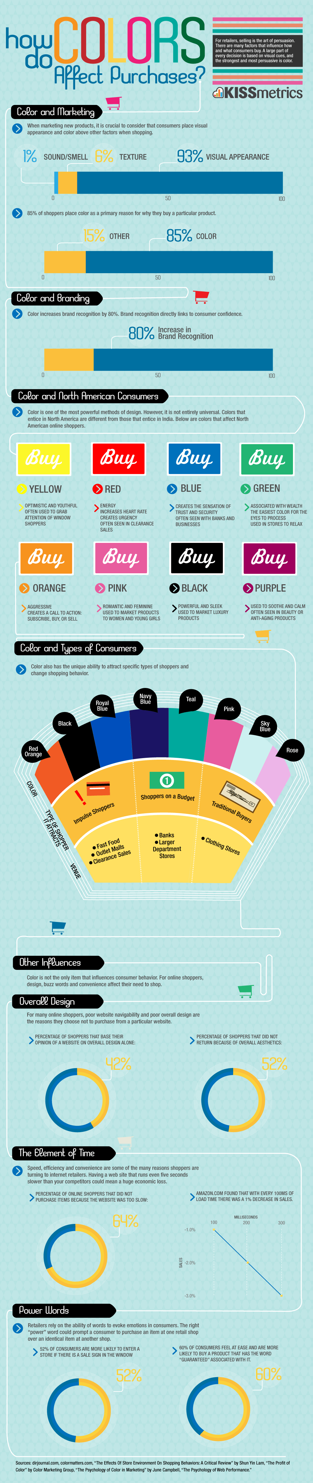