5 Billion-Dollar Business Landing Pages You Can Copy to Grow

“Never meet your heroes.”
That’s an old phrase that I’ve always liked.
It means that we all build up role models in our head.
Those heroes’ successes and accomplishments paint a picture of someone who’s infallible, perfect.
And when you actually meet them up close, you realize that they’re just as human and flawed as everyone else.
I once met and interviewed Steve Case, the founder of AOL. Nice guy but… He was just a dude! A human, like you and me.
But I say you should always meet your heroes.
Because despite them seeming less impressive in person (“oh, you’re just a person…”), your heroes have still accomplished something you can model or find inspiration from.
That’s why today, I’m taking a look at some of the “heroes” of digital marketing—those billion-dollar companies that have become leaders in their fields.
And a good chunk of their success is thanks to high converting landing pages.
In this article, I’m going to show you:
- 5 landing pages from billion-dollar companies like Shopify, Squarespace, and Airbnb.
- What these super-successful “marketing heroes” did right on their landing pages, where they could use some work, and what kinds of tactics you can copy to make your pages better.
- Why investing the time into nailing your own landing pages could be one of the best marketing decisions you’ll ever make.
All right, let’s do this.

What’s So Important About Having a Great Landing Page Anyway?
Duh.
A landing page is the first impression you make with your target audience.
It’s your chance to persuade them that whatever it is you’re offering, well, it’s exactly what they’ve been looking for (or never knew they needed).
And if you can nail the copy, design, and flow of your landing pages, you can boost your conversion rates and make more money.
Simple as that.
Now, it’s also important to recognize that landing pages also give you more control over how customized your visitor’s experience on your website will be.
As we all know, the more personalized your messaging is, the higher the chances are that your audience will convert on your offer.
And skilled marketers know it.
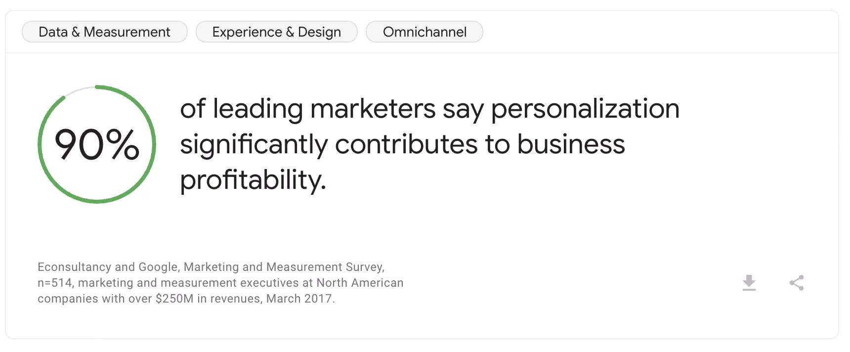
In fact, research from Google and Econsultancy found that 9 out of 10 leading marketers say increasing personalization is connected to better business results.
We actually listed increased marketing personalization as one of the top 6 marketing trends to watch for in 2020.
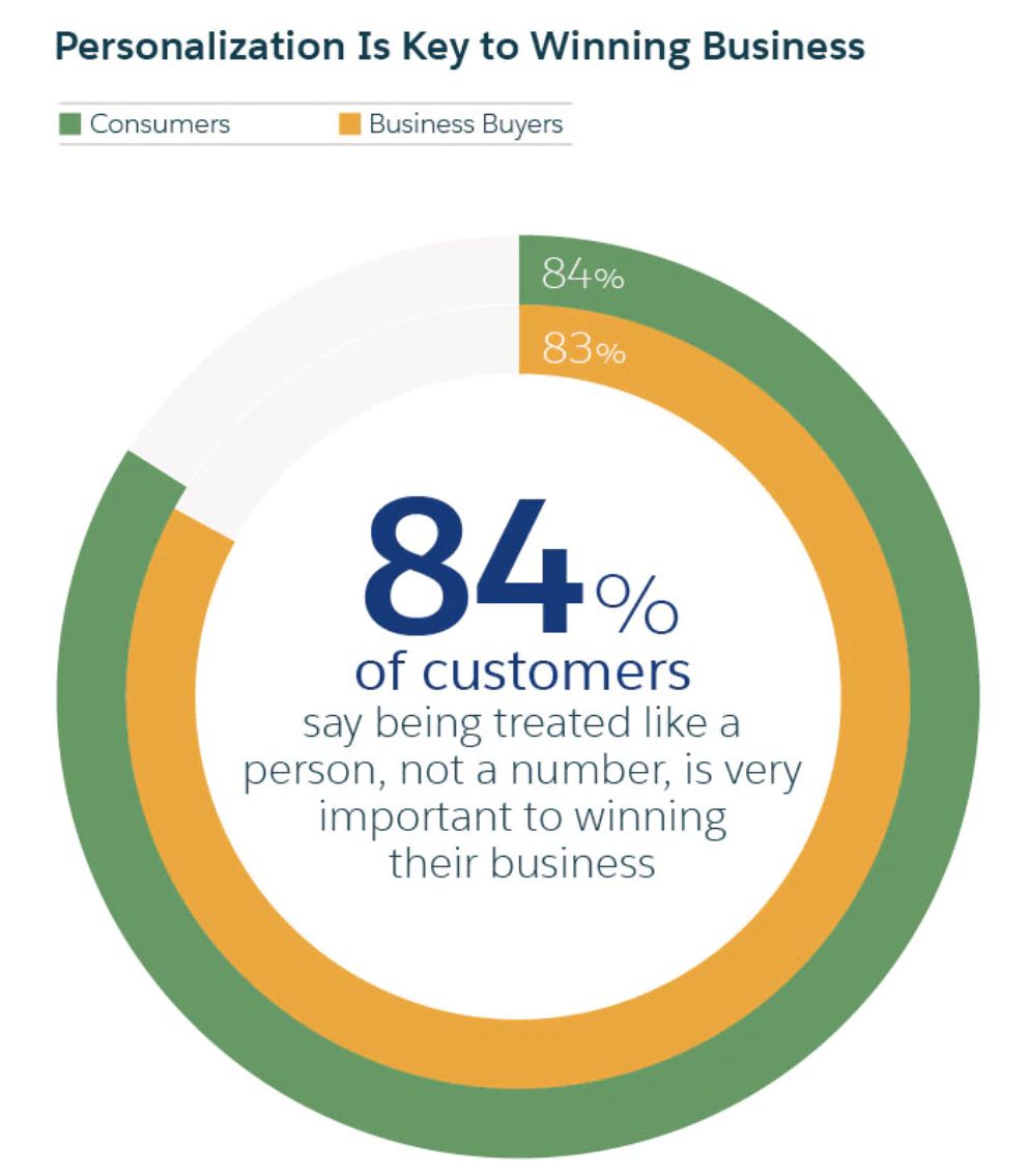
Simply put, people don’t like being treated like numbers according to research from Salesforce.
With your landing pages, you can customize how you sell your product or service to your visitors based on their unique customer journey.
Did they reach your site through Google ads? Organic traffic? From an email campaign?
Each source is going to have different expectations as well as different needs that your sales page needs to meet before prospects are willing to give you their business.
And if you can create a personalized landing page for different prospects from different sources, then you’re going to be much more likely to close the sale.
In fact, Hubspot found that there is a direct relationship with the number of landing pages a business has and the number of leads they produce.
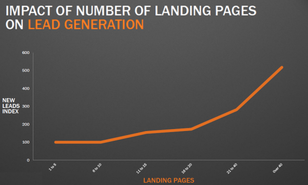
In a report more than 7,000 businesses, they found that increasing the number of landing pages on their site from 1-10 to 10-15 can actually lead to a 55% increase in the number of leads.
The takeaway here is that landing pages matter.
And in fact, they are one of the best tools at your disposal to attract and convert new customers and grow your business.
Now, let’s take a look at how some of the most well-known multi-billion dollar companies have structured their landing pages.
Landing Page Example #1: Airbnb Home Hosting Page Hits All the Points
What Is It?
Airbnb has taken the hotel industry by storm. Its unique take on renting a room lets travelers stay in spare bedrooms, offices, or even on the couches of anyone who has the extra space.
It’s available in over 65,000 cities and in more than 191 countries around the world.
In 2018 it was valued at $38 billion (though that has dropped substantially in 2020 due to the global pandemic).
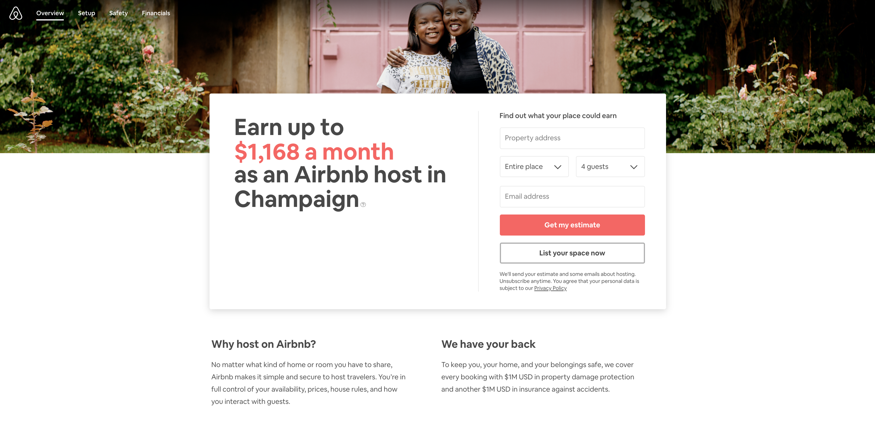
Their landing page is built specifically for people interested in renting out their property.
What This Landing Page Example Does Right
- Hits the #1 Pain Point Right Off the Bat – The headline makes it clear that Airbnb knows exactly why people want to rent their space out: money. In especially clear terms, Airbnb states that you can make a hefty amount of money hosting your space. Plus, the earnings actually shift to show you how much you could make per week, per month, and per year to really drive the point home. Check it out.
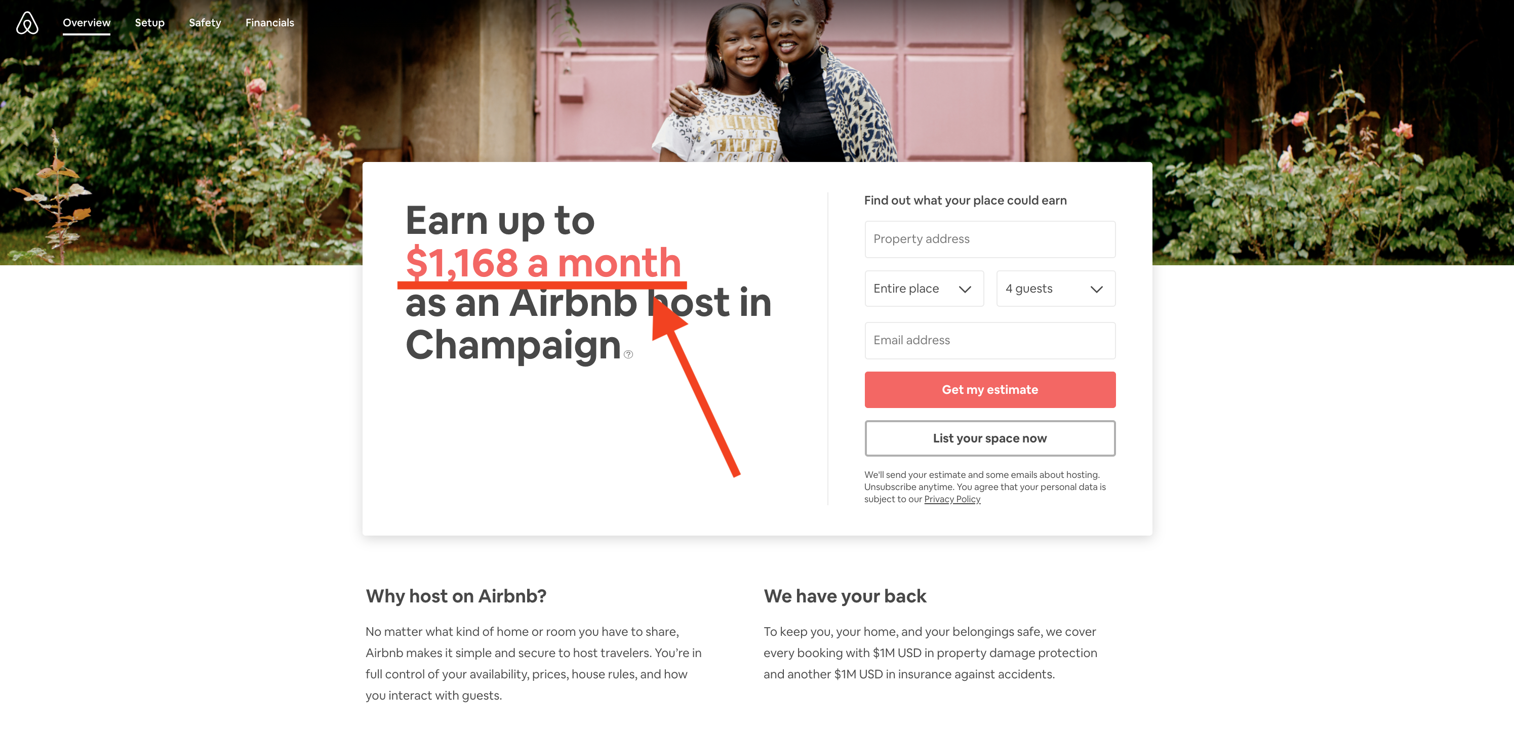
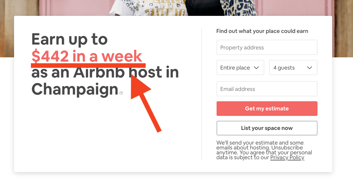
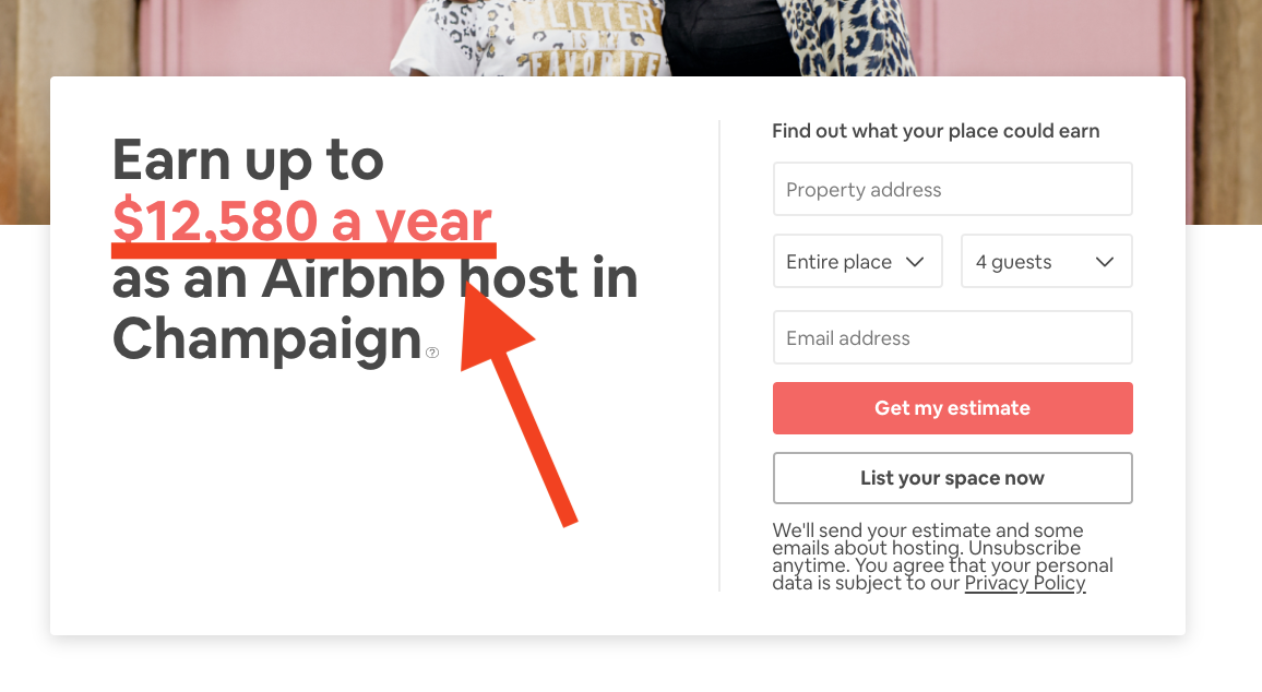
- Super Personalized Information – Another awesome detail about this landing page is it’s personalized based on your specific location. So the savings calculated actually come from where you’re located. As a result, you’re getting an accurate depiction of exactly how much you can save by renting out your property.
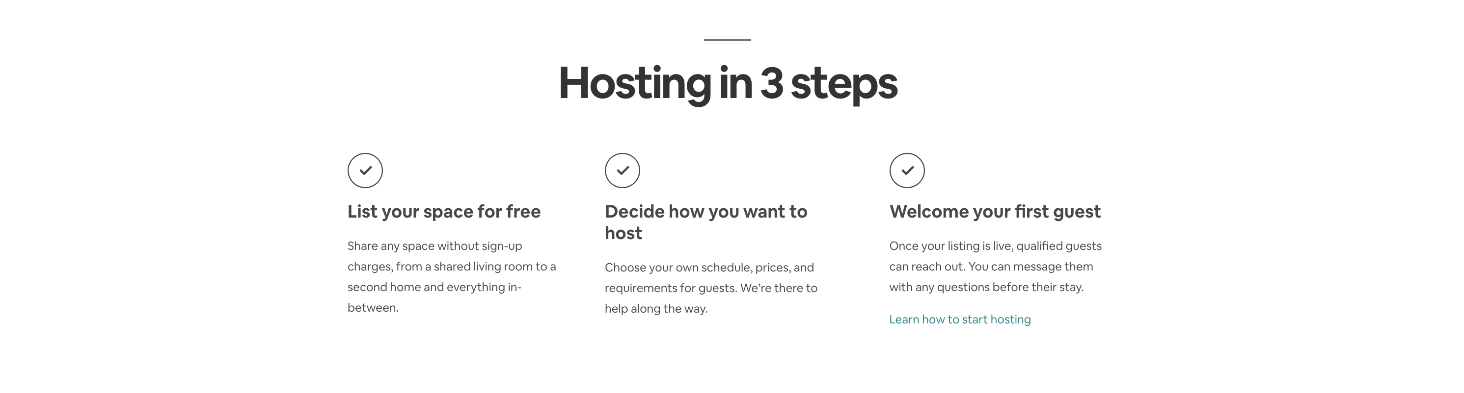
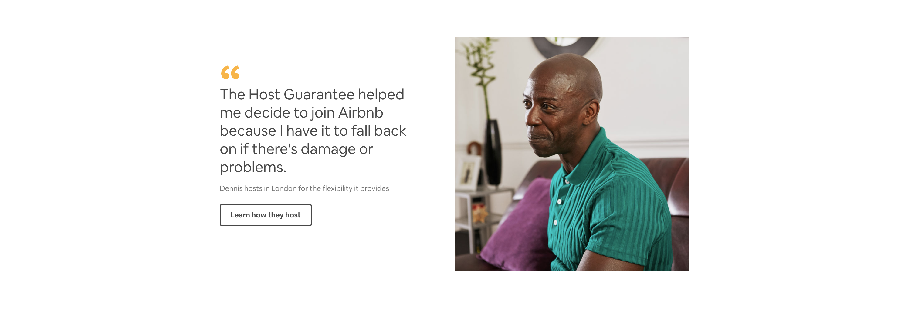
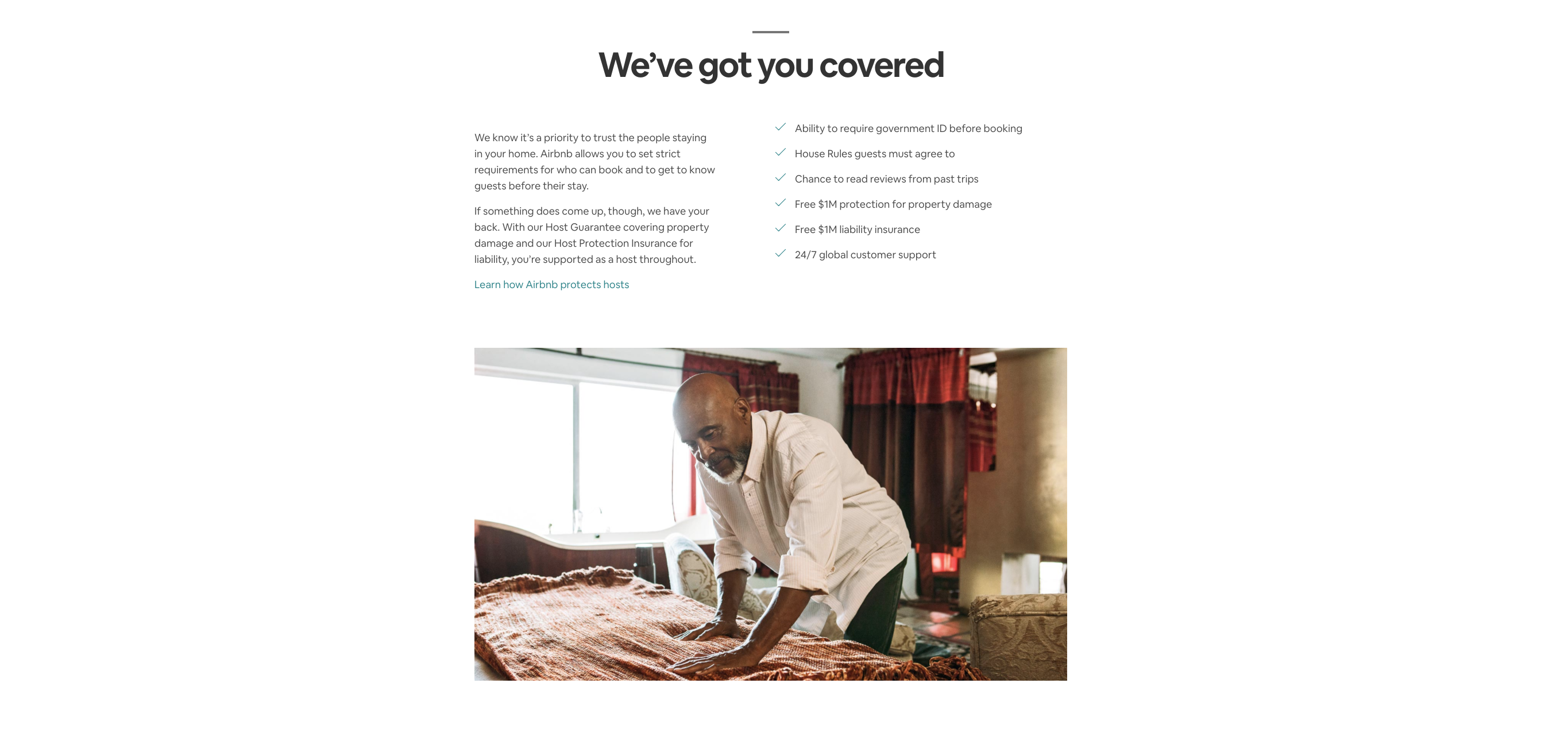
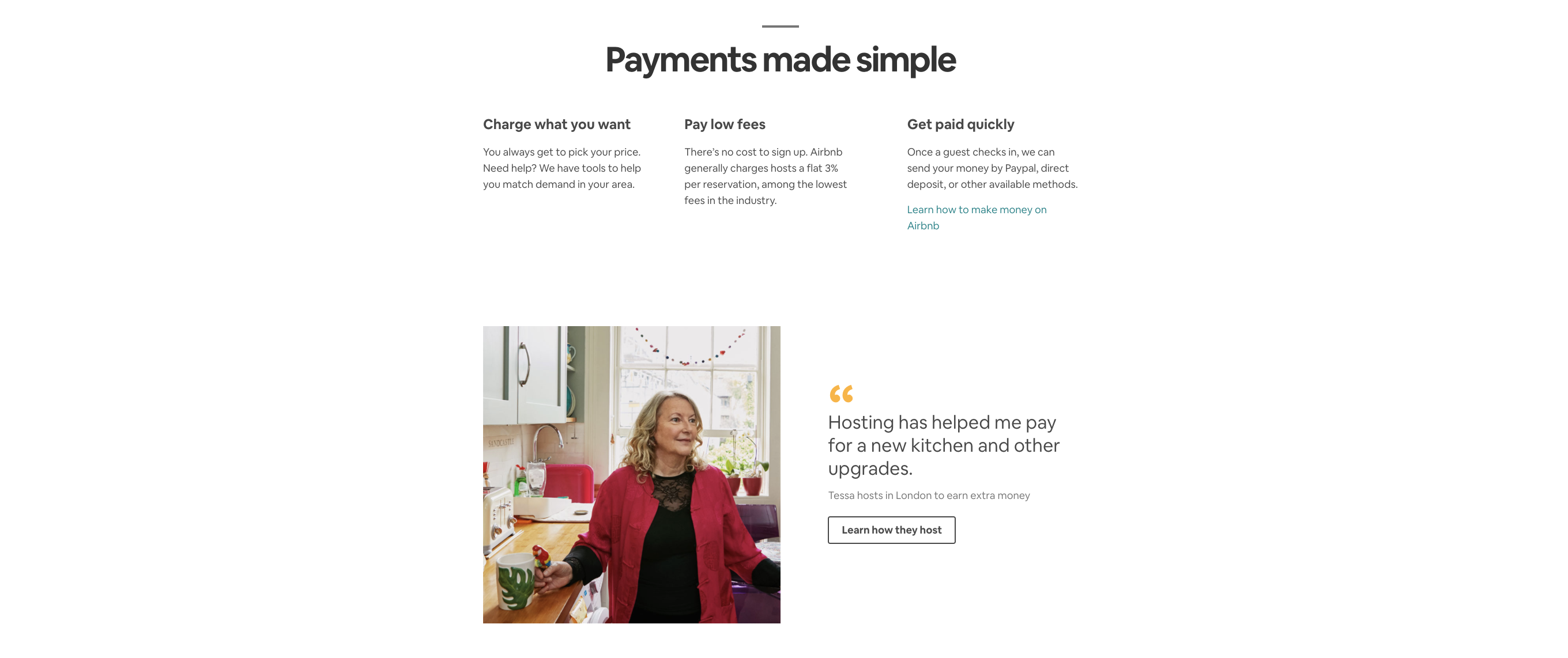
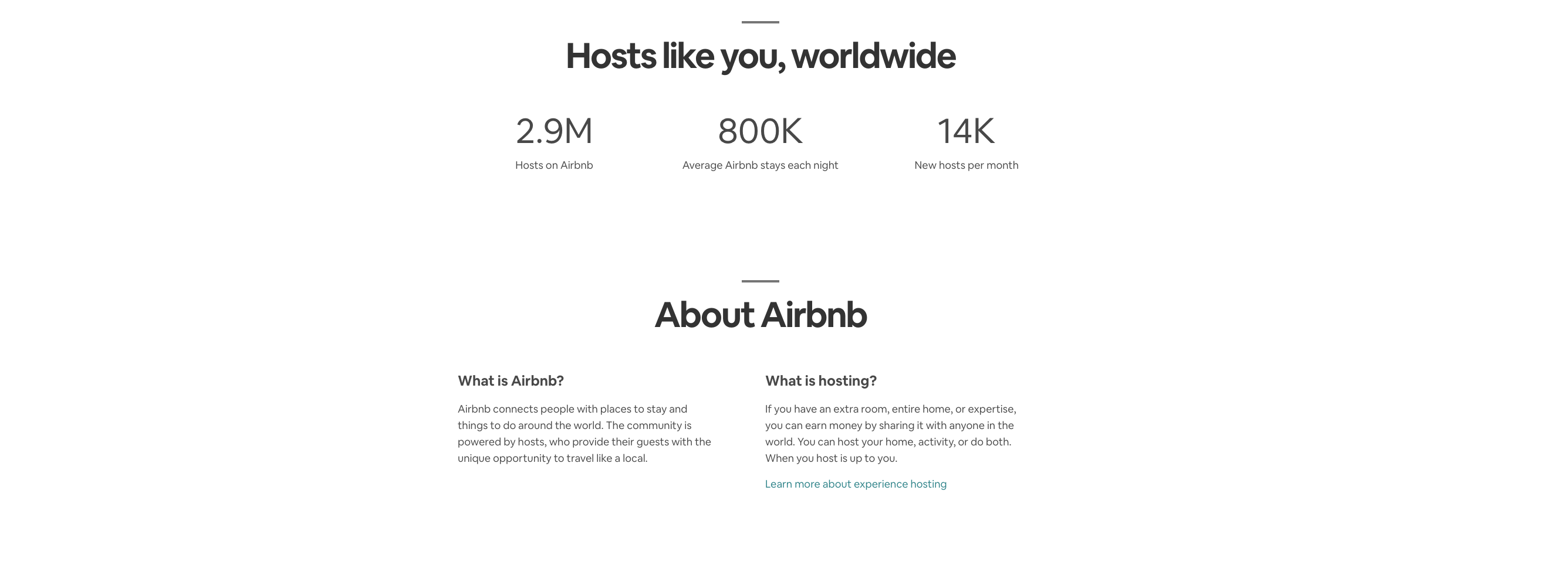
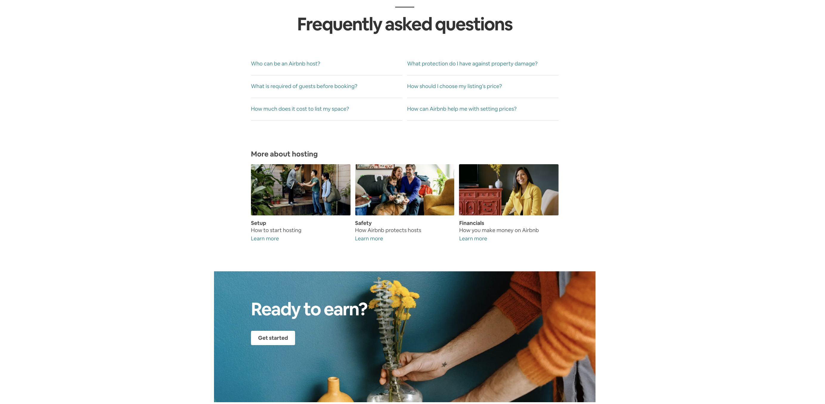
- Hits All the Structural Points – This landing page also hits a lot of the structural points that we follow when we’re creating high-converting sales pages for our clients. For instance, they have an eye-catching headline, CTA above the fold, a How It Works section, social proof and testimonials, a benefits and features section, vanity stats, and an FAQ section.
Where This Landing Page Example Could Improve
- Lackluster Design – There’s a lot of white space on this landing page. Too much in fact. This page would benefit from a few more pops of color throughout.
- Not Enough Pain Point Agitation – The headline section does a great job of calling attention to the main reason people are here: to see how they can make more money. But the copy on the page doesn’t do anything to actually agitate that pain (one of the best copywriting techniques to drive conversions).
Landing Page Example #2: Squarespace Is a Visual Feast
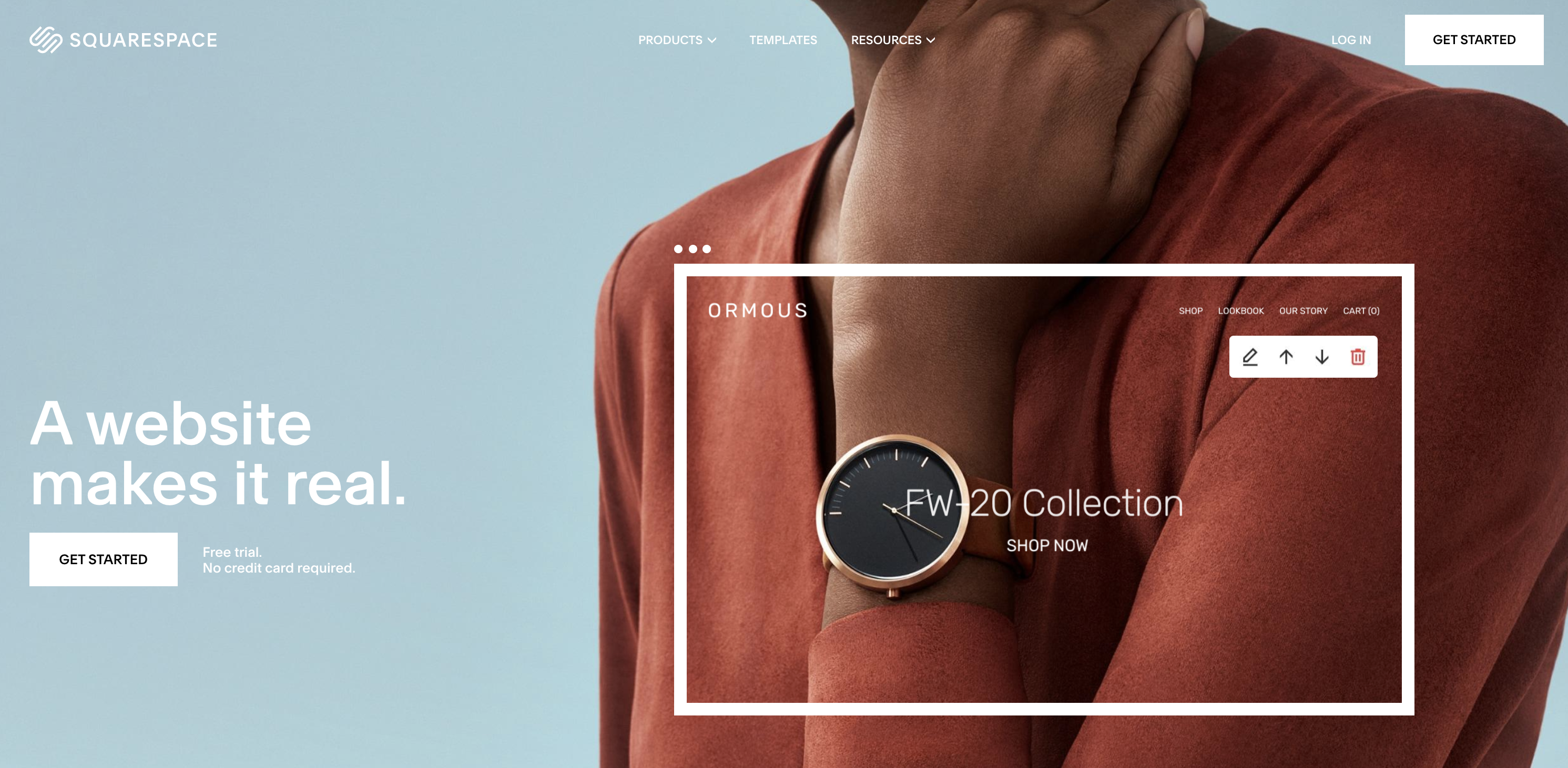
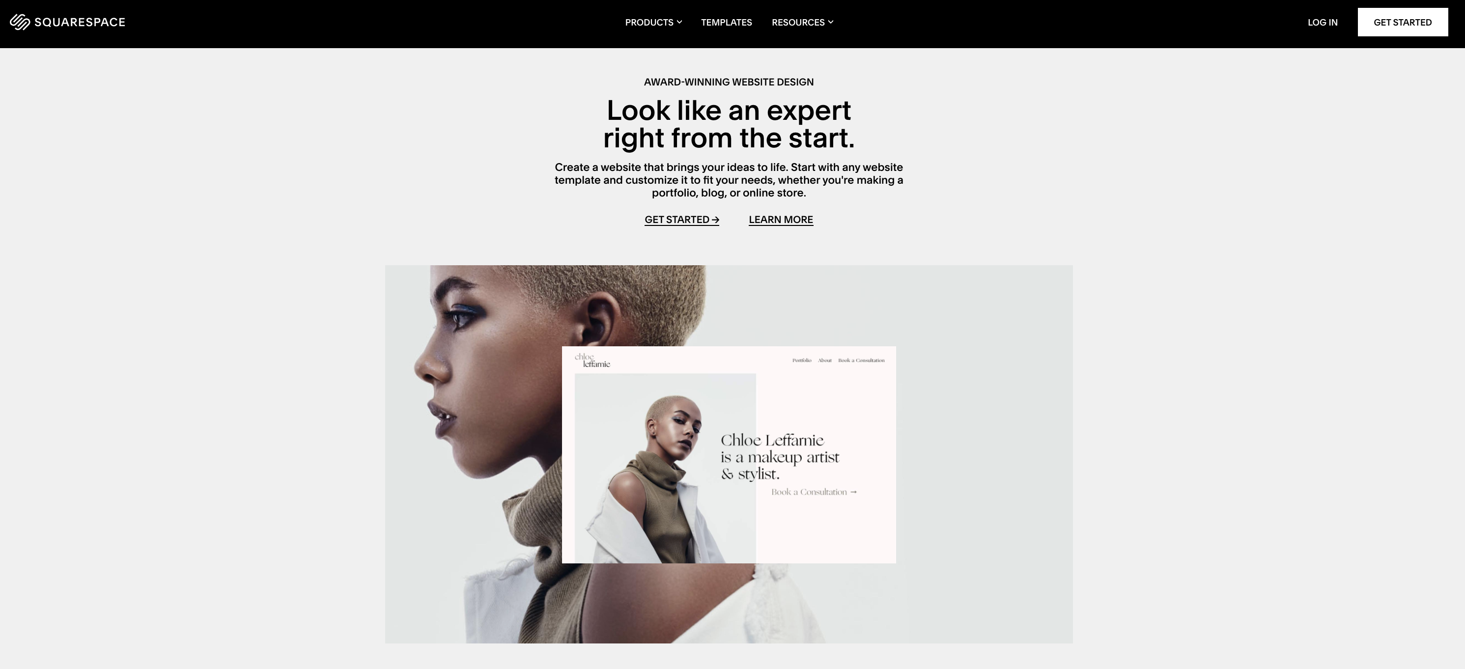

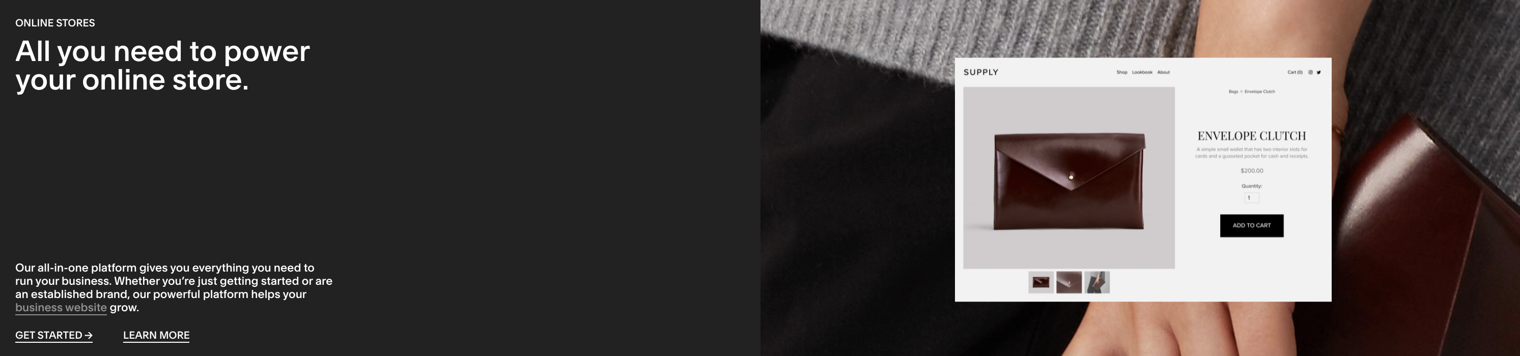
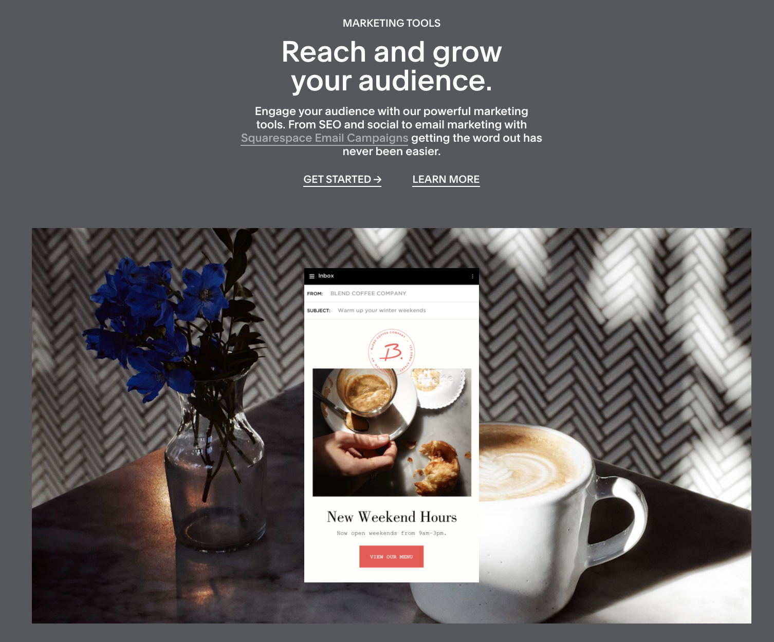

What Is It?
Squarespace not only solved a unique problem (regular people needing to create a great looking, stylish website without having any coding or design experience). But it also did so in a visually distinct and design-focused way.
Their website builder is as easy to use as it is pleasing on the eyes.
It’s no wonder Squarespace was valued at $1.7 billion in 2017.
Their landing page is their main sales page.
What This Landing Page Example Does Right
- Highly Appealing Design – An eye-catching design is great for most products. And it’s true—if your design sucks, then your leads are likely going to click off your page without another thought. But it’s especially important with Squarespace because beautiful design is one of their main selling points for their product. And with the cool, collected colors on their page as well as their smooth transitions from section to section, it’s clear Squarespace has their design game down.
- CTA Always Available – It’s always important that you make it as easy as possible for your visitors to convert on your offer. And ensuring that your CTAs are always on the page (Law of Visibility) is one of the best ways to do that. Squarespace made sure to follow this rule by actually placing their CTA right in their navigation bar that’s always visible, no matter how far down the page you scroll.
- Great Focus on People’s Faces – Including plenty of faces on your landing pages is a powerful way of connecting with your audience on a human level. It’s also one of the best tactics for conversion optimization. Squarespace is obviously aware of that fact and are using it to their advantage, especially in this section. See?


Where This Landing Page Example Could Improve
- FAQ & How It Works Section Would Be Valuable – While Squarespace does a good job of appealing to a variety of industries and shows what’s possible with their platform, they don’t really get into the specifics much. An FAQ and How It Works section would be helpful in answering some basic questions and giving visitors a sense of what it’s actually like to build their own page.
- Missed a Price Anchoring Opportunity – When it comes to website design specifically, pricing can be a major pain point. Squarespace missed a valuable opportunity at calling this detail out and positioning their own pricing against that of other companies (i.e., price anchoring). This is especially true because they’re quite a bit more affordable than the competition.
Landing Page Example #3: Shopify Is Chock Full of Real-Life Examples
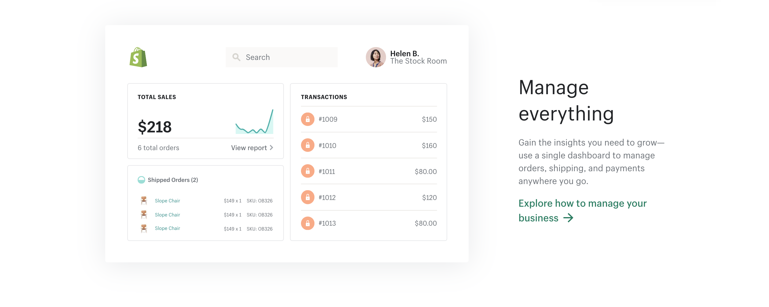

What Is It?
One of the leading ecommerce business building platforms in the industry, Shopify was founded all the way back in 2008. And since then, its users have built more than 500,000 stores using the platform.
It isn’t surprising, then, that Shopify brought in about $1.5 billion+ in revenue in 2019.
This landing page is its main sales page.
What This Landing Page Example Does Right
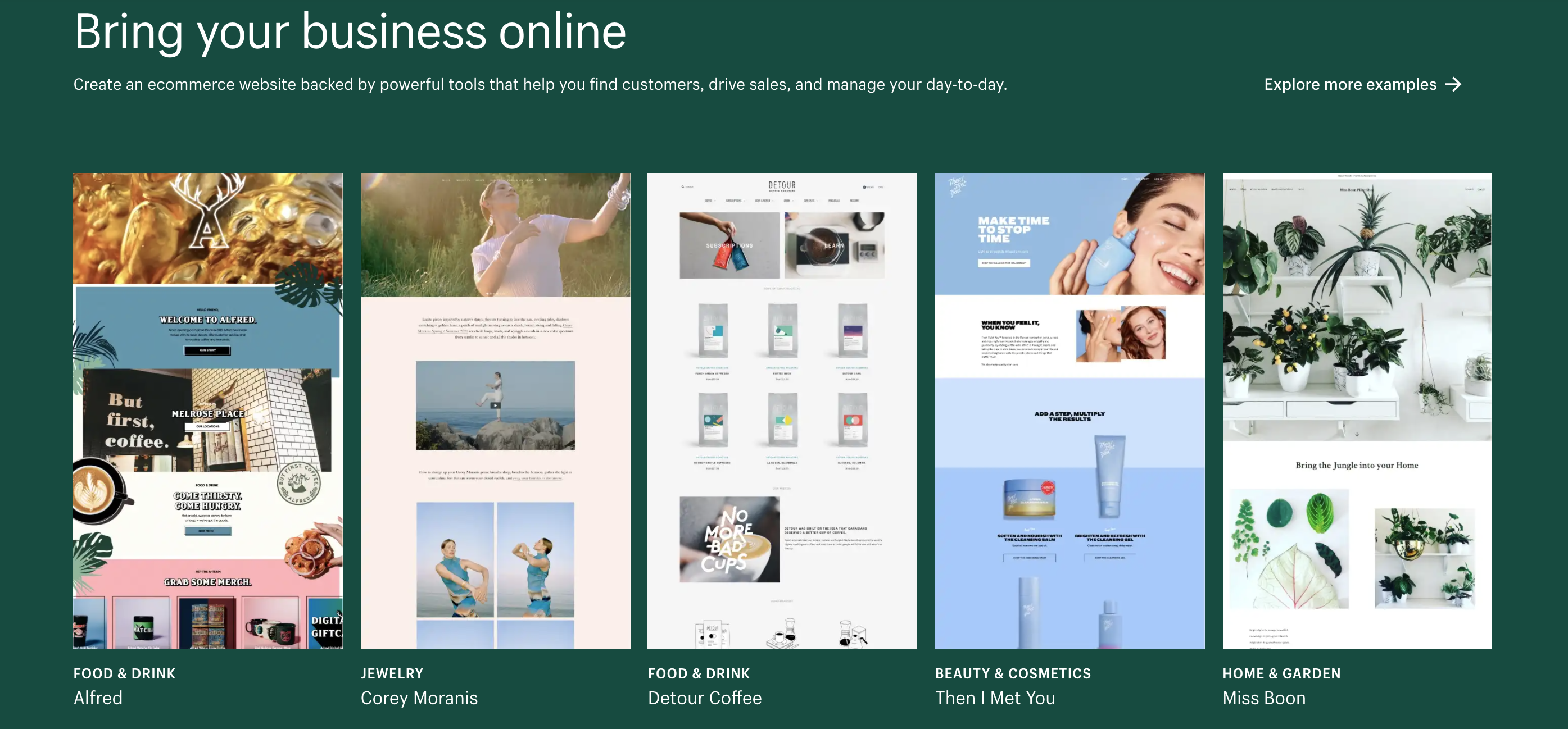
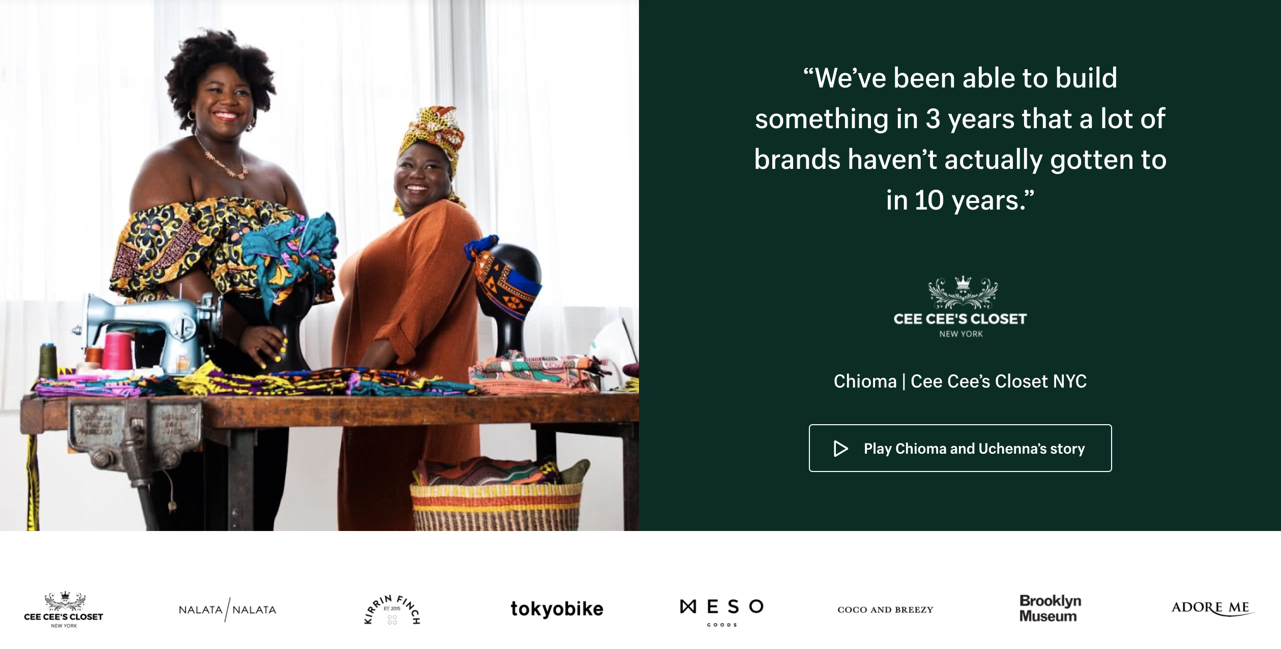
- Tons of Examples From Real-Life Customers – When working with an online business builder, you want to know that it’s actually worked for past customers. And you also want to see just what’s possible with the platform’s tools and features. Those two needs are fulfilled in one fell swoop with the examples section. Here you can get a sense of the design aesthetics possible with Shopify while also getting a hefty dose of social proof (these are real websites from past customers after all).
- Strong Offer Right Off the Bat – Free! People love the word. Love saying it, love hearing it. And with Shopify’s free 14-day trial, their visitors are going to be compelled to sign up. Best of all there’s no credit card required. That means you won’t be automatically charged once time runs out. It’s a powerful risk reversal (which as our Proven Sales Conversion Pack proves can help you convert 30% more) that’s bound to bring in loads more signups.
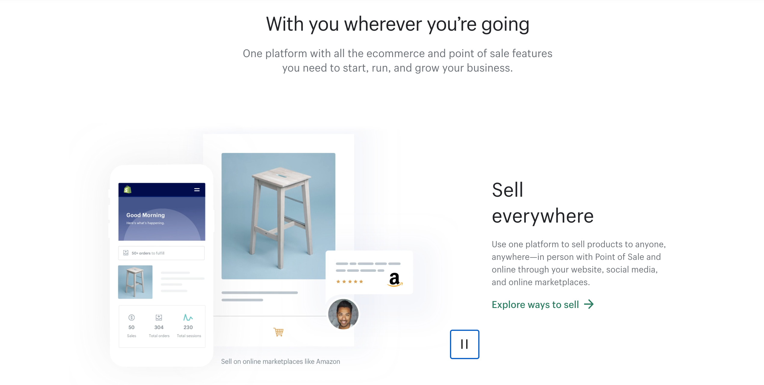
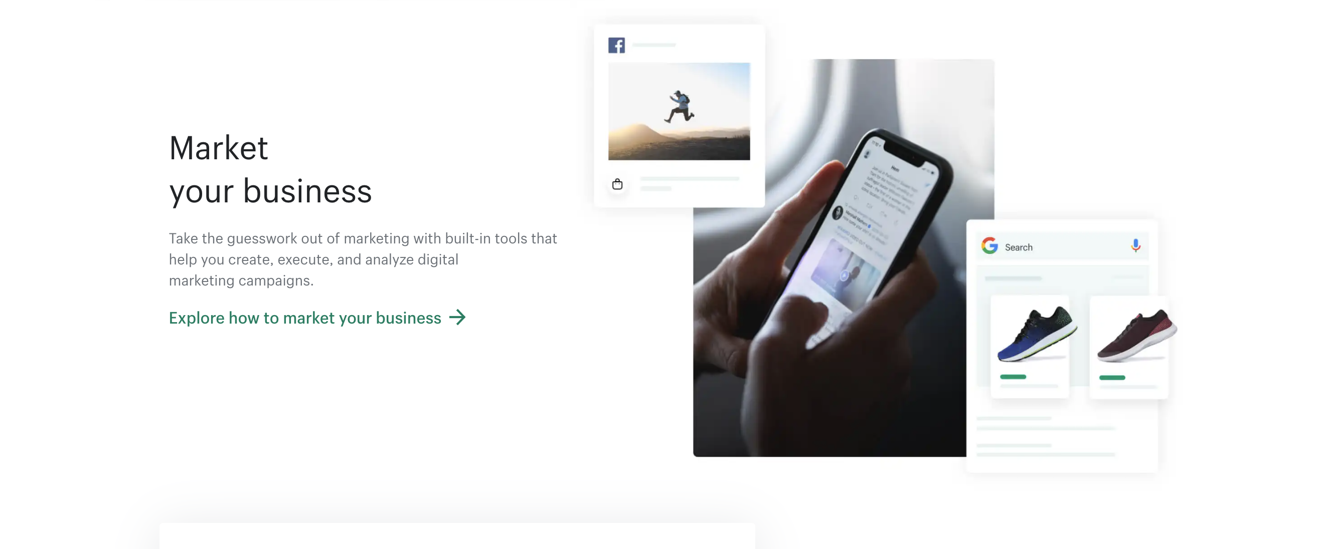
- Great Job at Hitting All the Major Pain Points – Last but not least, Shopify’s page does well at hitting the major pain points. First off, its main headline assures visitors that no matter what industry they’re in, Shopify can help them build a website. It also shows that the platform can support nearly every aspect of their business (selling, marketing, and managing). And finally, it hits on the pain point of not being tech savvy by pointing out that support is available 24/7, the app store integrates with tons of apps, and you can even hire a Shopify expert. The message here is clear: if you need help, Shopify can provide it.
Where This Landing Page Example Could Improve
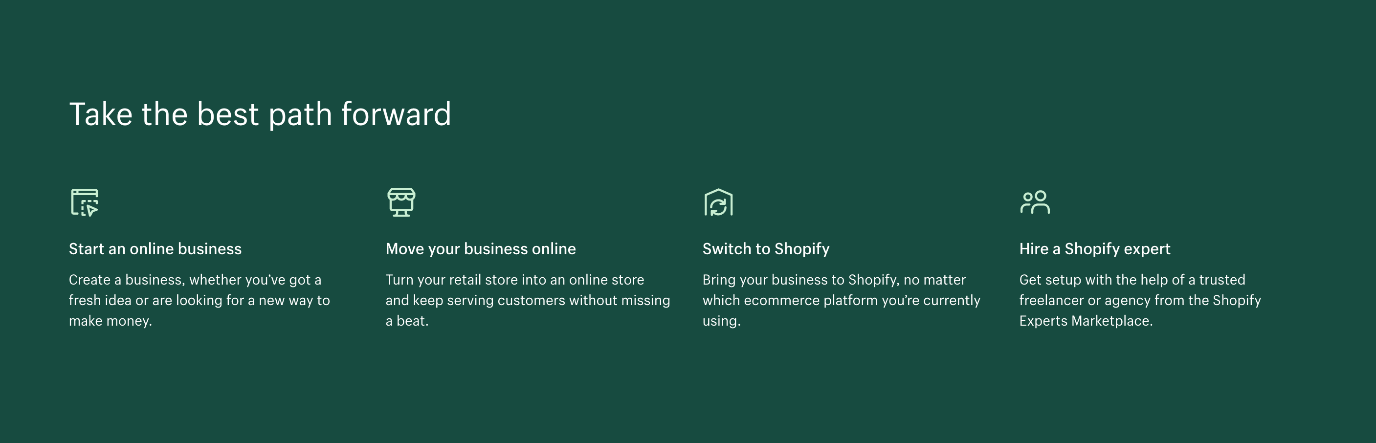
- A Section That’s Just “Meh” – One problem in particular that stuck out to me was the section pictured below. The points covered here, I think, are pretty important. Shopify is great for every type of business: whether you’re just starting up, trying to bring things online, or are using another platform, Shopify is for you. But the section doesn’t do a great job of calling out these different user profiles. And beyond that, they also throw in the “Shopify Expert” section at the end, even though it’s more of a feature than a type of customer. A better way to present it would be to highlight customers’ businesses that have matched those profiles and seen success using Shopify.
- A Few Frustrating Technical Details – First off, on my 15-inch MacBook Pro, the navigation bar reverts into a mobile version (see below). Now, this wouldn’t be too big of a deal if not for the fact that their navigation contains their primary CTA and follows you down the page. When it’s reverted into mobile though, that primary CTA disappears until you click the menu. Not good. Second, the pictures in the examples section are not hyperlinked to take you to the example page. Not a huge deal but it’s a small annoying blow to the user experience nonetheless.
Normal Navigation
![]()
Vs
Navigation on 15-Inch Screen
![]()
Landing Page Example #4: Acorns’ Crisp (Although a Bit Impersonal) Landing Page
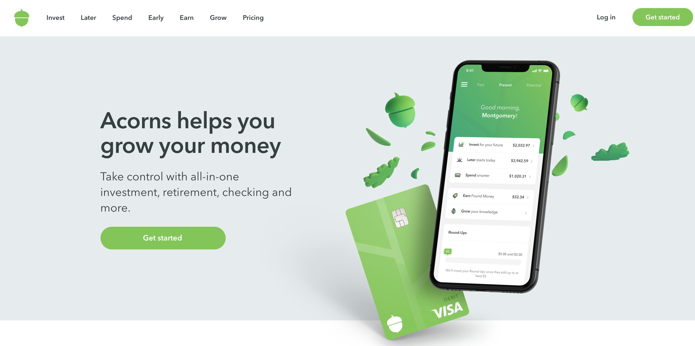
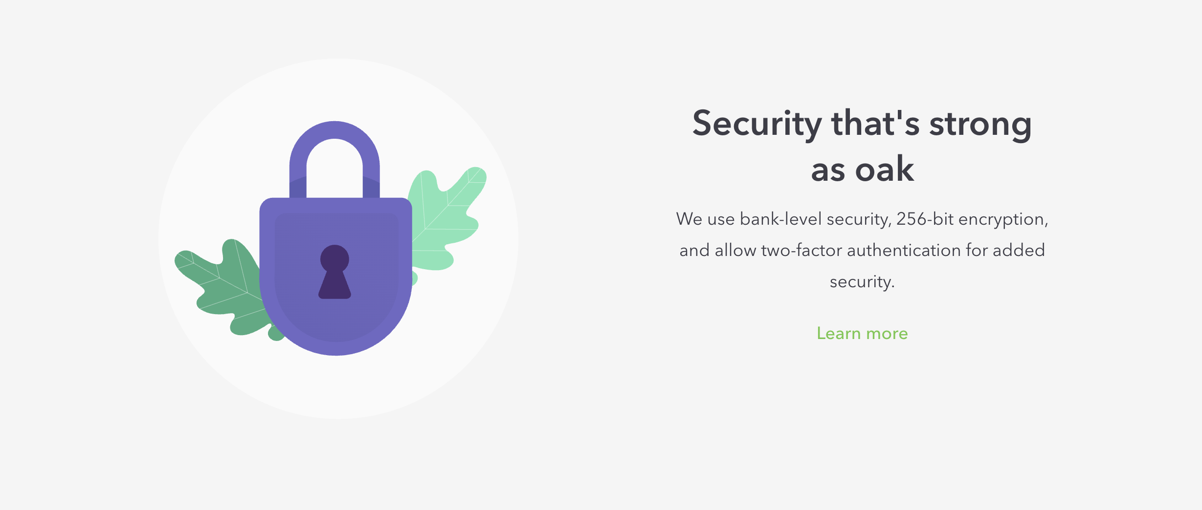
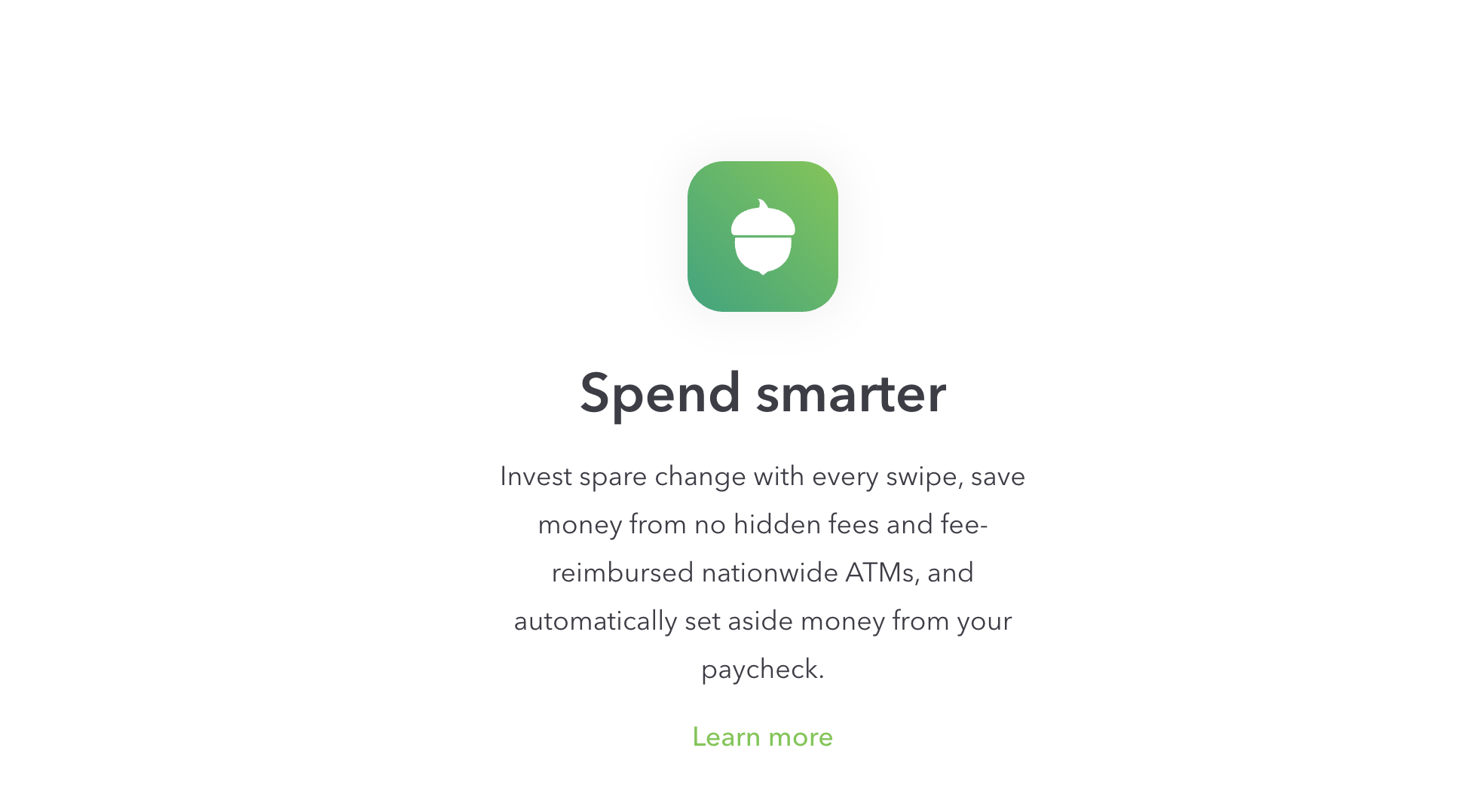
What Is It?
Okay, okay. So this one is cheating a bit.
Because to be completely honest with you, Acorns isn’t a billion-dollar company. It’s an $870 million company.
But hey, it’s pretty close. And it’s one of the best landing page examples we’ve seen.
Acorns made a name for itself by giving its users the ability to invest small amounts of money into stocks and bonds. Doesn’t sound that special, right?
Well, the Acorns difference is that the small amounts of money actually come from “roundups” where purchases made by a credit or debit card are rounded up to the nearest dollar. And the extra you pay goes straight into an investment account.
Pretty neat.
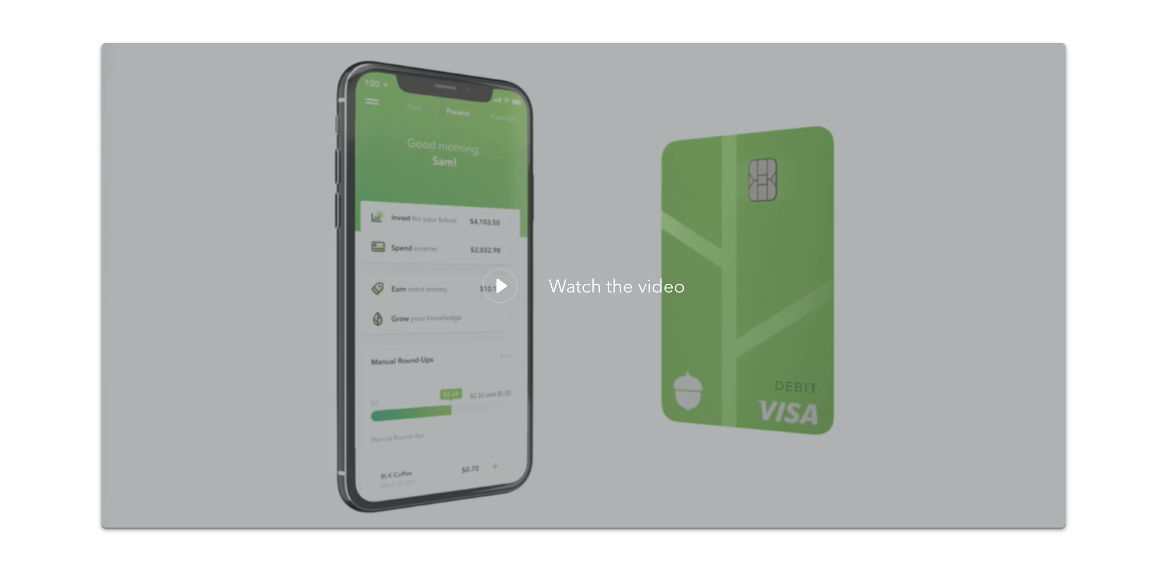
This landing page example is Acorns’ main sales page.
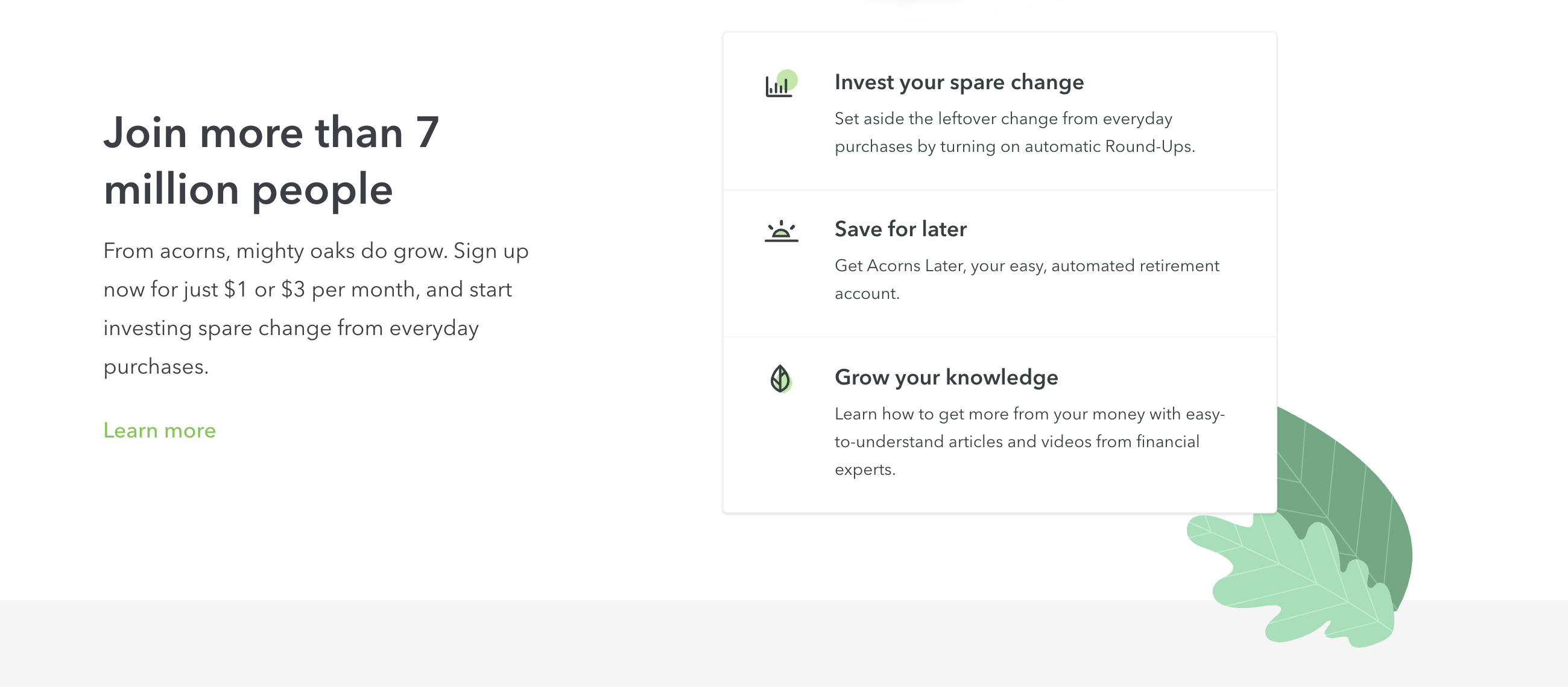
What This Landing Page Example Does Right
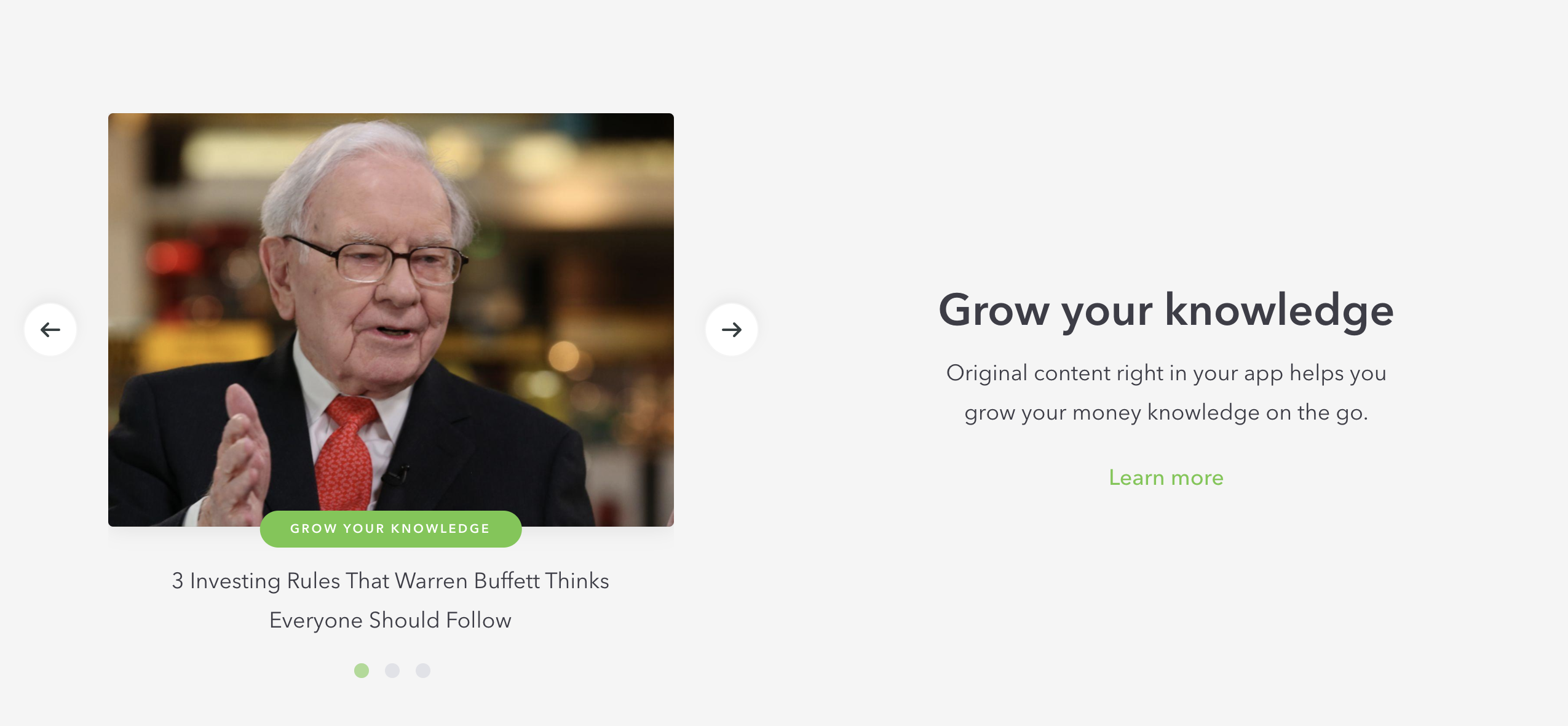
- Takes Advantage of Video – Acorns does a great job of including video on its main page too. True, this video is devoted primarily to selling a single feature (an Acorns’ branded debit card). But even still, it’s engaging, well-designed, and a snazzy addition to the page.
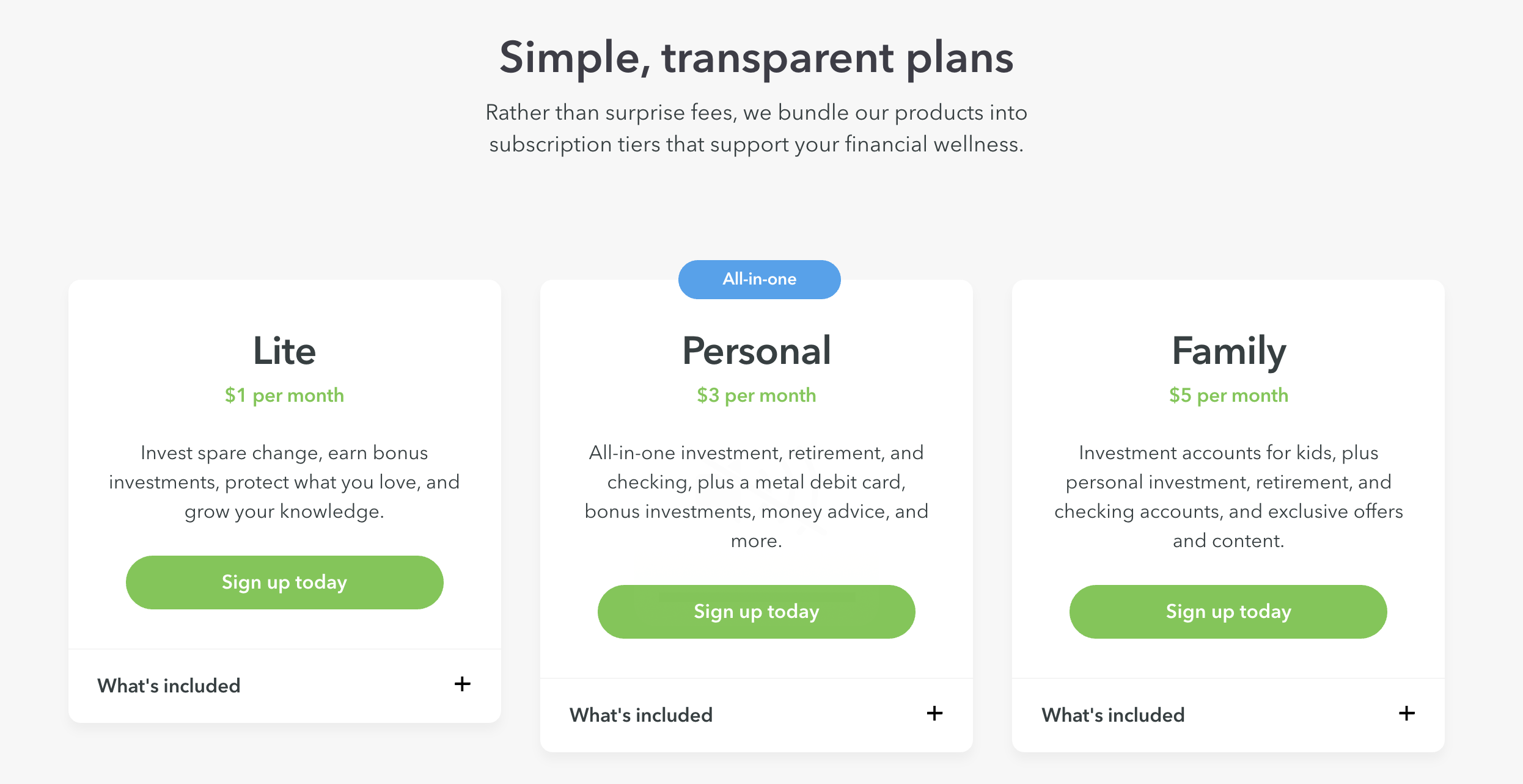
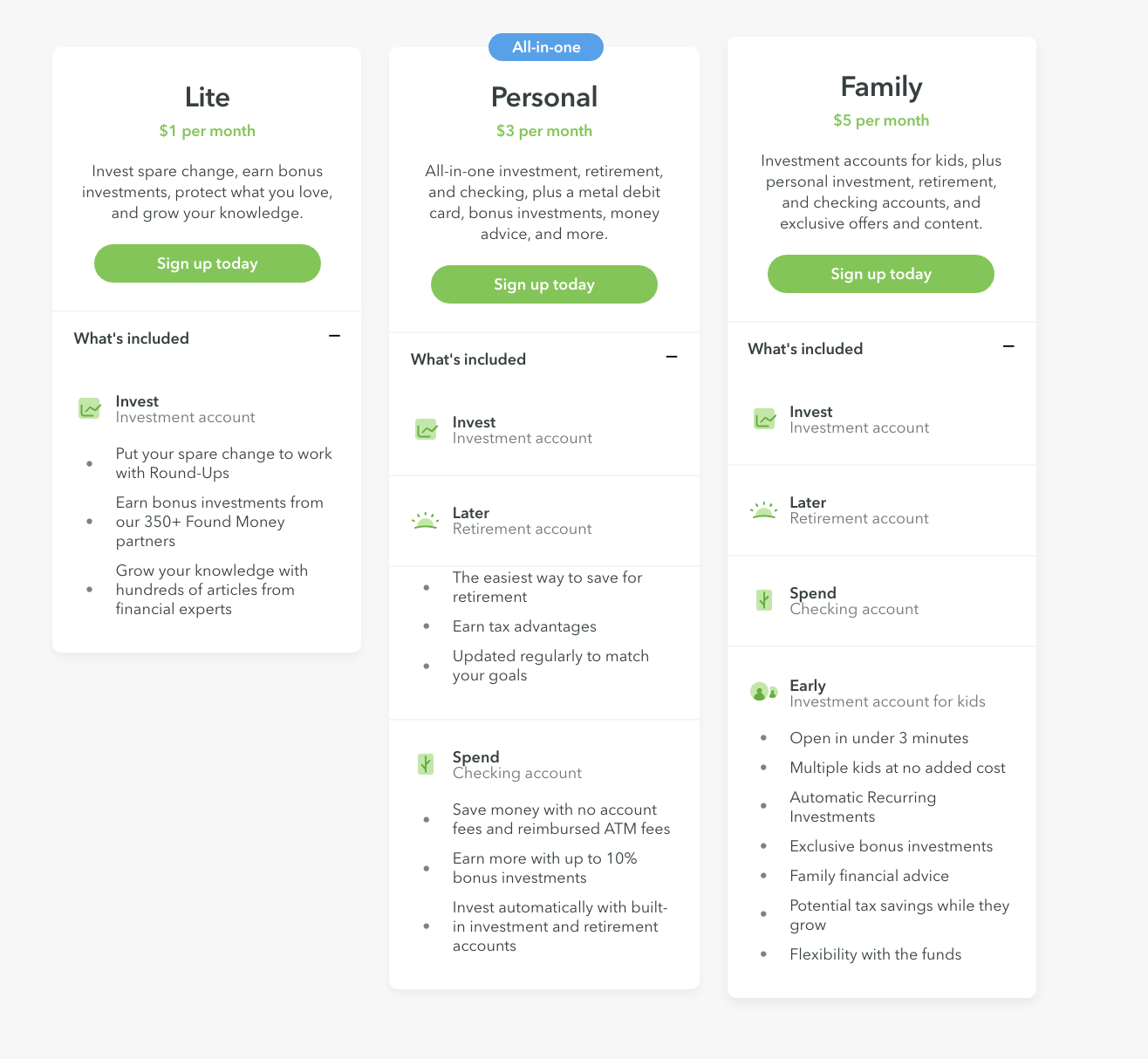
- On-Page Pricing – This one gets an extra special callout because surprisingly, a lot of companies don’t put their pricing up front and center like this. For most, there’s an entirely different page (we do the same thing). Now, part of why this is a benefit then is that having the pricing on the main page like this is great for low risk products. This is because the low cost is actually a big selling point. Acorns’ plans start at just $1 per month—not that risky, right? But for higher-ticket items or services, you’ll likely want your pricing on its own dedicated page.
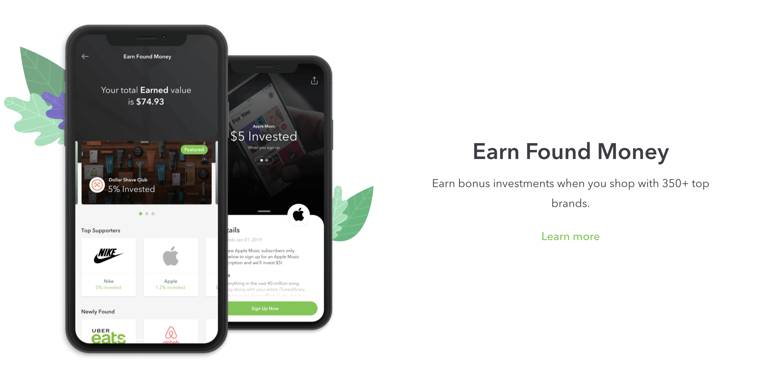
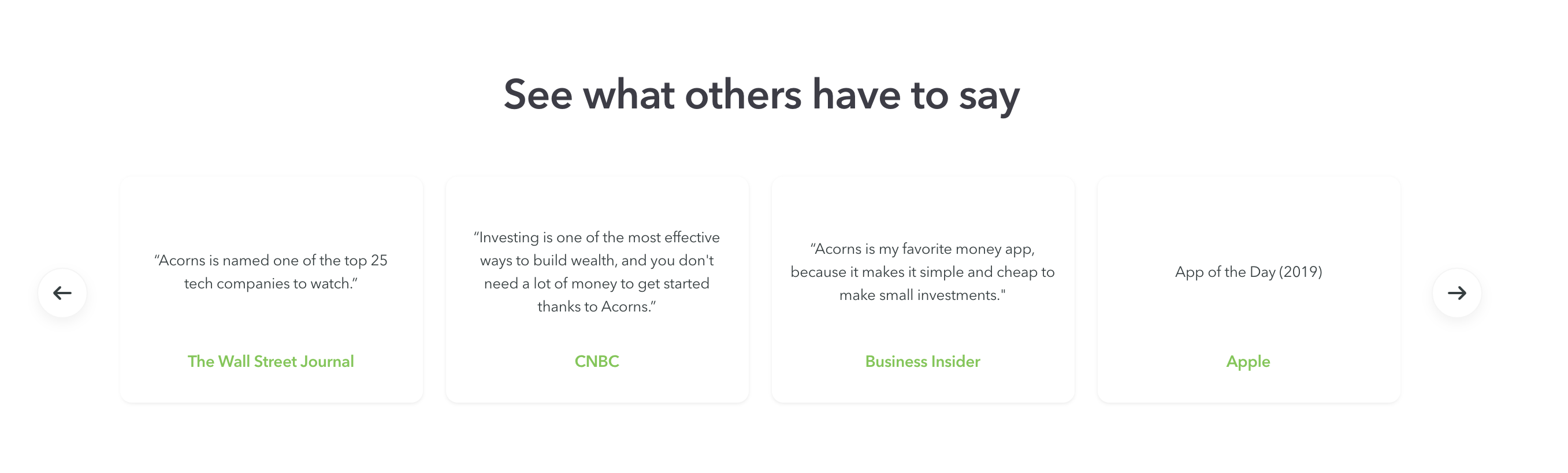
- Social Proof Is Ample (Though Not Highlighted) – This one’s a bit of a pro/con combination. As you may have noticed from the page, there’s quite a bit of social proof involved. There’s the “Join more than 7 million people” header of course but there’s also the entire “See what others have to say” section (pictured below). While this section contains tons of great PR from companies like The Wall Street Journal, Apple, and CNBC, there are no logos for speedy brand recognition and they’re way down the page. A simple vanity strip with the company logos would have been a great addition here.
Where This Landing Page Example Could Improve
- Design’s a Bit Cold – The design is sharp. It’s true. But it’s also a bit impersonal. As we’ve seen with other pages, using real life faces on your page is a great way to connect with your audience on a human level. You want to show real people using your product and ideally, enjoying themselves at the same time. But the only faces on Acorns’ landing page belong to people featured in their content section.
- Pricing Packages “Hide” What’s Included – The inclusion of the pricing packages is a great way to help sell the value of Acorns. But one thing I wasn’t a fan of was the fact that the differences between the packages were only visible from a dropdown menu (see below). The problem here is that visitors can’t immediately see the benefits of the higher priced tiers.
Landing Page Example #5: ZipRecruiter’s Highly Personable & Timely Page
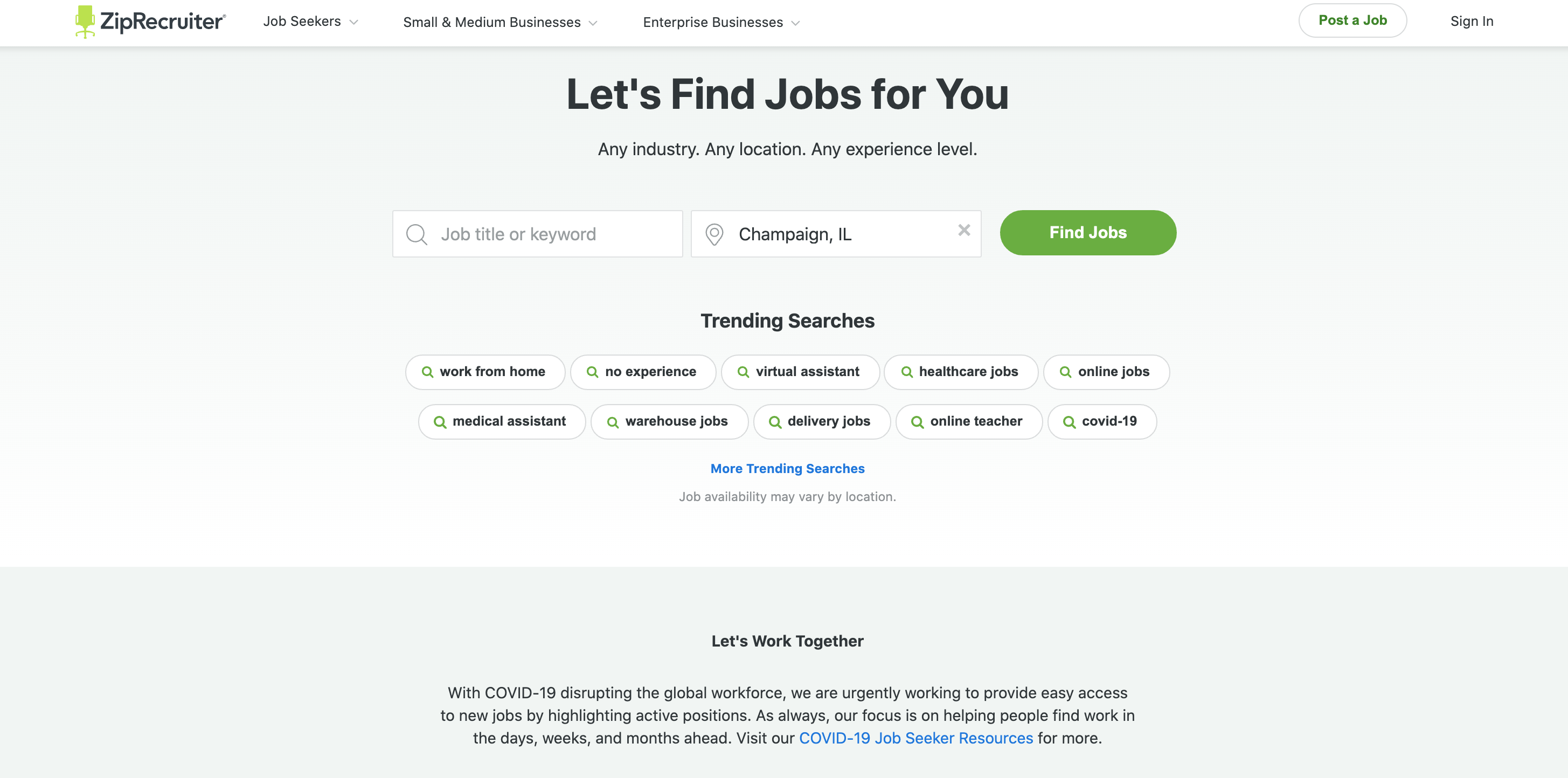
What Is It?
ZipRecruiter is an online employment marketplace that uses AI technology to connect millions of employers and job seekers.
They have 700+ employees around the world and in 2018, they were valued at $1.8 billion.
This landing page example is from their main sales page.
What This Landing Page Example Does Right
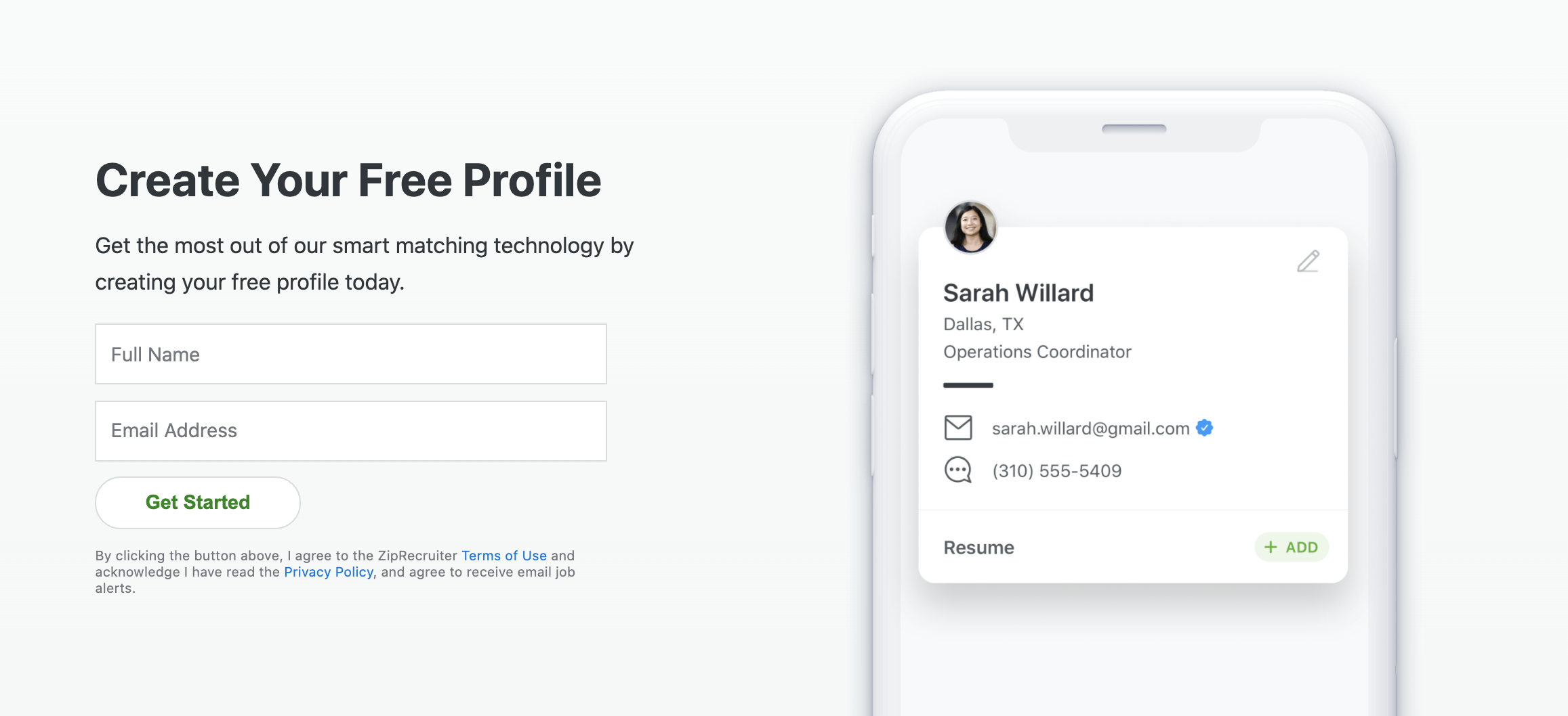
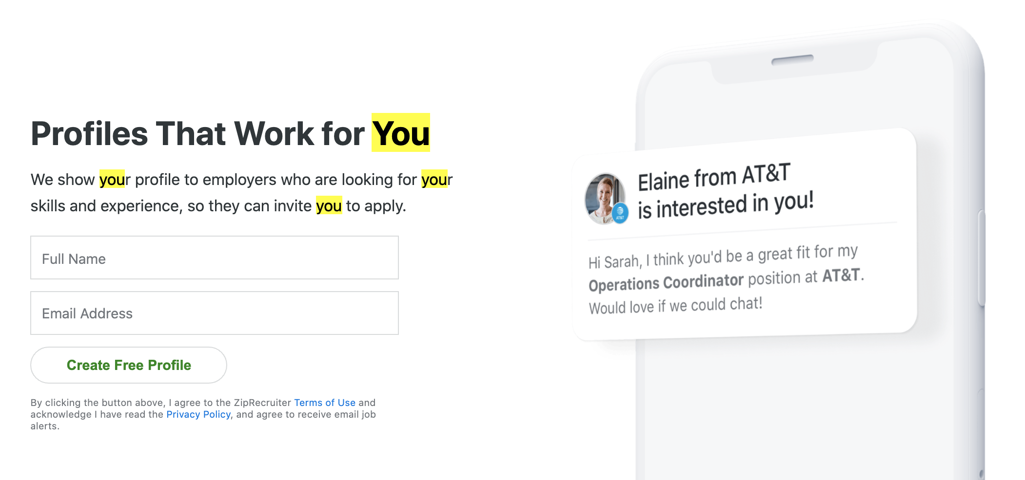
- Clear Headline With Up-Front USP & CTA – One of the best things about ZipRecruiter is that it’s built to help anyone get a job. It doesn’t matter where you are, what you do, or what kind of background you have. They can help you. And right off the bat, their headline says just that: “Let’s Find Jobs for You — Any industry. Any location. Any experience level.” Plus, they stick the CTA (form fields to look for a position in a specific location) right under the headline. Well done here.
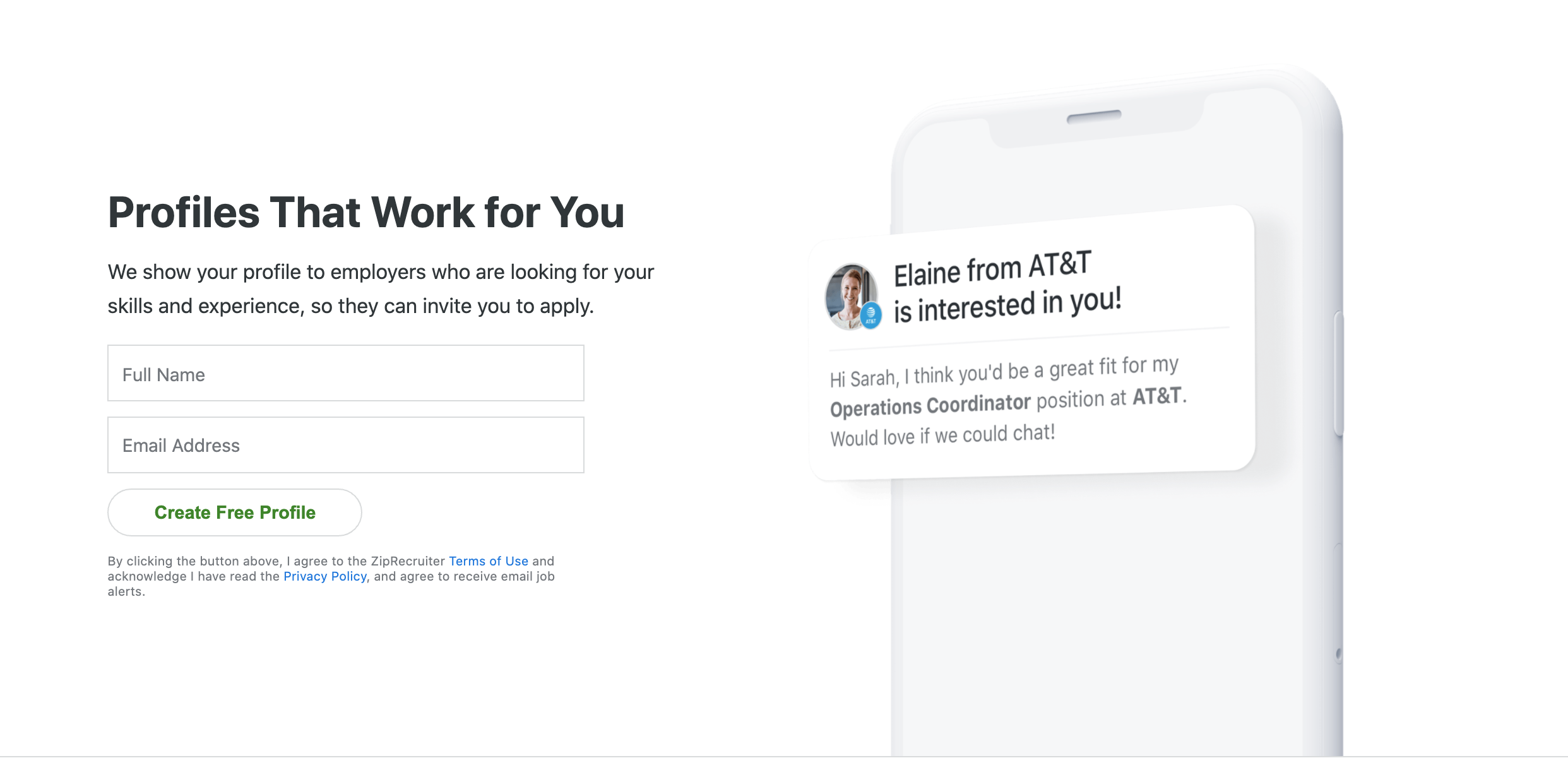
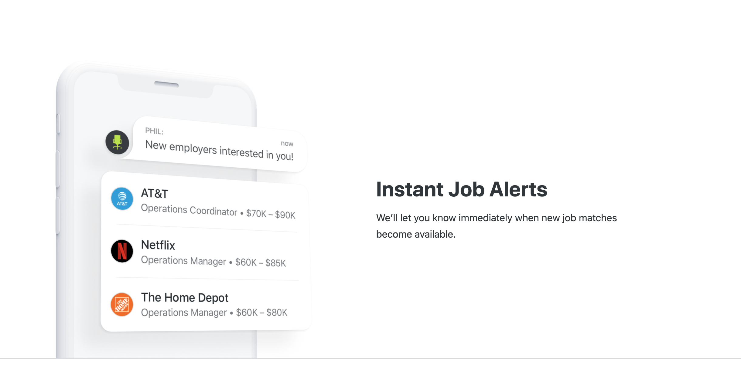
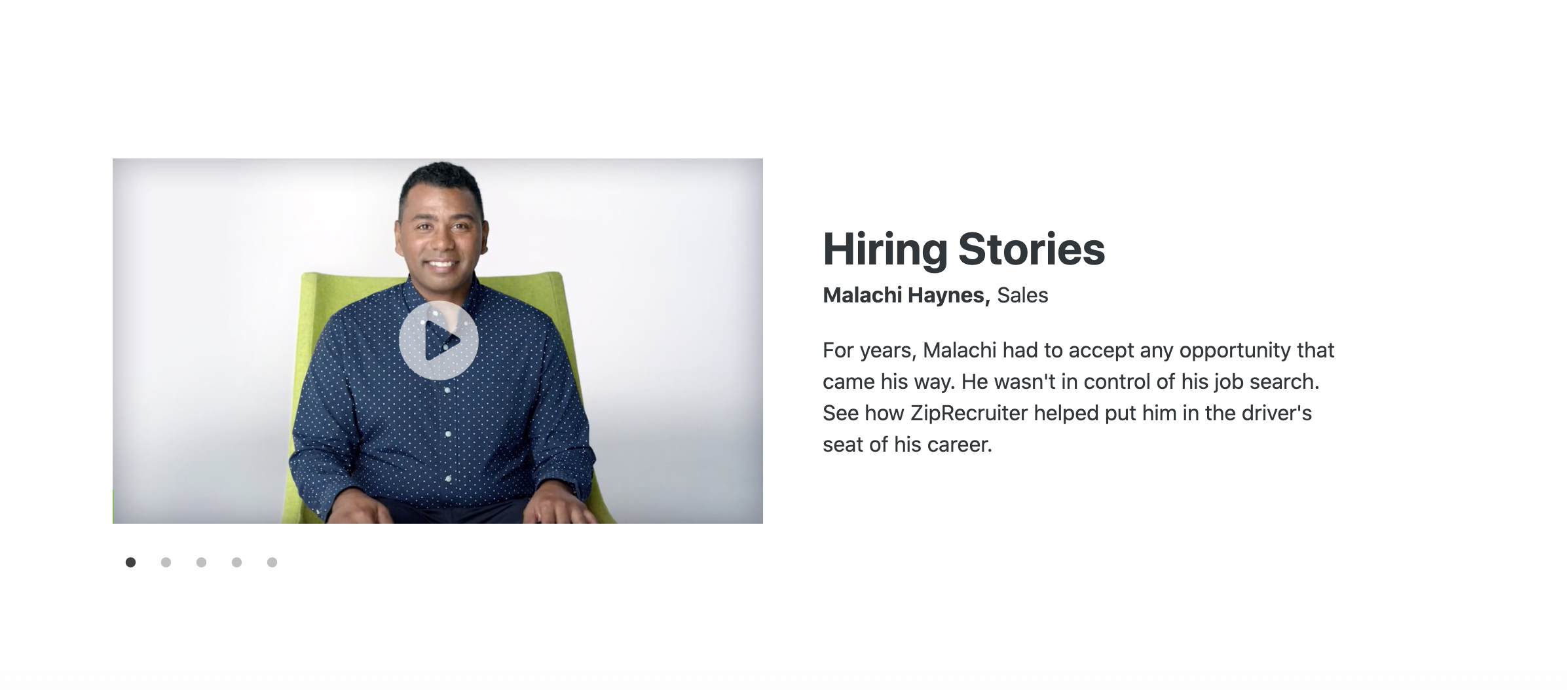
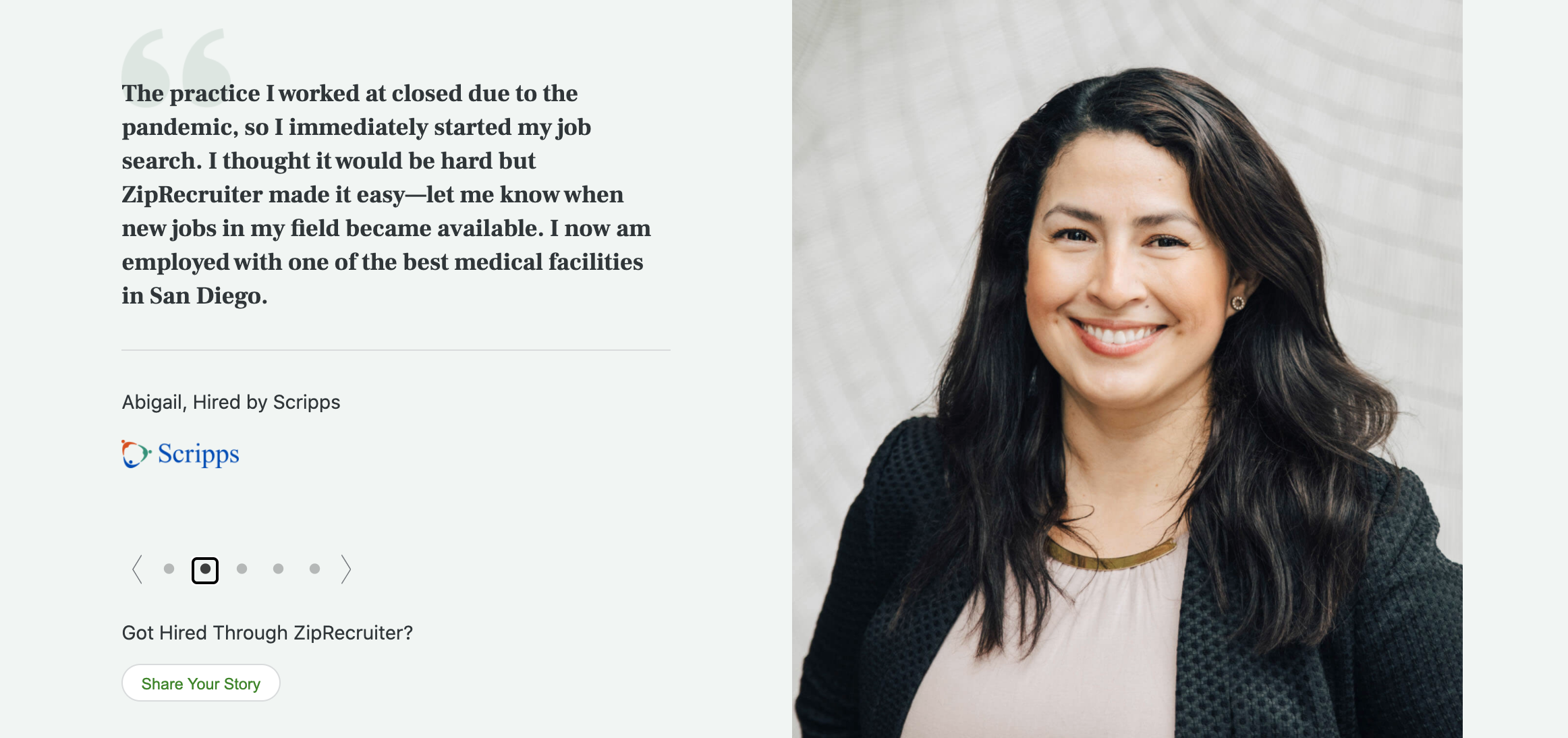
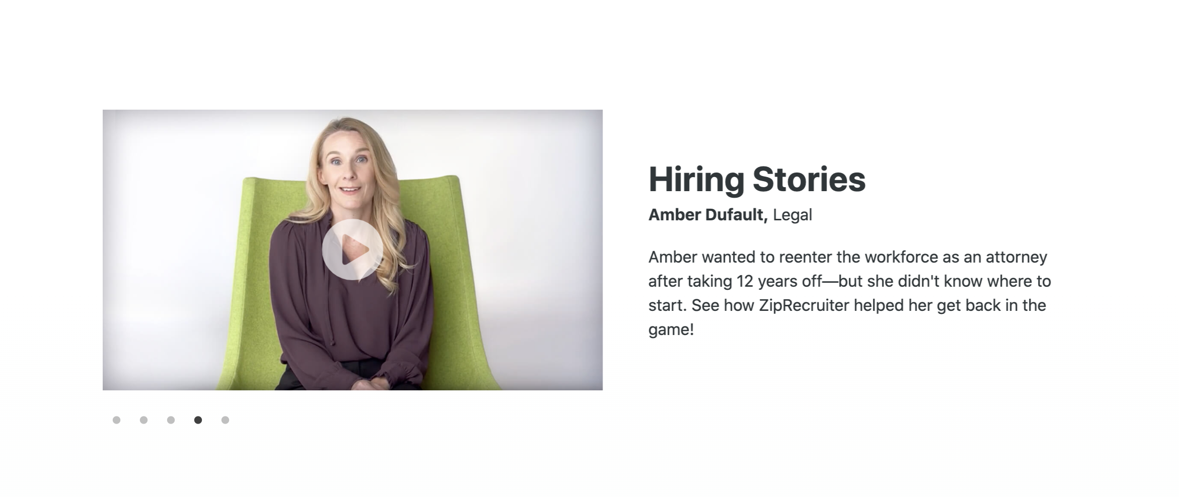
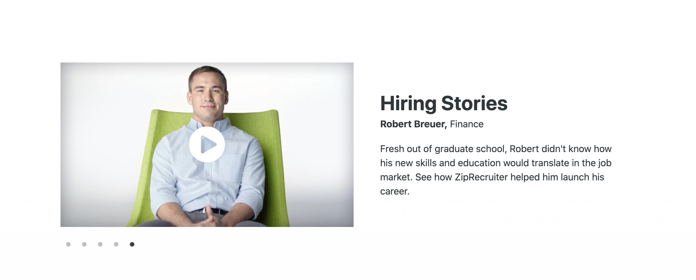
- Great “Humanity” Section w/ Video Testimonials – ZipRecruiter does a great job of connecting their brand with real people, particularly in the video testimonials section. The video does especially well at pointing out that these people aren’t actors (they don’t speak “perfectly”, they aren’t gorgeous movie stars, they’re just like us). Plus, they include people from lots of different backgrounds and professions (see below), from sales and HVAC to optometry and finance.


- Entire Portion Dedicated to Current Events – This landing page actually has an entire section dedicated to how it has helped people recover from the economic impacts of the coronavirus pandemic (which is on pretty much everyone’s mind right now). And while there’s a “Let’s Work Together” message at the top of the page, this section shows how ZipRecruiter is helping people during these times in a very practical way: they get you a job.
- Lots of “You” Focused Language – Using plenty of “you” language is one of the best copywriting techniques to engage your audience. And with ZipRecruiter, a lot of the focus is on their customers. From the very first headline “Let’s Find Jobs for You” to the next section where “you” is used all over the place (pictured below), it’s clear that ZipRecruiter was using this type of language intentionally. And it’s paid off.
Where This Landing Page Example Could Improve
- Not Much in Terms of Features – How easy is it to create a profile? What about the 1-Tap Apply featured on other pages? Or the notifications where you can see when your application was actually viewed? And what exactly is your “smart matching technology” anyway? While I can understand the value of simplicity on their main page, including just a short section where some of these especially important features are highlighted could help make ZipRecruiter’s app stand out among the rest.
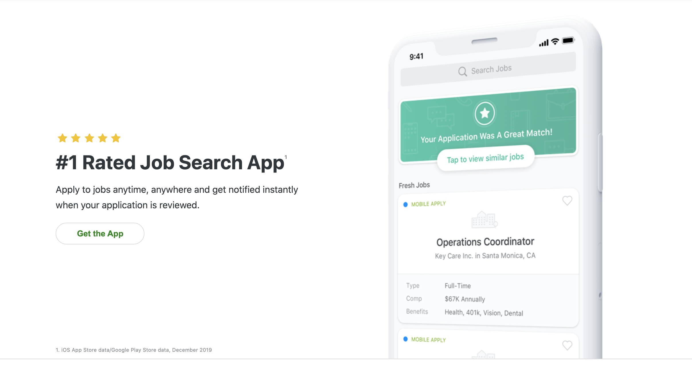
- Let’s See the Stats – ZipRecruiter is without a doubt one of the world’s largest hiring platforms. And it’s true that there is a small vanity stat section “#1 Rated Job Search App”. But surely they could have included some more impressive numbers on their page too. How many positions have they helped fill? How many profiles have been created with them (which would be helpful particularly for employers)? How many new postings do they get each day? These types of stats would help bolster their image even more.
Conclusion
So there you have it!
5 of the best landing page examples from billion-dollar businesses.
Some of the key takeaways from each that you can use to improve your landing pages include:
- Use social proof liberally (and don’t forget to throw in those smiling faces).
- Vanity stats should be a standard part of your landing pages (people love big numbers).
- Employ you-focused copywriting techniques to help your visitors tie the benefits of your product back to them.
- Be sure to include FAQs, price anchoring, and risk reversals on your page.
- Don’t skimp on design: people love good looking pages and are drawn to watching video too.
While most of these pages did a fantastic job of meeting visitor expectations and selling their products well, it’s important to also realize that there was room for improvement with each of them.
And in the end, that means you get to learn from their mistakes and make your pages even better.
Now, what are some of the best landing page examples you’ve seen from high-profile companies? What kinds of things do you think these pages did well or need to improve on? How have you implemented some of the lessons here into your own landing pages?
Let me know in the comments below.
Keep AutoGrowin’, stay focused,