Copy What Works: Best 7 Agency Website Design Examples

Remember show-and-tell when you were little?
You’d bring one of your newest Ninja Turtles to school or maybe your favorite Mighty Murphy Power Rangers.
You’d stand in front of a crowd of classmates eager to see what you were about to show...
Then, you’d take your coolest toy ever from your backpack and reveal it to everyone.
::Gasp!::
And shouting through cheers and deafening rounds of applause, you’d describe it and explain to your classmates why your toy was the best one ever.
Well, even if your experience wasn’t quite like this one, that exact same show-and-tell from when you were little happens with your agency website.
You literally show and tell your business to an unknown audience every day.
You do this with a perfectly-crafted website that has one mission: attract prospects and convert them into paying clients.
But today, I’ll show you:
- 7 high-converting examples of agency website designs you can find some inspiration from and model—so you can improve your show-and-tell.
- How the Laws of Sales Funnel Physics play a critical role in your agency website design’s conversions.
- And the specific tactics to improve your agency website design and accelerate conversions.
Ready to start showing and telling the right way to get more clients for your agency? Let’s take a look at this first example...
#1 Agency Website Design Example
What Is It?
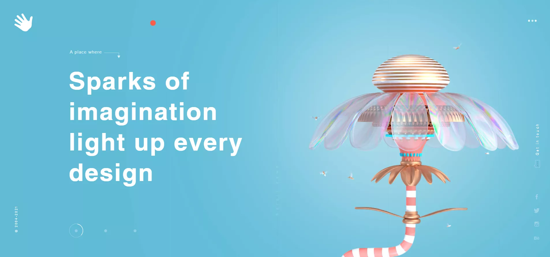
eDesign Interactive is a digital agency focused on storytelling, visual design, and technology.
They help small and large companies engage their audiences and build brand awareness beginning with deep market research, practical strategies, and professional execution. But they’re not limited to web design, motion graphics, and digital marketing.
This agency has been recognized with a large number of awards and has Welch’s, one of the world’s largest fruit products producers, in their social proof portfolio.
What Makes This Agency Website Design Worth Being Analyzed?
First of all, clarity beats cleverness in their landing page copy.
Because “Sparks of imagination light up every design” can only mean one thing: your agency’s website needs a creative design in order to convert.
And what this company offers is that.
So they’re selling their value proposition in a clear way.
That’s why I always tell you that your agency website’s copy must always follow the Law of Clarity—one of the most important Laws of Sales Funnel Physics.
I heard the expression “Better to be clear than clever” once from serial entrepreneur Dane Maxwell while he was being interviewed by Andrew Warner from Mixergy.com.
This expression highlights the biggest reason why most websites (perhaps yours?) don’t convert well in the first place: people don’t buy what they don’t understand.
Many people make the mistake of focusing on creating a catchy headline, instead of focusing first on prospective clients’ understanding by creating clear copy for their site.
So that’s why I like this agency website’s copy AND design too.
It’s very clear what their value proposition is and they have a minimalist and professional design.
The white background with the black text makes the reading experience super comfortable. And when it comes to user experience, the right choice of color and font sizes are vital for conversions.
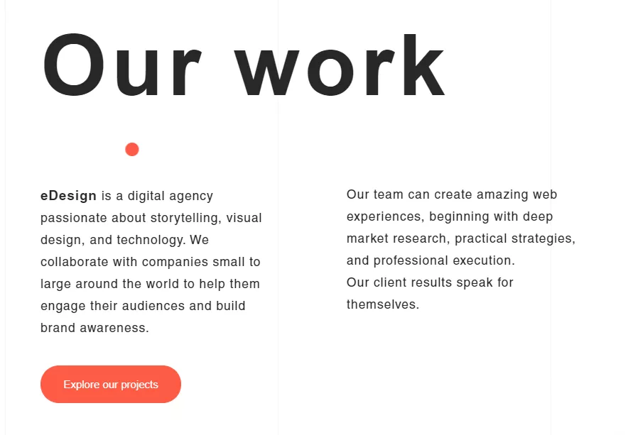
I really like their About Us section where they add photos of their team members and use some nice colors for the text.
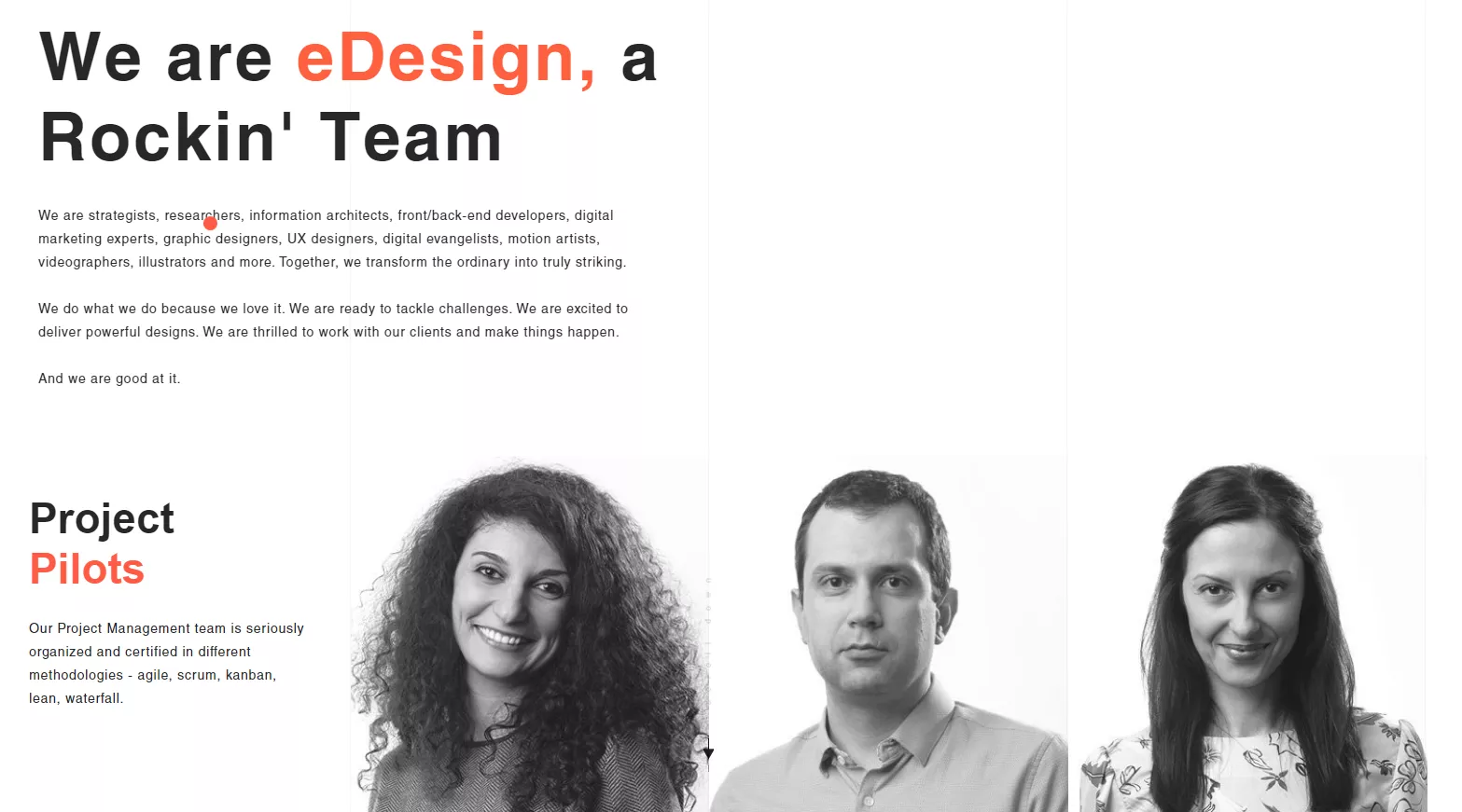
They also include their social proof on their homepage—a key design tactic for landing pages to boost conversions.

And this, without a doubt, gives prospective clients some peace of mind before deciding to sign up for their service.
How Can It Improve My Agency Website Design’s Conversions?
Just as you follow a recipe to bake a pie, you must follow a recipe to create a landing page that practically prints money for your agency.
So if you’re looking to boost your agency’s website conversions, then make sure to:
- Be clear with your copy so prospects know exactly what you’re selling—be clear, not clever.
- Create a minimalist and professional design—especially if your core offer is design services. If they don’t like your web design, they probably won’t like the design you'll create for them.
- Add social proof—it helps “inform” your audience about how many people have used your service, liked your brand, etc. It’s especially helpful if you have great social proof like well-known brands across your industry.
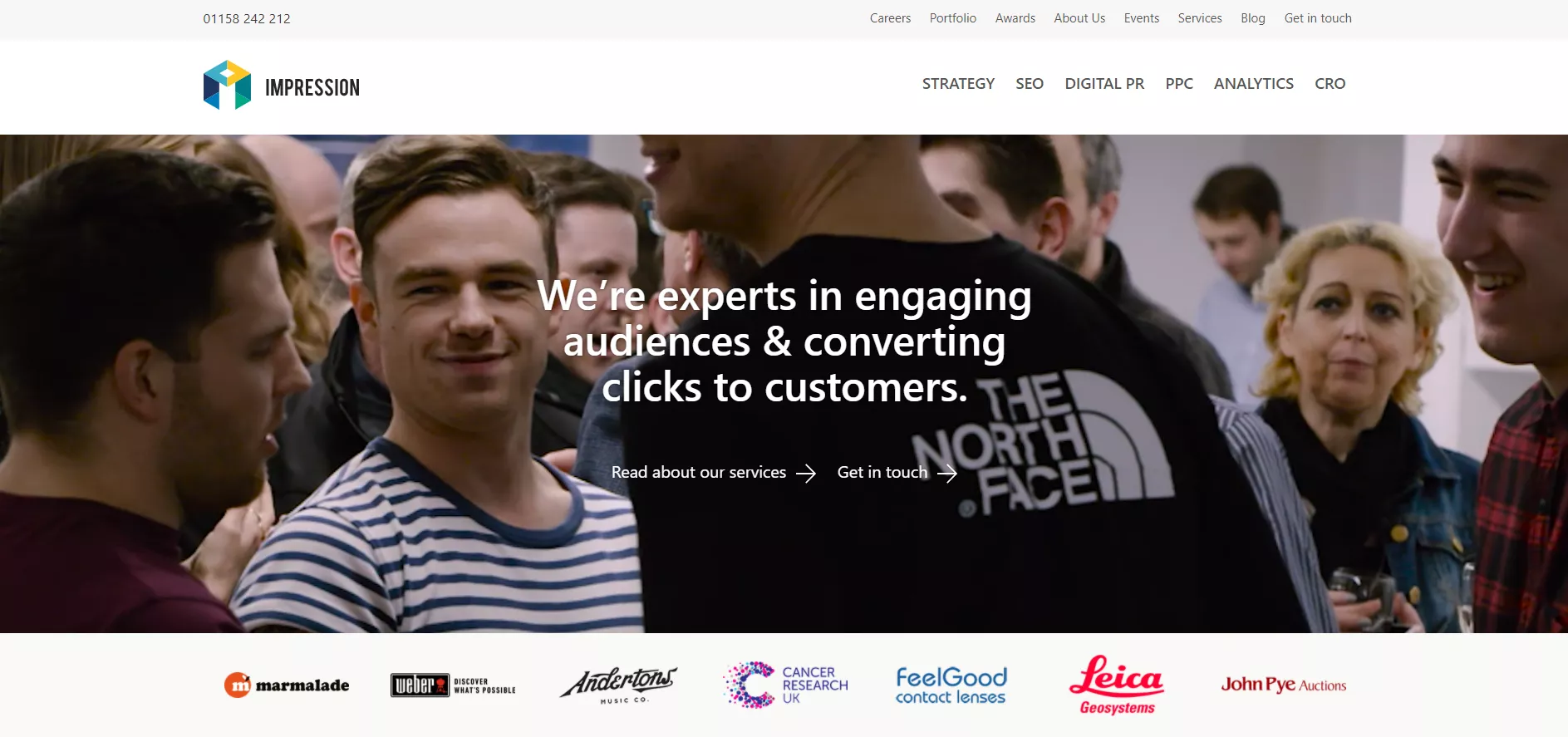
#2 Agency Website Design Example
What Is It?
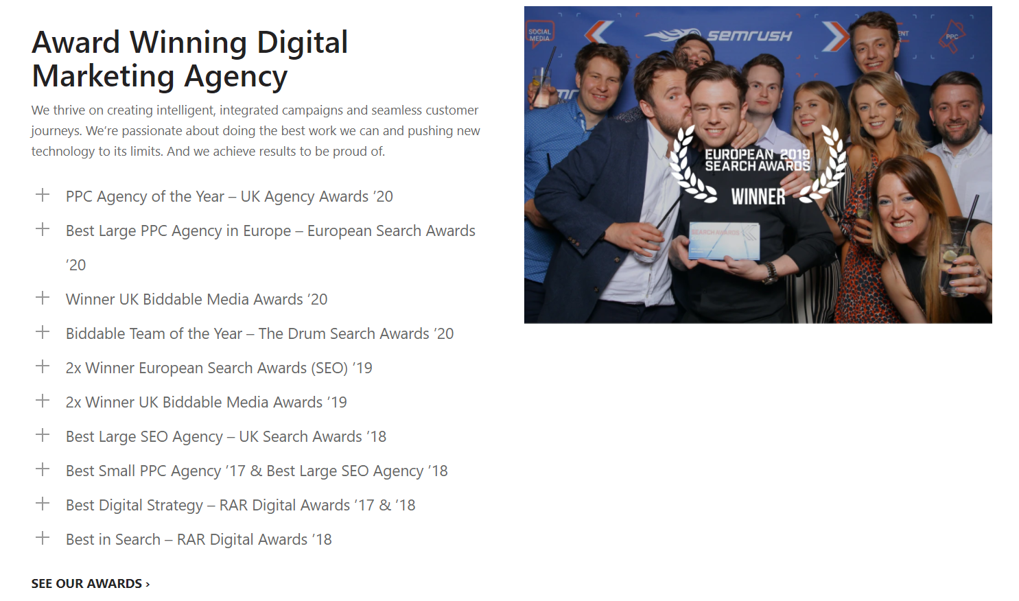
Impression is a multi-award winning team of digital marketing experts based in London and Nottingham.
Some of the services they offer are SEO, PPC, content marketing, analytics, and CRO.
What Makes This Agency Website Design Worth Being Analyzed?
I’ve told you (I think by now it’s been like thousands of times) about how your copy should always follow copywriting techniques for high-converting landing pages.
And I’ve told you how your copy must always follow our proven-to-work copywriting formulas to convert more leads.
Because guess what? If your copy—value proposition, unique selling point, etc.—isn’t clear, then you won’t convert any prospects into clients.
They’ll leave your site because they didn’t understand what your service is about.
So this agency website’s design example shows clearly in their hero section what they offer to their clients.
“We’re experts in engaging audiences & converting clicks to customers” can only mean one thing: they convert prospects into paying customers.
And if that’s the premise of their service, then that means they guarantee results for their clients.
And that’s something that we at AutoGrow always stay away from.
Because promising results have a downside.
Clients may be too focused on the results you’re promising them rather than on the value you’re actually providing with your service.
So in the case of this agency website’s copy, I think it’s clear enough for anyone looking to sign up for their service.
Plus, they clearly state each of the services they offer so prospects can have all the information before signing up.

I also like the simplicity of their design.
Is easy to navigate through, and although I think they could benefit from adding photos for their testimonials, I like that they’re tapping into the power of social proof through clients’ testimonials.

How Can It Improve My Agency Website Design’s Conversions?
- Revise your copy for clarity. Ask a family member or a friend to read it and tell you if your service offering and value proposition are clear.
- Make sure you list down all the services you offer as well so prospective clients don’t have to wonder.
- And never, never neglect displaying your social proof. Showcase any form of social proof like testimonials, awards, trust badges, vanity seals—anything that gives your prospects some peace of mind.
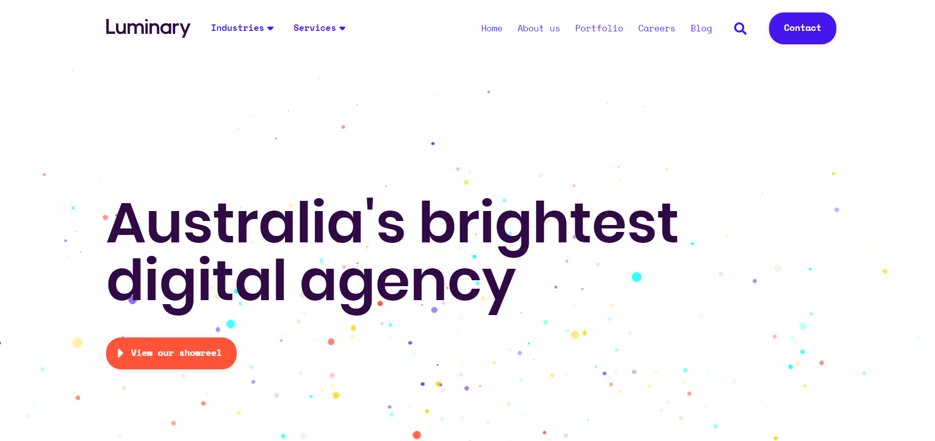
#3 Agency Website Design Example
What Is It?
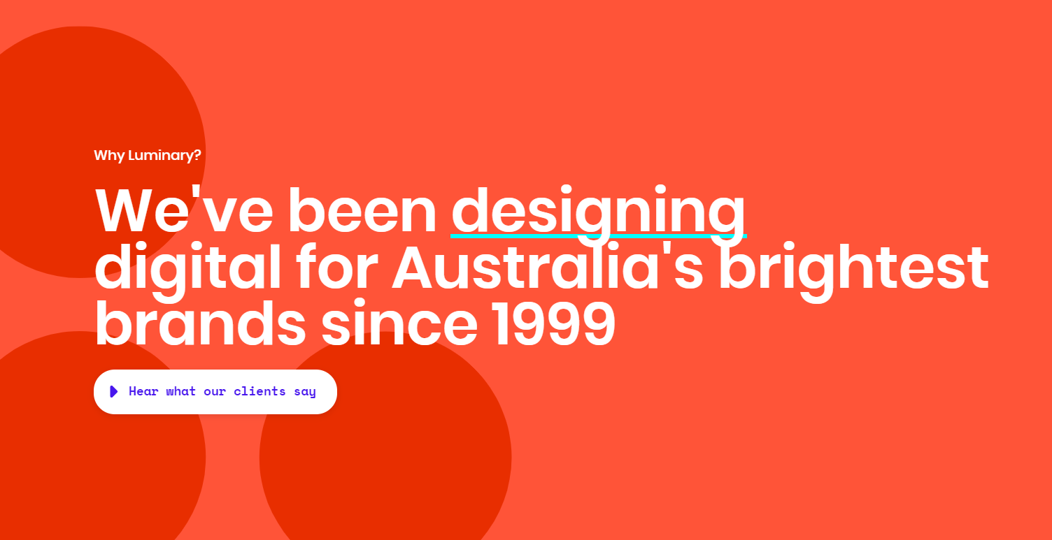
Luminary is an agency based in Australia that’s been in business since 1999.
They do everything from digital transformation and user experience design, to digital marketing and managed cloud services.
What Makes This Agency Website Design Worth Being Analyzed?
One of the reasons why I like this agency website design is because it uses bright colors that catch the site visitor’s attention.
They also use a very decent font size so it makes the reading experience very pleasing to the eye.
However, something I think they should improve is their CTA buttons.
Adding a white CTA button with such a small font size makes the button not stand out and hard to read.
And you know how you can actually boost conversions with your CTA buttons and the Law of Visibility, right?
This principle says that people will convert on offers that are highly visible.
So if for instance, prospects don’t actually see your CTA buttons on your landing pages, they simply won’t convert. They’ll just exit your page.
And that can easily happen in the landing page example above because the CTA buttons don’t really stand out.
But besides that, they have a great use of social proof with bright colors that makes that section stand out…
And they also add photos of people which is really cool because you can use human faces to increase your website’s conversion.
People love seeing who’s behind each brand. They like seeing faces.
On top of that, they have a section where they list down what their service includes which I also think is very helpful when it comes to converting prospects.
So for these reasons, I think this agency website design can be an inspiration for your own agency site.
How Can It Improve My Agency Website Design’s Conversions?
- Include people’s faces on your landing pages. This is a best practice that can actually help your website convert more visitors. Because people like seeing people’s faces when they land on a landing page. It creates some sort of inherent empathy between your site visitor and the faces of people on your landing pages. It also creates the assumption that “there are real people behind this brand.”
- Don’t be afraid to use bright colors in your landing pages. The human eye is seeking variety, contrasts, and anything pleasant to the eye. So as long as you make the UX design simple but choose the right colors and elements, then I guarantee your website will start manufacturing leads.
- Make your CTA buttons POP. Use rounded shapes so they actually look like buttons and make them contrast with the background so people can actually click on them.
#4 Agency Website Design Example
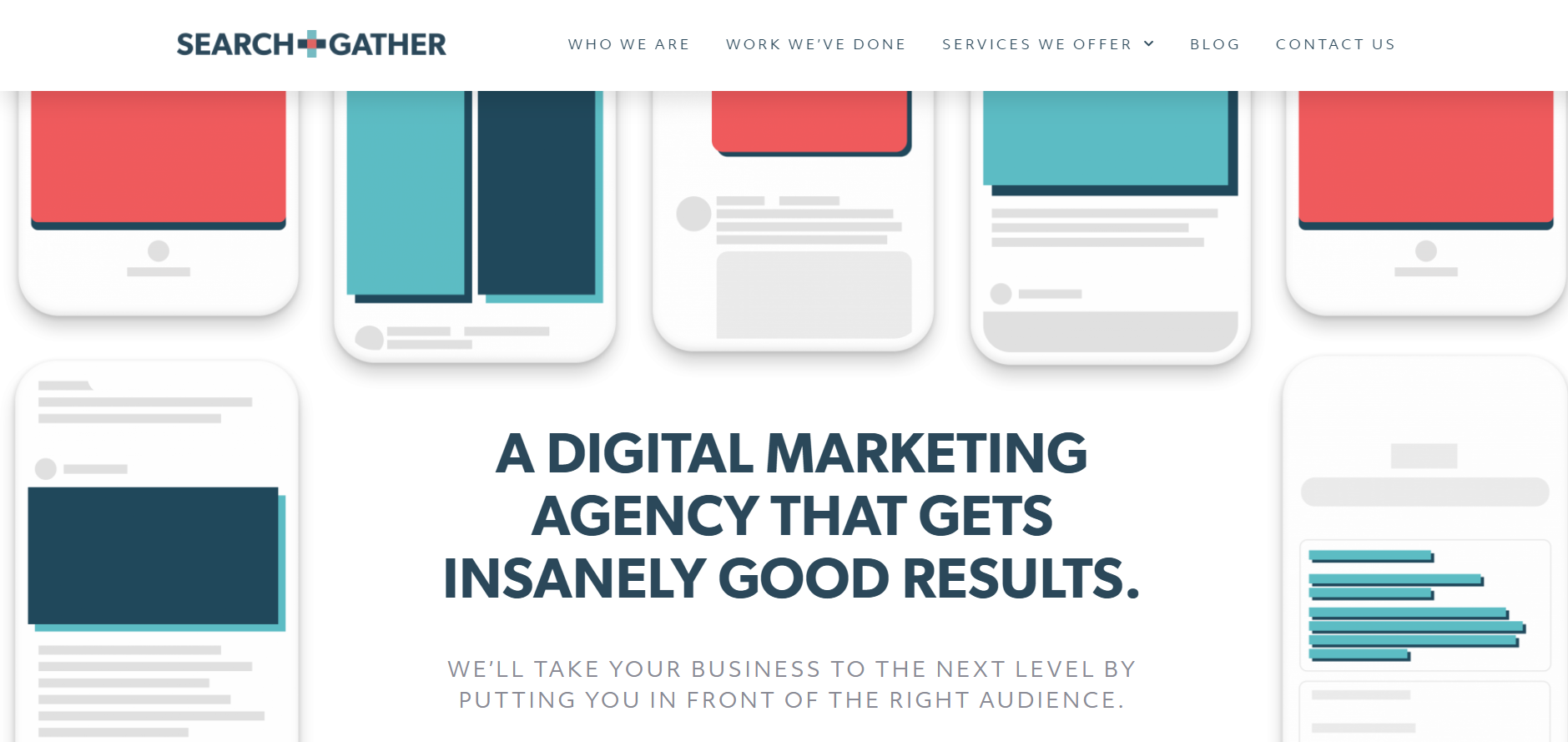
What Is It?
Search & Gather is a digital marketing agency in Toronto that specializes in helping businesses grow.
They offer different services like paid search, paid social, amazon integrations, CRM integrations, and more.
What Makes This Agency Website Design Worth Being Analyzed?
Ok so something I like about this agency website design is that it is very minimalistic.
The white background makes the copy stand out and makes it easy to read.
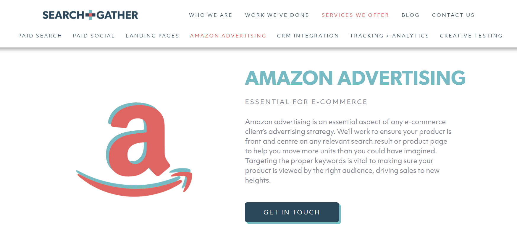
Their value proposition is clear—and the Law of Clarity comes into play here.
“A digital marketing agency that gets you results” clearly promises their clients that they guarantee results.
So for anyone looking for just that—results, then this agency may be a great fit.
But something I think could be improved on their site is to move their CTA button on the hero section so it’s visible above the fold.
I actually had to scroll down to see their CTA button and see if it was aligned with the next steps to take in their sales funnel.
Because the Law of Alignment plays a major role in any website.
This sales funnel physics law says that people will convert more often on offers and landing pages that better align with their context, like from which landing page they just came.
Alignment deals with helping customers to identify the need your product can address.
And it also deals with the customer’s intentions, questions, or context (like what previous website or page the customer came from).
That’s why you should always align your CTA buttons with whatever action you want prospects to take in your site.
One key to using the Law of Alignment in your funnel is tailoring the page that people enter into your website to the context of the traffic source.
Of course, not literally. Because if your traffic comes from Google, that doesn’t mean you should redesign your site to have a similar UI and layout to Google with the hope of increasing conversions.
Instead, you could acknowledge that people arrived on that page because they’re looking for services like yours. And by acknowledging that, you’re better aligning to those prospects’ expectations.
You get what I mean, right?
How Can It Improve My Agency Website Design’s Conversions?
- Again, simplicity in your design can do wonders for your conversions. You don’t need a complicated design to catch your prospects’ attention. So use your whitespace in your landing pages design wisely.
- Use high-contrasting colors for the background and text.
- Make your CTA buttons stand out with contrasting colors.
- Place your CTA buttons above the fold so prospects don’t have to scroll down to move down your funnel.
#5 Agency Website Design Example
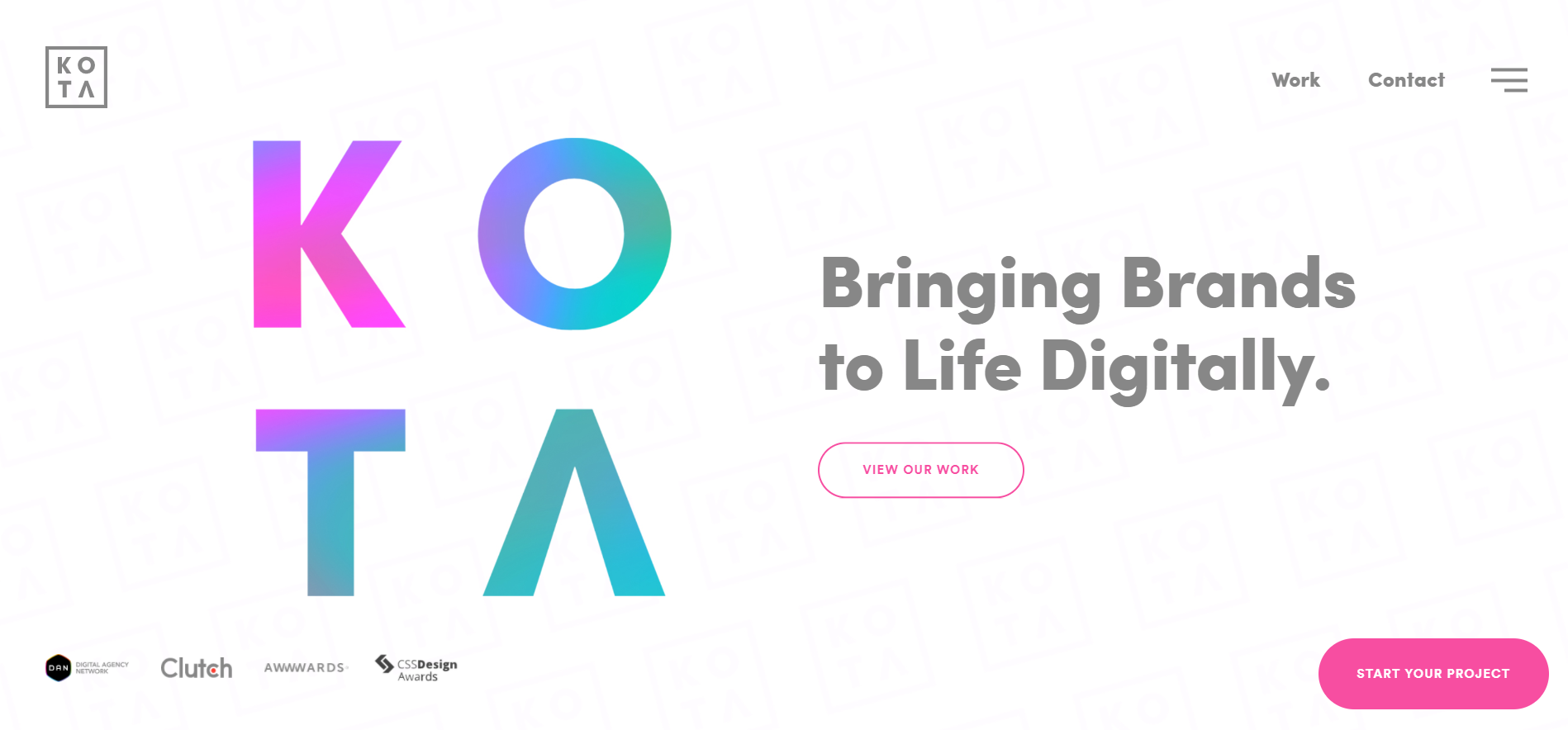
What Is It?
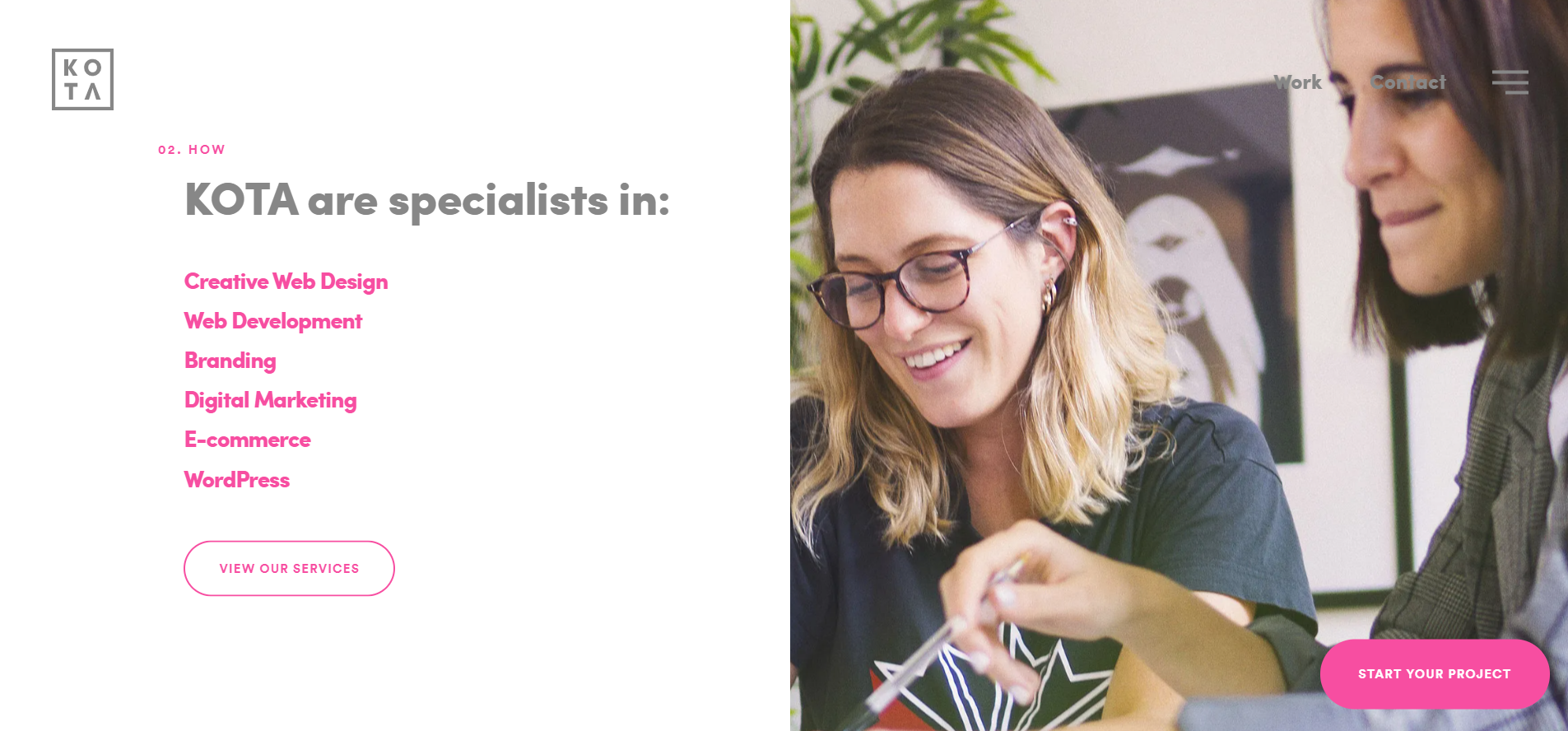
Kota is a London-based creative and web design agency that specialises in bespoke websites, branding, and digital marketing.
And some of the services they offer are web development, Shopify eCommerce websites, building websites with WordPress, and more.
What Makes This Agency Website Design Worth Being Analyzed?
I think the first thing to highlight is that their value proposition is clear.
They clearly state what they offer and list down their services—which is key to making a prospect to sign up.
Because who’s going to want to sign up for your agency if it’s not clear enough what you offer?
And this is especially true when you’re trying to get more clients for your digital marketing agency.
Because again, the Law of Clarity says that before people become interested and decide to buy your product, they must first understand what it is you’re selling.
And their color choice is great.
The pink used throughout the pages makes the text stand out from the black and white background.
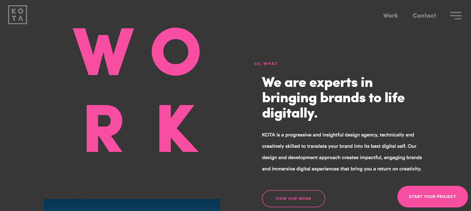
But something I think they could improve in their homepage is the alignment of their CTA buttons.
What is it that they really want the prospect to do? To view their services or start a project?
I think that can mislead prospects and take them into different directions.
How Can I Improve My Agency Website Design’s Conversions?
- Use the Law of Friction. This law says that the easier you can make the experience for an interested buyer, the more likely he/she will buy. So if for example, you add 2 different CTA buttons on your landing pages with 2 different actions, this could cause the prospect to be misled. Because if all they want is to sign up for your service, not showing them a clear CTA to sign up for your service can lead the prospect to exit your site.
- Remove friction from your landing pages. Often the business owner doesn’t know the potential customer’s goals or how their website is “blocking” these customers from buying. This is what is meant by friction. When friction is minimized—and a user’s goals are made easier to accomplish—conversions go up.
#6 Agency Website Design Example
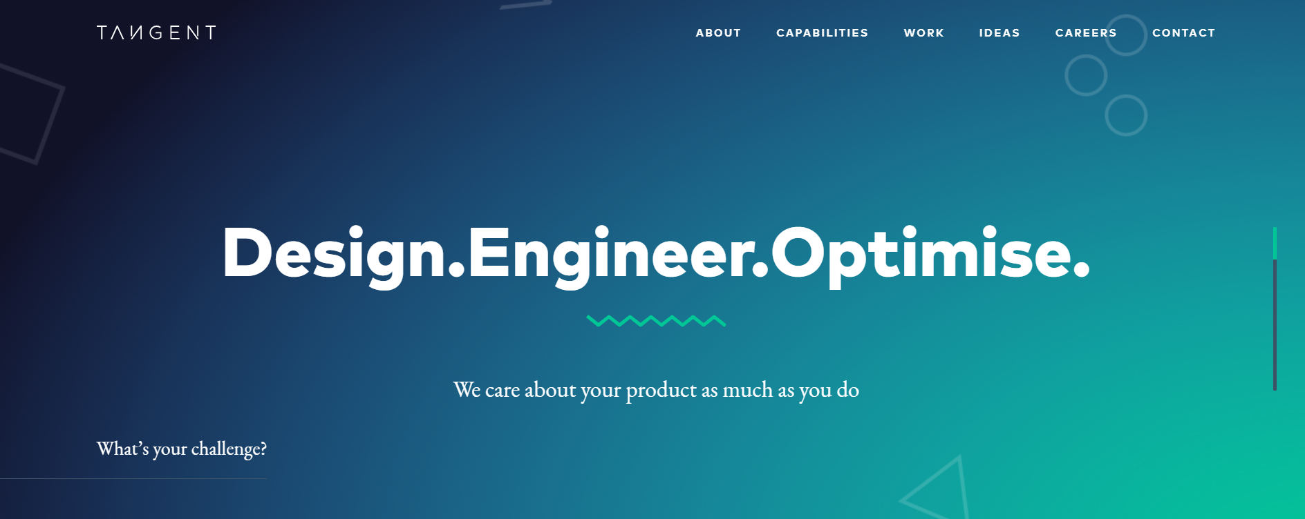
What Is It?
Tangent is another digital agency based in London that helps companies transform their existing digital products and/or launch brand new ones, they help identify and address some of the biggest digital challenges, and they provide clients with solutions and an actionable roadmap.
What Makes This Agency Website Design Worth Being Analyzed?
The simplicity of their design makes the experience very user-friendly.
They have great use of colors which adds some personality to the design.
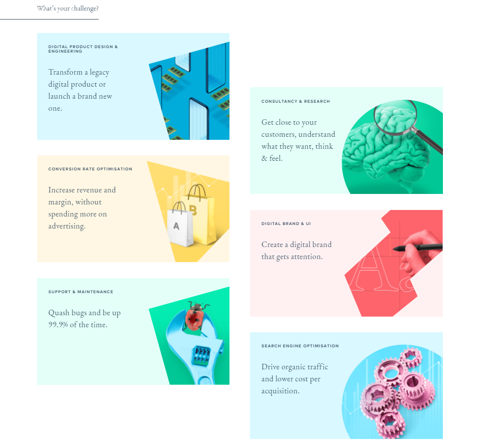
They also have a good use of their social proof.
But something I think they lack is CTA buttons.
If you land on their homepage, you can’t really know what action should be taken down their sales funnel.
Is it to sign up? View pricing? Learn more?
There’s no clear direction of what the prospects should do.
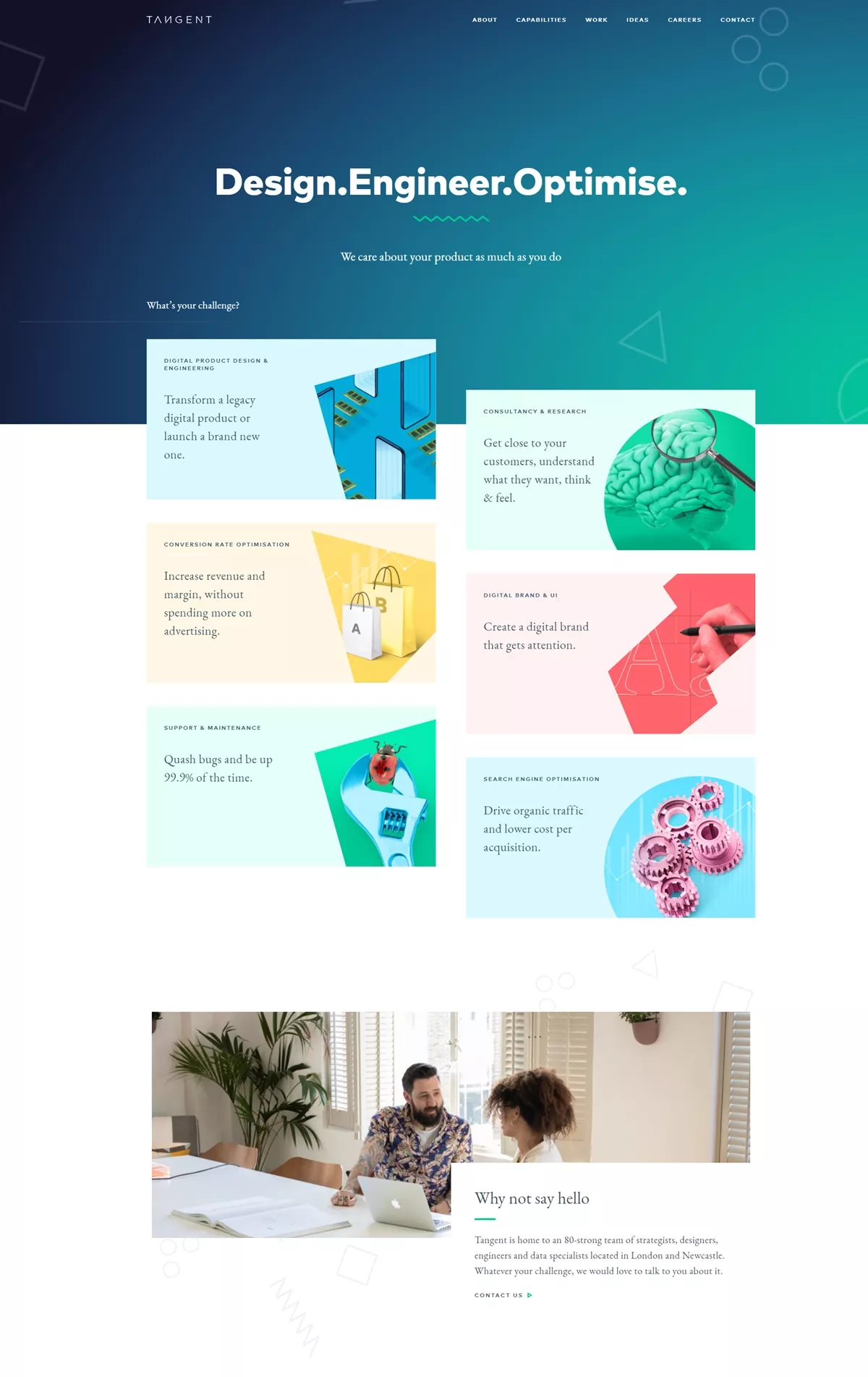
In fact, you have to scroll down the page to find a first CTA button that says “View our work” right below the social proof section.
How Can It Improve My Agency Website Design’s Conversions?
- Use the Law of Visibility. This principle says that offers must be seen in order for sales and conversions to occur. Sounds obvious, but it’s too often forgotten. So make sure to make your CTA buttons are visible throughout the page.
- Use the Law of Repetition. This law says that the frequency of exposure to your offer has a direct impact on conversion rates. And more exposure to the offer causes more conversions, though ROI diminishes after a point because people get annoyed. What does all that mean? It means that in order for your agency website design to convert, you need to not only add CTA buttons but you need to make them visible. Prospects must be able to see your CTA buttons while they navigate through your site. And not only that, but your CTA buttons need to be placed in more than one place on your landing pages so the frequency of exposure makes the prospect not forget to take action.
#7 Agency Website Design Example
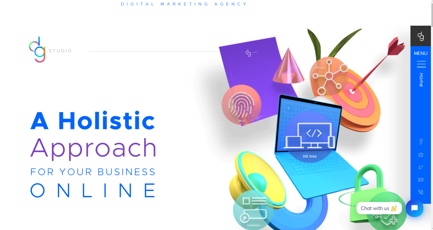
What Is It?
DGStudio is a digital marketing agency with headquarters in Los Angeles, California, and offices in Mexico City, Mexico, and Gurugram, India.
Their branding experts help their clients with their branding, graphic design, web development, app development, web hosting, internet marketing, and more.
What Makes This Agency Website Design Worth Being Analyzed?
I really like this agency website design example because it’s fun.
With colorful and interactive animation icons throughout their landing page, it makes you think “Boy they’re skilled in design!”
They play a lot with bright colors like yellow, purple, blue, and green but without making it overwhelming.
They follow a minimalistic approach with their design that makes it very easy and fun for the site visitor to navigate through their landing pages.
How Can It Improve My Agency Website Design’s Conversions?
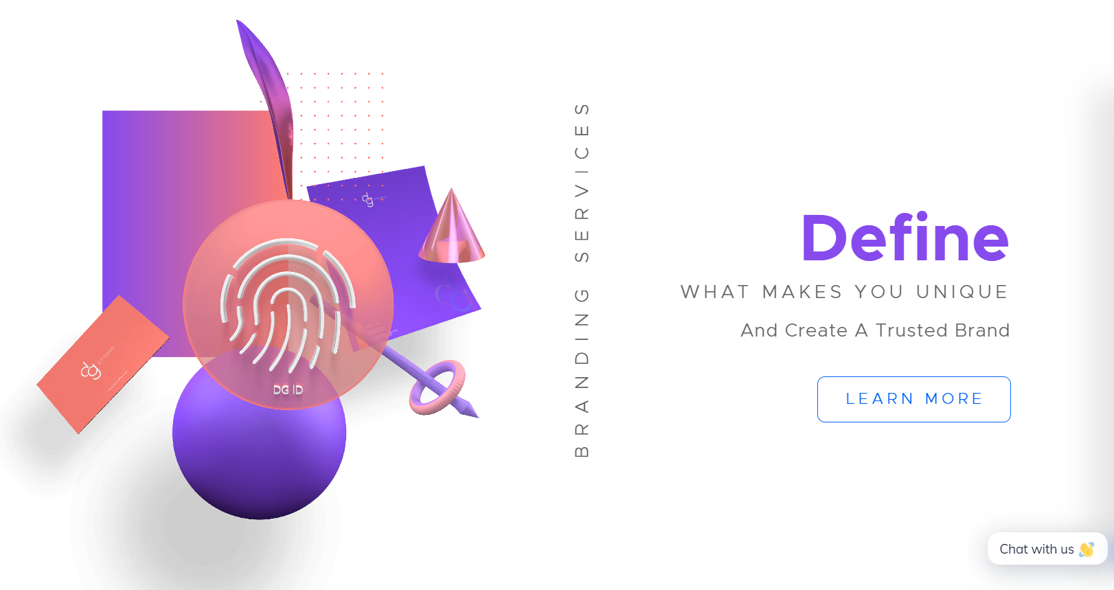
- As I said before, use high-contrasting and bright colors for your CTA buttons that look clickable. The CTA button above that says “Schedule a consultation” barely looks like a clickable button.
- Don’t be afraid to use multiple colors for your color palette. When used wisely, it can still create a minimalistic approach.
- Make your text stand out from the background so prospects can easily read through your site.
Conclusion
Well, there you go.
If you read this article you now know the necessary tactics to boost conversions with your agency website design.
And all the examples listed above should help inspire you to see what works and what doesn’t.
Because it all comes down to following the Laws of Sales Funnel Physics—especially if you’re wondering how to scale your digital marketing agency without ads.
With the right design and copywriting elements in place, your agency could be scaling in no time.
And best of all, you don’t even have to hire a conversion rate optimization agency for that. You can do it all on your own with the knowledge you gained after reading this article.
But of course, if you don’t have the time to improve your agency website design on your own, AutoGrow can help you.
Now tell me something, does your agency website design follow any of the principles explained in this article?
How close or far from converting is it?
Let me know in the comments below.
Keep AutoGrowin’, stay focused.