
Boost Your Sales With 9 Pricing Page A/B Test Examples

Why are your sales not meeting your forecasts?
(Stop banging your head against the wall)
Sometimes, it simply comes down to one small thing you could be doing wrong in your agency sales funnel…
In fact, have you heard of zero multipliers?
These are the silent killers of your funnel’s conversions. They’re tiny winny errors on your funnel that you don’t see at first glance.
They could be a broken CTA button. Or an opt-in form not working. Or your email sequence not putting contacts in the right automation. Or even a tiny typo.
You almost need a magnifying glass to spot those silent killers of your conversions .
That’s why here at AutoGrow we always look for potential zero multipliers. Especially in our pricing page.
Because your pricing page is one of those places that can spell doom for your sales outlook if anything is off (imagine a lead trying to sign up and your CTA button not working).
So once you “discover” those zero multipliers on your pricing page killing your conversions, it’s time for you to fix them and A/B test.
But what is A/B testing?
A/B testing is like conducting a science experiment.
You create a hypothesis based on existing data. And from there, you begin a test in which you compare two variables.
Then, examine the data to see which has the best outcome. And conclude whether your hypothesis was correct or incorrect.
Finally, you plan future tests around this conclusion.
So to make your life easier, I put together this resource where you’ll:
- Get inspiration from 9 pricing page A/B test examples from other businesses that you can model for your next redesign and/or A/B test to grow sales.
- See what worked and what didn’t for those businesses’ pricing pages—so that you don’t make the same mistakes.
- Learn the importance of your pricing page, why it should not have any zero multipliers, and why you should be constantly A/B testing it.
After analyzing these pricing page A/B test examples, you’ll be eager to get in touch with your design and copy team to get those A/B tests running.
And now, let’s see the…

The Importance of Your Pricing Page
When someone lands on your pricing or product page, it means that they’re at the bottom of the sales funnel. They’re seriously considering your product as a final purchasing decision.
Your agency can put in all the hard work you want into nurturing your website visitors and leads, but it all means nothing if they get scared away.
And there are always different reasons why users might be put off.
It doesn’t automatically mean that the price point is the problem.
It could have to do with the user experience.
Or maybe you aren’t including enough information on certain features.
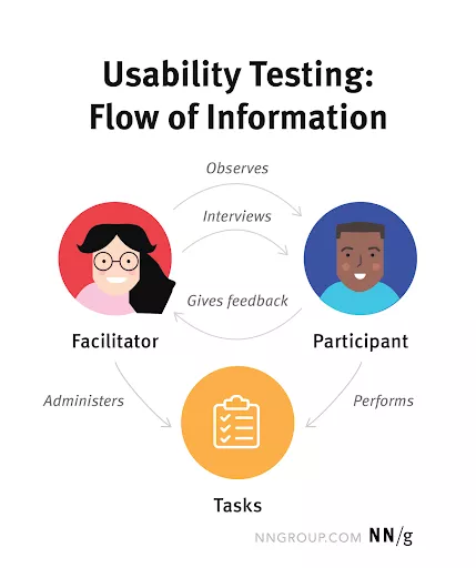
This is why it could be useful to set up a usability test.
That way, you understand how people interact with your pricing page.
Moreover, you gather feedback from users on what could be better.
How To Carry Out Your Pricing Page A/B Test
To carry out an A/B test for your pricing page, follow these steps:
- Look at the data from your current pricing page and try to identify weak points. For example, use a heatmap to see what sections of the page aren’t being interacted with.
- Brainstorm some new designs for your pricing page.
- Select your new design(s).
- Using your research insights, make a hypothesis on what the A/B test results will be and what you think the problem was.
- Test using tools like Google Optimize, Optimizely, AB Tasty, VWO and Unbounce.
- Analyze the results.
- Choose the best course of action.
- Reflect.
If you’d rather not worry about the headaches of A/B testing, consider our free trial to see how we can help you with your redesign.
Here at AutoGrow, our teams have thorough experience with refining client pricing pages through A/B tests — that way they see a boost in revenue.
Back to the main focus here …
Now that you know how to perform an A/B test for your pricing page, let’s look at some examples to help you think about a redesign.
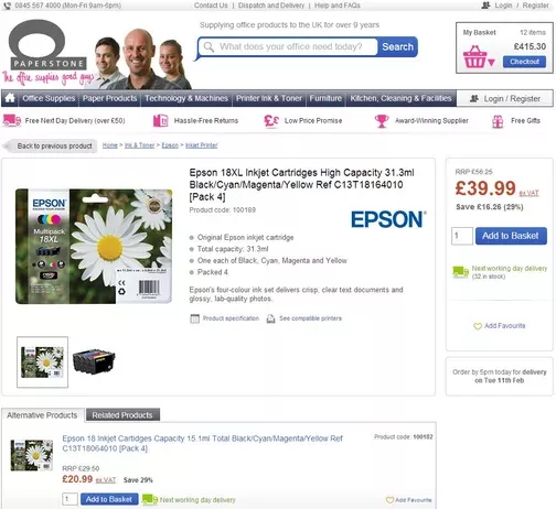
Example of A/B Testing Pricing Page #1: Paperstone
Paperstone is a U.K.-based e-commerce store that specializes in selling office supplies.
For this A/B testing example from AutoGrow’s Proven Sales Conversion Pack, the team decided to display a price comparison with Paperstone’s competitors on product pages.
Old
New

With the new pricing variation, Paperstone increased its conversions by 10.67%.
Takeaway
As you can see, the original checkout box is bare bones. A user can only see the price of the product.
But that’s a problem.
It adds a layer of friction to the buying process.
You see, the user would then have to conduct his or her own research to see if there are better prices available. In turn, this could lead to them discovering another brand or just simply distracting them altogether.
By displaying the price comparison, Paperstone positions itself as the most affordable option.
If any of your agency's clients are SaaS companies, the next pricing page A/B test example is for you.
Example of A/B Testing Pricing Page #2: BIGContacts
For SaaS companies, free trials are pretty much a given nowadays. It gives new users a chance to see how the platform works and how it can help them.
Moreover, it leads to more sales.
According to Useproof, free trials that don’t require a credit card have an average conversion rate between 8% and 10%. With a credit card required, that number jumps up to 25%.
So it’s no wonder that CRM platform BIGContacts wanted to A/B test its pricing page to generate more free, 30-day trial sign-ups.
The original pricing page was not very well constructed. The service package boxes were not aligned evenly, the text was too generic, and, above all, the free trial CTA was not emphasized enough.
Apologies for how blurry the image is but it’s the only version available.
Old

New

Takeaway
The new pricing page increased free trial users by 76% for two key reasons:
- The new design is much more aesthetically pleasing and consistent.
- For the new page, the free trial is more prevalent by being bolded at the top of the page.
Example of A/B Testing Pricing Page #3: Instapage
When Instapage wanted to A/B test its pricing page, they decided to limit the amount of words a user would have to read.
Its original format was a long list of features for its business and enterprise packages.
Old


Instead of a long comparison list, the new pricing page displayed the core features for the packages.
And they added sections for features “Available on Every Plan” as well as “Enterprise-Only”.
Essentially, the new page would use less vertical space.
New


If you expected the new variation to perform better, then you’re not alone. Instapage hypothesized the same thing.
But the results indicated that the original pricing page performed slightly better than the new one.
In the 16 days of testing, the original page generated a 3.67% conversion rate compared to 3.44% for the variant.
Takeaway
What can be gathered from this example is that Instapage didn’t redesign the pricing page enough to see an impact.
Although a .23% loss does have sales implications, it’s not enough to say the new page was bad. It was just inconclusive.
Because when you really look at the two pricing pages, they’re not that different. Both allow users to quickly see which features they’d miss out on by not choosing the Enterprise plan.
If I were a betting man, I would’ve thought the new and more simplified version would’ve performed better.
But it just goes to show that A/B testing your clients' pricing pages is the only way to know definitively how website visitors will respond to your changes. Or else, you're just sitting around hoping for the best.
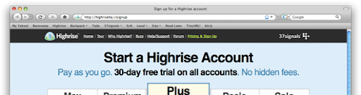
Example of A/B Testing Pricing Page #4: Highrise
Highrise, like BIGContacts, is a CRM platform.
Using Google Website Optimizer, the team carried out several tests to see what new pricing page variant converts the most new users.
For this example, the headline and subheadings are the variables being tested.
According to Leadfeeder, between 60% and 70% of users only read headings.
The original pricing page headline said, “Start a Highrise Account.” And the subheading says you can pay as you go. There’s a 30-day, free trial and no hidden fees.
Old
For the best-performing pricing page version, the heading highlights the 3-day, free trial. But some of the real magic is in the subheading where it tells users that it only takes 60 seconds to sign up.
New
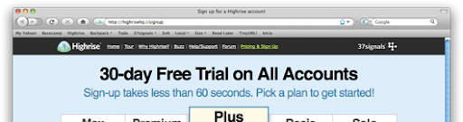
According to Highrise, the second page converted 30% better than the original.
Takeaway
Free stuff is always a fan favorite.
By making that the main takeaway for the pricing page, users can rest easy knowing they have a full month to get accustomed to the Highrise platform before making any financial investment.
Moreover, the use of an exclamation point makes the offer more urgent. Although it’s best to minimize your use of exclamation points, it can work well in moderation.
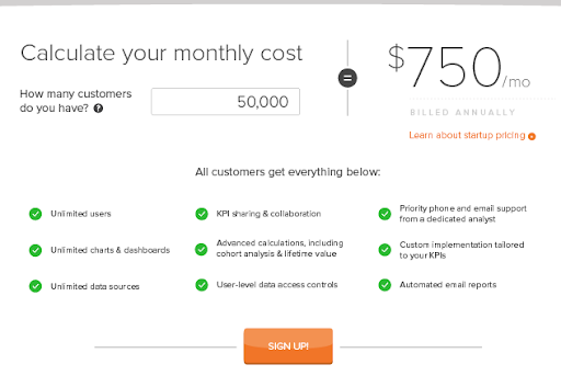
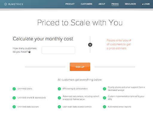
Example of A/B Testing Pricing Page #5: RJMetrics
RJMetrics was a SaaS company that provided big data to businesses of all sizes.
It was acquired by Magento in 2016.
But its pricing page A/B example is, nevertheless, useful to look at.
The original pricing page was nicely organized and professional. It had a clean design.
But it wasn’t converting enough users.
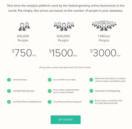
Now, the team wanted to find a pricing page solution that would benefit anyone from startups to enterprises.
So they settled on using an input field that would calculate the price depending on how many customers the company has.
Unfortunately, just 1.2% of visitors were signing up.
From there, the CTA was moved up further to the top of the page.
This little change in CTA placement resulted in a 310% increase in conversions.
Takeaway
After the first A/B test, RJMetrics knew they were onto something.
Using a heatmap, the team discovered that the monthly cost calculator saw a lot of action.
But the problem was that the sign-up CTA button wasn’t getting as much engagement because it was too far down on the page.
By being more quick to the point with the CTA, RJMetrics removed a little bit of friction from the user experience.

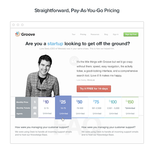
Example of A/B Testing Pricing Page #6: Groove
Groove is an all-in-one customer service platform for small businesses.
Their journey to settling on a pricing page wasn’t a brief one.
In fact, they had to try three different versions before finding the sweet spot.
Groove’s first pricing page prioritized flexibility in a freemium model.
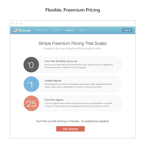
But the conversion rate was just 1.11%.
So they turned to their customers for feedback.
And their customers told them they’d rather pay for support tickets as opposed to the number of customer service agents they have.
With that, the new pricing page was up and running in a few days.
Sadly, this too was for naught.
A 1.17% conversion rate.
You’d think your customers would provide the best insight. But in this case, it just didn’t work.
From there, Groove asked its website visitors for feedback instead of customers. They learned that website visitors were concerned about never knowing how much they’d have to pay each month.
Because you can’t predict exactly how many support tickets you’ll need.
So the last pricing page tested was the most simple one.
Just a straight $15 per month plan for everyone.
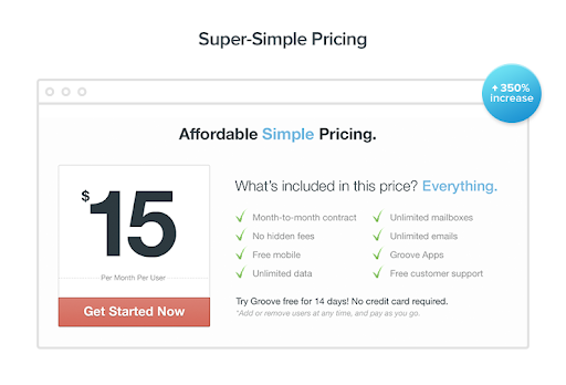
Immediately, Groove saw improvement. The new pricing page resulted in:
- 4.15% conversion rate
- 350% increase from the previous pricing model
- 25% more revenue
Takeaway
Groove’s new pricing page was effective because of how simple it was for small businesses to understand the financial investment they would need to take.
Clearly, Groove’s audience is more price sensitive than average. After all, most SaaS companies offer different tiers of service, and they’re doing just fine.
Perhaps small business decision-makers don’t think customer service is as important to them as something like a CRM platform. Therefore, they’re more reluctant to purchase the Groove software at an unpredictable price.
Either way, this example just goes to show that your agency can’t ever be scared to try new things. Perhaps, you need to persuade a client that their entire pricing model needs to be changed.
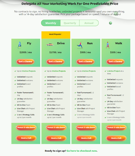
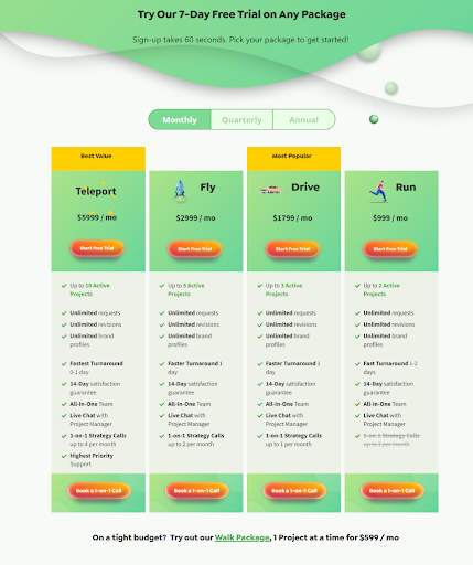
Example of A/B Testing Pricing Page #7: AutoGrow
Back when we decided to add a more expansive Teleport package to our pricing page, we didn’t get the results we hoped to see.
In version A of our A/B test, our main call to action was watching a demo. And our headline emphasizes one predictable price.
Version A
But when we introduced the Teleport package, we focused more on the ability to sign up for a free trial.
And we had two yellow-highlighted packages instead of just one.
Moreover, our smallest package, Walk, was removed from the tiers of service and moved to the bottom of the page, like an afterthought.
Version B
Takeaway
Although we’re still in the process of fine-tuning our pricing page, we gathered some valuable information from our A/B test.
Our version B pricing page had all the hallmarks of a high-converting page.
You’d find a similar design among many successful freemium-model SaaS companies.
But the problem is, we’re not a SaaS company.
And we're also not technically an agency 9even if we offer similar services).
Our target audience clearly has different preferences than B2B buyers looking for software solutions.
Needless to say, version A had a 17.94% conversion rate while version B converted at just 11.43%.
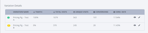
First, highlighting two packages sends the wrong message. It adds friction.
So we decided to scale back and focus on just the most popular choice.
Another thing we found from our study is that we must focus more on nurturing our audience with demos and sales calls.
Prioritizing a free trial may be good for a SaaS company’s pricing page, but our audience is finding it too aggressive.
With that, we understand that we must work more on education rather than selling.
Lastly, the A/B test results go to show that our Teleport package is scaring off some potential clients. They might see that big scary “$5,999 / mo” and bounce.
Even though our team is ready to take on bigger clients in the enterprise realm, we might be sending a mixed signal to the small business audience that usually frequents our website and subscribes to our newsletter.
Example of A/B Testing Pricing Page #8: Wishpond
Like HubSpot, Wishpond had a competent pricing page in place, but there was room for improvement.
One of the biggest problems with the original page was its wordiness. There was a lengthy list of features for users to process.
So Wishpond shortened the list of features dramatically for sake of simplicity.
Old

New
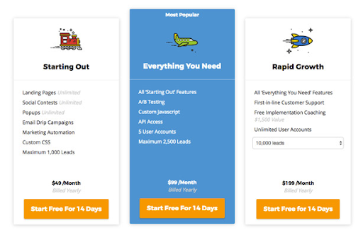
Now you probably also noticed some other changes between the two, such as the color scheme, the plan names and the tweak in the CTA buttons.
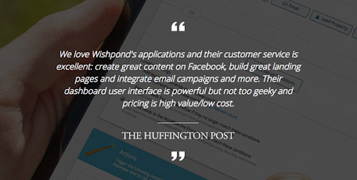
But that’s not all. Wishpond also A/B tested the headline at the top of the page and the testimonial section towards the bottom.
Old

New
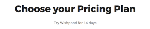
The new headline is more action-oriented.
And for the testimonial section, the team opted for social proof from everyday business professionals, as opposed to a brand name like The Huffington Post.
Old
New

After the full-blown redesign, Wishpond increased sign-ups by 41.7% and upgrades by 54.3%.
Takeaway
First thing’s first. Wishpond’s example just highlights the fact that what works for one company won’t necessarily work for another.
So, your agency can't simply look at some pricing page examples (like the ones in this article) and assume that you'll receive the same results.
Previously, we looked at Instapage’s pricing page A/B test. And, as you may remember, their page didn’t convert any better when the copy was shortened.
But with Wishpond, it did help convert more website visitors.
Admittedly, it wasn’t just the change in copy length.
This example also demonstrated the value of exchanging a generic headline for a more action-oriented one.
Moreover, Wishpond added a little more personality into the pricing page with the use of icons and colors.
Lastly, the new page resonated better with the average B2B buyer by switching the testimonial of a brand name to a like-minded business professional.
Example of A/B Testing Pricing Page #9: Buck Mason
Buck Mason is a retailer that sells durable clothing for men and women.
Its product page A/B test centered around customer reviews.
As you may know from our article “How to Respond to Bad Reviews,” customer feedback is a big factor in purchasing decisions.
A household name might get away with no reviews. But for a smaller brand, that could be a problem.
Fortunately, Growth Rock, the team handling Buck Mason’s marketing, recognizes this truth.
With that, they swiftly implemented customer reviews on all of Buck Mason’s product pages.
From then on, every product listing would include a star-based rating.
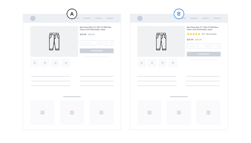
By adding the customer review score, Buck Mason saw:
- 15% higher conversion rate
- 17% more revenue per session
Takeaway
Retail shoppers want to see social proof just like any kind of consumer.
Especially when they’re deciding whether or not to spend money on expensive products like those that Buck Mason offers.
What the marketing team found was that the shopping journey wasn’t exactly how managers visualize it. It’s not a straightforward process of clicking on the product page, checking out and completing the purchase.
Instead, consumers are looking for ways to convince themselves that it’s okay to buy the product.
So they often revisit the product page to read reviews. That way, they can rest easy.
Conclusion
Your clients' pricing pages can make or break their entire business model.
And that will have definite ripple effects on your agency.
Because you can have the best marketing team and the best product in the world, but if your website visitors see something they don’t like on your pricing page, they won’t make a purchase.
And that’s where A/B testing can help you.
By reading about 9 pricing page A/B test examples, you have inspiration for your next redesign for a client or even for your own agency's website.
Remember, not every method will work for all your clients.
It's not like a one-size-fits-all baseball hat.
If you don’t see good results with one variation, try another. And another.
There’s plenty of options to choose from.
And if your agency's team is inexperienced with A/B testing pricing pages or you’re worried about time constraints, feel free to book a call with AutoGrow.
Our team of designers and copywriters have helped countless agency clients like yours soar their clients' sales by revolutionizing their pricing pages.
Using our web-based project management app, you’ll see your pricing page project unfold in real time. All you have to do is delegate a project to us through the chat, and we take care of the rest.
If you’re not ready for a call, check out our on-demand video to learn more about our platform.
And before you go, let me ask you … Are you going to try out any of these redesigns for your own pricing page?
Let me know in the comments below.
Keep AutoGrowin’, stay focused.
Mark


