
How to Create a Landing Page That Practically Prints Money

When I started my first business back in college, online marketing seemed like voodoo black magic.
It was too good to be true.
But… Tomorrow is AutoGrow’s 10 year anniversary 🎉🥂.
I started with almost $0 in my bank account and grew the business to where we’ve generated well over $25MM in revenue for our clients.
We’ve saved them 80,000+ hours of work—while also generating hundreds of thousands in revenue per year (500% growth from 1 year ago when we relaunched our done-for-you service).
This decade of working hard to grow the company has shown me there’s really NO magic involved in marketing success.
I know it’s not what you want to hear, you want to know “the secret” but that’s a mistake I myself made for FAR too long: searching for some “silver bullet”.
Here’s the real secret I discovered:
- Find what works, by testing and learning from other successful companies—then rinse and repeat baby 😎 (and get a little better each time)
All that being said, today I’m sharing with you some of the wisest tips and tactics that helped AutoGrow generate more leads and sales with high-converting landing pages.
If you’re looking to convert more leads and practically print money with your website, this guide will show you how to do it.
In this article, I’ll show you...
- How to create a high-converting landing page that not only increases your conversion rate but piles up money and leads.
- The best 15 tips that will persuade prospects to buy your products or services.
- Plus, a detailed video teaching you more about the “why” and “how” to drive more leads and sales with your landing pages.
Let’s lay the cards on the table and start building that high-converting landing page you’ve always wanted.

What Should Your Landing Pages’ Goal Be?... Make a Sale? Or Drive Leads?
The overarching goal for any landing page is to rake in conversions.
Ultimately, you want people landing on that page to follow through with an action.
And typically, that action is highly specific to that landing page and to your specific marketing campaign.
Nearly 1 out of 2 marketers, for example, build a brand new landing page for each of their marketing campaigns according to Wordstream.
However, only about 1 in 5 marketers is actually satisfied with their conversion rates.
After all, most websites on average convert at about 2.35% Wordstream reports. That being said, the top 10% of companies actually see 3-5X higher conversion rates.

And part of that success comes down to defining the goal of your landing page.
What is the goal of your page? What do you want people to do after they read through your content?
And in most cases, the answer comes down to 2 scenarios in particular...
Scenario #1: If You’re Looking to Drive More Leads
The first scenario is when you’re looking to drive leads to contact your company.
This is particularly relevant for service-based businesses.
In many cases, the landing pages of these businesses are designed to help answer questions, overcome buying objections, and essentially convince the prospect that your service is worth investing in.
Then, after that’s accomplished, all that’s left to do is show them your contact info.
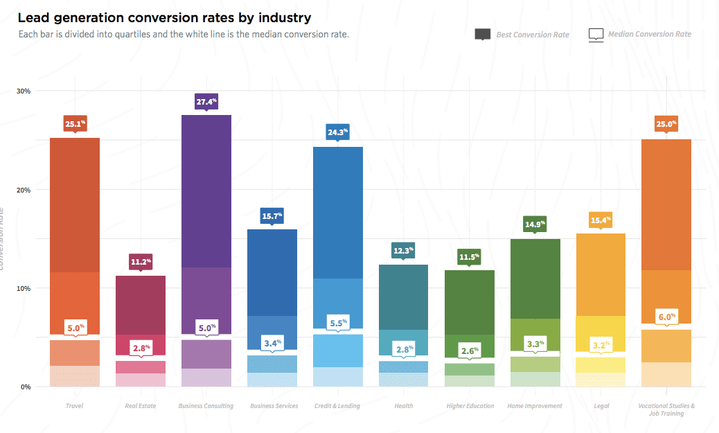
Research from Hubspot found that the #1 priority for marketers is actually generating leads. Makes sense, right?
Now, it’s worth remembering that not all industries will be able to generate leads at the same rate. So be sure to do a little research on your specific industry’s average lead generation rate.
Here’s a graph from Smart Insights to give you a bit better idea about the disparity between industries.

All that being said, landing pages designed to drive leads are usually more practical when visitors are coming in from the following contexts:
- Paid traffic like Google
- Organic traffic where people are landing on your site to be educated
- Miscellaneous sources like your blog
Scenario #2: If You’re Looking to Drive More Sales
While generating leads is great, not all businesses will need to hop on the phone or go through a lengthy exchange with prospects in order to convert leads into customers.
So it shouldn’t come as too much of a surprise that Scenario #2 for landing pages is to simply drive more sales.
Now, this type of landing page is actually good in a few different situations.
1. Your price point for your product is especially low and easy to explain (which means you don’t have to put as much effort into describing it and addressing objections).
2. You’re directing leads here that you’ve been nurturing through your expertly crafted email sales funnel (thus making these leads qualified, informed about your product or service, and ready to buy).
Does Length Matter?
Before we get into the 15 tips for creating a high-converting landing page or improving the ones you have now, let’s talk about one common question I hear all the time in marketing circles…
Does landing page length matter?
Good question.
And like most good questions in life, the answer isn’t black and white. Instead, it’s a bit more nuanced.
For example, a case study in our Proven Sales Conversion Pack found that a longer landing page actually increased a page’s lead generation power by more than 220%.
Here’s what recovery center Sierra Tucson’s page looked like before…

And here’s what it looked like after…

And like I said, adding more copy to their page increased conversions by 220%!
That being said, there are also other cases where shorter copy actually beats out longer copy.
For instance, website optimization company Crazy Egg tested the conversion rate of their own website across 4 different page lengths. Here’s a quick overview of the 4 samples, just so you can get an idea of how long each was.

Now, according to the first case study we mentioned, you’d expect the conversion rate winner would turn out to be option 1 on the far left, right?
Wrong!
The winner, with an impressive 13% higher conversion rate over the control, was actually option 4 on the far right.
Surprised?
So was Crazy Egg.
It turns out, the best length for your product or service’s landing page more than likely comes down to one thing…
The required investment.
The more that’s required to buy your product or service, the higher the risk. And the higher the risk, the more a prospect is going to need to be convinced that they are getting a high value for their investment.
So if, for instance, you’re selling a Hello Kitty Keychain off of Amazon for $8.99 like this…

...then you probably don’t need FAQ, How It Works, Benefits & Features, or Price Anchoring sections.
Why? Because it’s just 9 bucks!
But if, for instance, you’re selling a high-ticket item like a $40K Tesla, a $1,500+ training program, or a $50K- $200K enterprise software service, you’ve got to spend the extra time to address your prospects’ buying objections and show them how your product works.
The more questions you can answer beforehand, the easier selling them on your product or services is going to be.
Alright, now that we’ve covered the length question, let’s jump into the 15 tips for creating a high-converting landing page.
15 Tips to Create (& Improve Your Existing) High-Converting Landing Pages
Ready?
Tip #1: Speak to Your Audience & Avoid Using Corporate Language (They Don’t Like Formality!)
If there’s one thing that all great marketers have in common, it’s being able to speak (or write) in such a way that resonates with their target audience.
And if you want your audience to both understand and feel compelled to act with your words, you’ve got to speak plainly.
Forget the jargon. Forget the fancy schmancy lingo. And forget overly-flowery language.
Instead, get to the point.
Make it absolutely clear what you’re trying to say.
And get on with the rest of the page.
According to research by Business Insider, what you say to an audience isn’t nearly as important as how you say it. Studies suggest that effective presentations are 38% your voice, 55% non-verbal communication, and only 7% your content.
Now, when it comes down to your landing pages, the lesson here is that there are ways you can communicate with your prospects that go outside of just the cold hard facts.
For instance, using the word “you” is one way to really grab your audience’s attention.
And it’s one technique we use at AutoGrow all the time.
For example, check out this section of one of our client’s landing pages. See how many times “you” is mentioned in just this small group of text?

All these “you”’s act as ways of engaging prospects and getting them to focus their attention on what’s on the page.
Tip #2: Write a Clear Headline (Don’t Try to Sound Too Fancy)
Now that you’re in the right headspace for speaking to your audience clearly, it’s time to capture their attention with a well-crafted headline.
With headlines, you need to resist the urge to be overly clever.
I know, I know: everyone wants to come up with some pun, some ingenious imagery, some mind-blowing word combination when it comes to their headlines.
But the truth is, the clearer you can be, the better. And in most cases, that means you don’t have room to be clever.
In fact, choosing clarity over cleverness is the basis of The Law of Clarity from the 11 Laws of Sales Funnel Physics.
One way to boost clarity is by stating clearly what your product is and then listing out the benefits of using them.
Check out how we did just that for one of our clients below.

There are plenty of other copywriting techniques you can use to make your headlines better than ever.
But without a doubt, keeping it clear is the most important.
Tip #3: Write a Sub-headline That Supports Your Headline
Next up, it’s time to clarify and support your headline with a solid and value-packed subtitle.
Now, with a subtitle, you don’t have a whole lot of room to work with.
So try infusing your copywriting with the 11 Laws of Sales Funnel Physics here.
Because with such little room available, you need to be especially sure that your copy has an impact in your subtitle.
If you haven’t already done so in your headline, this is a great place to introduce the name of your product or service.
It’s also a good place to highlight the specific benefits you provide clients.
Check out an example of doing both in the subtitle we built for a client below.

Tip #4: Add Irresistible & Clickable CTA Buttons That People Can’t Ignore
Mastering the CTA button is key to getting your visitors to convert into leads or customers.
According to Wordstream, over 90% of visitors who reported reading headlines also read CTA copy.
But even still, an astounding 70% of small business B2B websites actually lack a call to action completely according to research by DSIM School of Internet Marketing.
Now, if you know anything about marketing by now, it’s probably that the more personalized you can get with your prospects, the better. And that same principle applies to your CTA buttons too.
According to Hubspot, personalized calls to action actually convert 202% better.
So be sure to personalize your CTAs as much as possible.
One way to do that is similar to using “you” language like we discussed above.
But instead of using your copy to take on the voice speaking to prospects, try speaking from the prospect’s point of view with words like “my.”
Let me show you what I mean.


See that?
By shifting the perspective to your visitors and giving them an action focused on them, you can help increase your conversions.
Tip #5: Add Social Proof of Any Kind (Be Greedy)
Social proof is one of the best tools in a marketer’s tool belt.
Because humans are such social animals. Understanding that other people actually like a product can be enormously powerful in our decision to buy something.
For example, research by Nielsen found that 92% of people will trust a recommendation from someone they know.

Impactbnd also found that testimonials can actually increase conversions on sales pages by 34%.
And research by Cxl discovered that review stars in search engine results significantly improve click-through rates by as much as 35%.
Now, what does social proof look like on your sales page?
Well, I’m glad you asked. Because here are a few examples.
Testimonials…


Past customer logos…

Vanity stats, accreditations, and awards…

In the end, anything you can show to prove that other people trust you, you can use to help convince your prospects to click that “buy now” button.
Tip #6: Introduce & Agitate Pain Points (Put Your Finger on It)
You’ve created an eye-catching headline and subtitle, added your CTA button, and inserted a bit of social proof. Now it’s time to dive into the problem your prospects experience without your products or service.
At this point, you’ll want to assure your prospect that you actually understand what it is they’re going through by describing what they’re feeling.
If, for instance, they’re sick and tired of having to spend hours and hours every week managing their rag-tag group of marketing freelancers. Or handling all of their business’ marketing themselves, call out that problem with a chunk of text.
You don’t even have to be sneaky about it.
In fact, we even call out the “problem” section on our own homepage.
After you’ve identified the problem they’re going through, take a few lines of copy to really agitate the problem.
Don’t be cruel or over-the-top with it, of course. But take those pain points you mentioned and really make them land with your visitors. One way to do that is by showing them how bad things can get when their problem isn’t solved.
For instance, check out the last 2 sentences on one of our client’s sales pages.

And for those who have spent years and decades of their lives putting money aside for a more comfortable future…
There is nothing more devastating than 20, 30 years of saving gone down the drain in a matter of weeks.
See how that idea of losing decades worth of savings can really cut into your visitors’ fears?
Use it!
Tip #7: Add a Solution Statement—The Solution Your Audience Needs!
Now that your readers are sufficiently agitated about their problem, it’s time to present the solution: your product or service!
Take extra pains to be clear here—simply state the name of your product or service and then add a small bit of copy emphasizing your benefits.
Here’s how we do just that on our own homepage…

And here’s how we’ve done it on some of our clients’ pages…


No need to go crazy with creativity here. Again, clarity beats out cleverness every time.
Tip #8: Explain Why Your Products or Services Are What Your Prospects Need (Include Benefits)
Now that you’ve introduced your solution, it’s time to break down why your product or service is the answer to your prospects’ problems.
Now, this step is actually kind of combined with the next one (explain your features) because they’ll both take place in the same sections.
But the important takeaway is that you’ll want to introduce your business’ specific features by first pointing out the benefits they provide.
That’s because on a fundamental level, people are highly interested in themselves.
How is this going to help me?
What am I going to get out of this?
How will it help me achieve my goals?
So in this section, introduce your features by highlighting how they help the prospect.
Here are a few examples of how to do it from our own homepage.


See how they each start out by stating the exact benefits to the prospect that our service offers?
Tip #9: Show (& Explain) Your Products or Services’ Features
After touching on the benefits of your service, you’ll also want to show how each of your features actually provide those benefits.
For example, take a look at how we positioned the fact that our client’s mobile notaries are trained in spotting fraud.

And because of that extra training, their customers can rest easy knowing that they’re protected against fraud and identity theft.
Another tactic you can use in this section is to insert snippets of social proof between each benefit/feature.
We even do it on our own homepage.
The trick is to actually link that social proof to the feature or benefit you’re describing.
Let me show you an example from our own page.

The benefit here is that we let businesses save thousands of dollars on hiring while giving them the services they need to grow their business.
And below that feature, we’ve included a testimonial from Kelly Cammack where she mentions her revenue doubling and how we’ve helped her save her “a ton of time.”
See how the testimonial she gave actually backs up the feature?
So if you have a wealth of testimonials for your service, be sure to put them to use here on your features page.
And if you don’t have a lot of testimonials, it’s time for you to learn how to ask your customers for more reviews.
Tip #10: Explain How Your Product or Service Works in a Simple Way (Almost for Dummies)
Okay so—your prospect understands their problem, knows about your solution, and gets the gist of your benefits and features.
Now it’s time to get a bit more into the specifics by showing how your product actually works.
There are a few different ways you can do this.
First, you can create a simple demo video that gives your prospects the rundown.
It’s a well-documented fact that people love watching videos. Hubspot even found that a whopping 58% of visitors want to see more video content from brands.
But if you don’t have a demo video on hand, you can instead just list out a quick overview of the process in 3 easy steps.
No need to go too crazy on the copy here either. Keep it simple like in the examples below.


In the end, you want to give a super general idea of what’s involved with working with you.
But try to keep the number of steps down to 3. Otherwise, your visitors may get the impression that this process is too complicated for them.
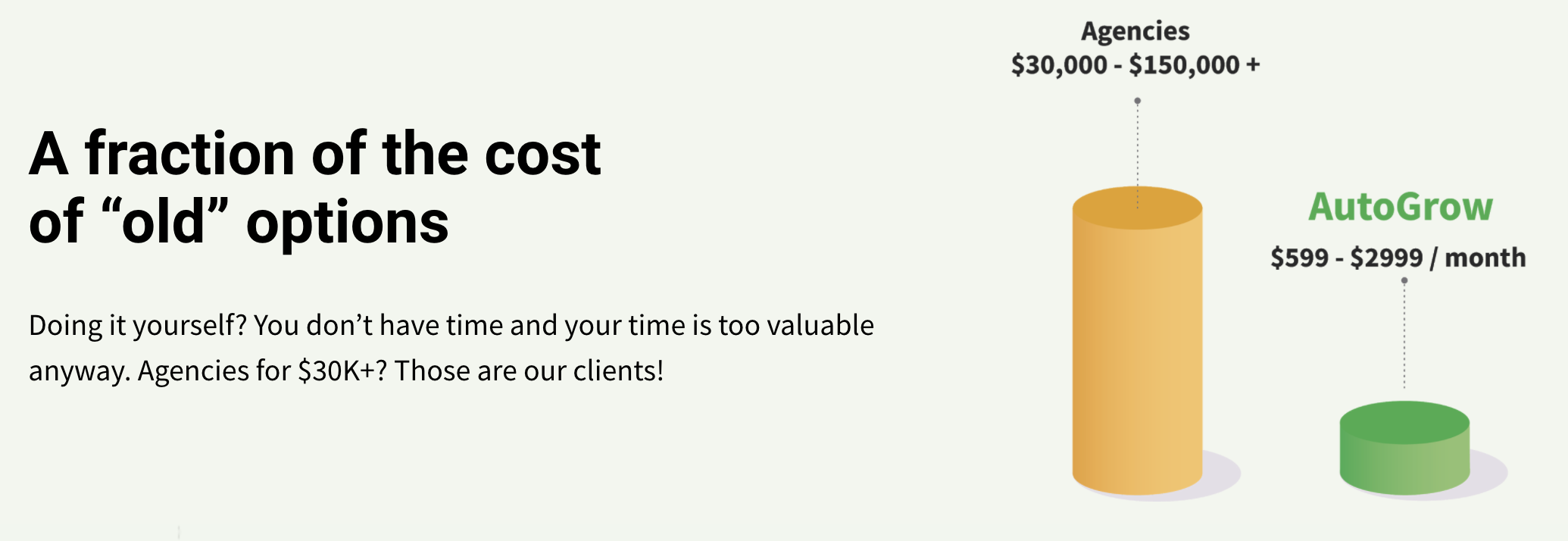
Tip #11: Set Up Your Price Anchor (Don’t Let People Wonder How Much Your Products Cost)
While every tip in this list is important for building a high-converting landing page, this tip in particular is one that you should really hammer into your brain…
Always set up a section on your landing page for price anchoring.
For those of you that don’t know, price anchoring is a specific copywriting sales or persuasion tactic. You use it to better convey the value of your product or service and/or make it appear more affordable, so that the price point is, therefore, more persuasive.
Here’s how it works on a landing page.

If you’re selling, say, wrist guards for people who type all day long, you can position your product either as more affordable than other wrist guards or as a better option compared to the problem it prevents (getting carpal tunnel syndrome).
In either case, you generally want to point to cost more than anything else because it’s much easier to measure against.
Let’s look at a page we designed for an interior designer to see how this works.
Visual representations of the costs, like the graph above, are a great way to communicate savings quickly and effectively.
So if you can, try to use graphs or other visual elements in your price anchor too.
Tip #12: Include a FAQ Section to Answer Any Questions
An important yet often overlooked element of a landing page is the frequently asked questions section.
Now, when done correctly, this section can be a powerful tool for getting your visitors to convert.
The trick is to put yourself into the role of the buyer and ask yourself, “What are my biggest reasons for not buying right now?”
After that, create a hypothetical question whose answer actually addresses those reasons you came up with.
Here’s an example of a great FAQ section from our interior design client that gets to the heart of the most common questions clients have before requesting a consultation.

You see, it’s your job as a business to make the buying process for your customers as simple as possible. And if there are any lingering questions your prospects have about your product or service, that uncertainty is going to be held against the value of your product.
Think of it like a scale. On the left side, you have the value that your landing page is communicating. And on the right, there’s your visitors’ uncertainty about buying. The more you can answer that uncertainty, the more you can remove from the right side and stack onto the left.
According to research by Helpscout, three-quarters of online customers expect help within five minutes.
And with a well-made FAQ section, you can answer those questions right on the landing page without having to get on the phone.
Tip #13: Include Risk Reversal for Prospects’ Peace of Mind
No matter how well you describe your product, how succinctly you cover the benefits, and how adeptly you address your audience’s pain points, there’s always going to be hesitation before buying.
It’s human nature to be skeptical.
And as a marketer or business owner, the more you can put your prospects’ minds at ease, the more likely they’ll be to buy.
That’s where the risk reversal comes in.
A risk reversal is basically any tactic you can use to basically flip the risk of buying from your prospect onto you.
30-day guarantees, free consultation calls, 1-week trials, discounts, and money-back pledges are all examples of risk reversals.
And if you’re going to incorporate them into your landing page (which you should), then you’ll want to put in the effort to make this section really stand out.
Here are a few examples of how we’ve incorporated risk reversals into the landing pages we’ve created for clients.


Again, the trick here is to draw attention to the risk reversal and take as much risk off of the plate of your visitors as possible.
Tip #14: Add Opt-In Forms to Attempt to Get People’s Contact Info
Whether the goal of your landing page is to drive sales or simply bring in leads, you should always, always, always be asking those who convert for their contact info.
Part of that reason is because it drives more commitment on the side of your prospects, making it more likely that they’ll follow through on, say, showing up for your consultation call.
But in addition to that, when you’ve captured their contact information, you can continue to follow up with them. That way, you can nurture the lead and eventually turn them into a paying customer.
Check out our Ultimate Sales Funnel Template (Advanced) to see all the things you can do with leads to keep them interested and even increase the value of each customer.

However, you’re going to want to be strategic about how you build your opt-in forms as well. And one of the best ways to do that is by limiting the number of form fields you have.
Research from Wordstream found the following stats about form fields to give you a better idea of how to build yours.
- The average number of form fields is 11.
- Reducing the number of form fields from 11 to 4 can result in a 120% increase in conversions.
- The optimal number of form fields for the most conversions from your landing pages is 3.
Tip #15: Don’t Forget to Mobile Optimize Your Page
And last but certainly not least, make sure your landing page is mobile optimized!
Gone are the days of skating by with solid websites that just don’t perform on mobile.
Why? Because the truth of the matter is, most people are actually viewing your content on mobile.
Adobe found all the way back in 2012 that traffic from mobile devices had doubled in the past year but less than half of the survey respondents said they have a mobile-optimized site or mobile app.
But fast forward to today and you’ll see stats like these:
- Mobile commerce now accounts for nearly 1 out of 4 ecommerce sales according to Invespcro.
- In 2018, 52.2% of all website traffic worldwide was generated through mobile phones according to Statista.
- Companies with mobile-optimized sites triple their chances of increasing mobile conversion rate to 5% or above according to Adobe.
- 93% of people who use mobile to research complete the purchase of a product or service according to Google.
Without a doubt, mobile optimization is incredibly important.
So give this last tip the credit it deserves and spend the few extra minutes optimizing your landing page for mobile viewers.
Conclusion
So there you have it!
This article has shown you 15 tips you can use to increase the converting power of your landing pages:
- Speak to Your & Avoid Using Corporate Language (They Don’t Like Formality!)
- Write a Clear Headline (Don’t Try to Sound Too Fancy)
- Write a Sub-Headline That Supports Your Headline
- Add Irresistible & Clickable CTA Buttons That People Can’t Ignore
- Add Social Proof of Any Kind (Be Greedy)
- Introduce & Agitate Pain Points (Put Your Finger on It)
- Add a Solution Statement—The Solution Your Audience Needs!
- Explain Why Your Products or Services Are What Your Prospects Need (Include Benefits)
- Show (& Explain) Your Products or Services’ Features
- Explain How Your Product or Service Works in a Simple Way (Almost for Dummies)
- Set Up Your Price Anchor (Don’t Let People Wonder How Much Your Products Cost)
- Include a FAQ Section to Answer Any Questions
- Include Risk Reversal for Prospects’ Peace of Mind
- Add Opt-In Forms to Attempt to Get People’s Contact Info
- Don’t Forget to Mobile Optimize Your Page
And when you follow them, you can rest assured your landing page is going to see sky-high conversions in no time.
Now tell me, which of these tips are you going to implement first on your new landing page? Do you have any others that have gotten your business results?
Let me know in the comments below.
And as always,
Keep convertin’, stay focused.


